Share:
This is a stage by stage process of the studio version of “Valdemossa Light” painted from a photo reference.
Most of the time when I paint in-studio from a reference photo, I refer to some of the sketches done on the spot or rely on my memory to remember the feel of the place.

Plein air painting of Valdemossa.
As I had already almost a finished painting on the spot itself, and the feel of the location was easy to recollect.
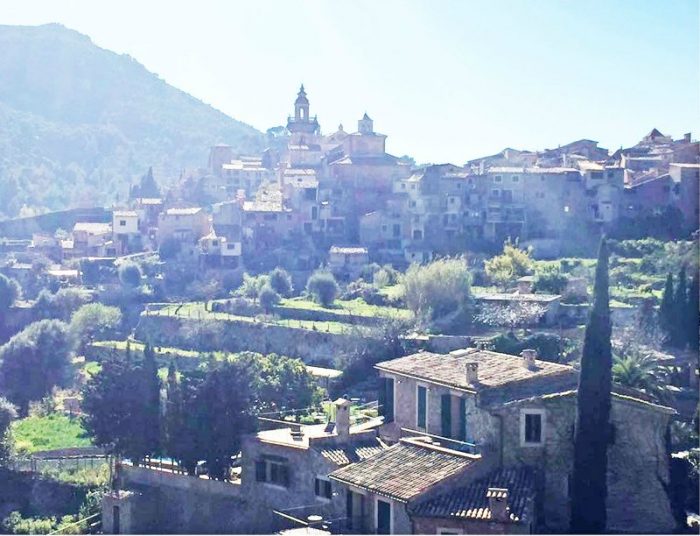
Reference photo of Valdemossa.
The photo reference will give you all the information needed but I think the experience which we have with all our five senses … like smell, sounds, etc. are also important. These things that we recall make a difference in the painting.
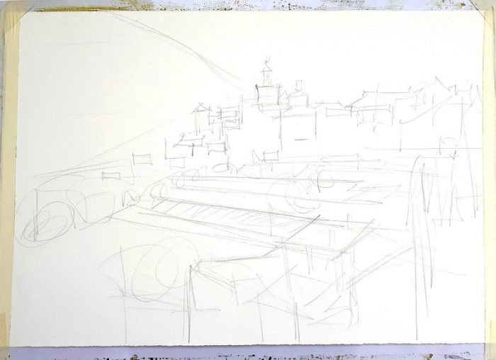
Stage 1. Pencil sketch of Valdmossa.
Stage 1 – Pencil sketch.
I blocked in the major shapes of the scene. Usually my pencil work is quite random and more of a loose approximation.
I am not that patient, so rather than spend a lot of time doing the pencil work, I prefer to focus on the general space division, a general movement, and interlocking of shapes in the painting.

Stage 2. Laying out the colors for “Valdemossa Light”.
Stage 2 – Laying out my colors for the painting.
Here I lay my colors in the palette…. though I have all the paints of my choice in my box (just received my DANIEL SMITH Watercolor Dot Card with all my picks!), I still like to use limited shades for every painting in a separate palette. [See Milind’s Dot Card color list further below].
If I need any extra accents, I keep a standard box of paint alongside for easy access.
The shades here are Cobalt Blue, Phthalo Blue (Green Shade), Phthalo Green (Yellow Shade), Permanent Alizarin Crimson, Burnt Sienna and Hansa Yellow Light.

Stage 3. Starting with basic washes.
Stage 3 – Starting with basic washes.
The basic wash starts from the top with mix of Cobalt Blue and a touch of Phthalo Blue (GS) blending with Burnt Sienna and bit of orange created by mixing Hansa Yellow Light and Permanent Alizarin Crimson.
Below that I add a fresh green, obtained by Hansa Yellow Light and Phthalo Green (YS) in different proportions.
Further down I add hints of a reddish yellow and some neutral achieved by blending Burnt Sienna and Cobalt Blue.

Stage 4. Adding the background.
Stage 4 – Adding the background.
Here I’ve started with background cluster of distant buildings. If you notice it is one uniform variegated wash. I have used a transition of warm and cool colors, a warm mixture of Burnt Sienna, Hansa Yellow Light and Permanent Alizarin Crimson, and a cool mix mainly using Cobalt Blue and Permanent Alizarin Crimson. Permanent Alizarin Crimson being the common color in warm and cool but not showing anywhere in an isolated hue.
Care was taken in leaving the shining roof shapes alone.

Stage 5. Building up areas.
Stage 5 – Building up areas.
At this stage there is a slow and deliberate build up of the shadow areas of the trees and foreground buildings and a mountain behind.
While a transition of warm and cool shades, tonal variation is important here…. mostly leaving accurate negative shapes (or positive) of light areas is the most important thing here.
Most of the painting is accurately built here and all that is needed further is the details.

“Valdemossa Light”, Milind Mulick
Stage 6 – Final
Tiny additions of dark windows and accents, with some sharp line work.
Consciously keeping the economy of details and yet not making an understatement is the challenge at this stage.
The darks are created using either Burnt Sienna and Phthalo Blue (GS) which is warmer or Phthalo Green (YS) and Permanent Alizarin Crimson for strong cool dark.


