Share:
I have been drawn to the immediacy of painting on location for many years. Whether it is a quick study or a completed painting, painting from life only enhances my studio work. Capturing the scene at hand (en plein air) and all at once (alla prima) forces me to make quick decisions on value, color and composition. For me it hones the powers of observation.
Because I travel with my paints- teaching national and international workshops as well as attending plein air events- I was really excited to try the DANIEL SMITH Water Soluble Oil Colors.
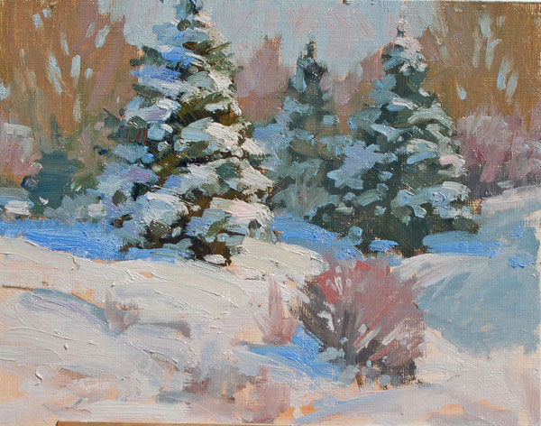
Shortly after I received the paint, we had a sudden, unusually heavy snowstorm with 18 inches here in Colorado. I wondered how the Water Soluble Oils would handle the cold temperatures, and I decided this would be a fun opportunity to get introduced to these paints. I choose my subject, some snow-laden evergreen trees with cottonwoods in the distance, and looked for an interesting composition. While at first glance it looks as if I was deep in the snowy Rockies, I was actually within walking distance to my studio, close to town.
I set up my easel and squeezed out the colors I chose. When outdoors, I like to work with a limited palette:
- Titanium White
- Cadmium Yellow Light Hue
- Cadmium Yellow Medium Hue
- Quinacridone Gold
- Cadmium Red Medium Hue
- Alizarin Crimson
- French Ultramarine
- Burnt Sienna
- Viridian
- Sap Green
I had one container of water to use for thinning the oils and for cleaning my brushes. In another container was the Water Soluble Linseed Oil. As I usually don’t use a medium when I use regular oils, I wanted to see if these paints needs the extra push.
On my easel I set out a canvas panel and began toning it with Burnt Sienna thinned a little water. Normally, I would have thinned the paint with odorless mineral spirits to tone my substrate. I enjoyed the fact that I only needed to use water. I travel a lot, and being able to use the local water instead of trying to purchase turpentine and odorless mineral spirits would be a great advantage.

1) When I started to paint my subject, I tried to divide my canvas into uneven shapes. It was not about the trees, but the shapes and how you can invite the viewer into and around the scene. After toning the canvas, I began drawing in the shapes with a small brush, using the Burnt Sienna thinned a little with water.
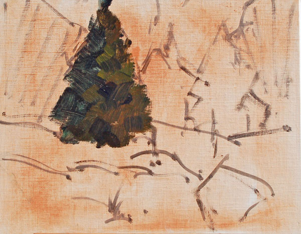
2) I began adding in the darks of the trees because they will act as anchors in the painting. The Sap Green and touch of Alizarin Crimson worked nicely for the darks. The ‘light’ side of the tree, which was also part of the dark shape, was Sap Green and Quinacridone Gold.

3) I started adding the first bit of shadow snow with brush strokes of French Ultramarine Blue mixed with Titanium White. These are also part of the dark shapes. Just those two colors made for a very close match to the actual shadow. It is easy to make snow shadows too grey. They are actually very clean and colorful. It is easy to lighten them later with reflected light from the sky.

4) Because the two large trees looked like salt and pepper shakers I changed the shape and placement of the second tree. I wanted to establish a focal point with only one dominant tree. To push it back, I painted it in a lower chromatic color. I added a small bit of the French Ultramarine Blue to my warm tree color to cool and recede the mid-ground trees.

5) I now added in more evergreen trees as well as roughed in the mass of the cottonwood trees in the background. The distant cottonwoods were a fairly neutral color but I wanted to enhance the ‘cool’ warm. I blocked in the lollipop shape of the trees with Burnt Sienna and then later added brush strokes of Burnt Sienna and Alizarin Crimson and Titanium White. This helped to give the feel that there was a bit of snow in the branches.

6) I started to give more form and volume to the secondary evergreens and added the start of the bush in the foreground. There was actually a willow bush that was out of the picture but I moved it over for balance and a design lead in. I mixed the Sap Green with a touch of Alizarin Crimson and Titanium White.

7) On the right I intentionally incorporated some shadow shapes that weren’t there. Compositionally it helped to direct the eye over to the main tree. The shadow blues on that second tree are also less chromatic than the shadow blue of the forward tree. A bit of the tree underpainting mixed in and knocked down the color. This helped to recede those back trees.
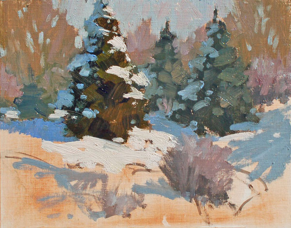
8) The distant cottonwood trees were painted with a thinner paint. I was then able to lay in the negative space ‘sky holes’ with thicker sky color (fat over lean) opening up the trees and giving them more personality. In the scene, the sky was very close in value and color to the snow shadows. I didn’t want the painting to about the sky, but about the trees and shadows. I wanted to make the snow pop and have more contrast so I intentionally muted my sky a bit. For the sky color I took the same snow shadow color and added more white and a touch of Cadmium Red. Afterwards I warmed up the sky a bit with just a few brush stokes of Alizarin Crimson and Titanium White. A little vibration is nice.

9) Time to continue adding my heavy sun filled snow. I did add a touch of red to warm the snow facing the sun. As the Titanium White was a bit stiffer than the other colors it was at this time that I dipped into the Painting Medium and ladled on the snow with the White. This is the fun part as you feel like you are frosting a cake, putting tactile texture onto a flat surface.
As I was finishing the painting, I added some reflected light back into the shadow snow boughs. The bright snow reflects all sorts of wonderful color. Here it is fun to subtly add Viridian and the Quinacradone colors.
This painting took about 1½ hours. You want to not only document the scene at hand, but also convey a sense of place and mood. A snow scene painting with evergreens can often be too black and white with not much color. It can appear cold. What makes the painting so much more inviting is to add warmth (ie; warmer cottonwoods and willow), enhanced reflected light (shadow snow boughs) and warm sun-kissed snow from a morning sunrise.
I was pleased to find that the water soluble felt the same as my regular oils, except the Titanium White seemed a bit stiffer. Here I used the Water Soluble Linseed Oil to loosen it up. Others may enjoy using the oil medium throughout the entire painting. Most of the time I painted with the paints either thinned with water or straight from my palette. In the heat of painting, the artist often tends to forget the tools and materials as you concentrate on the values, edges, color temperatures and shapes. Even though I was using a different type of oil paint, I felt comfortable and found that the paints did lend themselves very well to my style of painting. I like using paints thin to thick, ending with a fun bravado of brush work for the lights in the rocks, snow and clouds.
These water-based oils worked well under all situations, even in colder temperatures, and they cleaned up exceptionally well with just water. I didn’t have to worry about the toxicity of turpentine or mineral spirits. The paints also stayed supple through the entire painting (and after) so you didn’t have to worry about your brushes drying as with with acrylic. The overall experience was great!
