Share:
Painting in watercolor is fun and exciting, even if you don’t have a clue what you are doing. Many of us are instantly hooked by the seductive medium and start by jumping right into painting pretty pictures. So if that’s where you are, you’re in good company.
A word you will probably hear again and again on your artistic journey through watercolor painting is “practice, practice, practice.” The truth is, you really do learn to paint by painting. My lessons on split primaries are meant to acquaint you with the fundamentals of mixing colors.
Color sets a mood and gives an artist unlimited means of expression. Color can be magical. Whereas composition and technique connect with our intellect, color touches our heart.
Is studying basic color theory instead of simply relying on color formulas worth the effort? Each of you will have to answer that question for yourselves. Learning about color relationships can be liberating, allowing you to focus on other aspects of painting, which opens the door to greater freedom of expression.
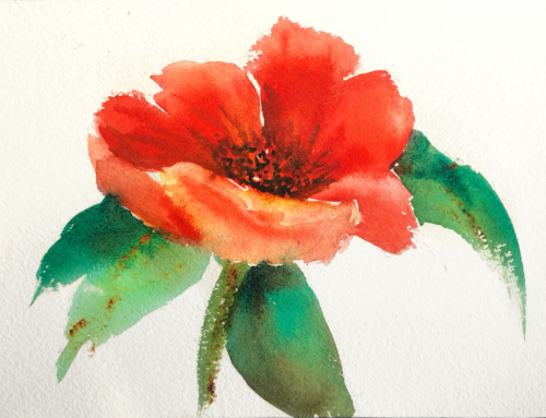
Although watercolors obey the same color laws as other mediums, there is one very important difference – watercolor is transparent. It’s the unique transparency of the paints and the translucent quality of the colors that make watercolor so popular.
Being able to mix the colors you want is considered to be a basis for successful watercolor painting. Even though experienced watercolor painters seem to be able to make color mixing look extremely easy, most of their skill and confidence comes from knowledge and practice.
Once you learn the basic principles and how they apply to a split primary palette, color mixing will become simple and automatic. And yes, mixing muddy colors will only be by choice!
Let’s begin with the definitions of some basic watercolor terms:
- Hue — another word for color, refers to a color’s name
- Intensity — strength, brightness and/or purity of a color; AKA chroma.
- Saturation — brilliance or purity of a color
- Value — lightness or darkness of a color – pure colors will vary greatly in value
- Primary colors — hues that cannot be mixed from any other colors– red, yellow, and blue – from these primaries, most other colors can be mixed
- Secondary colors are the resulting hues of mixing two primaries in equal amounts (R+Y =Orange, Y+B=Green, B+R=Purple)
- Intermediate colors are products of mixing one primary and one secondary (R+O=Red-Orange, Y+O=Yellow-Orange, etc.)
- Tertiary colors are products of mixing two secondary colors
- Complementary colors are any two hues that are directly opposite each other on the color wheel
- Neutral hue is the result of combining all three primaries in various amounts, thus neutralizing the intensity and saturation (combining a primary with its complement results in a neutral hue)
- Temperature refers to the warmth or coolness of a color, which is relative in comparison to other colors
Now let’s look at the color wheel, arranged like a clock (illustration above) and divided into three equal sections. At the top of the wheel (12 o’clock) is a cool yellow, Hansa Yellow Medium — a lemony, slight bias to blue-green is on the right of the line; a warm yellow, New Gamboge — a golden, slight bias to red-orange is on the left of the line. Going clockwise around the circle (at 4 o’clock) there is a cool blue, Phthalo Blue (Green Shade) — an icy, slight bias to blue-green is above the line; a warm blue, French Ultramarine — a purplish blue, slight bias to violet is below the line. Continuing clock wise, (at 8 o’clock) a cool red, Quinacridone Rose — a rosy, slight bias to red-violet is below the line; a warm red, Pyrrol Orange — a tomatoey red, slight bias to red-orange is above the line.
Here’s how it works:

Use a warm and a cool of each primary hue (a warm red and a cool red; a warm yellow and a cool yellow; a warm blue and a cool blue) to mix bright, high-intensity secondaries called a “mixed primary hue.” The secret is in using the right split primary colors and not crossing over the lines into another section!

For oranges, mix the red and yellow within the lines to the left of the circle. First mix orange, and then add more yellow for yellow-orange and more red for red-orange.
For greens, mix the blue and yellow within the lines to the right of the circle. First mix green (2 o’clock), and then add more yellow for yellow-green (1 o’clock) and more blue for blue-green (3 o’clock).
For purples or violets, mix the pink or rose with the blue within the lines at the bottom of the circle. First mix purple (6 o’clock), and then add more blue for blue-violet (5 o’clock) and red for red-violet (7 o’clock).
Now here’s the rule that makes this work – to achieve high-intensity color when mixing two colors on the wheel, don’t cross over the line. Stay in each section. Just imagine, no more muddy colors!
Crossing over the lines and mixing the colors on either side of the line causes the mixtures to become less intense and slightly grayer. Cross two lines and even more graying occurs. This graying is called neutralizing. It is the result of a slight touch of that third color being added to the mix. To mix earth colors, you simply cross over the lines or add a warm neutral to your mixtures.
That’s where Quinacridone Burnt Orange, the seventh color of our essential 7 basics, enters the scene… it’s a versatile warm neutral.

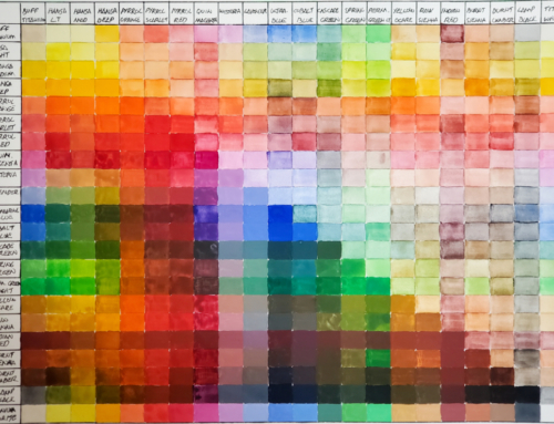
To create your own color mixing chart using the “Essential 7” basic colors of the split primary palette, use a pencil to draw eight rows and columns as shown above. To show how transparent or opaque each pigment is, make a black line using a permanent marker before you apply the colors. Each row is about the color/hue in that row and what the other colors in the palette do when mixed with the dominant row color. NOTE: Each color will be mixed with itself during this process.
Each column contains the same colors placed in the same order as in the rows. Mix less of the column color and more of the row color for the best results.
This chart shows the secondary and tertiary color combinations that are possible by mixing only two tube colors. It’s possible to create many more neutral hues by combining three or more tube colors in the basic split primary palette.


