Share:
There are many techniques for saving light areas of the paper in watercolor painting, including masking fluids and tapes – but I prefer to preserve the lights by painting around them… painting the negative space.
Negative painting is a unique approach of painting around an object to define it in a composition. When working in watercolor, we have the challenge that other mediums do not – it’s what we don’t paint that becomes the most important element. Think of yourself as a stone carver, chipping away, until only the most precious lights remain.

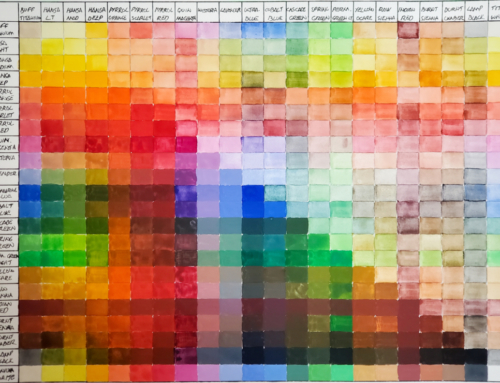
I don’t use opaque paint colors for negative painting. Opaque paints are wonderful for accent marks at the end, but not for glazing (a transparent wash of color laid over a dry, previously painted area). The negative painting technique requires numerous glazes which would become muddy with opaque paints. To determine if your paints are opaque or transparent, read the product label, consult the color chart, or do this simple test. With a black permanent marker, draw a bold line across a piece of watercolor paper. Brush some paint with the consistency of cream across the black line. If the line is obscured at all, the paint is opaque. The colors on the top line above are opaque, and on the bottom line are transparent.
When I draw for a negative painting, I am especially mindful of the negative space – the shapes between things. I want to have shape and size variety. I draw enough to get the general shapes down, but I’m not bound by what I see. In fact, it’s important to understand additional shapes will be developed in the painting process, so don’t over draw.

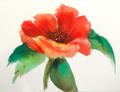
To determine which 3 colors I will use for the underpainting, I make numerous swatches. The swatches will contain a red, blue, and yellow. The colors do not need to be true primaries. When I mix the colors, it is important to have the paint be the same consistency to encourage good mixing on the paper. I am looking for colors that have the underlying feeling of the subject matter. The 3 colors I selected here are Quinacridone Gold (QG), Cobalt Blue (CB), and Quinacridone Rose (QR).
I wet the entire paper with clean water and introduce the 3 colors separately onto the wet paper. I paint at an angle to encourage mixing, as the paint runs down the paper. I don’t over work the surface with a brush, but instead encourage the paint to mix on the paper. Let thoroughly dry.
I will use the 3 original colors throughout the painting process. I consider these to be my “mother colors,” but I will add additional colors as the painting evolves. I start by painting hard edges against the rose and some of the leaves, and soften the edges with water as I move out from the subject. This is what I call the adolescence of a painting, because it often looks and feels awkward. Let thoroughly dry. I concentrate on the space and shapes between.
With each glaze, I create new negative shapes and darker values. I sometimes soften edges with a light mist from a spray bottle while the paint is wet. Let thoroughly dry between glazes or colors will become muddy.

In the final stage, I paint the darkest darks and smallest shapes. I use a rich deep green made with Phthalo Turquoise and Italian Burnt Sienna. While the green mixture of paint is still wet on the paper, I drop a small amount of Permanent Alizarin Crimson. The addition of this red livens up the greens. You can see an example of this directly beneath the left rose. I am selective to place my darkest darks near my lights to intensify the focal area. I finish with a few details.