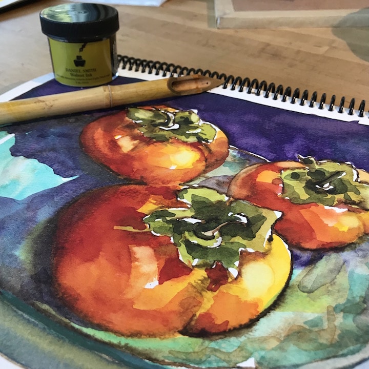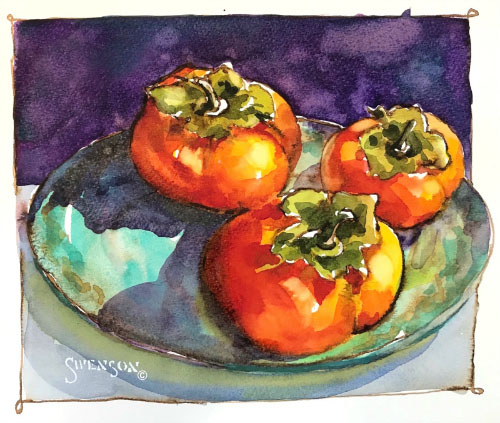











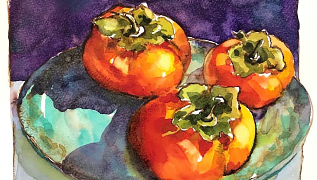

가을은 다채로운 색깔과 질감을 선사합니다. 제가 자주 가는 동네 농산물 직판장에는 다양한 모양과 색깔의 감이 새로 수확되어 나옵니다. 저는 보통 한 봉지 가득 사서 좋아하는 요리에 넣어 먹습니다. 주황색과 빨간색이 어우러지고, 매끄러운 감과 거친 감의 질감이 조화를 이루는 모습이 정말 좋습니다.
저는 기꺼이 드리고 싶었습니다. 다니엘 스미스 월넛 잉크 따뜻한 색조의 잉크를 특히 좋아해서 한번 시도해 보기로 했습니다. 호두 잉크로 감을 그리는 아이디어가 마음에 들었는데, 특히 이 잉크가 내광성이 뛰어나고 색이 바래지 않는다는 점이 좋았습니다.
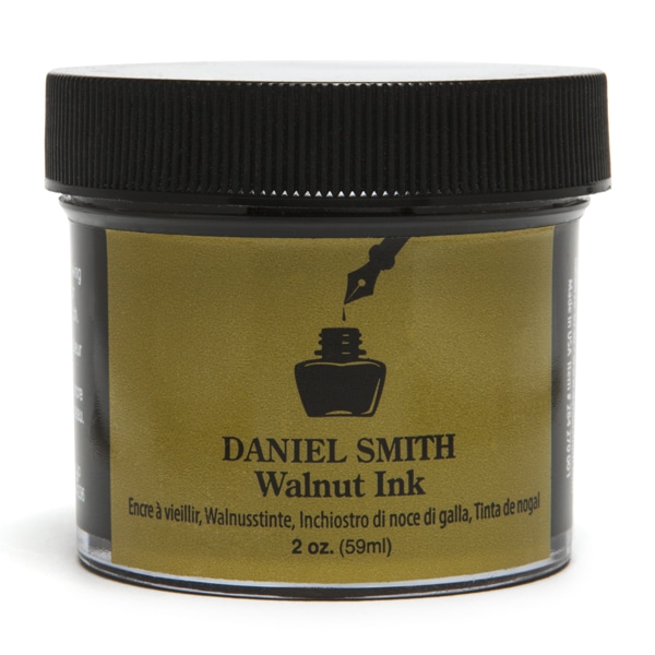
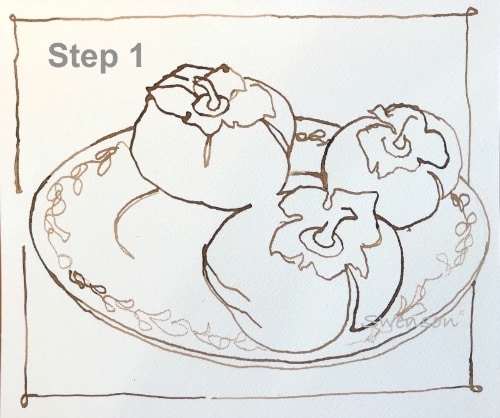
저는 호두 잉크와 대나무 펜(이 펜으로 표현할 수 있는 선의 변화가 마음에 들어요)을 사용하여 140lb 콜드프레스 수채화 용지에 감을 그렸습니다. 제가 가장 좋아하는 드로잉 기법은 연속적인 선 윤곽선 그리기입니다. 그림을 그리는 내내 펜을 종이 위에 계속 대고 있습니다.
팁: 그림을 그리기 전에 대나무 펜촉을 7.5cm 깊이의 물에 20분 동안 담가두면 잉크가 더 오래 머금게 됩니다.
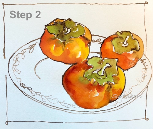
팔레트 중앙에 새 수채 물감을 덜어낸 후, 마른 표면에 물감을 섞어 작업합니다. 호두 잉크가 약간 번지는 게 보이시죠? 전 그게 좋아요. 선을 살살 건드리면 조금 움직이고, 붓으로 문지르면 더 많이 움직입니다. 감은 여러 색을 섞어서 표현했어요. 한사 옐로우 미디엄, 안트라퀴노이드 스칼렛 그리고 퀴나크리돈 번트 오렌지. 줄기와 잎의 면적은 다음과 같습니다. 퀴나크리돈 골드 그리고 프랑스 울트라마린.
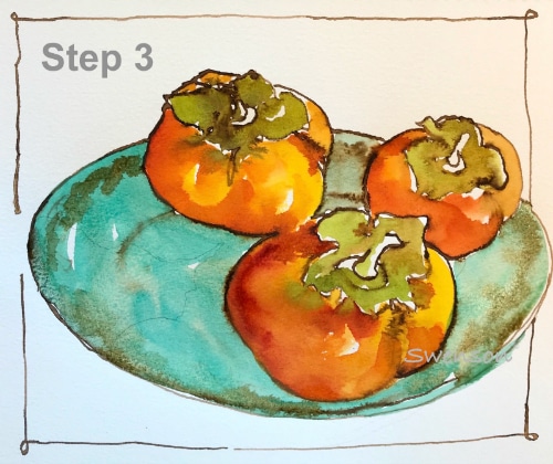
나는 접시에 그림을 그렸다 코발트 틸 블루. 저는 의도적으로 붓으로 접시 위의 세부 묘사를 흐릿하게 처리했습니다. 선들이 부드럽게 퍼지도록 하고 싶었기 때문입니다. 특히 접시 대부분이 감의 그림자에 가려질 것이기 때문에 선들이 선명하게 드러나는 것을 원하지 않았습니다.
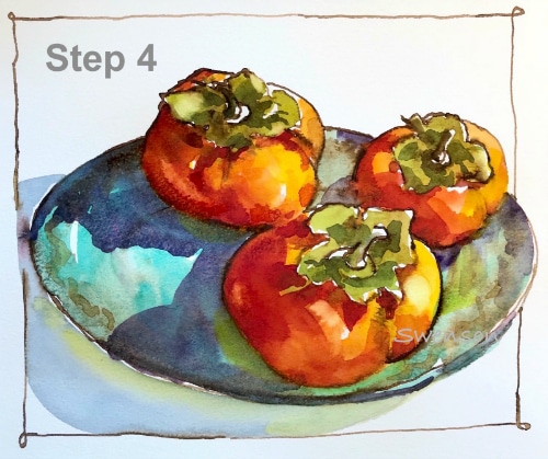
그림자는 제가 가장 좋아하는 소재입니다! 빛의 존재는 형태를 정의하고 사물에 생명을 불어넣습니다. 저는 팔레트에 물감을 섞어 두 개의 물웅덩이를 만드는 것으로 시작합니다. 퀴나크리돈 번트 오렌지 그리고 퀴나크리돈 로즈, 소수 임페리얼 퍼플. 먼저 퀴나크리돈 색으로 감의 형태 그림자를 칠한 다음, 재빨리 임페리얼 퍼플 색으로 접시에 드리워진 그림자를 표현합니다. 사물과 색 사이의 부드러운 전환을 원하기 때문입니다.
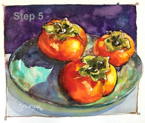
마지막 단계에서는 배경에 임페리얼 퍼플 색상을 사용합니다. 색상이 완전히 사라지기 전에 소량을 덧칠합니다. 프탈로 터쿼이즈 이 구역에 들어가면서 나뭇잎 부분에 마지막 손질이 더해집니다. 여러분도 좋아하는 농산물 직판장 상품들을 직접 그려보면서 즐거운 시간을 보내시길 바랍니다!