


From the delicate wings of butterflies to the colorful feathers of birds, nature offers endless inspiration for watercolor artists.
In our August 13 episode of 목요일 라이브 방송: 존 코글리, we explored the wonderful world of painting birds and butterflies in watercolor. Discover how thoughtful color choices, expressive brushstrokes, and the unique properties of DANIEL SMITH Watercolors can help bring these beautiful subjects to life.
Whether you’re capturing the intricate patterns of butterfly wings or the soft textures of bird feathers, this session offers plenty of inspiration to explore color and technique. Now, let’s take a closer look at the creative insights, favorite color combinations, and practical tips shared by our DANIEL SMITH Brand Ambassadors!
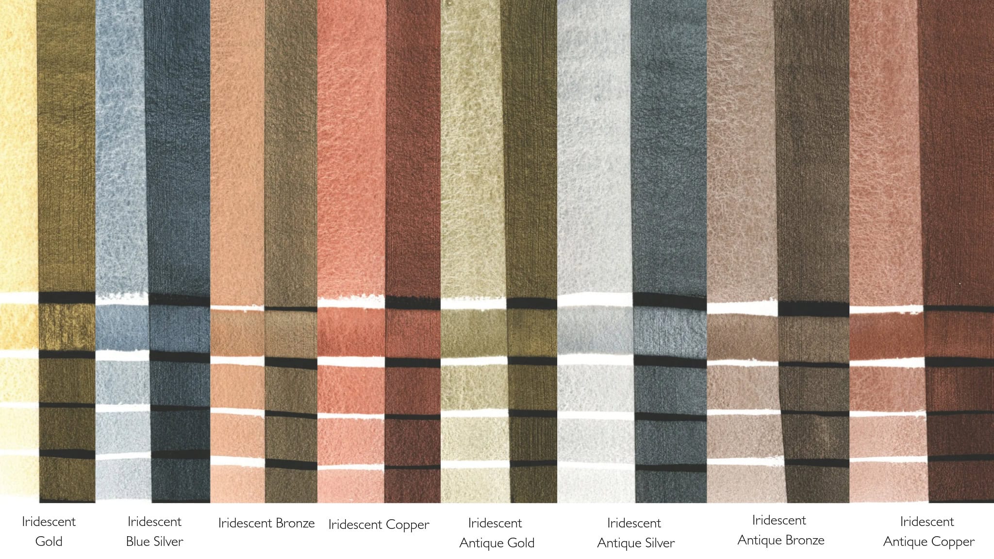
 무지갯빛 금색 수채화
Iridescent Gold is the quintessential gold shade – bright, reflective and regal. Iridescent colors reflect light and their transparent quality adds a fascinating sense of depth to your work.
 무지갯빛 푸른 은색 수채화
Iridescent Blue Silver is a rich metallic steel tone.
 무지갯빛 청동 수채화
Iridescent Bronze is highly reflective with a warm bronze sheen.
 무지개빛 구리 수채화
Iridescent Copper is the bright and reflective color of a newly minted penny.
 영롱한 앤티크 골드 수채화
Iridescent Antique Gold has a deep shine without the bright, brassy quality found in some metallic gold watercolors.
 무지갯빛 앤티크 실버 수채화
Iridescent Antique Silver is a pewter shade that is deeper in tone than other metallic silver watercolors.
 영롱한 앤티크 브론즈 수채화
Iridescent Antique Bronze is among the darkest luminescent colors with its’ warm metallic bronze sheen.
 무지갯빛 앤티크 구리 수채화
Iridescent Antique Copper is a burnished cinnamon tone with a dark, saturated quality.
실비아 트라드
DANIEL SMITH Brand Ambassador Silvia Trad shares how Iridescent colors can bring birds, butterflies, and other wildlife paintings to life! Inspired by nature’s own shimmering effects, Silvia demonstrates how touches of Iridescent Copper, Gold, and Blue Silver add beautiful highlights, depth, and a luminous finish while preserving the underlying brushwork. She also shares why these unique colors are perfect for adding a special sparkle to handmade cards and festive creations!

Silvia Trad - Brand Ambassador
“I often paint realistic watercolors, but also I like a more fluid style. I think that’s how we are – mind and heart, reason and sensitivity, the synthesis of this balances us. I enjoy teaching as much as painting, showing artists how learning to manage accidents in the painting process can teach us how to solve everyday problems that arise in our lives” – 실비아 트라드
사빈 드레허
A little shimmer can bring a whole new dimension to your watercolor paintings!
DANIEL SMITH Brand Ambassador Sabine Dreher shares how a touch of shimmer can transform existing watercolor paintings. Using her own color reference cards, she explores beautiful patina effects by combining Iridescent colors with favorites like Jadeite Genuine and Quinacridone Sienna. Inspired by fellow Brand Ambassador Buffy Kaufman, Sabine demonstrates how subtle touches of Iridescent Copper can give sunflowers a warm, sun-kissed glow, while Iridescent Blue Silver adds delicate luminous highlights. Her takeaway? Even paintings we consider unfinished or imperfect can become opportunities to experiment, rediscover, and create something beautiful!

Sabine Dreher - Brand Ambassador
사빈 드레허 독일 라인란트팔츠주 카이저슬라우테른 근처에서 자란 그녀는 어린 시절부터 그림에 대한 열정을 발견했습니다. 1998년, 그녀는 스위스 미술대학(Hochschule der Bildenden Künste)에서 미술 교육을 시작했습니다. 동시에 독일, 오스트리아, 미국에서 유명 작가들의 워크숍에 참여하며 예술적 역량을 꾸준히 발전시켰습니다. 2001년부터는 스위스, 독일, 이탈리아에서 국제 수채화 워크숍을 진행해 왔습니다. 현재 그녀는 스위스에서 거주하며 활동하고 있습니다.
버피 카우프만
DANIEL SMITH Brand Ambassador Buffy Kaufman explores the magic of Iridescent and Duochrome colors through a loose, expressive rainforest painting! From layering shimmering pigments and experimenting with splatters to creating contrast between light and dark, Buffy shares creative ways to add depth, texture, and unexpected sparkle. She also encourages artists to paint freely, embrace spontaneous brushstrokes, and discover exciting color combinations along the way!

Buffy Kaufman - Brand Ambassador
“예술은 함께 나눌 때 더욱 빛을 발한다는 것이 제 신념입니다. 다니엘 스미스는 기업 문화, 지역 사회 참여, 그리고 배움에 대한 헌신을 통해 이러한 신념을 구현하고 있습니다. 특히 한사, 퀴나크리돈, 프탈로 시리즈를 비롯한 다채로운 색상 덕분에 색을 섞는 즐거움이 큽니다. 자연에서 영감을 받는 예술가로서 질감은 저에게 중요한 요소인데, 다니엘 스미스의 입자형 안료는 놀라운 다양성을 제공하며, 일부 색상은 종이의 자연스러운 질감에 아름답게 스며듭니다.”– 버피 카우프만
Missed the LIVE? Catch the replay and paint along at your own pace!
Get your brushes ready, explore your favorite DANIEL SMITH colors, and let’s mix, paint, and have fun!