












From the delicate wings of butterflies to the colorful feathers of birds, nature offers endless inspiration for watercolor artists.
In our August 13 episode of Thursday LIVE with John Cogley, we explored the wonderful world of painting birds and butterflies in watercolor. Discover how thoughtful color choices, expressive brushstrokes, and the unique properties of DANIEL SMITH Watercolors can help bring these beautiful subjects to life.
Whether you’re capturing the intricate patterns of butterfly wings or the soft textures of bird feathers, this session offers plenty of inspiration to explore color and technique. Now, let’s take a closer look at the creative insights, favorite color combinations, and practical tips shared by our DANIEL SMITH Brand Ambassadors!
 Iridescent Gold Watercolor
Iridescent Gold is the quintessential gold shade – bright, reflective and regal. Iridescent colors reflect light and their transparent quality adds a fascinating sense of depth to your work.
 Iridescent Blue Silver Watercolor
Iridescent Blue Silver is a rich metallic steel tone.
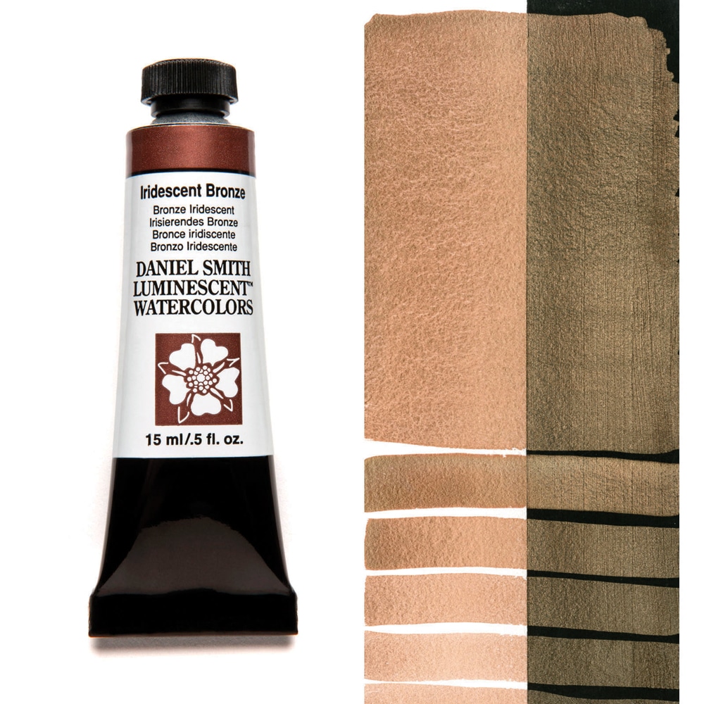 Iridescent Bronze Watercolor
Iridescent Bronze is highly reflective with a warm bronze sheen.
 Iridescent Copper Watercolor
Iridescent Copper is the bright and reflective color of a newly minted penny.
 Iridescent Antique Gold Watercolor
Iridescent Antique Gold has a deep shine without the bright, brassy quality found in some metallic gold watercolors.
 Iridescent Antique Silver Watercolor
Iridescent Antique Silver is a pewter shade that is deeper in tone than other metallic silver watercolors.
 Iridescent Antique Bronze Watercolor
Iridescent Antique Bronze is among the darkest luminescent colors with its’ warm metallic bronze sheen.
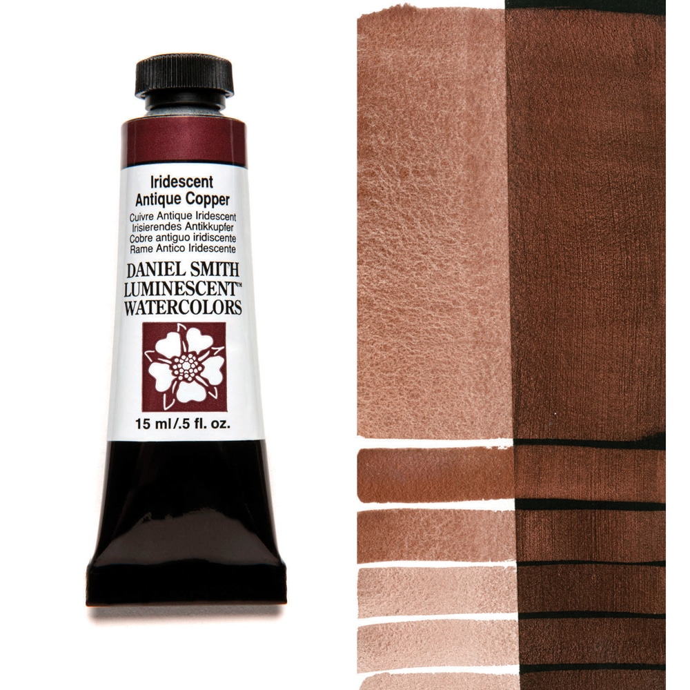 Iridescent Antique Copper Watercolor
Iridescent Antique Copper is a burnished cinnamon tone with a dark, saturated quality.


Silvia Trad
DANIEL SMITH Brand Ambassador Silvia Trad shares how Iridescent colors can bring birds, butterflies, and other wildlife paintings to life! Inspired by nature’s own shimmering effects, Silvia demonstrates how touches of Iridescent Copper, Gold, and Blue Silver add beautiful highlights, depth, and a luminous finish while preserving the underlying brushwork. She also shares why these unique colors are perfect for adding a special sparkle to handmade cards and festive creations!

Silvia Trad - Brand Ambassador
“I often paint realistic watercolors, but also I like a more fluid style. I think that’s how we are – mind and heart, reason and sensitivity, the synthesis of this balances us. I enjoy teaching as much as painting, showing artists how learning to manage accidents in the painting process can teach us how to solve everyday problems that arise in our lives” – Silvia Trad
Sabine Dreher
A little shimmer can bring a whole new dimension to your watercolor paintings!
DANIEL SMITH Brand Ambassador Sabine Dreher shares how a touch of shimmer can transform existing watercolor paintings. Using her own color reference cards, she explores beautiful patina effects by combining Iridescent colors with favorites like Jadeite Genuine and Quinacridone Sienna. Inspired by fellow Brand Ambassador Buffy Kaufman, Sabine demonstrates how subtle touches of Iridescent Copper can give sunflowers a warm, sun-kissed glow, while Iridescent Blue Silver adds delicate luminous highlights. Her takeaway? Even paintings we consider unfinished or imperfect can become opportunities to experiment, rediscover, and create something beautiful!

Sabine Dreher - Brand Ambassador
Sabine Dreher grew up near Kaiserslautern, Rhineland-Palatinate in Germany and discovered her passion for painting at an early age. In 1998, she began her artistic training at the Hochschule der Bildenden Künste college. At the same time, she continued her arts education by attending numerous workshops with well-known artists in Germany, Austria and the USA. Since 2001, she has been teaching international watercolor workshops in Switzerland, Germany and Italy. She now lives and works in Switzerland.
Buffy Kaufman
DANIEL SMITH Brand Ambassador Buffy Kaufman explores the magic of Iridescent and Duochrome colors through a loose, expressive rainforest painting! From layering shimmering pigments and experimenting with splatters to creating contrast between light and dark, Buffy shares creative ways to add depth, texture, and unexpected sparkle. She also encourages artists to paint freely, embrace spontaneous brushstrokes, and discover exciting color combinations along the way!

Buffy Kaufman - Brand Ambassador
“My core belief is that art is better shared. Daniel Smith embodies this in their culture, community involvement, and commitment to learning. Their versatile color range—especially the Hansa, Quinacridone, and Phthalo series—makes mixing color a joy. As a nature-inspired artist, texture is important to me, and DANIEL SMITH’s granulating pigments offer incredible variety, with some settling beautifully into the paper’s natural texture.”– Buffy Kaufman
Missed the LIVE? Catch the replay and paint along at your own pace!
Get your brushes ready, explore your favorite DANIEL SMITH colors, and let’s mix, paint, and have fun!