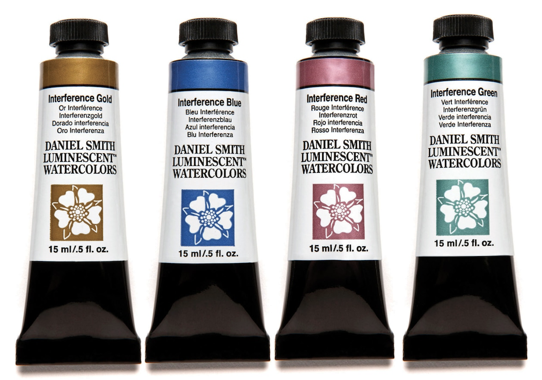
One thing I love about DANIEL SMITH’s wide selection of colors is how each artist can choose precisely the palette that works best for each piece. There’s always something new to try, a new creative experience to discover – like their Luminescent Watercolors, which I explored with my Head in the Stars portrait. This painting is based on a photo I took of a friend who is a dancer and aerialist. The retro sparkle of her costume was perfect inspiration for using the Luminescents to create a painting that felt nostalgic and dreamy.
I like to work with a photo reference because I can capture fleeting expressions, unique movements, as well as the memories of a particular time and place. I also enjoy painting the model from life (this practice informs all of my other artwork), but a live model is limited by what pose can be sustained for an extended period of time. I love photographing dancers, actors and other performers because they’re at ease in front of a camera. I might have a particular concept in mind when I start shooting or I might just file the photos away for later.

Preliminary drawing:
I used 300lb cold press (rough) paper on a watercolor block, so I can move the Luminescent pigments evenly on the page, without them pooling into ripples formed by a regular sheet of paper that buckles as it dries.
I start with a fairly well-defined drawing, which allows me to be looser and more relaxed with the painting process. To avoid overworking the paper, I transfer the basic lines for the image from a draft copy of my photograph, then I refine the drawing using an HB (#2) mechanical pencil. I try to avoid excessive erasing.

Atmospheric background:
I begin with Lamp Black as a foundation, so I can have fun with how the Luminescents change on a dark background versus a light background. I chose Lamp Black specifically because of its high staining qualities. I want this underpainting to stay as locked into the paper as possible when I build on top of it. This “night sky” atmosphere will overlap just the top of the model’s head – dark at the top, fading down to the white of the paper. I use a spray bottle with plain water and big soft brushes to create this gradation. I rotate and tilt the watercolor block to move the wet paint around. I’m not concerned with making things perfectly smooth. I enjoy the unexpected textures that can arise within a wet wash, which add to the overall atmosphere.

Underpainting:
Continuing with Lamp Black, I paint the portrait in grayscale over the dry atmospheric background. This will add structure beneath the Luminescent colors. It will also lend the painting a vintage, nostalgic feeling, as if the final result is a hand colored photograph; as well as provide grounded, neutral contrast to the shimmer of the Luminescent colors.
Overall, I tend to think in shapes of value, leaving fairly hard edges to my shapes. I might soften the edge of a transition within a face with just a little bit of clear water or with a dry brush texture; or paint certain areas, like the jawline and cheek shadows, as wet into wet for a softer effect. However, “smoothness” is not something I concern myself with too much – I don’t think of it as a fundamental characteristic of watercolor. The major relationships are more fundamental in creating the illusion of realism. And any blooms or organic textures that arise in the course of painting are embraced and appreciated.

Light values:
Once the previous layer is fully dry (I use a hair dryer to speed things up), I begin to build up the largest, lightest areas with the Luminescent colors in my palette. At this stage, I’m using mainly Iridescent Gold and Duochrome Hibiscus, fairly diluted for the flesh, and Duochrome Violet Pearl for the hair. Areas that I’ve identified as white highlights within my reference photo, I’m leaving blank and unpainted. These areas would normally be the white of the paper, but because of my atmospheric Lamp Black background, in some places, they are actually gray- it’s a bit of a brain twister, but I try to ignore it and pretend as if I’m painting on white paper. I like my faux squirrel brushes for this stage because their softness is less likely to disturb the black and grey underpainting beneath as I layer the Luminescent colors on top.

Midtones and details:
I allow the previous layer to dry fully using a hair dryer. Now I am layering my midtone warm flesh colors on top of the lightest lights, leaving some of those previous light areas unpainted. I’m adding in Duochrome Desert Bronze as a darker flesh tone, and adding more concentrated areas of the Iridescent Gold and Duochrome Hibiscus. I also add more detail to the hair with a smaller, stiffer brush.

Highlights:
Now comes a really fun stage that only happens in my portrait paintings done with Luminescent colors. Normally, the white highlights in my portraits are the white of the paper. Here, because of the atmospheric Lamp Black background, some of my highlight areas are gray or black. The semi-transparent and reflective qualities of the Luminescent colors mean I can use them to reintroduce sparkling highlights in those areas. I use Iridescent Antique Silver and Pearlescent Shimmer to add the highlight areas in Krystal’s face and eyes, and to create her glittering stars and moon headpiece. I create a splatter spray of stars in the dark sky by holding a brush loaded with watery paint a few inches above the page and tapping it against the finger of my opposite hand.
Definition:
To give the face more definition and contrast, I return to Lamp Black, and selectively add back in some details and small shadows layered over the dry Luminescent Colors. I also go back in and selectively soften some highlight areas with a wet brush, such as the stars in the crown, to give them more of a glowing feeling.

More tips for working with DANIEL SMITH Luminescent Watercolors:
- Don’t be afraid to try something new in the studio, even if you have a tried and true process. Adding a new element into the mix can spark new discoveries. Remember to make time to play and explore.
- Try a palette of several Luminescents together, or try adding just one to your standard palette as an accent.
- Create swatches of your Luminescents over both white paper and a dark wash to get to know their properties.
- Pearlescent Shimmer makes a great bright white highlight – it’s one of the brightest and most reflective.
- Try offsetting or grounding the bold, dazzling qualities of Luminescents with non-reflective darks and neutrals.
- Whatever colors you choose, embrace the fundamental character of watercolor. Allow it to be alive and do what it wants to do. Accept blooms, tide lines, and other organic textures that arise naturally during the painting process as a beautiful, natural part of the process, rather than fighting them or trying to correct them. An organic accident is more beautiful than overworking an area trying to force it to behave in a certain way.