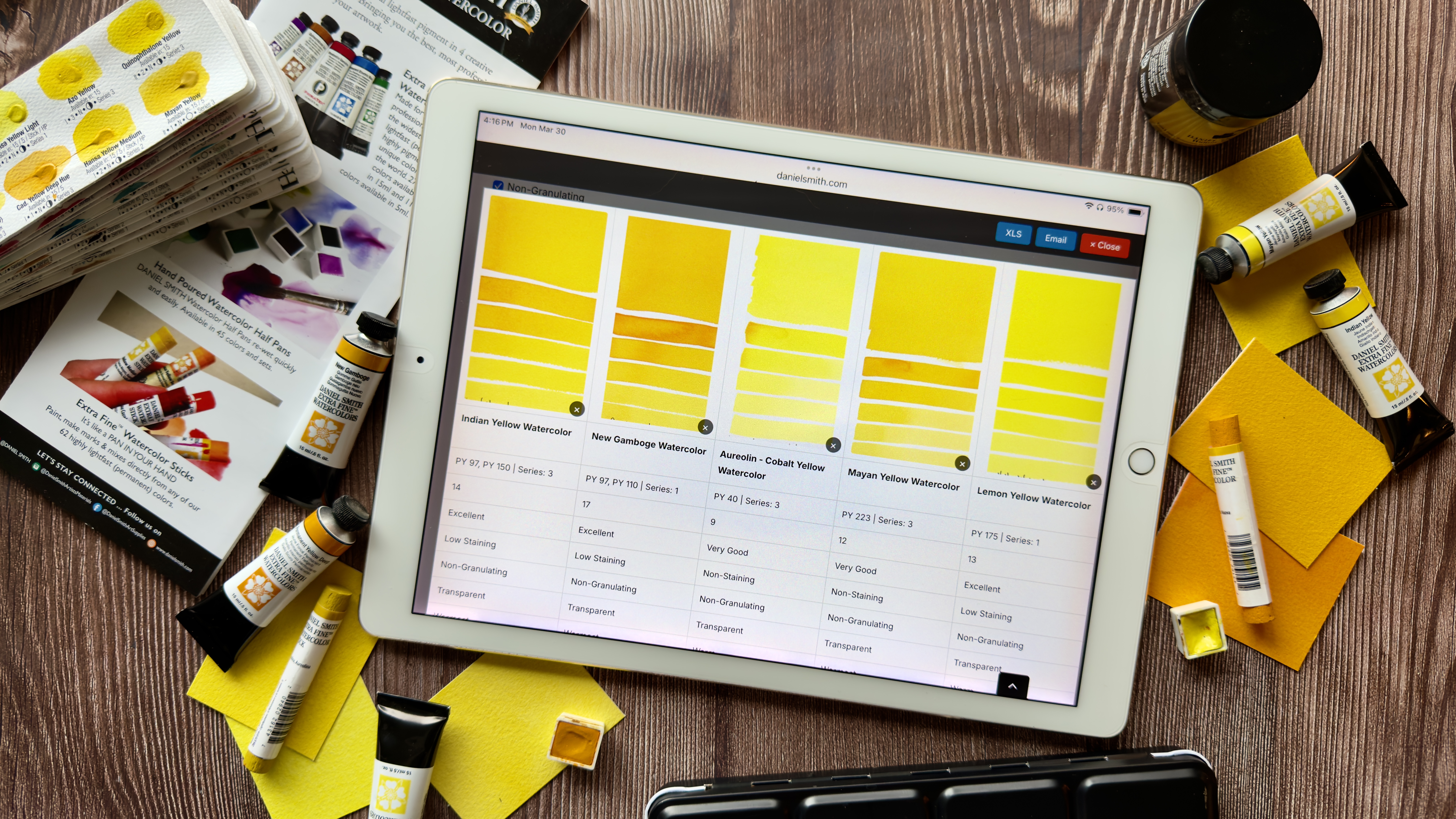
Your art materials are part of how you think, plan, and create. Having a clear view of your colors and products, what you already have, what you need, and how each pigment behaves, can make a real difference in your process. Our Inventory Registry gives you a place to organize your DANIEL SMITH collection, explore color characteristics, and plan with intention. Whether you are mapping out a new painting, preparing for a class, or building a thoughtful shopping list, it helps bring clarity and confidence to every step of your creative journey!
How to Use the Inventory Registry
Getting Started
- Register for an account and login.
- Browse all DANIEL SMITH products, organized by category and listed in alphabetical order.
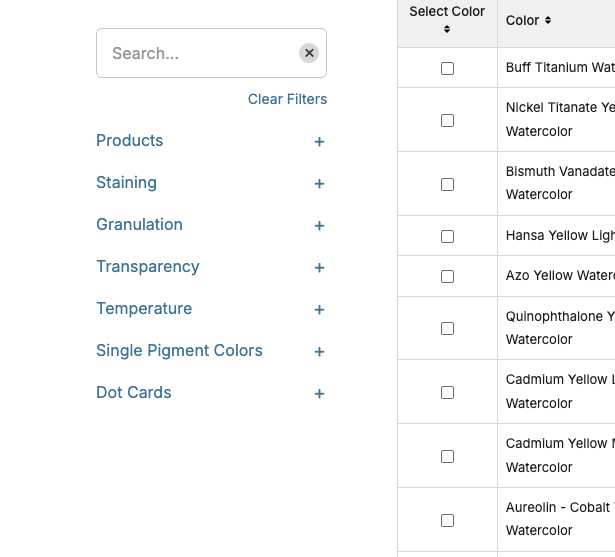
Use the left menu to filter your selection. Click the + symbol to expand categories and refine your search.
Finding and Sorting Colors
- Click on colors to explore their features and properties. Check the box left of the color/product name to select it.
- Reorder the list using the up and down arrows, or sort by chroma order, similar to the printed color chart.
Building Your Project
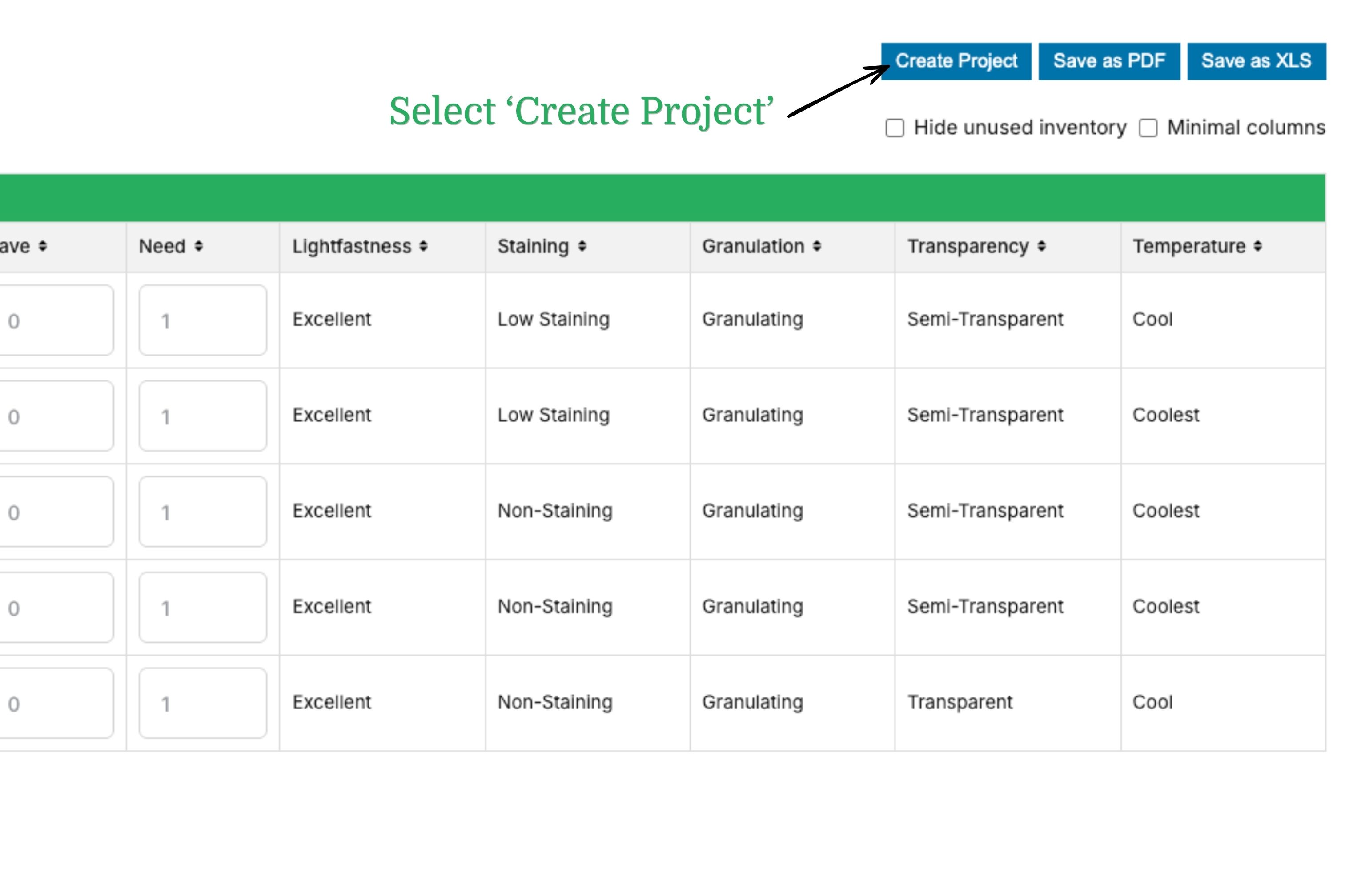
- Select the “Create Project” button.
- Select the colors you want for your painting, class, or reference list.
- For each color, assign a value in:
- HAVE – how many you currently own
- NEED – how many you want to purchase
Important:
At least one color must have a value of 1 or more in HAVE or NEED to export your project. If all values are set to zero, the exported file will be empty.
Example
- Select 5ml tubes
- Filter to single pigment colors
- Choose Cobalt colors
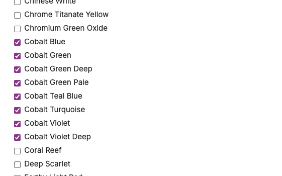
You will see all available options along with their detailed properties. If you’re ready, you can export your selection. Below is an example of what it will look like as a PDF.

Compare Colors
The Compare feature makes it even easier to evaluate your color choices! Click on any color to open a pop-up with a swatch and an “Add to Compare” option.
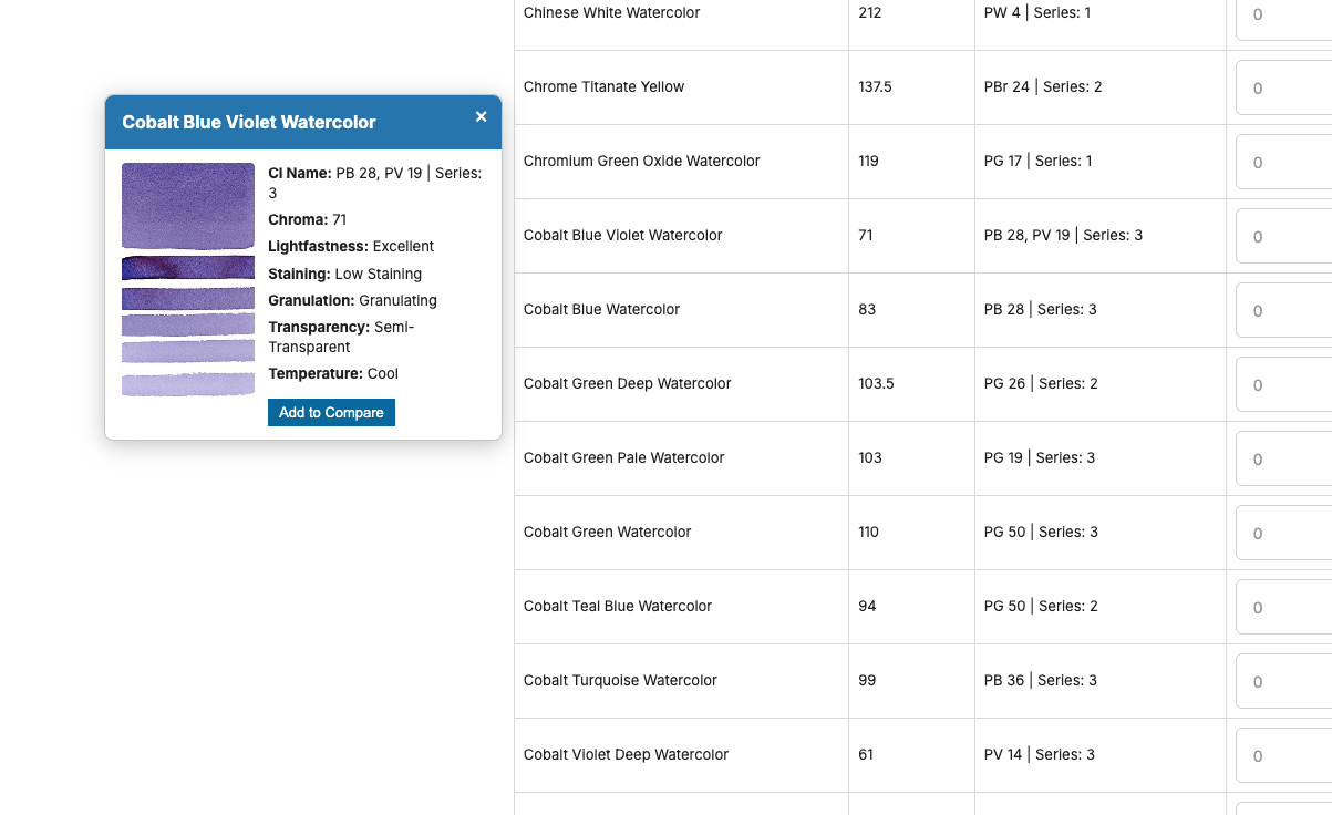
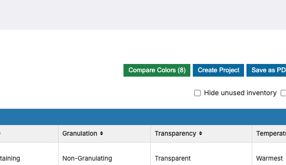
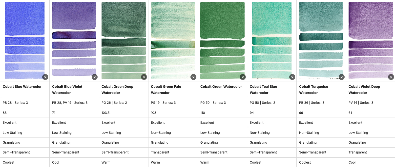
You can also select multiple colors using the checkboxes and click “Compare colors” to view them side by side. (The button will show in parenthesis how many colors you have selected)
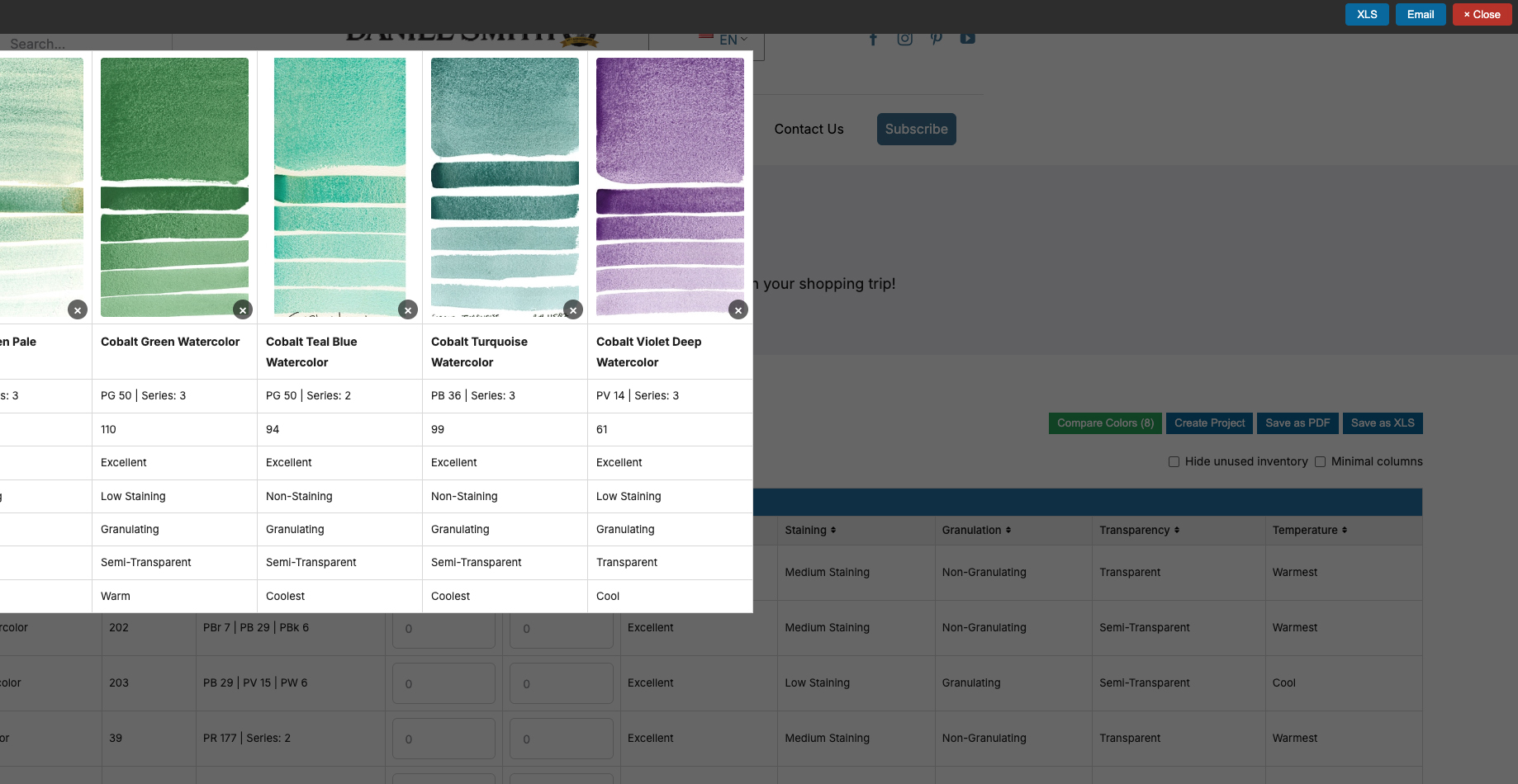
You can then have your comparison emailed to you or download it as an XLS file for easy reference.
Refining Your Selection
- Натисніть Hide unused inventory to focus only on your selected colors
- використання Select Color to further refine your choices
- Choose Show only selected color to view your final list
Exporting Your Project
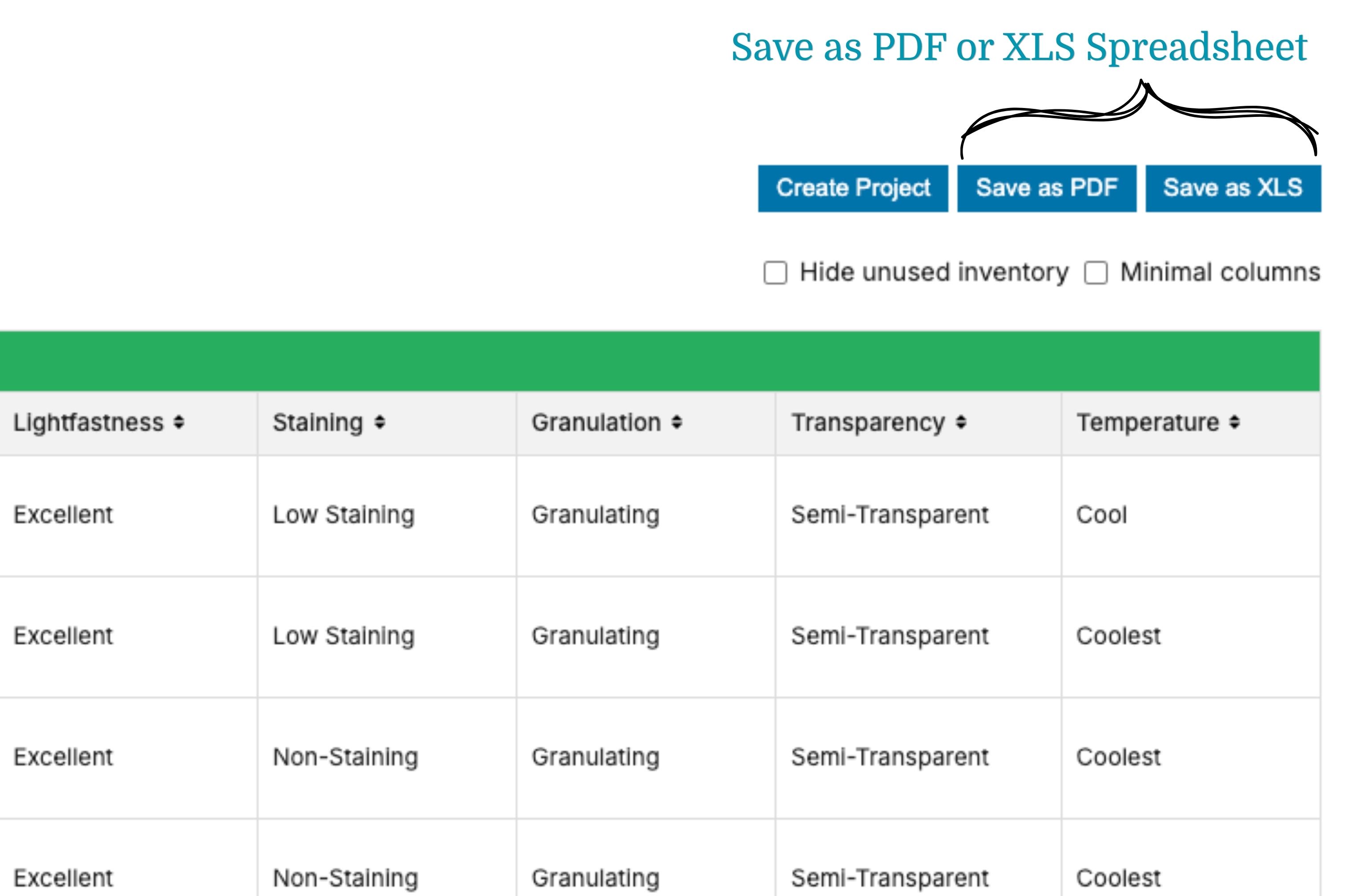
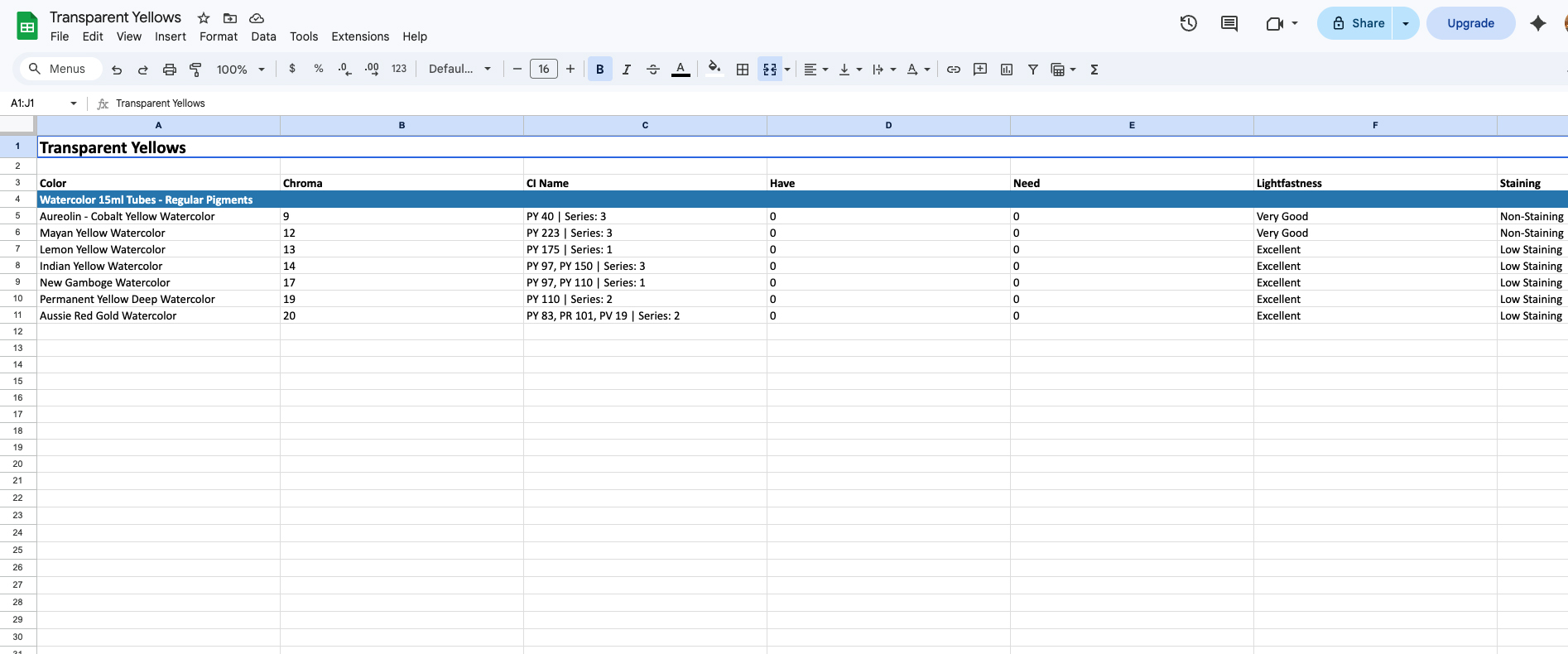
- Once your selections are complete, you can save, export, and print your project as a:
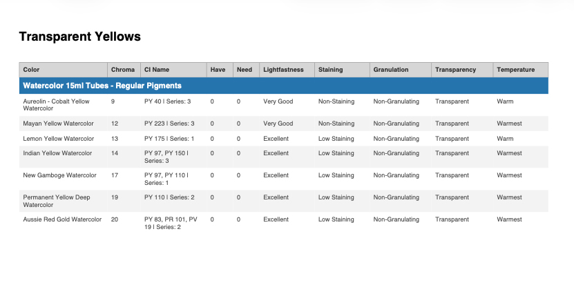
-
- Excel file
Starting a New Project
When you are ready to begin a new project, there are several easy ways to reset the page and clear your previous selections, allowing you to start fresh and build a new list.
- Deselect all previously selected colors (remove blue checkmarks) to begin a new list.
- Hit the “reset” button.
- Refresh the page and start again!
Have Fun Exploring, organizing, and creating!
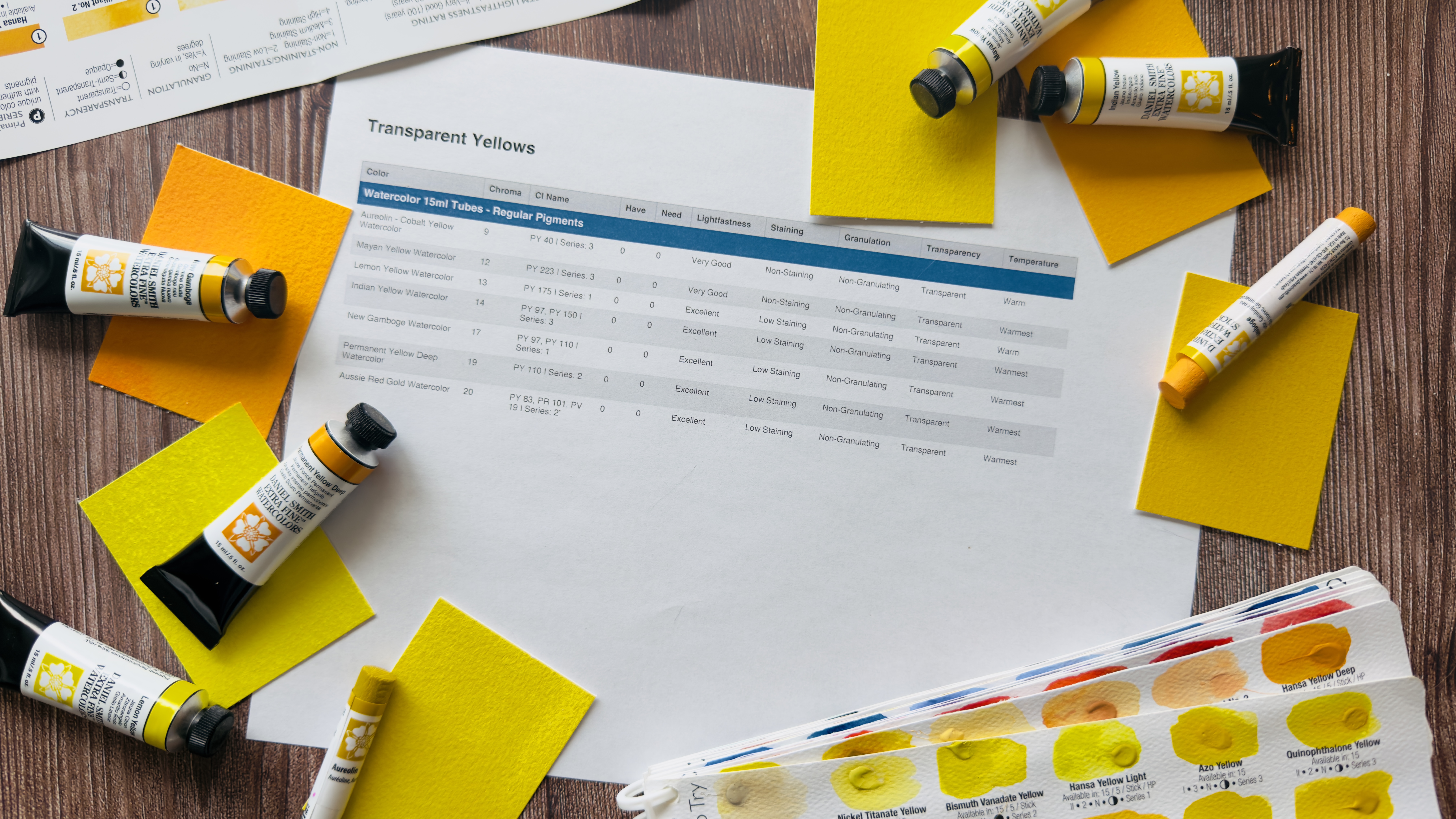
The Inventory Registry is a simple way to bring clarity and intention to your materials and your process. Take a few moments to explore, build your list, and see how organizing your colors and products can support your next painting, class, or shopping trip!
Пов’язані публікації
Нічого не знайдено

