You know that Daniel Smith makes paint. But we really see ourselves as a color or pigment house. We source the best quality pigments to make colors throughout all of our product lines – watercolor, gouache, water-soluble oil and grounds.
To ensure continuity of color during manufacturing – in other words, every color you use will be the same from batch to batch – we purchase pigment in large quantities that will last at least a decade. This really matters when you run out of a color in the middle of a painting, but it also matters with respect to the time and effort you spend learning how the colors in your palette work, alone or in mixes.
We know that ample supplies of pigment exist because most are made for larger industries outside the art world. However, when a major industry no longer needs a color, pigment manufacturers generally stop producing it. Additionally, we’re living in an era where “just in time” inventory management can easily be disrupted by world events.

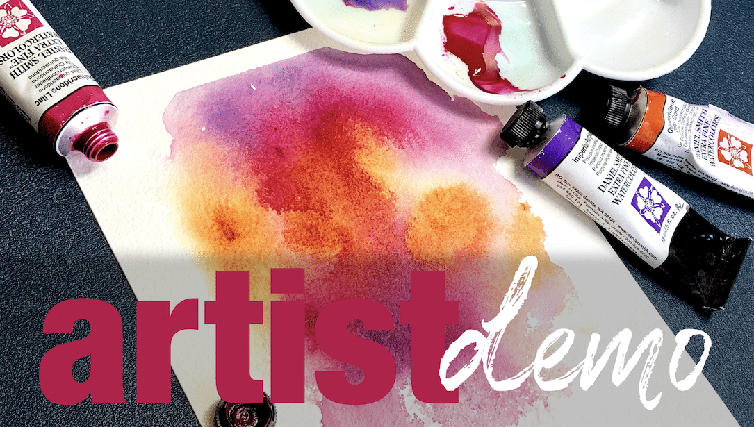
For example, the 喹吖啶酮焦橙色 pigment stopped being made two years ago. According to the manufacturer, it’s doubtful that it will ever be produced again. The good news is that we have enough of this pigment to last nearly 20 more years.
A mainstay on the palette for several of our 品牌大使, Quinacridone Burnt Orange is a smoldering shade of orangey sienna. Brilliant on its own, it also mixes well with 法國群青 for dramatic sky washes or with 樹液綠 for rich mossy shades.
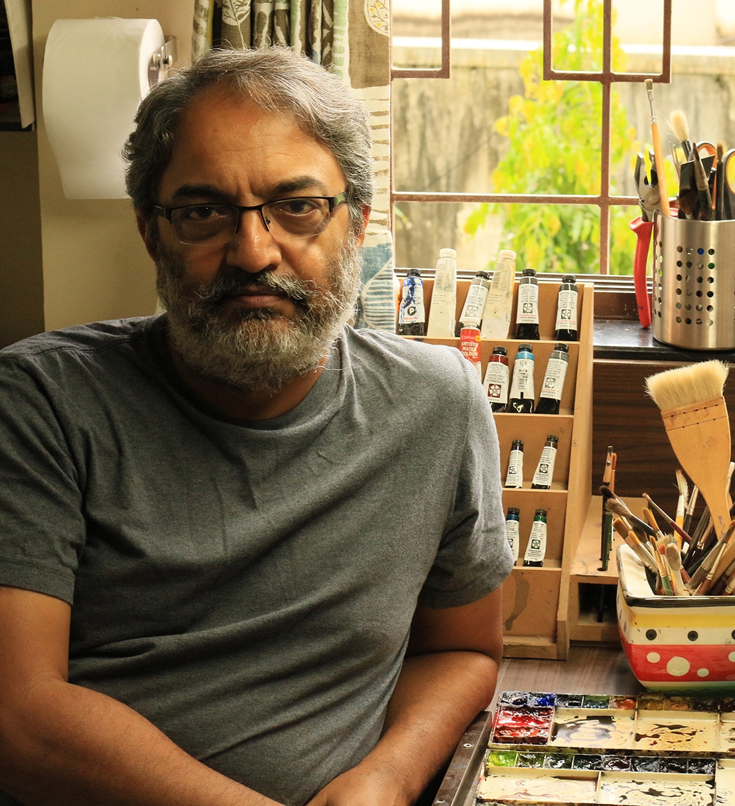
“I love this color! It’s very useful to create warmth in my Indian landscapes. I hardly ever use any color at mass tone, but I mix colors to control the overall temperature. Quin Burnt Orange makes a great base color because it mixes so well with blues, violets and even greens.” —桑傑·德賽

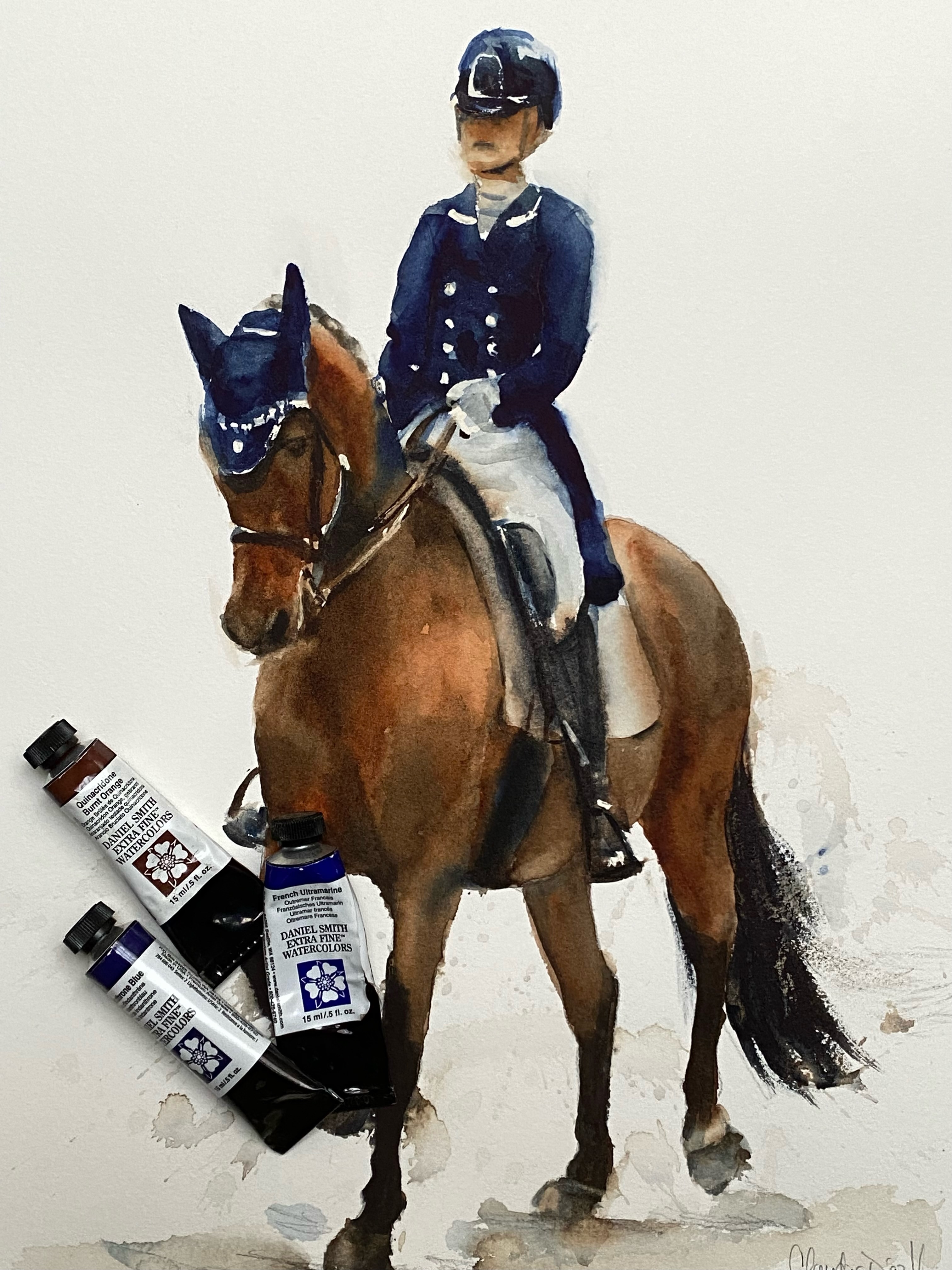


“I love Quinacridone Burnt Orange because it’s very versatile and transparent with rich, powerful color. Combine it with other colors to get gorgeous floral tones, fabulous skin tones, or intense, vivid darks. It’s a must on my palette!” – 克勞蒂亞·迪亞茲·埃爾南德斯

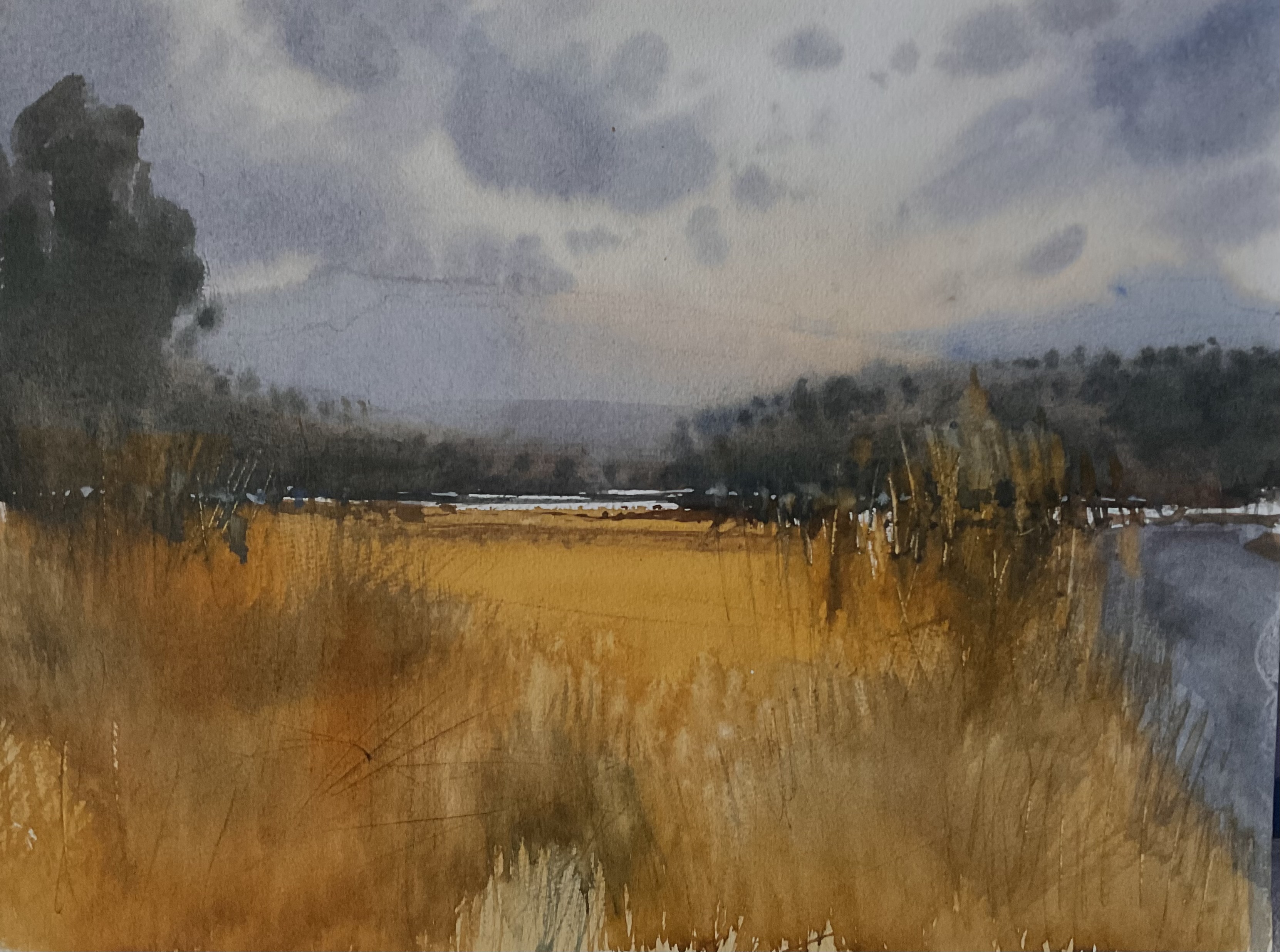
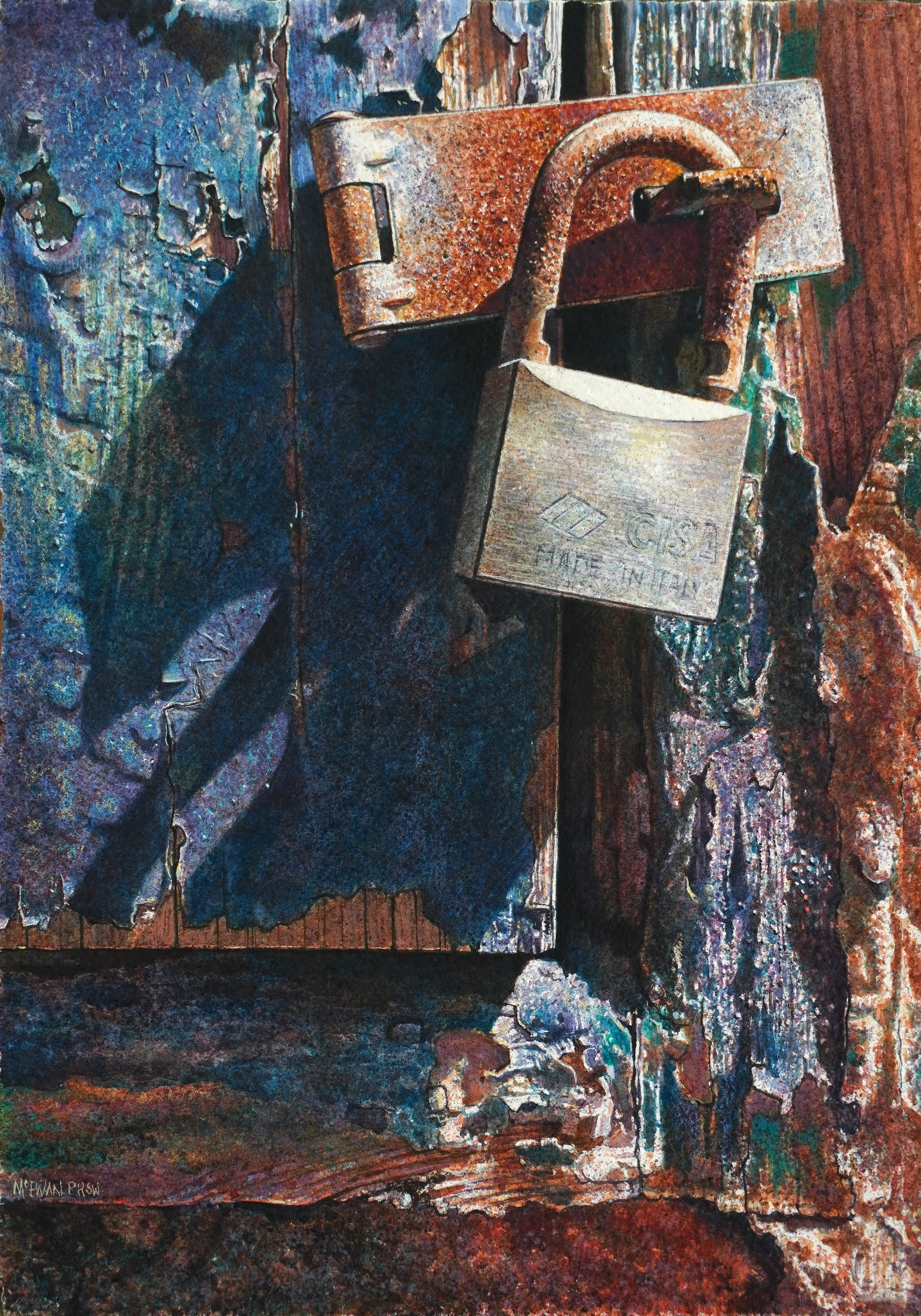
“This is one of my go-to colours. It’s vibrant, strong and beautifully transparent. I quite often start a painting with it, sometimes mixed with Manganese Blue in a warm/cool dance. I rely on this colour heavily for all my rust work, which is featured often in my paintings.” – 安格斯·麥克尤恩
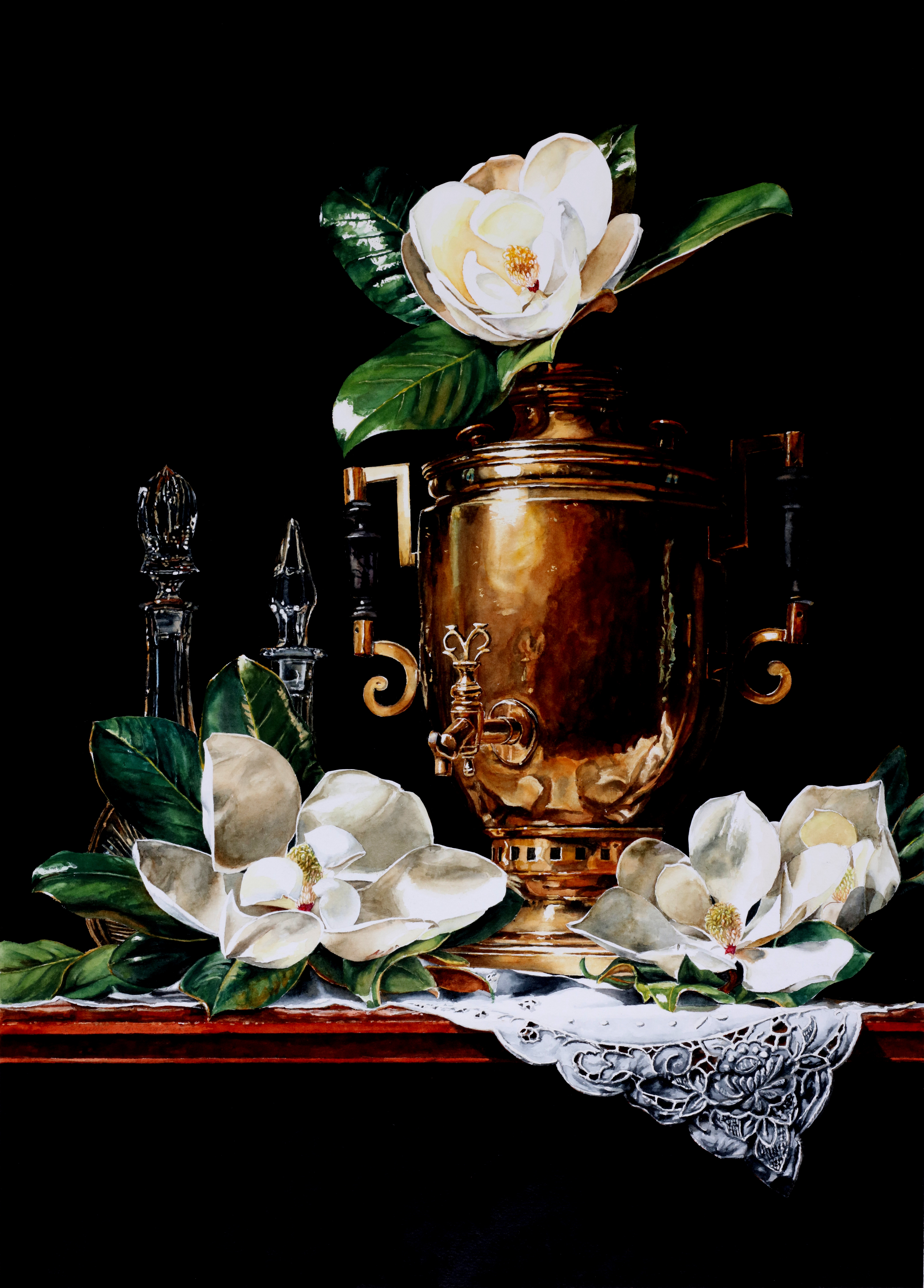
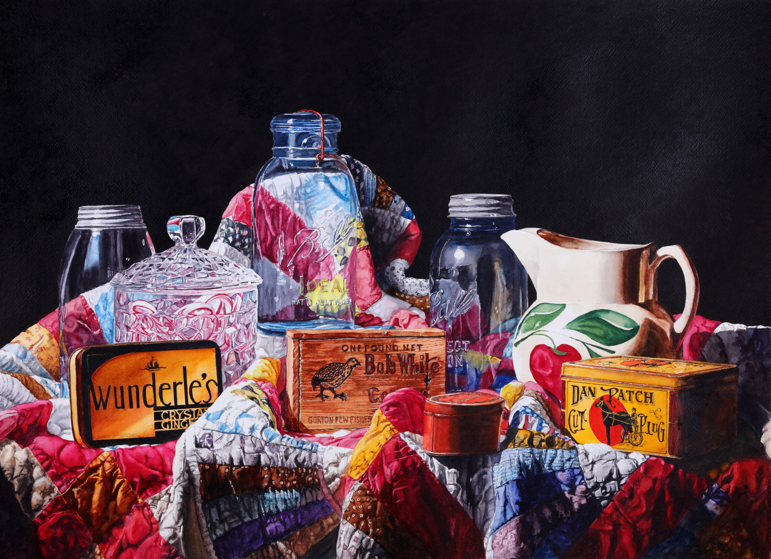


“This color was quite a surprise for me – my first impression was that it was pretty garish. Then I started using to it brighten up some paintings and I learned how versatile and subtle it can be, so now I keep it on my palette. It can be used full force with yellows and red to create a visual impact, as shown in Four Pears on Foil. I used it about half-diluted in Objects on a Quilt to add eye-catching warmth to objects in the center. For Samovar with Magnolias, I created a very believable brass color by mixing it with Quinacridone Gold. This antique samovar seems to come alive where the light hits it because of the lighter shades of this blend.” – 勞林·麥克拉肯
“I rely on Quinacridone Burnt Orange a lot. It’s my go-to color for paintings that require multiple glazes. I use it for its mixing strength, transparency and clarity of color. It’s a real workhorse for mixing dark, rich and believable greens, too!” One of my favorite combinations is mixing it with Quinacridone Gold and Phthalo Blue (Green Shade).” – 布倫達·斯文森


So everyone can keep on painting with Quinacridone Burnt Orange! When the time comes that we do run out of this pigment, we already have a plan in place for a close replacement.