Share:
Undoubtedly blue is the essential color in my palette and I have up to six spaces reserved in my usual work zone for them. My works are characterized by cold and grayish ranges, so the blues are completely irreplaceable. The blues that I use the most are: Indigo, Indanthrone Blue, Ultramarine Blue, Cerulean Blue Chromium, Lavender and Cobalt Teal Blue.

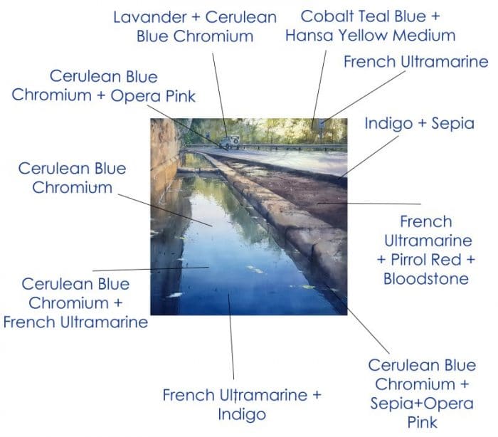
Diagram of the colors used for “Fuente de Castellar”.
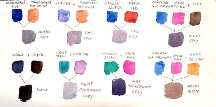
When mixed with different earth tones (Burnt Sienna, Burnt Umber, Sepia, etc.) I get infinite ranges of grays for all types of planes (background, middle ground and foreground). Mixed with a single yellow, I get a great variety of greens, as I do not usually have greens on my palette.

Pablo Ruben’s DANIEL SMITH Watercolor mixes for making grays.
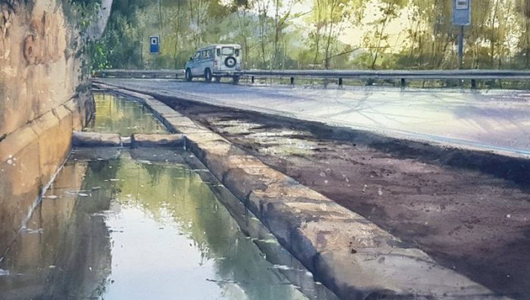
In the reference work “Fuente de Castellar” (Castellar Fountain) the blue is the essential protagonist of the work since the source is the main element of the work. To achieve the main gradient, three blues interlaced and fused with the proper density are necessary to produce the depth effect.

“Fuente de Castellar” by Pablo Rubén.


