











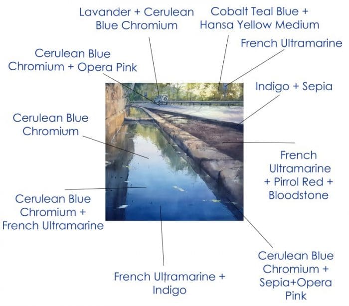
"Fuente de Castellar"에 사용된 색상 다이어그램.
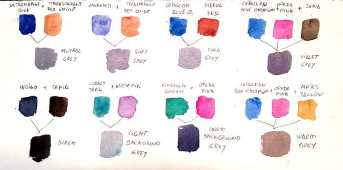
파블로 루벤의 다니엘 스미스 수채화 물감 혼합법: 회색 만들기.
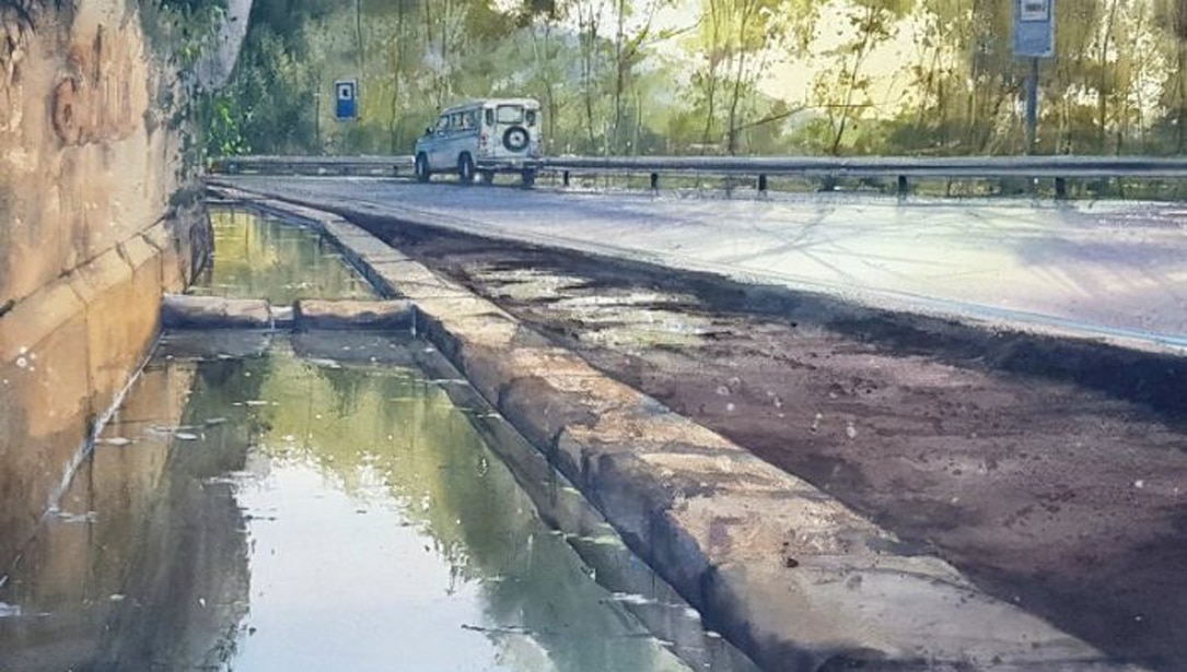
참고 작품인 "카스테야르 분수(Fuente de Castellar)"에서 파란색은 작품의 핵심적인 주인공입니다. 분수의 수원지가 작품의 주요 요소이기 때문입니다. 깊이감을 표현하기 위해서는 세 가지 파란색을 적절한 밀도로 엮고 융합해야 합니다.

“파블로 루벤의 '푸엔테 데 카스텔라'.
"Fuente de Castellar"에 사용된 색상 다이어그램.
파블로 루벤의 다니엘 스미스 수채화 물감 혼합법: 회색 만들기.
참고 작품인 "카스테야르 분수(Fuente de Castellar)"에서 파란색은 작품의 핵심적인 주인공입니다. 분수의 수원지가 작품의 주요 요소이기 때문입니다. 깊이감을 표현하기 위해서는 세 가지 파란색을 적절한 밀도로 엮고 융합해야 합니다.
“파블로 루벤의 '푸엔테 데 카스텔라'.

다니엘 스미스는 수채화 및 과슈를 포함한 전문가용 물감 및 미디엄을 생산하는 세계적인 선도 제조업체입니다.
이 웹사이트는 구글 번역을 사용하여 콘텐츠를 여러 언어로 즉시 자동으로 번역합니다. 저희에게 연락하세요 부정확한 자동 번역을 발견하시면 저희에게 알려주세요. 바로 수정하겠습니다.
© 저작권 2012 - 2026 다니엘 스미스 | 쿠키 정책