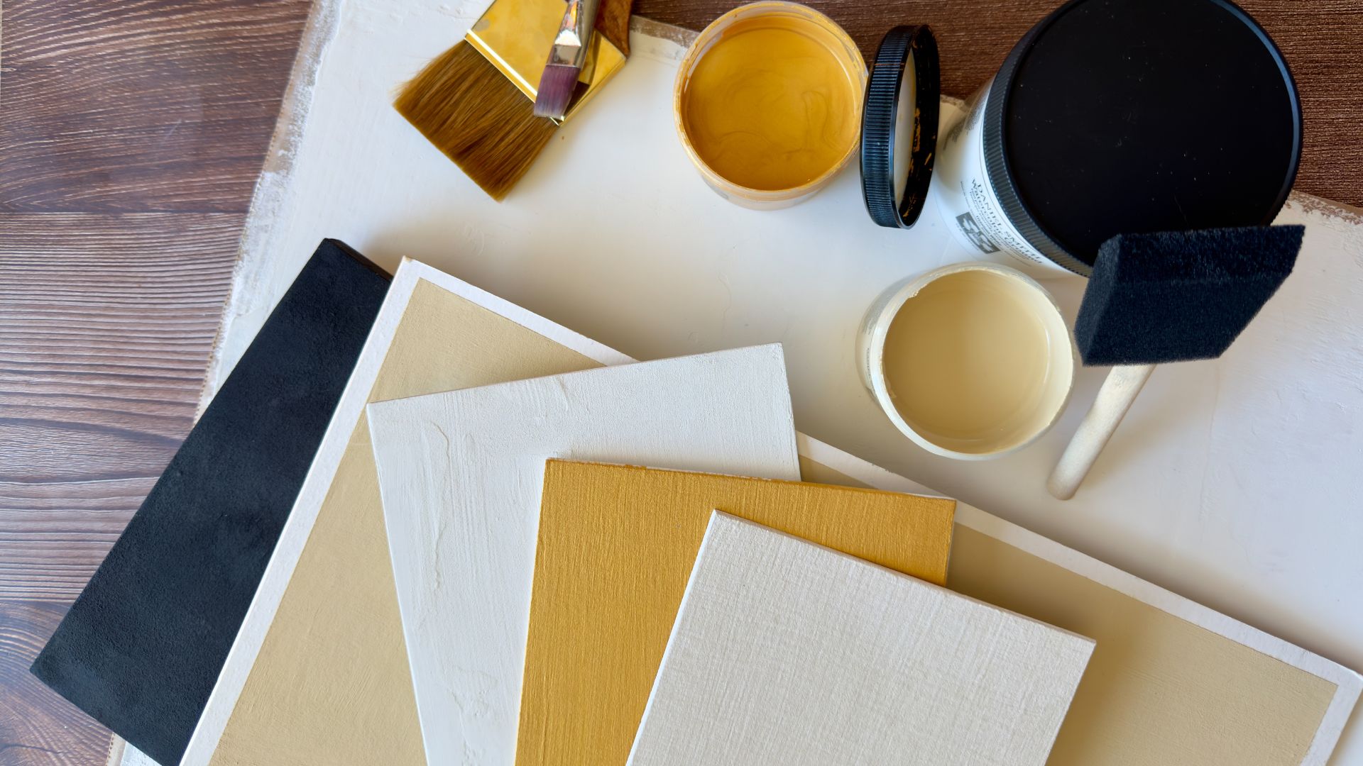
As a mixed media artist, I’m always looking for unique ways to use mediums on different kinds of surfaces. I’ve been working with watercolor lately, and I learned about DANIEL SMITH Watercolor Ground. It’s a stiff yet creamy foundation medium that gives any surface (plastic, wood, glass, metal, etc.) a slight texture just like watercolor paper. So now you can paint with watercolor on so many other surfaces besides paper! It comes in six colors – my favorites are the Mars Black, Iridescent Gold, Pearlescent White and Transparent.
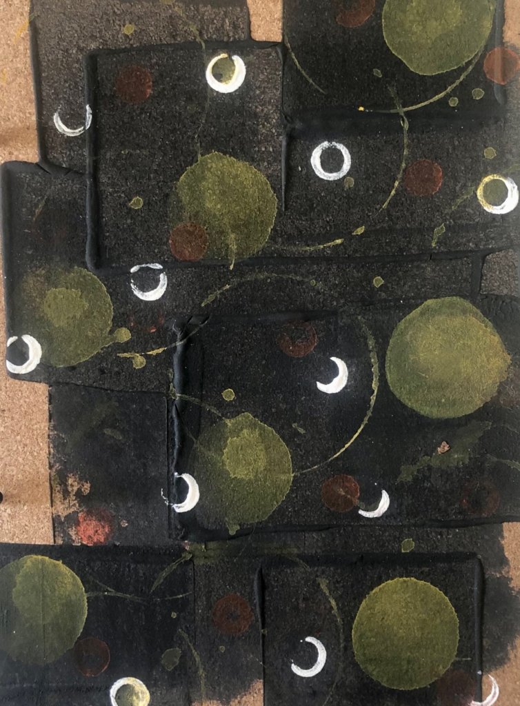
For this abstract geometric piece, I used a plastic hotel key card to scrape the Mars Black across a thin sheet of cork. I overlapped it in square sections, leaving the ridges in place. After the ground dried, I made concentrated washes (very little water) of Cadmium Yellow and Iridescent Copper and stamped circles on top by dipping a variety of household objects into the wash, including a foam stopper, a pencil eraser and a cookie cutter. I finished by stamping some of the Titanium White ground with the tip of a silicone straw. Cork sheets look great mounted on a cradled wood panel.
This piece is on a sheet of heavy chipboard that I saved from a paper pad. I applied a fairly generous amount of Iridescent Gold ground with a palette knife. After smoothing it out, I carved a few arched lines with the tip of the knife – some at the bottom for the green hill, some at the top to suggest more hills in the background, plus some smaller marks for texture in the trees. Once the ground was dry, I blended a few greens (Cascade Green, Serpentine Genuine, Green Apatite Genuine) and added some quick tree lines, then tapped in branches with a fan brush. After brushing over the hill, I lifted some of the paint with a fingertip texture while it was still damp. Painted chipboard makes a nice, sturdy cover for a hand-bound poetry journal.
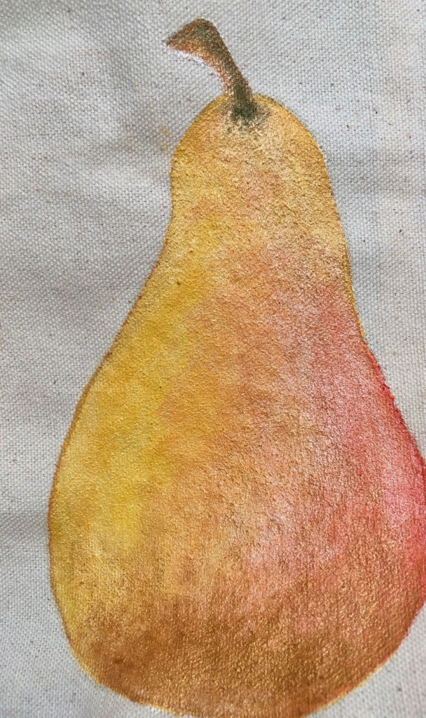
This skinny little pear was painted on a piece of raw canvas. I used a flat brush to apply the Pearlescent White ground in a pear shape and let it dry before painting. I love how easy it is to blend colors right on top of the ground – and the pearly sparkle shined through the paint beautifully, even when lifting some of the color out. My pear palette included Cadmium Yellow, Indian Yellow, Iridescent Copper and Mayan Orange. Raw canvas can be mounted and framed, used in an art quilt, or folded and stitched into a custom soft book for children – P is for Pear!
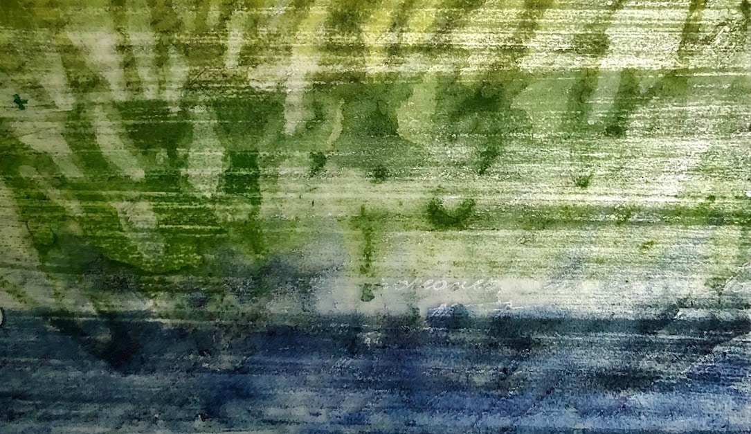
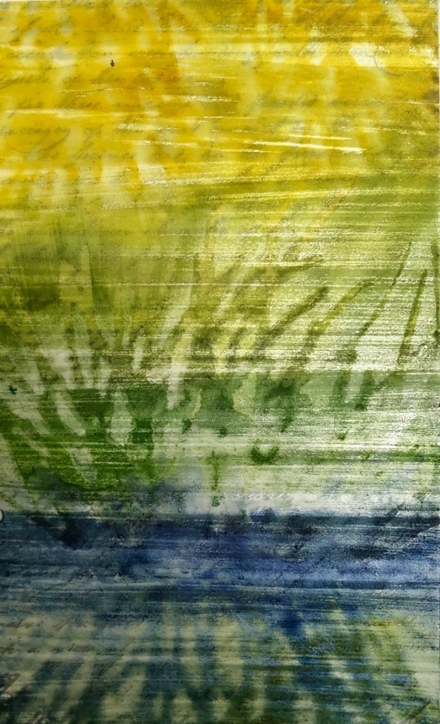
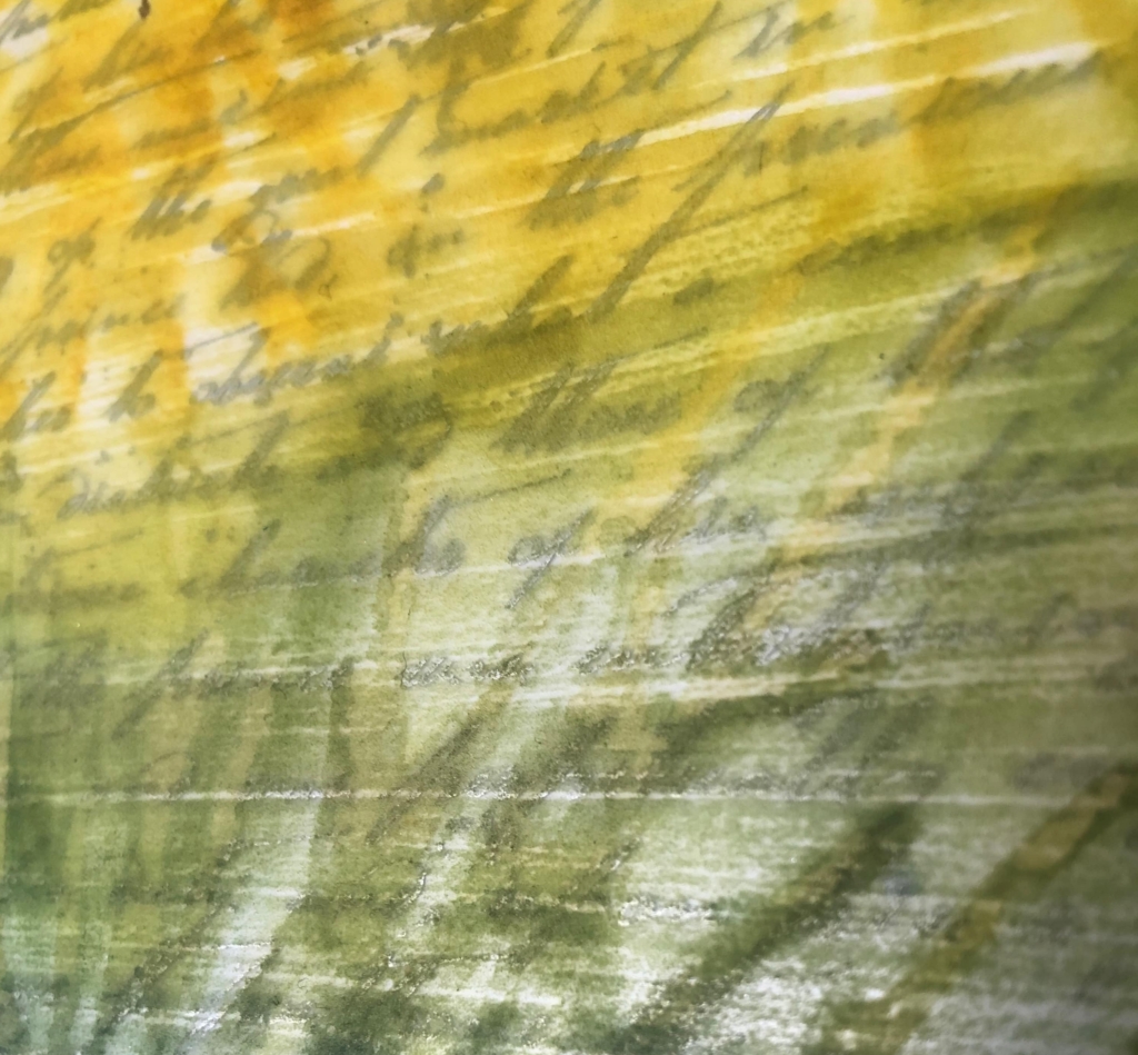
I used a large, flat “beat-up” brush to apply the Transparent Ground to a sheet of printed clear acetate so the brush strokes would be rough and prominent. I found the acetate in the scrapbook paper section of my local craft store – it was printed with random handwriting in a silvery gray color, which I wanted to show through. Once the ground was dry, I blended and brushed light stripes of color from top to bottom. Along with the colors already mentioned, I added some Cobalt Blue to my palette. After letting the first pass dry, I used a sponge to blot and stamp heavier washes of color with a seagrass shaped stencil. This piece looks great against a white background to feel like light is coming through it, so it can either be pressed against a sheet of white aluminum in a frame or placed against a white wall in a glass floating frame.

