Have you explored the DANIEL SMITH 交互式颜色图(CIE-Lab) lately? Whether you’re new to our paints or a long-time fan, this tool is a 必须 for discovering the full range of colors we offer—and more importantly, for sparking inspiration in your creative process.
Here’s a LINK and a below is a video that both give a basic overview
This Color Map is more than just a color reference. Think of it as your personal color playground! Let’s take a look at some fun and practical ways artists are using the Interactive Color Map:
Working on a new painting or series? Use the color map to build your ideal palette. With the “filter by property” feature, you can explore pigments by granulation, transparency, lightfastness, or staining characteristics. Looking for bold granulating colors for dramatic texture? Or transparent pigments for subtle glazing? The map helps you mix and match based on what you need. For example, let’s say you want to compare all granulating greens. Simply check the box for “granulation” under the “Properties” tab and then select the green color family.


Or perhaps you want to find non-granulating greens!


You can even click on any color to have another window pop up telling you more about that color!

Ever clicked on a color just because it looked pretty? That’s half the fun. The interactive map encourages you to follow your curiosity. Each color square reveals the color’s name, pigment information, and a larger swatch when you hover—perfect for discovering those hidden gems you may not have tried yet (hello, Moonglow!).

Here we selected the “Mayan” family so we can see them all together!
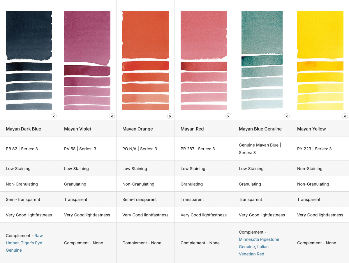
Mayan Range: Simply click the option under “Family”
Want to try something new but unsure how it fits into your current collection? The map helps you visualize and compare up to 20 colors side by side, saving you from second-guessing your next addition. Try combining your go-to colors with new possibilities to plan future mixes or dream palettes. Here’s an example of a split-primary color palette put together using this tool!


You can even email your results to yourself or a friend!

We emailed ourselves a list of the granulating greens!
Looking for just the right shade of blue for your seascape, or a juicy orange for your autumn palette? Use the zoom and pan features to zero in on specific color families. Seeing all the variations within one hue range can help you choose the exact shade that speaks to your style.
柔软、顺滑、温暖宜人,, Jaune Brilliant No. 1 如同春日清晨的金色阳光。它带有淡淡的蜜桃色调和柔和的遮盖力,非常适合描绘玫瑰花瓣的娇嫩晕染、小鸡腹部的曲线,或是为肤色和皮毛增添温暖的光晕。与冷色调的粉彩色系搭配使用,能营造出和谐平衡的视觉效果。规格:15毫升管装。.

Here we chose “warmest” temperature and the Orange color family.

You can click on each square to see what color it is and add it to compare!

Added!

Finally, you can click COMPARE for all of the colors you added and see them together!
If you’re studying pigment properties or trying to memorize pigment codes, the map is a helpful visual companion. Teachers and students alike are using it as a reference during demos or assignments—especially when learning how different pigments behave on paper.

Here we have selected the Quinacridones Family so that we can compare their pigment properties. Pigment info and series number for each is listed in the box directly under the color name.


Whether you’re planning, playing, or just exploring, the 交互式颜色图(CIE-Lab) is a vibrant way to stay connected with your creativity. Plus, it’s accessible anytime, from anywhere—so your next color adventure is always just a click away.
Explore the DANIEL SMITH Interactive Color Map here
祝您绘画愉快!