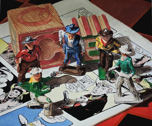
I decided to capture images of the toys I enjoyed as a child in the same style of realism that I use in my Dutch-style still life paintings. I hope you will appreciate both the realism and the nostalgia in this painting.
While nostalgia played a big part in my selecting the subject matter, it was more about answering the question – Can my style of realism be successfully applied to other subjects besides my usual silver and crystal?
While assembling this still life, I got involved in the story I could tell my audience. After I found the iconic image of Red Ryder, I was intrigued by the comment in the speech bubble: Hold on! Here are six reasons you’re going to listen to me! Five cowboys made a better composition than six, so that might cause my viewer to wonder what the “six reasons” might be, which would then lead them to the six bullets in the six shooter.
At first glance, the painting looks very different from what people have come to expect from me. The primary reason is not just the subject matter, it is also the range of colors in the painting. My silver and crystal pieces tend to be more monochromatic.
This painting is full of color. It is full of greens that I don’t normally use. When I usually paint greens, I am painting leaves and flowers and like to mix my greens, since the colors change as they move across the leaf or petal. In this painting, I am reproducing mechanically produced colors. They change with the shadows and reflections of other colors, and therefore proved very difficult to mix. I turned to my DANIEL SMITH palette and found I could use the following greens with much success: Permanent Green Light, Cascade Green, Phthalo Green (BS) and Phthalo Yellow Green.
The reds also proved to be a challenge. There is a wide range of reds in the subject matter and they vary a lot as the light changes across the still life. I used a wide range of DANIEL SMITH reds: Permanent Alizarin Crimson, Cadmium Red Medium Hue, Quinacridone Red, Cadmium Red Scarlet Hue, Perylene Red and Permanent Red Deep. I used Neutral Tint to help solve the matter of dealing with the shadows. The DANIEL SMITH range was a big help in getting the colors right.
I did not think it appropriate to sign my name across the bottom of the painting. I hope you will enjoy finding where I placed it!


