Partager:
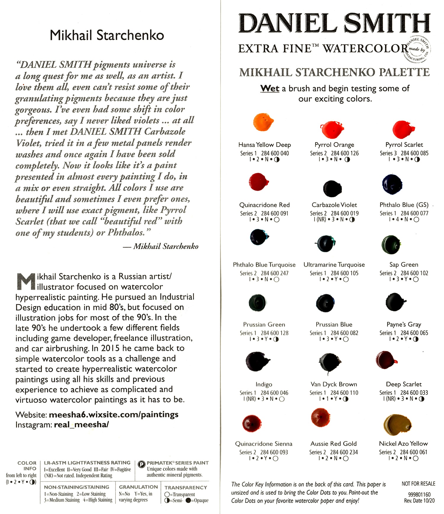
DANIEL SMITH’s universe of pigments is a long quest for me as an artist. I love them all – I can’t resist some of their granulating pigments because they are just gorgeous. I’ve even had some shift in my color preferences. For example, I never liked violets at all … then I met Carbazole Violet, tried it and I was completely sold. All the colors I use are beautiful and sometimes I even prefer the exact pigment, like Pyrrol Scarlet (that we call “beautiful red” with one of my students) or Phthalos. —Mikhaïl Starchenko
Or rouge australien
Violet de carbazole
Écarlate profonde
Jaune Hansa Profond
Indigo
Nickel jaune azoïque
Gris de Payne
Bleu phtalo (nuance verte)
Bleu phtalo Turquoise
Prussian Blue
Vert de Prusse
Orange pyrrol
Pyrrol Scarlet
Rouge de quinacridone
Quinacridone Sienne
Vert de sève
Turquoise outremer
Van Dyck Brown