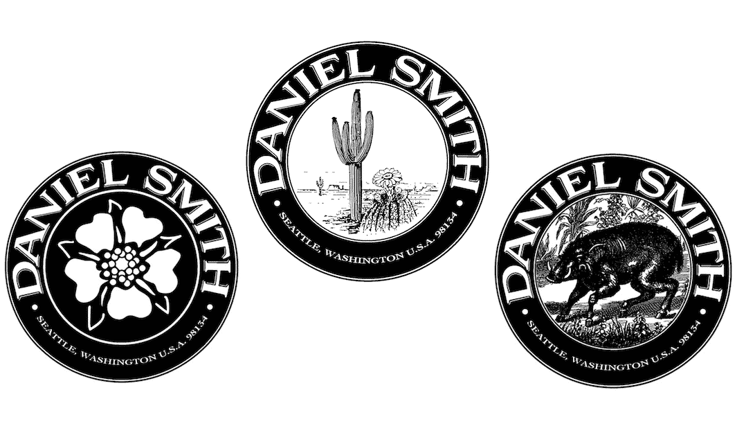
As we were first developing our brand, we wanted to make sure the logo was more than just a company mark. Our logo needed to symbolize the quality of our products and reflect what matters to us as a manufacturer of professional artist materials – such as elegance, durability and timelessness. We designed our logo to be uniquely adapted for each product line, allowing it to stand out in the marketplace and be recognized as ours.
There’s a saying we like – Life is short, art is long. It means art will outlive all of us. Art conveys what we felt was important to future generations. We chose a round logo because it is without end, conveying longevity. The exterior of the logo is always the same, with our company name and location where we started (and continue!) the business in Seattle, Washington. The various artistic images inside the circle each represent something specific.
A saguaro cactus is featured in our corporate logo because it’s strong, elegant and resilient, like a monument. This type of cactus is also globally recognized as being from the United States.
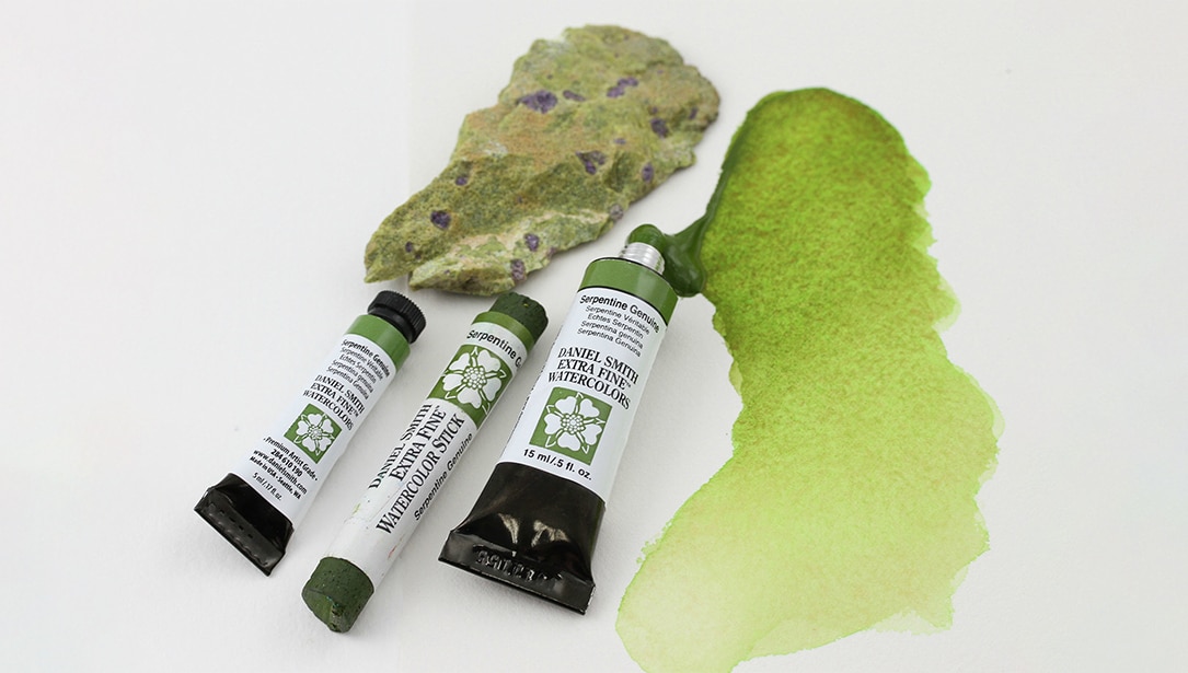
To represent our line of watercolors, we selected a flower. While watercolors are used to paint a wide variety of imagery, they are historically tied to floral paintings.
We chose the wild boar for our oil paints. The popular bristle brushes used with oils are primarily made from boar’s hair.
We hope that whenever you look at a Daniel Smith logo, you see it as a symbol of our products, which are made with care to support artists worldwide with their artistic expression. That is what it means to us.

