Our Extra Fine Watercolor Sticks are so fun, versatile, and highly pigmented! Many of our customers write in and ask for suggestions on a selection of sticks that would make a good mixing set. While we do offer a Core Mixing Set of 5, we figured, why not MIX things up a little (pun totally intended!) and toss in a fabulous trio to jazz up your art?
The primary colors we have curated are:


Hansa Yellow Light
“Cleaner, more transparent and brighter in chroma than Cadmium Yellow Light, this is a high-tinting, organic pigment. Hansa Yellow is considered the ‘perfect yellow’, offering more control when mixing. Painters admire the purity of this primary pigment and ability to adjust its temperature while avoiding a gray from a hidden complement. Think of a yellow pepper.”

Opera Pink
“The most vivid of all pinks, has long been requested by DANIEL SMITH customers. A primary magenta with a hint of fluorescent pink granulation producing some of the most brilliant glowing mixes you have ever seen. Try mixing Opera Pink with our New Gamboge for fiery oranges or with an Indanthrone Blue for stunning violets and glowing purples.”

Cobalt Teal Blue
“An extraordinarily beautiful color for painting turquoise blue skies, a must-have for sunny Mediterranean skies and tropical seas! Mixing with this pigment helps make bright shadows – also use it to render the desired patina on a copper pot. As an inorganic pigment, it is considered non-staining (or low-tinting) and ideal for glazing methods. Cobalt Teal Blue’s ability to create soft edges, to lift and to mix readily make it a valuable contribution to watercolor palettes.”


Creating a color wheel chart, we mixed these three colors together and were surprised with punchy purples, gorgeous greens, and outstanding oranges!
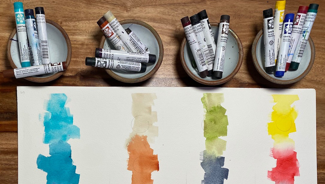
Using a brush, we wet the ends of the sticks and swirled the stick into a ceramic dish, starting with pink and blue!


It doesn’t take much! These sticks are so full of pigment!

The granulation from the Cobalt Teal Blue and Opera Pink created some terrific textures in these violet and magenta hues!

Next, we moved on to our coral and orange mixes, by combining our Hansa Yellow Light and Opera Pink.

Again, that Opera Pink is bringing the granulation! We love the way the granulating pigments settle into the paper’s dips and valleys.

And finally, we end with making some exciting green and aqua shades! Cobalt Teal and Hansa Yellow Light pair up perfectly, making it easy to be green!


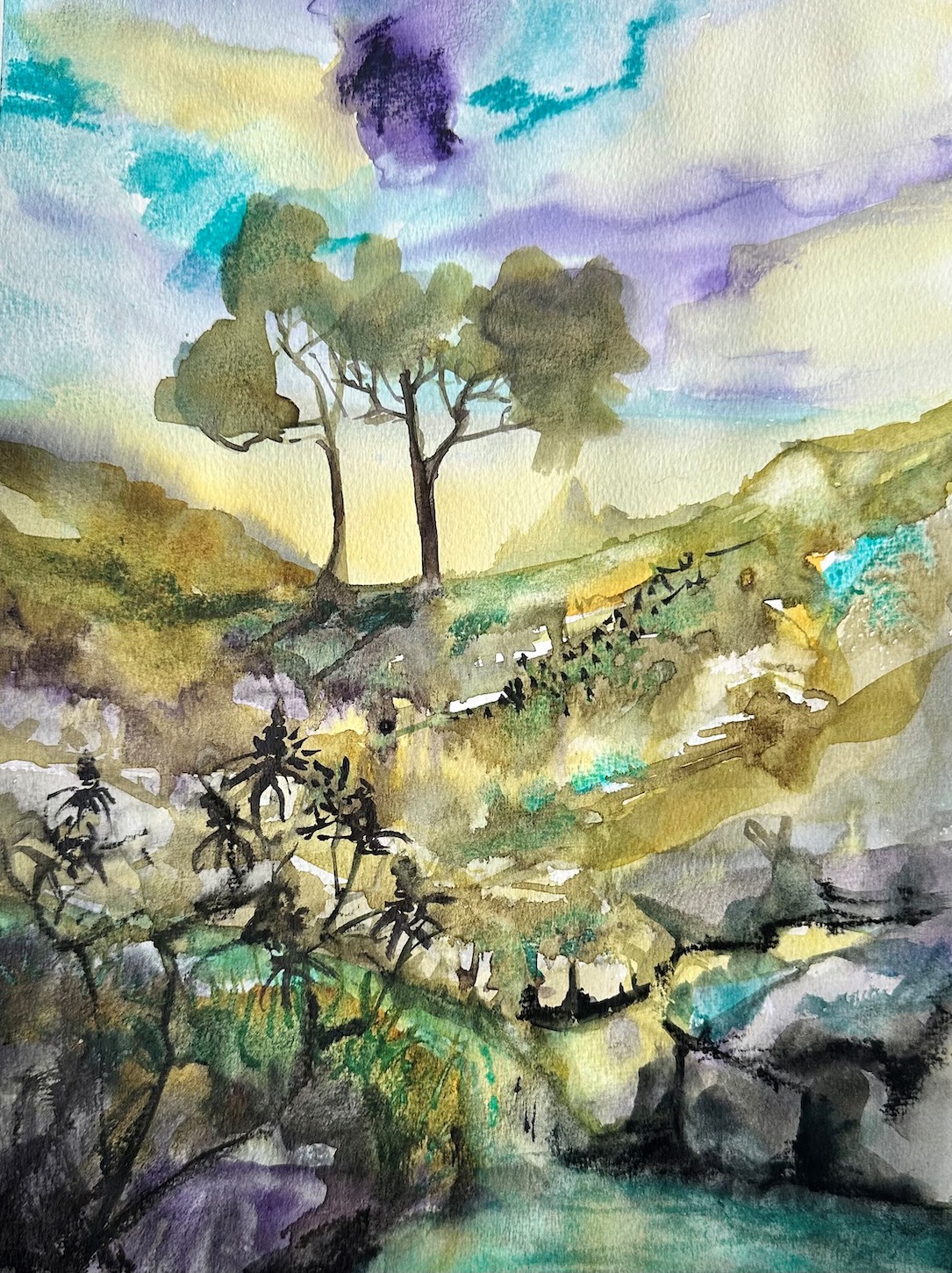
Here is our completed primary, secondary, and tertiary color wheel!


Just for fun, we also whipped up some earth tones!

Look at those mossy greens, rich textural browns, and cool greys!


Combining 3 primary colors is so much fun, and you never quite know what you’re going to get! Now it’s your turn! Go mix up some colors and see what awaits you!