





Color harmony can transform a watercolor painting from a collection of beautiful colors into a cohesive visual experience. When colors relate naturally to one another, they can create a sense of balance, atmosphere, movement, and emotion—while still leaving room for spontaneity and expression.
For watercolor artists, harmonious palettes can be especially powerful. The transparency of watercolor allows colors to mingle, overlap, and reveal the character of the pigments underneath. Add granulation, staining, lifting, and other unique pigment properties, and the possibilities become almost endless.
But what makes colors harmonious? And how do artists choose combinations that work beautifully together?
To explore the subject, we turned to DANIEL SMITH Brand Ambassadors and asked them to share how they approach harmonious color combinations in their own work.
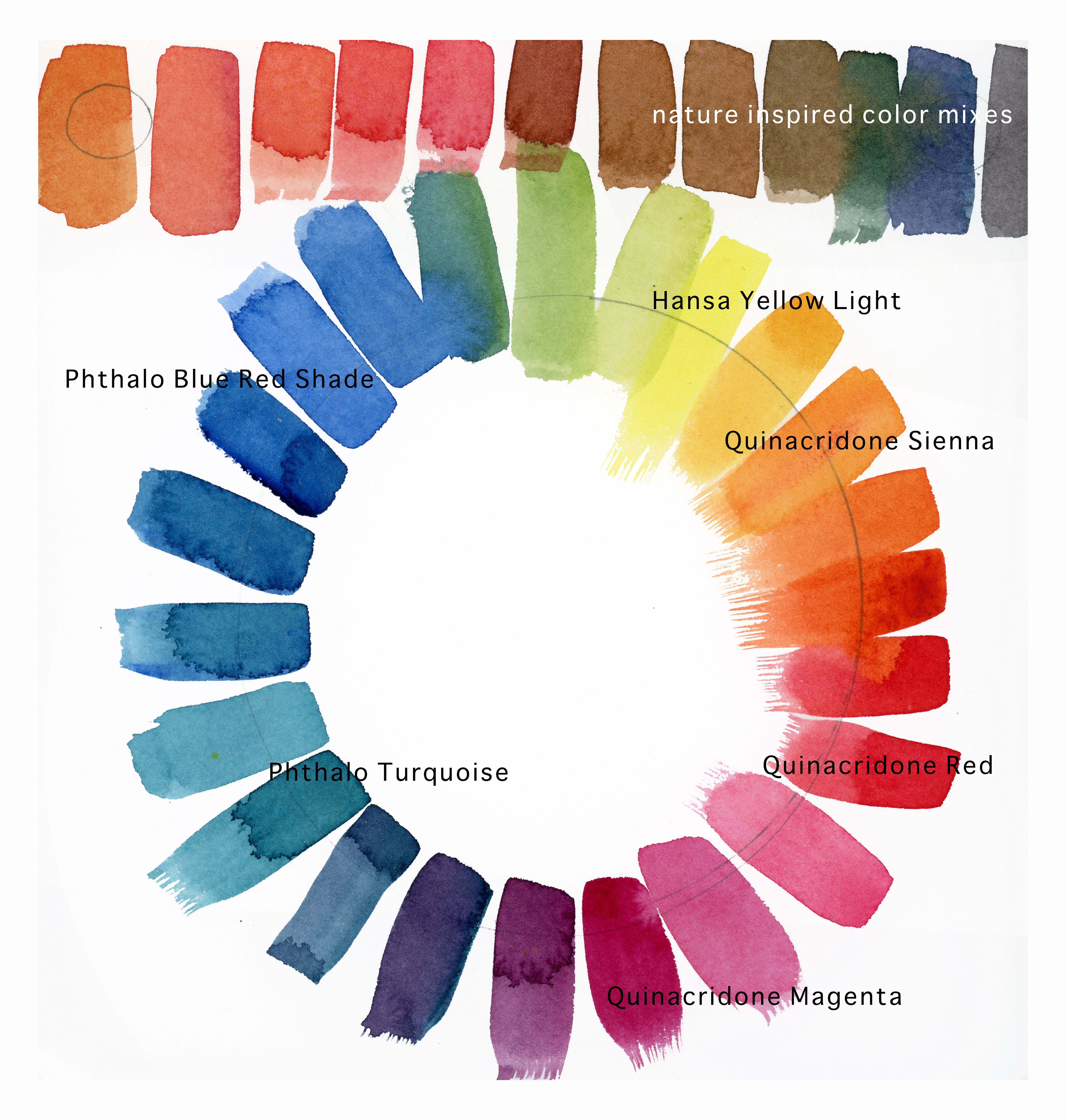
Color swatch by Buffy Kaufman
Having a harmonious palette when using watercolor pouring and wet-into-wet painting techniques is very important. How colors blend and mix, as well as how they behave through consecutive pours and glazes, are all essential considerations.
Watercolors applied in these ways behave differently depending on how diluted the pigments are. How a color acts at full strength, as well as when it is watered down, can play an important role in the finished painting.
Beginning with a limited palette of colors that get along well together is a great way to start. Color mixing in watercolor isn’t always as straightforward as it is in other mediums. Each pigment has its own behavior, nuances, and characteristics. When teaching color mixing, I like to start with colors I know blend together effortlessly. The Hansa, Quinacridone, and Phthalo families make a wonderful place to begin.
My core palette of Hansa Yellow Light (HYL), Quinacridone Sienna (QS), Quinacridone Red (QR), Quinacridone Magenta (QM), Phthalo Turquoise (PT), Và Phthalo Blue Red Shade (PBRS) is one I’ve nicknamed the Limitless Palette. From these six colors, I can mix and blend the colors of nature, from rich neutrals to bold brights!
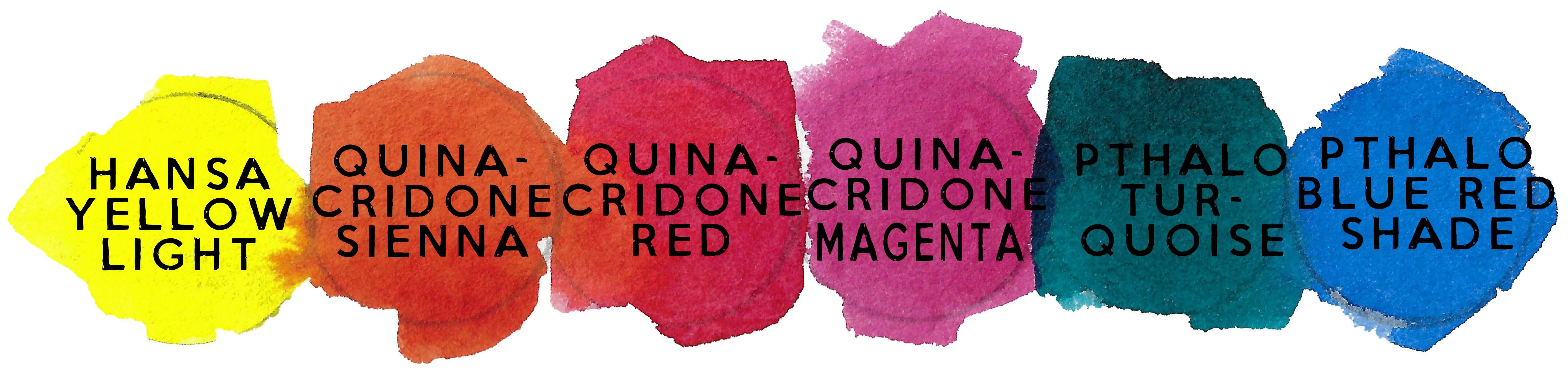
This limited palette gives you a wonderful starting point for creating balanced, harmonious color while still leaving plenty of room for expressive and unexpected mixes.
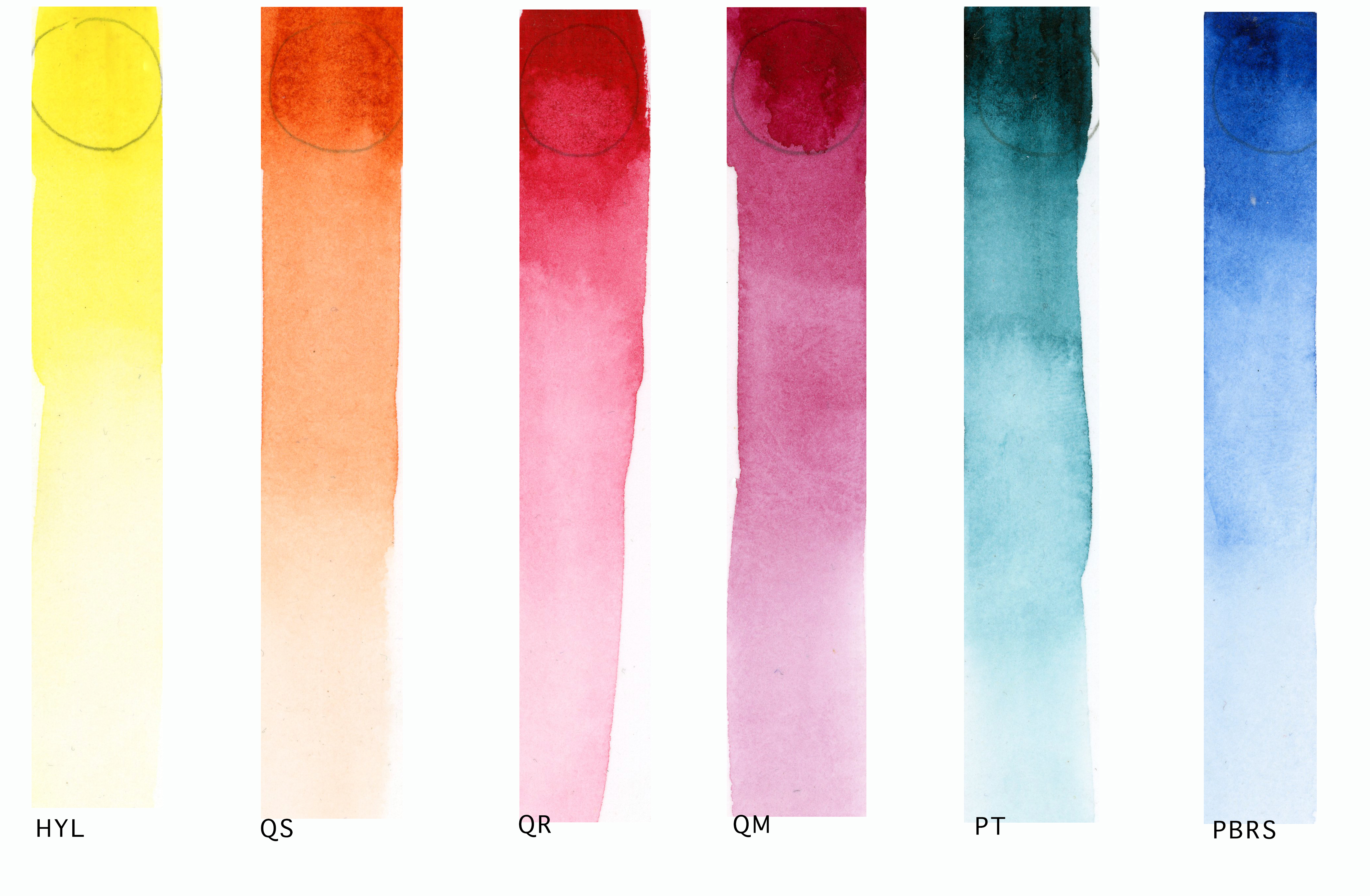
Painted out here as a value scale, you can see the range of each color. Even at its most watered-down, pastel value, each one still glows.
For me, a harmonious color palette helps create balance by establishing a connection between the different areas of a painting. It prevents each color from working in isolation. When you repeat colors, use mixtures derived from them, or allow the same pigment to appear in different areas, you create a visual connection. The eye recognizes this relationship, making the whole painting feel more unified.
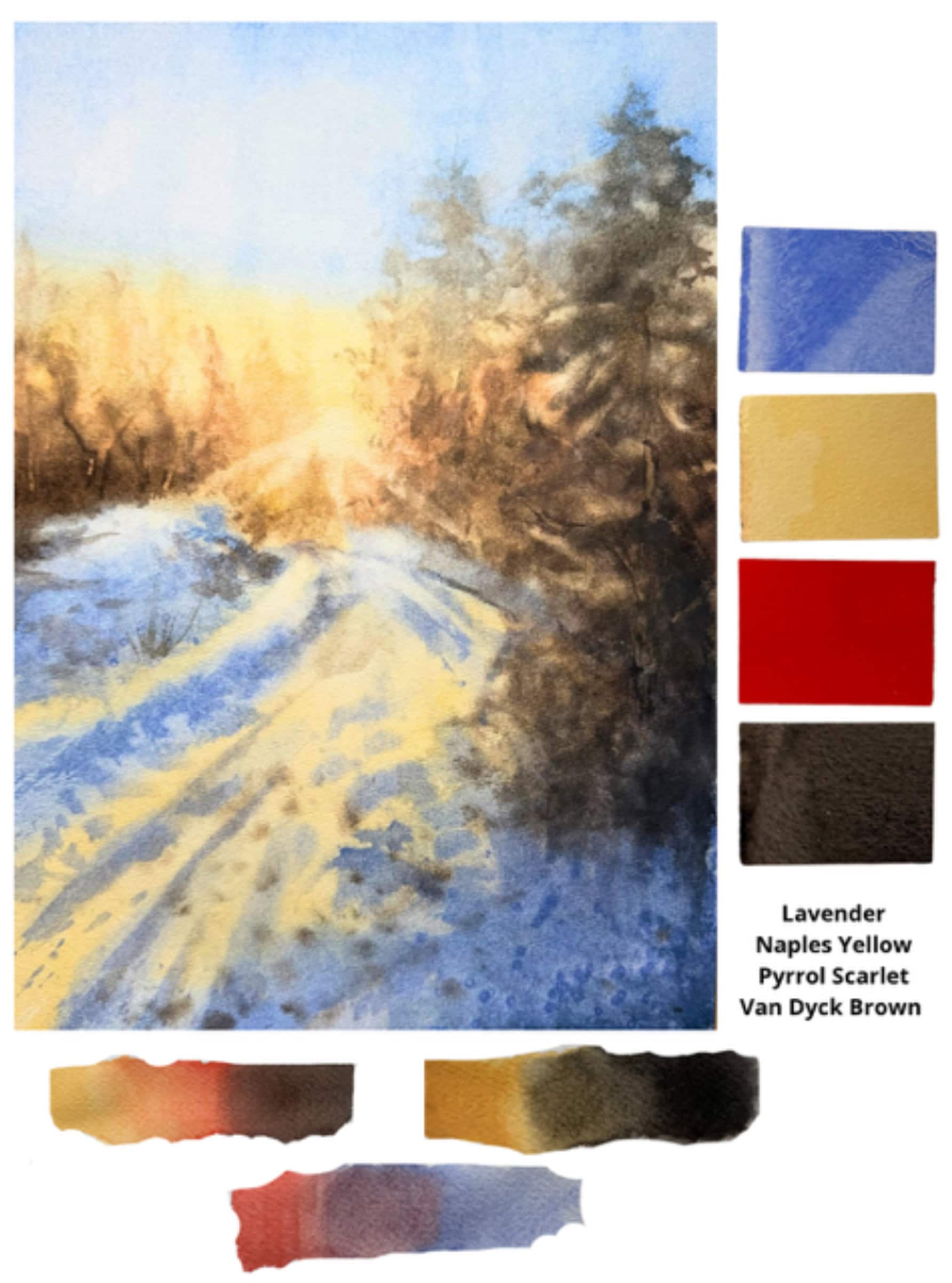
Creating color harmony doesn’t require a large palette. While some artists work with 5–7 colors, I often use even fewer—usually just 2–5 colors.
My motto is simple: fewer colors mean more harmony.
I use the color wheel as a guide, exploring analogous colors that sit next to each other or complementary colors that sit opposite each other, such as yellow and violet or red and green. I also consider the balance between warm and cool colors to create depth and visual interest.
Another approach is to choose one color as the dominant color—allowing it to predominate throughout the painting. Repeating that color in different areas helps tie the composition together and creates a natural sense of harmony.
For example:
Analog
For me, working with a harmonious color palette creates a sense of unity throughout the painting. When the colors naturally relate to one another, the composition feels more balanced and visually pleasing, and this can bring a sense of calm and coherence to the work while still allowing it to be expressive.
I also find that a harmonious palette makes the painting process more intuitive. When the colors already “speak the same language,” there is less uncertainty when making color decisions. I can move more freely from one mixture to another, knowing that the colors will work together rather than compete with each other. This gives me more freedom to focus on the atmosphere, light, and emotion I want to convey.
Artwork by Silvia Trad
Artwork by Silvia Trad
Which DANIEL SMITH color combinations create effortless harmony for your painting style?
From my core palette, I expanded the colors into three columns. The first column is the Smooth Mixers. The second, which I call the Granulating Cousins, includes colors similar in hue but more earthy and granulating, offering a bit of grit I can’t achieve through color mixing alone.
The third column is the Magic Mixers! These are colors that each have something extra special—like the granulating spread of Payne’s Gray, the gorgeous settling sediment of the Lunars, the pepper-like texture of Sepia, and the natural, gorgeous sparkle of Bronzite and Kyanite Genuine.
Each row works analogously, while each column behaves differently. Together, they combine endlessly, offering a head start toward harmony and balance.
These are the 18 colors in my DANIEL SMITH Dot Card. Each performs beautifully as a stand-alone color, and they all mix together to create gorgeous, dynamic blends.
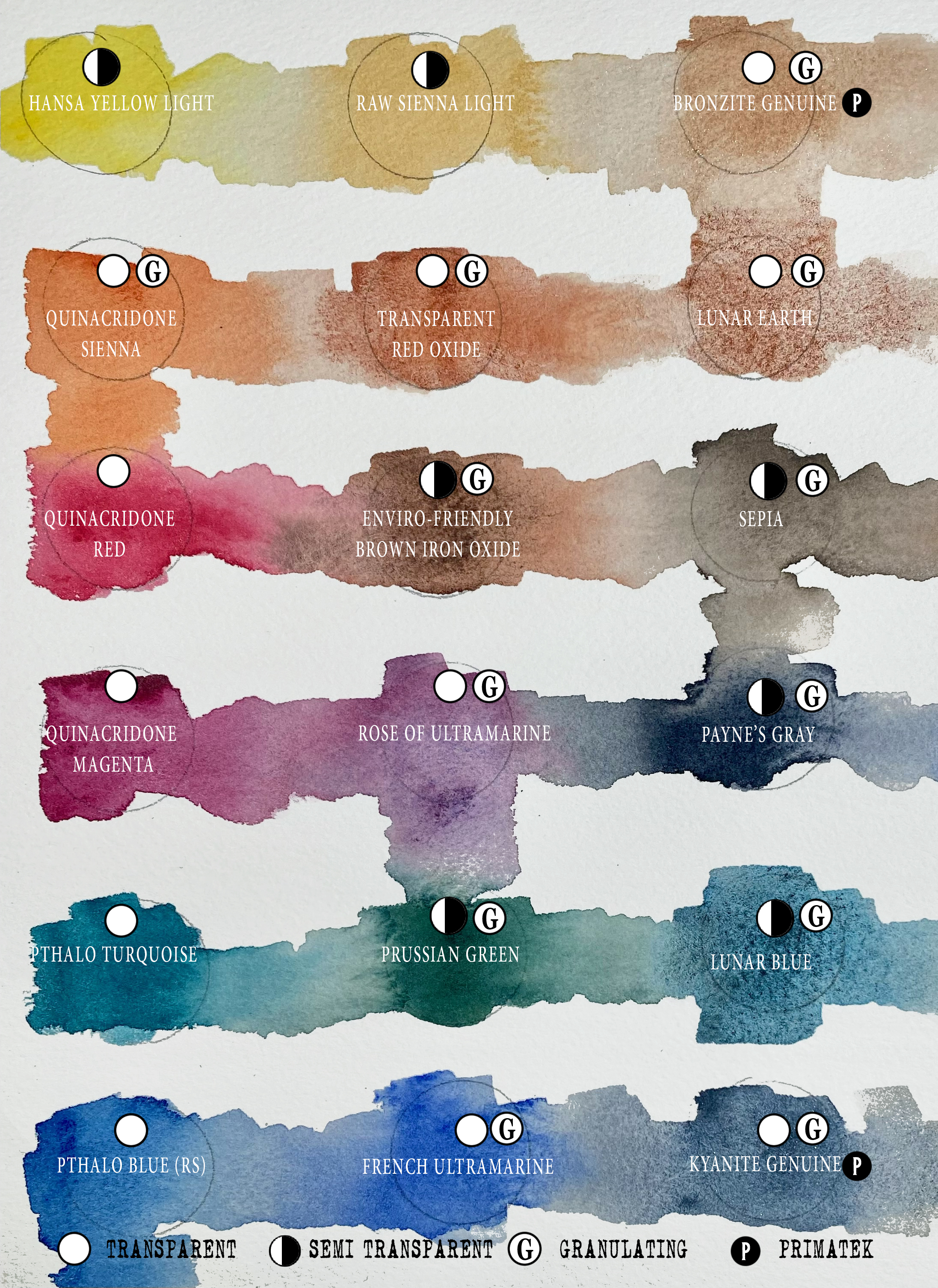
Photo by Buffy Kaufman
Here are two recent paintings using these colors. The added mark making was done with wet DANIEL SMITH Quinacridone màu cam cháy Và Olive Bút màu nước.
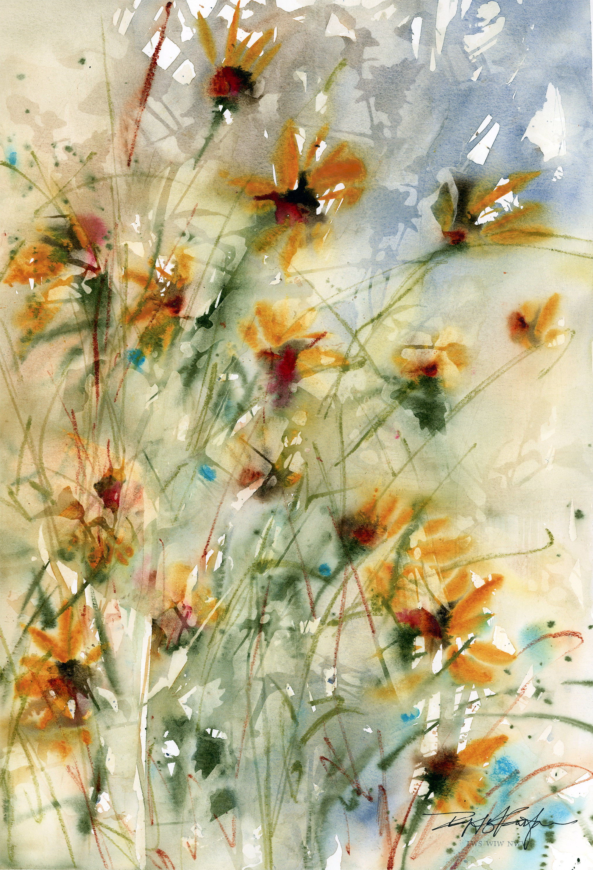
Artwork by Buffy Kaufman
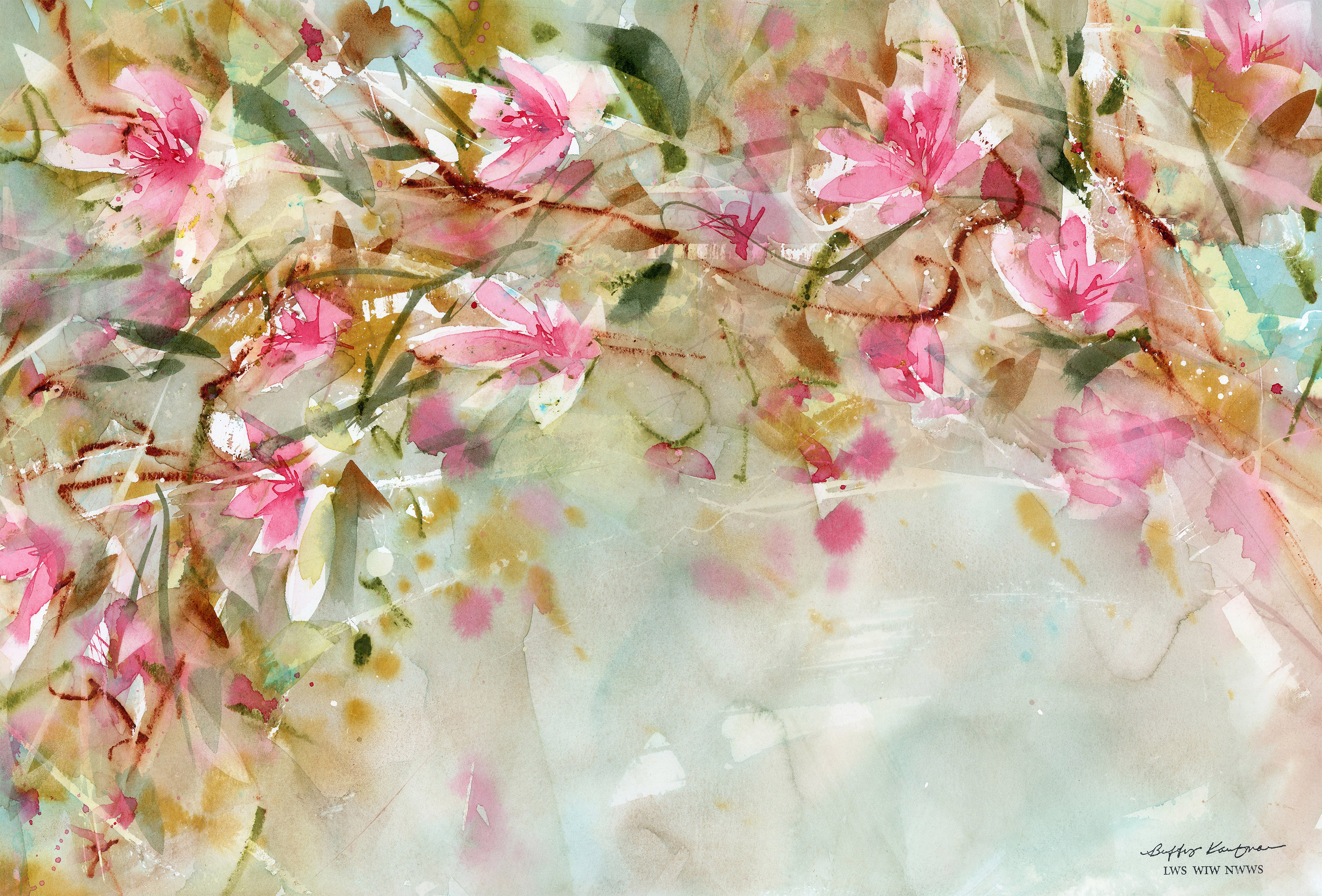
Artwork by Buffy Kaufman
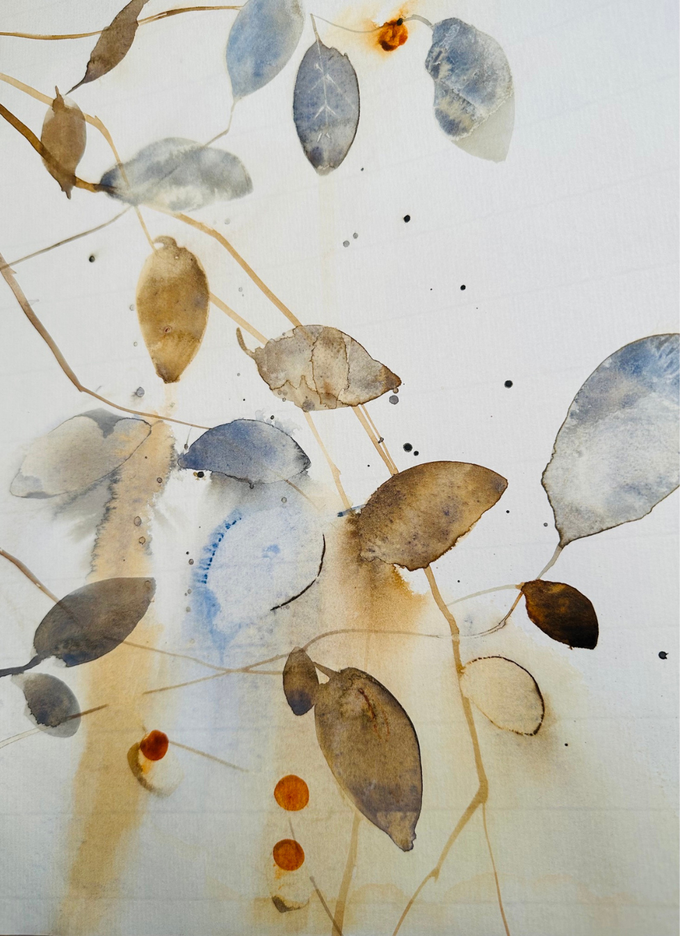
I rely a lot on color theory when choosing my palettes. I especially enjoy working with analogous colors or colors that belong to the same color family. Because they already share a visual relationship, they create a natural sense of harmony in the painting. I can then play with variations in value, temperature, and saturation while still keeping the overall palette cohesive.
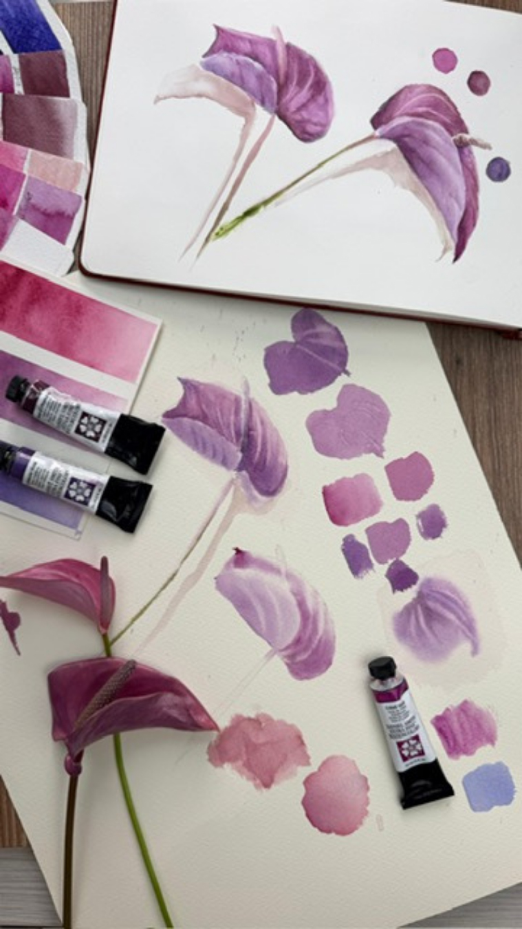
Artwork by Martha Gómez-Silva
Artwork by Martha Gómez-Silva
I love using Xanh coban Và Quinacridone Sienna, cũng như Violet and Yellow. But ultimately, it depends on my mood that day and what colors I feel drawn to.
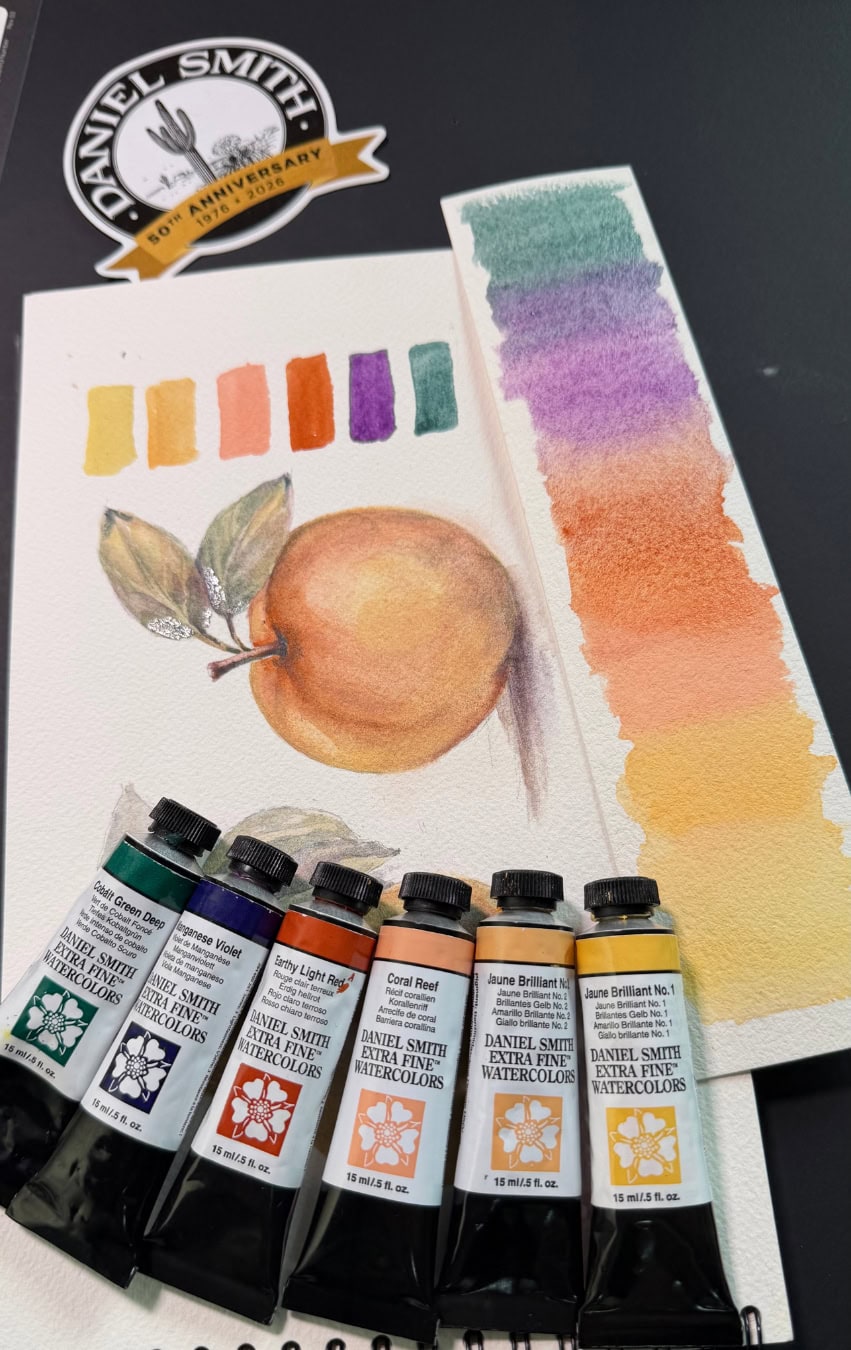
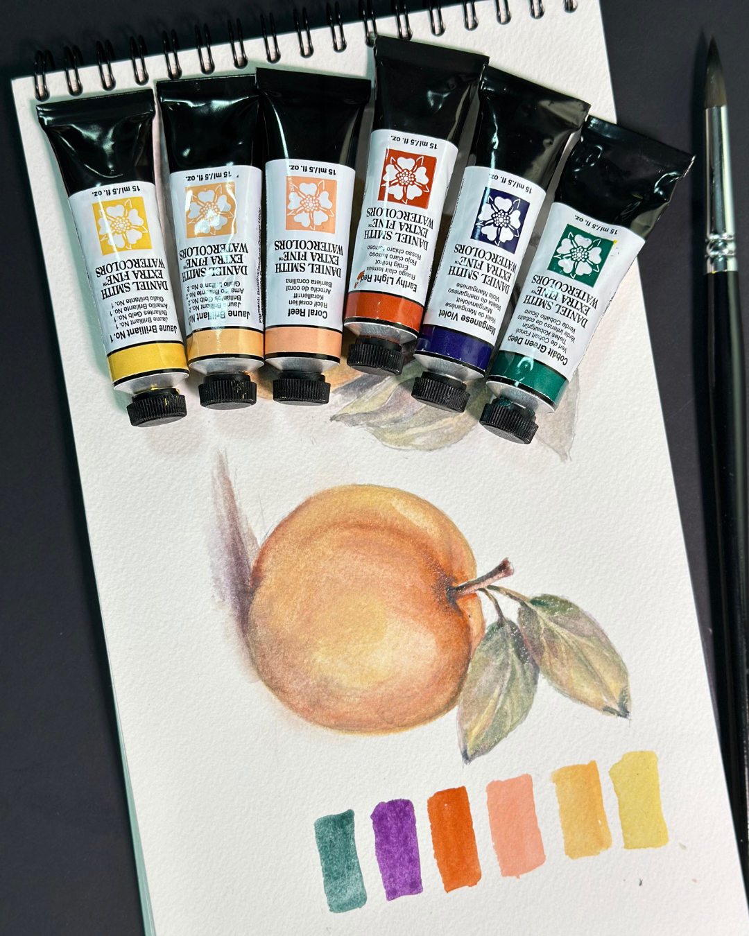
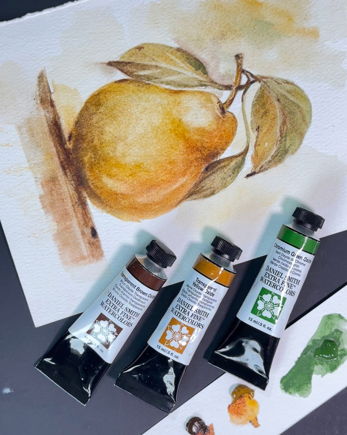
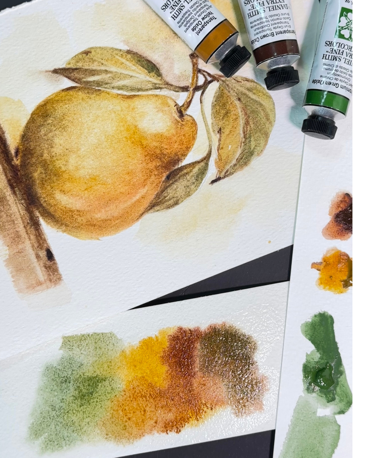
One combination that creates a very natural sense of harmony for my painting style is Oxit vàng trong suốt, Oxit nâu trong suốt, Và Crom oxit xanh.
I used these three colors in my Pear painting, and I particularly enjoyed this combination because it allowed me to create something that is very important in my work: volume, light, and contrast, while still maintaining a strong sense of color harmony.
Although these are predominantly earthy colors, I don’t feel limited by them. On the contrary, I find that a restricted palette like this can give a painting a very distinctive personality and a strong visual identity, and I really enjoy that. The colors establish a particular mood and character that can be felt throughout the entire painting. Transparent Yellow Oxide brings warmth and luminosity, Transparent Brown Oxide gives me richness and depth, and Chromium Green Oxide adds a cooler, grounded note that creates a beautiful balance with the warmer tones.
Artwork by Silvia Trad
Artwork by Silvia Trad
Do you have a favorite harmonious color combination?
As I developed favorite mixes and combos, I began pre-mixing them during palette fills. Over time, my palette evolved into a new assortment of these Dot Card colors, pre-mixed for consistency and convenience. Here are some of my favorite combos!
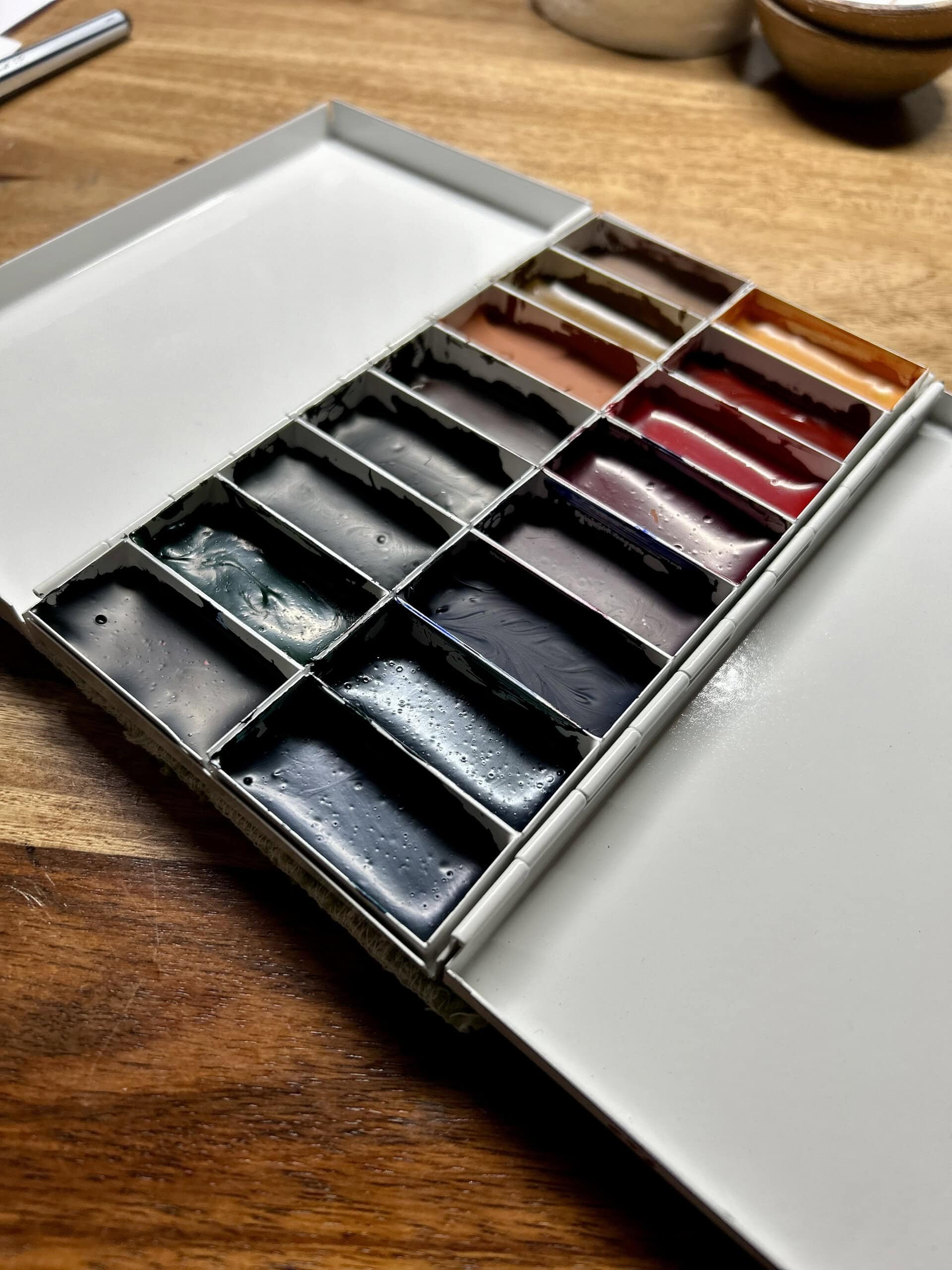
Photo by Buffy Kaufman
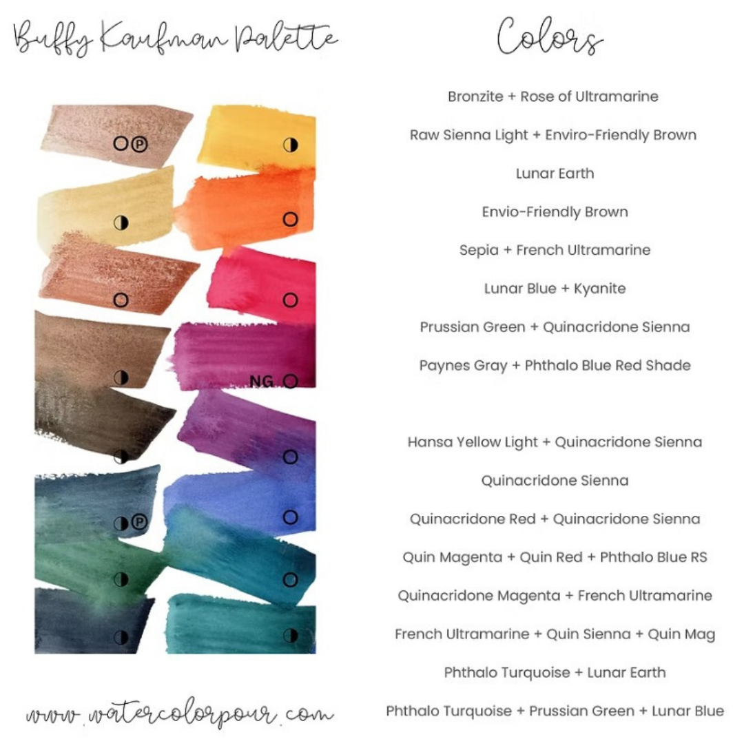
Color swatch by Buffy Kaufman
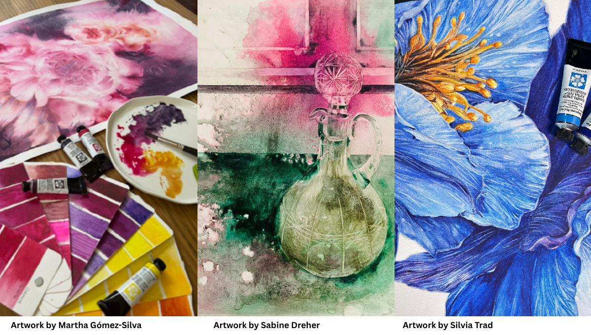
One of my favorite harmonious color combinations is pink and green. Although they are complementary colors, I love the balance they create together. Nature is often our greatest teacher: pink flowers surrounded by green foliage are a perfect example of how beautifully these two colors can coexist. This is where I especially enjoy playing with color values, allowing one color to be more dominant while using subtle variations of the other to create depth, balance, and harmony.
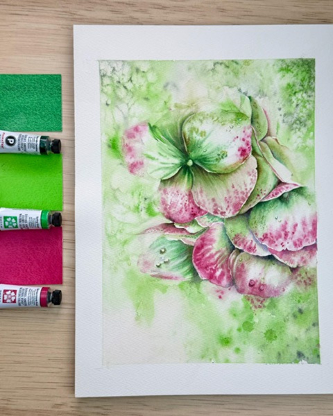
Artwork by Martha Gómez-Silva
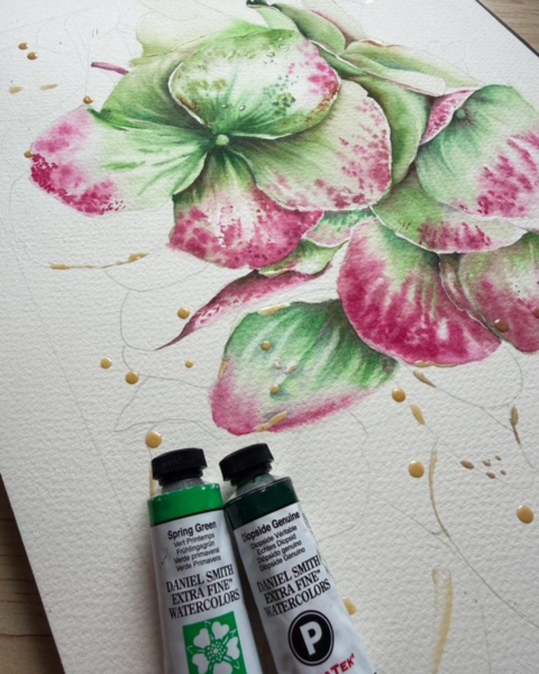
Artwork by Martha Gómez-Silva
It’s definitely Jadeite Genuine paired with any shade of pink or violet.
I love all kinds of color combinations, but some are especially beautiful—like Cobalt Violet with Lemon Yellow, or Manganese Violet with pink.
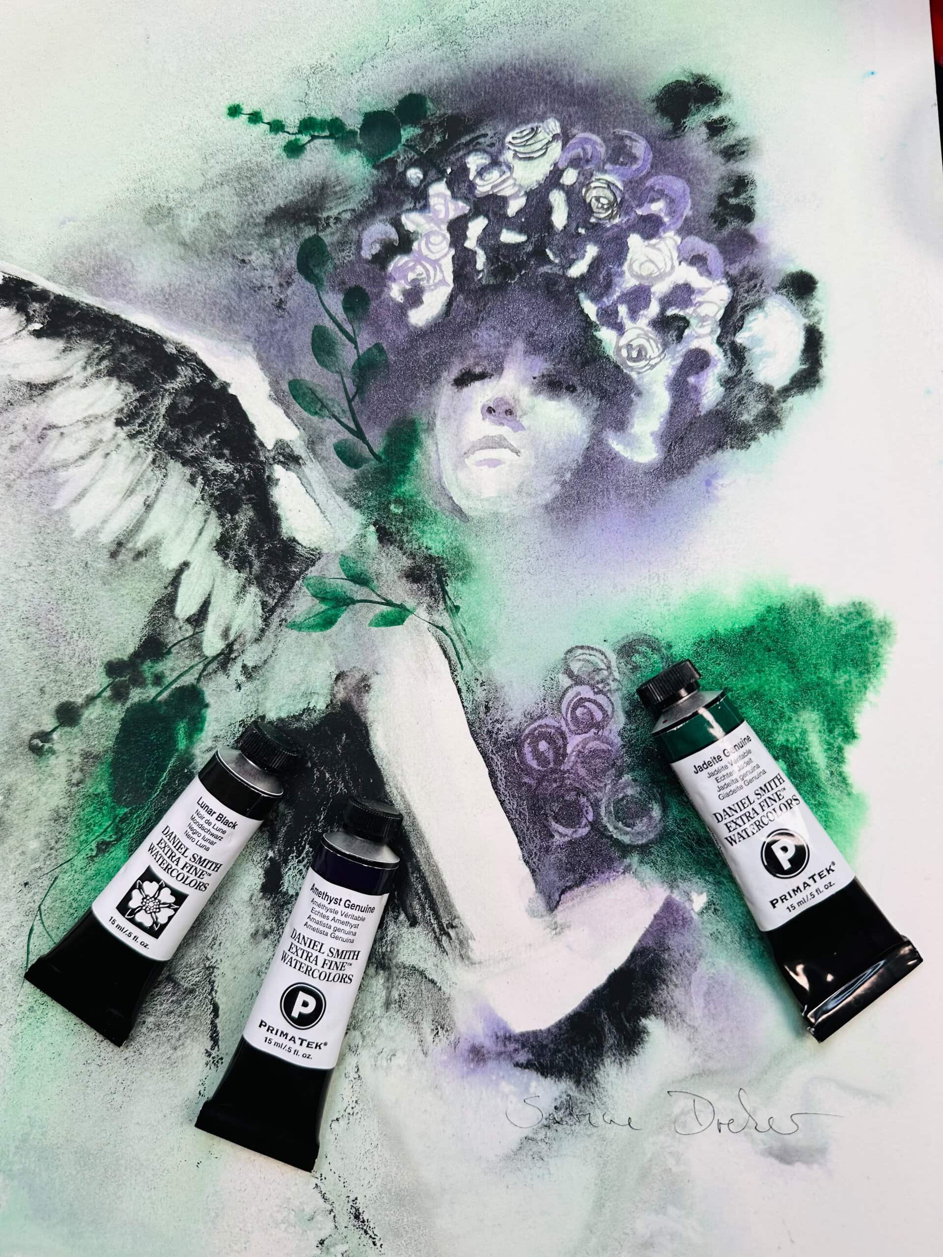
Artwork by Sabine Dreher
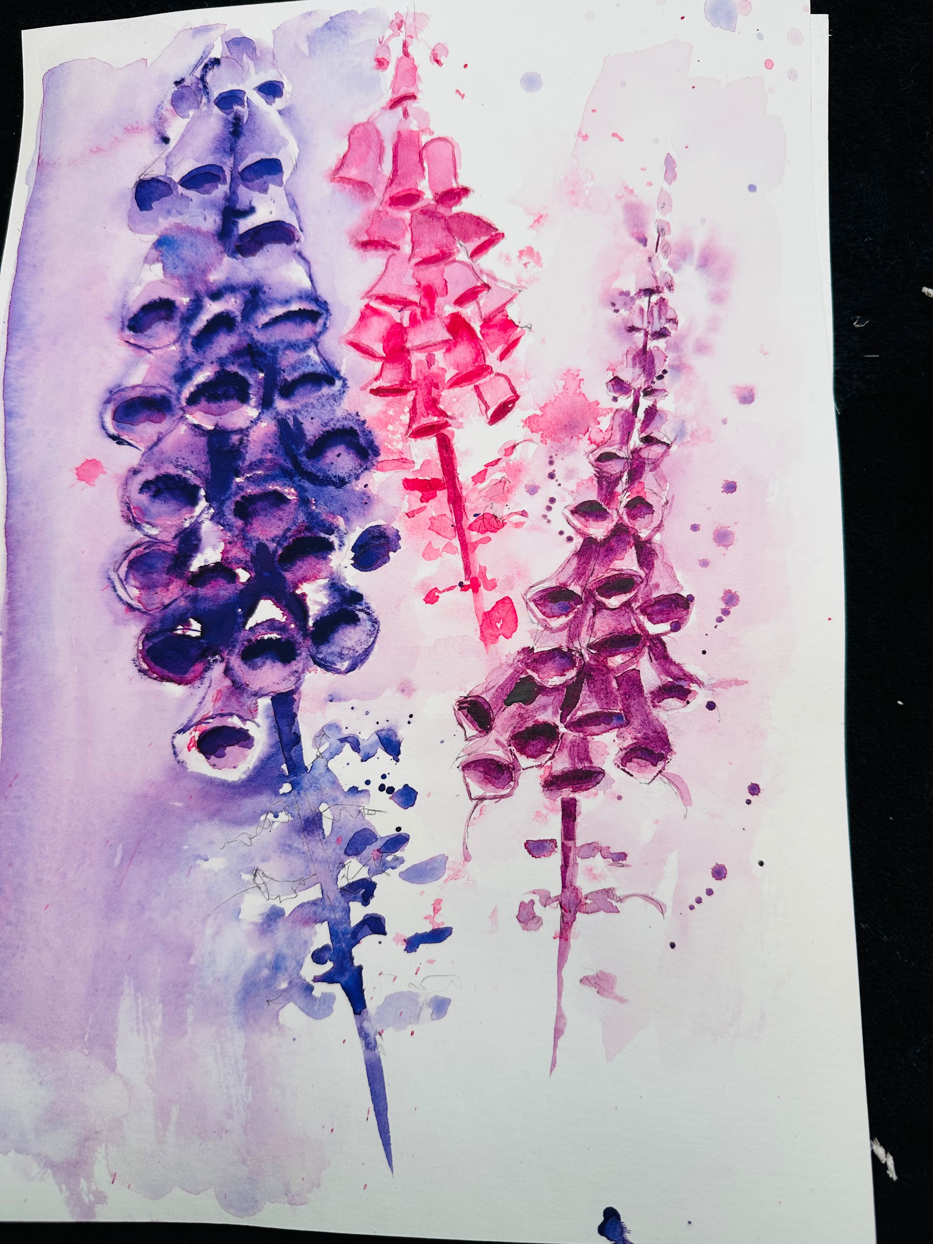
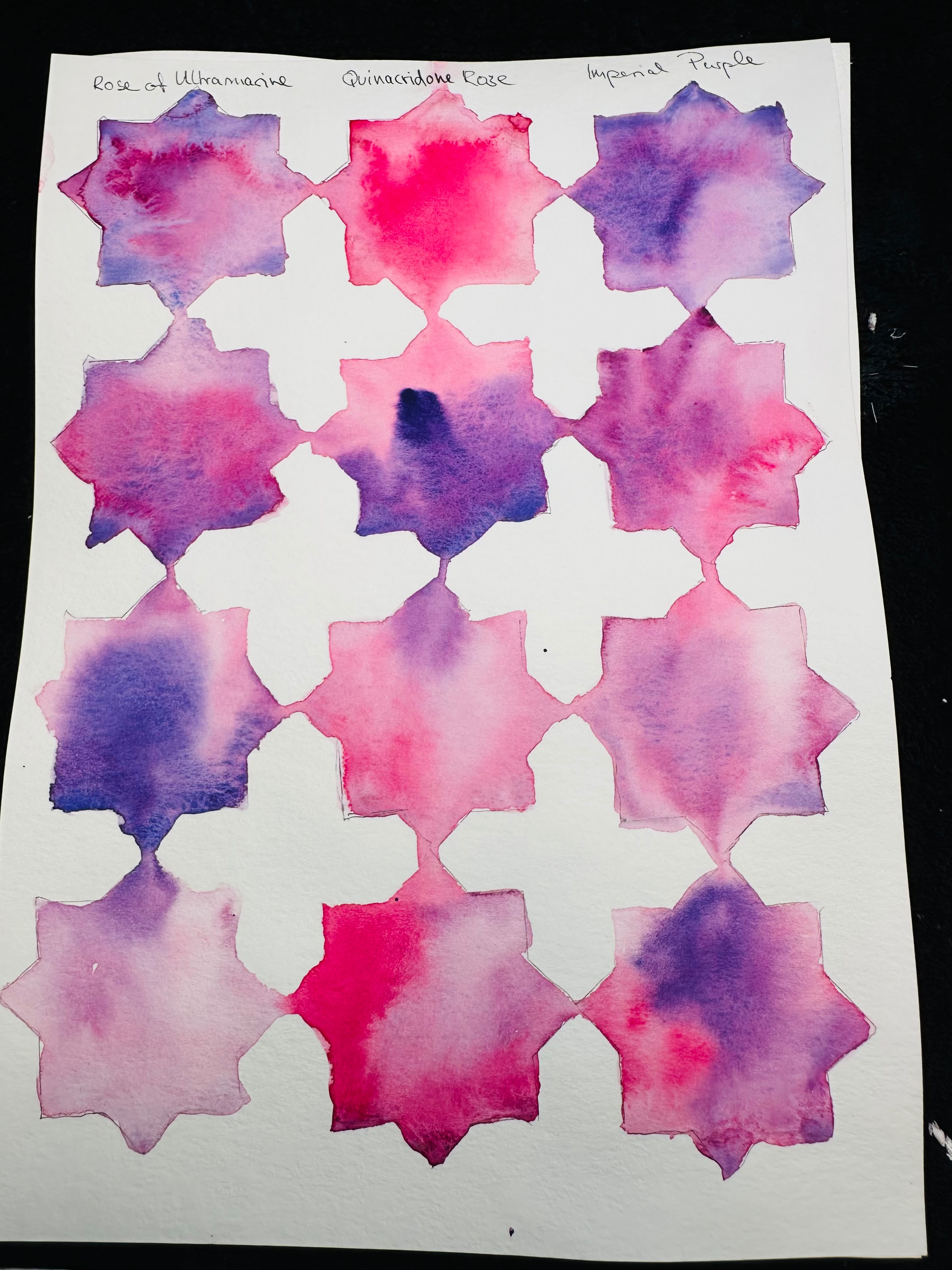
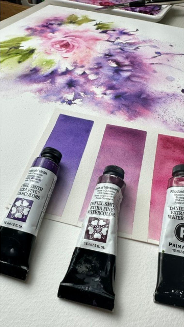
One of my favorite harmonious color combinations is Sắc xanh mangan, Indanthrone Blue, Tím Hoàng Gia, Xanh coban tím, Và Hoa hồng Quinacridone.
I used this combination in my Violet Iris, and it is a palette I particularly love because of the way these colors interact and flow into one another on the paper.
For me, one of the most beautiful aspects of working with harmonious colors in watercolor is what happens when they meet. The transitions and fusions feel very natural and pleasing to the eye. There is a sense of beauty in watching one color gradually become another while still allowing each pigment to preserve its own character.
What makes this particular combination even more interesting to me is that the harmony goes beyond the colors themselves. The characteristics of the pigments — their transparency, movement, and the way they behave on the paper — work beautifully together, helping me preserve the luminosity that I value so much in watercolor.
This combination moves naturally through turquoise, blue, and violet, creating a continuous flow of color. To me, this brings a sense of calm and well-being to the painting. These colors are beautiful to observe, but they are also beautiful to paint — and I think that feeling becomes part of the finished work.
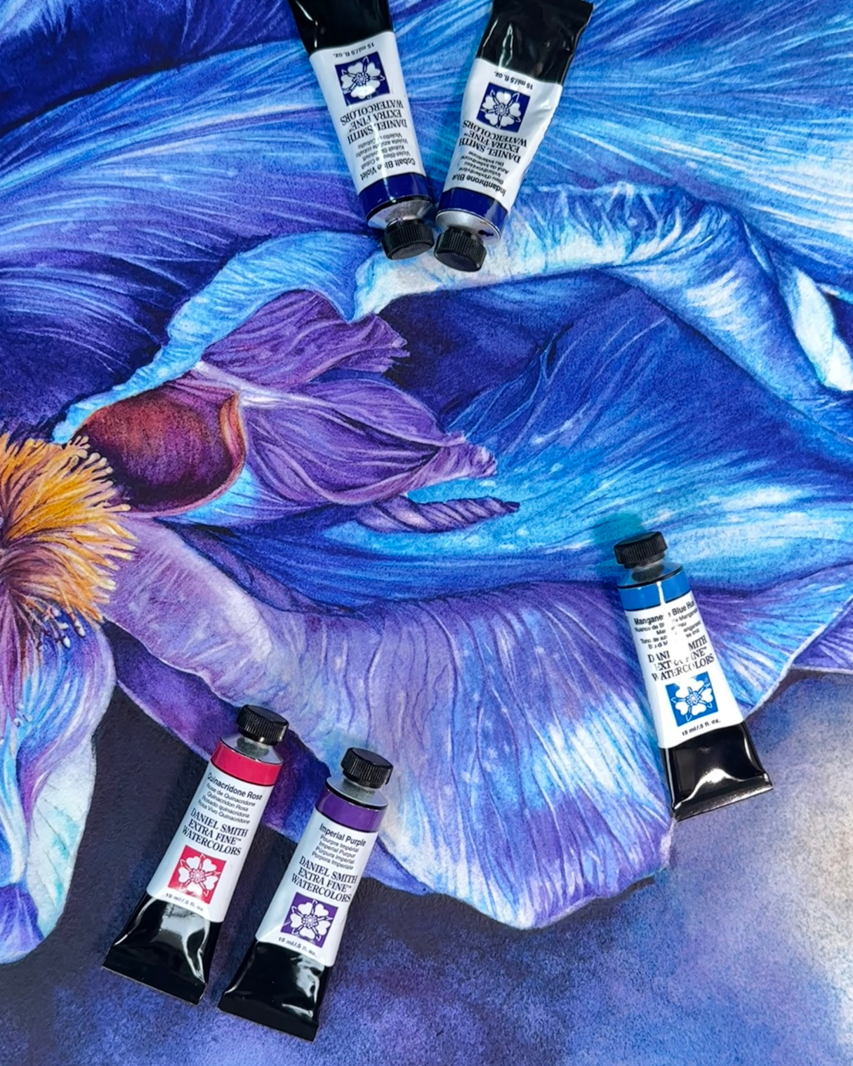
Artwork by Silvia Trad
What harmonious DANIEL SMITH color combination will you discover next?
Ultimately, creating color harmony is about discovering combinations that speak to you. With the incredible range of DANIEL SMITH Watercolors—from vibrant classics and beautifully granulating colors to unique PrimaTek® colors —there are endless possibilities to explore. Mix, layer, and experiment, and let the colors surprise you along the way.
Giới thiệu về các Đại sứ thương hiệu

Buffy Kaufman
Sinh ra và lớn lên ở miền Nam California, Buffy Kaufman Cô tạo ra những tác phẩm màu nước đầy cuốn hút thông qua việc lựa chọn màu sắc thú vị và kỹ thuật tinh tế. Phong cách độc đáo của cô ấy bao hàm sự ngẫu hứng và trừu tượng, tạo nên những tác phẩm sống động, tràn đầy chuyển động, cảm xúc và màu sắc nhiều lớp. Lấy cảm hứng từ thế giới tự nhiên, cô sử dụng các sắc thái cách điệu, hình dạng biểu cảm và sự tương tác giữa không gian dương và âm để hiện thực hóa tầm nhìn của mình. Trong giai đoạn này của cuộc đời, cô đã tìm thấy những điều tốt đẹp mà nghệ thuật mang lại cho cộng đồng. Cô là Thành viên Danh dự của Hiệp hội Màu nước Louisiana và Hội Phụ nữ trong Nghệ thuật Màu nước.

Martha Gómez-Silva
Martha Gómez-Silva (Còn được biết đến với tên Marty) là một nhà quản lý khách sạn chuyên nghiệp đến từ Peru. Cô bắt đầu tổ chức các lớp học vẽ trực tuyến vào năm 2020 trong thời gian phong tỏa do đại dịch. Kể từ đó, cô đã xây dựng được một lượng người theo dõi đáng kể gồm những nghệ sĩ mới nổi có cùng chí hướng trên mạng xã hội.

Sabine Dreher
Sabine Dreher grew up near Kaiserslautern, Rhineland-Palatinate in Germany and discovered her passion for painting at an early age. In 1998, she began her artistic training at the Hochschule der Bildenden Künste college. At the same time, she continued her arts education by attending numerous workshops with well-known artists in Germany, Austria and the USA. Since 2001, she has been teaching international watercolor workshops in Switzerland, Germany and Italy. She now lives and works in Switzerland.

Silvia Trad
“The fluidity of water inspires my intuition, my creativity and my adaptation to life. As the water runs through the paper, the pigment works its magic to form what my imagination is looking for. I seek knowledge, balance and serenity and that is what I want to record in my work.
I love painting fruits, flowers, landscapes, and everything that brings me a feeling of vitality, such as colors, texture and often even the aroma.” – Silvia Trad
Bài viết liên quan
Không tìm thấy gì