Letzte Woche haben wir offiziell enthüllt 6 brillante neue Farben für 2025Heute werden wir diese fabelhaften Neuzugänge unserer Extra Fine Watercolor-Kollektion genauer unter die Lupe nehmen! (Damit umfasst unser Sortiment übrigens nun insgesamt 272 fantastische Aquarellfarben!)
Sie können unsere aktualisierte Broschüre und Farbtabelle herunterladen. HIER!

Diese tollen neuen Farben, die in 15-ml-Tuben erhältlich sind, sind Jaune Brilliant Nr. 1, Jaune Brilliant Nr. 2, Korallenriff, Erdiges rotes Licht, Manganviolett, Und Tiefes Kobaltgrün. Sie können auf jeden Farbnamen klicken, um die Farbbeschreibung und die Pigmentinformationen für jede Farbe anzuzeigen!
Um die einzelnen Farben zu untersuchen, wurden sie aus der Tube in volle Näpfchen gedrückt und jeweils ein großzügiger Klecks davon auf eine Keramikpalette gegeben. Die Näpfchen ließ man dann über Nacht trocknen.


Sie sehen aus wie Bonbons!


Um die Farbe sowohl in ihrer reinen Farbe als auch verdünnt mit Wasser zu präsentieren, wurde jede Farbe locker auf ein Blatt kaltgepresstes Baumwoll-Aquarellpapier aufgetragen.

Alternativ wurde ein kleineres Muster auf Papier mit einer etwas raueren Textur angefertigt.

Es ist interessant zu beobachten, wie sich die Farbe auf verschiedenen Papierstrukturen unterschiedlich verhält!
Um die Deckkraft zu demonstrieren, wurde jede Farbe anschließend über wasserfeste schwarze Tinte aufgetragen.

Zu jeder Farbe wurde eine Komplementärfarbe ausgewählt, die Sie direkt unter dem Deckkraft-Farbmuster sehen werden, wenn wir die einzelnen Aquarellfarben genauer betrachten!
Im letzten Schritt werden alle Farben miteinander vermischt, um die entstehenden Farbmischungen zu entdecken. Es erwarten Sie Überraschungen!

Vor diesem Hintergrund wollen wir uns nun mit jeder einzelnen Farbe genauer befassen und sie besser kennenlernen!
Jaune Brilliant Nr. 1

“Jaune Brilliant Nr. 1 Diese halbtransparente, nicht färbende und nicht granulierende Farbe mit exzellenter Lichtechtheit ist wie Sonnenlicht aus der Tube. Sie eignet sich hervorragend für Himmelslandschaften und Blumen-/Gartenbilder. Perfekt für die Gestaltung von Lichtern und Negativtechniken. Eine Bereicherung für jede Palette.”
Pigment: PY 65, PW 6 | Serie: 1, Lichtechtheit: Ausgezeichnet, Transparenz: Halbtransparent, Färbewirkung: Nicht färbend, Granulierung: Nicht granulierend


Das ist so eine leuchtende und fröhliche Farbe! Sie ist wunderbar cremig, egal ob man sie direkt aus der Tube verwendet oder aus eingetrockneter Farbe in einem Farbnapf reaktiviert!
Es verleiht jeder Farbe, mit der es sich mischt, einen Hauch von Sonnenschein! Es passt auch hervorragend zu … Glyzinie!


Jaune Brilliant Nr. 2

“Jaune Brilliant Nr. 2 Diese Farbe ist nicht färbend, nicht granulierend und halbtransparent. Der helle Pfirsichton tendiert zu Orange und erinnert an ein Eis am Stiel an einem Sommertag. Sie eignet sich hervorragend für Sonnenaufgangs- oder Sonnenuntergangsdarstellungen. Auch als Akzentfarbe oder in Negativmalerei-Techniken ist sie vielseitig einsetzbar. Mit dieser Farbe zu arbeiten, ist ein Vergnügen.”
Pigment: PO 62, PW 6 | Serie: 1, Lichtechtheit: Ausgezeichnet, Transparenz: Halbtransparent, Färbewirkung: Nicht färbend, Granulierung: Nicht granulierend


Dieser köstliche pfirsichfarbene Orangeton ist unvergleichlich und erinnert an Zirkus-Erdnüsse, traumhafte Eis am Stiel, spritzige Starburst-Bonbons oder edle Macarons! Nostalgie pur in der Tube!
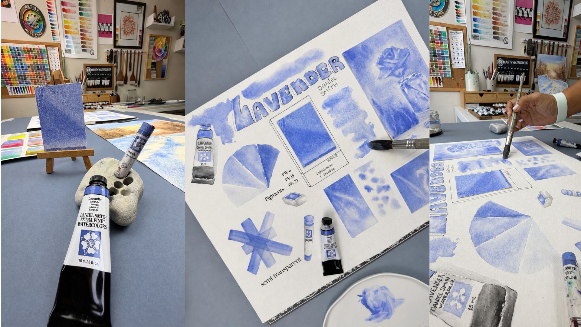
Lavendel Ergibt eine wunderschöne blau-violette Komplementärfarbe! Das ist eine fabelhafte Ergänzung für jede Farbpalette!
Korallenriff

“Korallenriff Es ist ein helles Rosa, halbtransparent, nicht färbend und mit ausgezeichneter Lichtechtheit. Was für eine fröhliche Farbe! Ideal für Blumenmotive. Sie erinnert an Flamingos, Garnelen und Muscheln. Kombiniert mit Kobaltblau-Türkis weckt sie Assoziationen an sonnige Karibikurlaube.”
Pigment: PO 73, PW 6 | Serie: 1, Lichtechtheit: Ausgezeichnet, Transparenz: Halbtransparent, Färbewirkung: Nicht färbend, Granulierung: Nicht granulierend

Dieses herrlich verträumte Rosa ist wie ein Hauch von Magie! Es harmoniert perfekt mit den ersten beiden Farben in einem zuckersüßen Trio!

Kobaltblau Und dieses spritzige Rosa bildet das ultimative dynamische Duo!


Erdiges rotes Licht
“Erdiges Hellrot Es handelt sich um eine einpigmentige, nicht färbende, granulierende, halbtransparente Farbe mit ausgezeichneter Lichtechtheit. Dieser Farbton entführt Sie in sonnige, rote Felslandschaften. Das helle Rot mit orangenen Nuancen eignet sich hervorragend für die Malerei fröhlicher Blumenmotive. Es gehört auf jede Palette.”
Pigment: PR 290 | Serie: 2, Lichtechtheit: Ausgezeichnet, Transparenz: Halbtransparent, Färbefähigkeit: Geringe Färbefähigkeit, Granulierung: Granulierend
Das ist ein atemberaubendes, erdiges Rot, das Ihnen den Atem rauben wird. Kein gewöhnlicher Erdton!


Dieses einzigartige Rot erinnert an die roten Felsen der Wüste, Sonnenuntergänge im Südwesten und die Textur der Rinde von Redwood-Bäumen. Die Art, wie es sich mit anderen Farben vermischt, ist ein wahrer Augenschmaus. Die rötliche Körnung verleiht jeder Farbe zusätzliche Struktur!
Es bildet einen auffälligen Kontrast zu Türkis, insbesondere Echter Sleeping Beauty Türkis!
Manganviolett

“Manganviolett Manganviolett ist ein atemberaubendes, einfarbiges Violett, das sich wunderbar mit anderen Farben mischen lässt. Es färbt nur schwach und ist halbtransparent, wodurch sich leuchtende, malvenfarbene Lasuren erzielen lassen. Die wunderschöne Granulierung macht es zu einem ausdrucksstarken Werkzeug für die Malerei tiefer, üppiger Blumenlandschaften. Sie befinden sich in bester Künstlergesellschaft – Manganviolett war ein fester Bestandteil der Palette von Claude Monet.”
Pigment: PV 16 | Serie: 3, Lichtechtheit: Ausgezeichnet, Transparenz: Halbtransparent, Färbefähigkeit: Geringe Färbefähigkeit, Granulierung: Granulierend


Tiefes Kobaltgrün

“Tiefes Kobaltgrün ist eine halbtransparente, einfarbige Farbe, die sich hervorragend für die Darstellung tiefer Waldlandschaften eignet. Sie lässt sich mühelos mit anderen Farben mischen – probieren Sie sie zum Beispiel mit Neutral Tint oder Indigo für faszinierende Effekte an Meer und Himmel. Die granulierenden Eigenschaften von Cobalt Green Deep verleihen Ihren Gemälden Tiefe und Lebendigkeit.”
Pigment: PG 26 | Serie: 2, Lichtechtheit: Ausgezeichnet, Transparenz: Halbtransparent, Färbefähigkeit: Geringe Färbefähigkeit, Granulierung: Granulierend


Der Weg Echter Granat Der Kontrast zu diesem satten, strukturierten Grün weckt Erinnerungen an die Weihnachtszeit.

Dieses Grün ist der absolute Star unter den Farbkombinationen! Schau dir nur diese Möglichkeiten an! Ein Muss für jede Landschaftsgestaltung! Ein einzigartiger, tiefer und kühler Grünton – unvergleichlich mit allen anderen Grüntönen der Daniel Smith Kollektion!

Vielen Dank, dass Sie dieses Entdeckungsabenteuer mit uns unternommen haben!
Diese sechs Farben sind eine wundervolle und einzigartige Ergänzung der Daniel Smith Aquarellfarben und werden Ihre Palette garantiert aufpeppen! Jede einzelne ist ein strahlender Genuss und wartet nur darauf, in Ihrem nächsten Meisterwerk für Furore zu sorgen! Erkundigen Sie sich in den nächsten Wochen und Monaten bei Ihrem bevorzugten Händler nach der Verfügbarkeit!