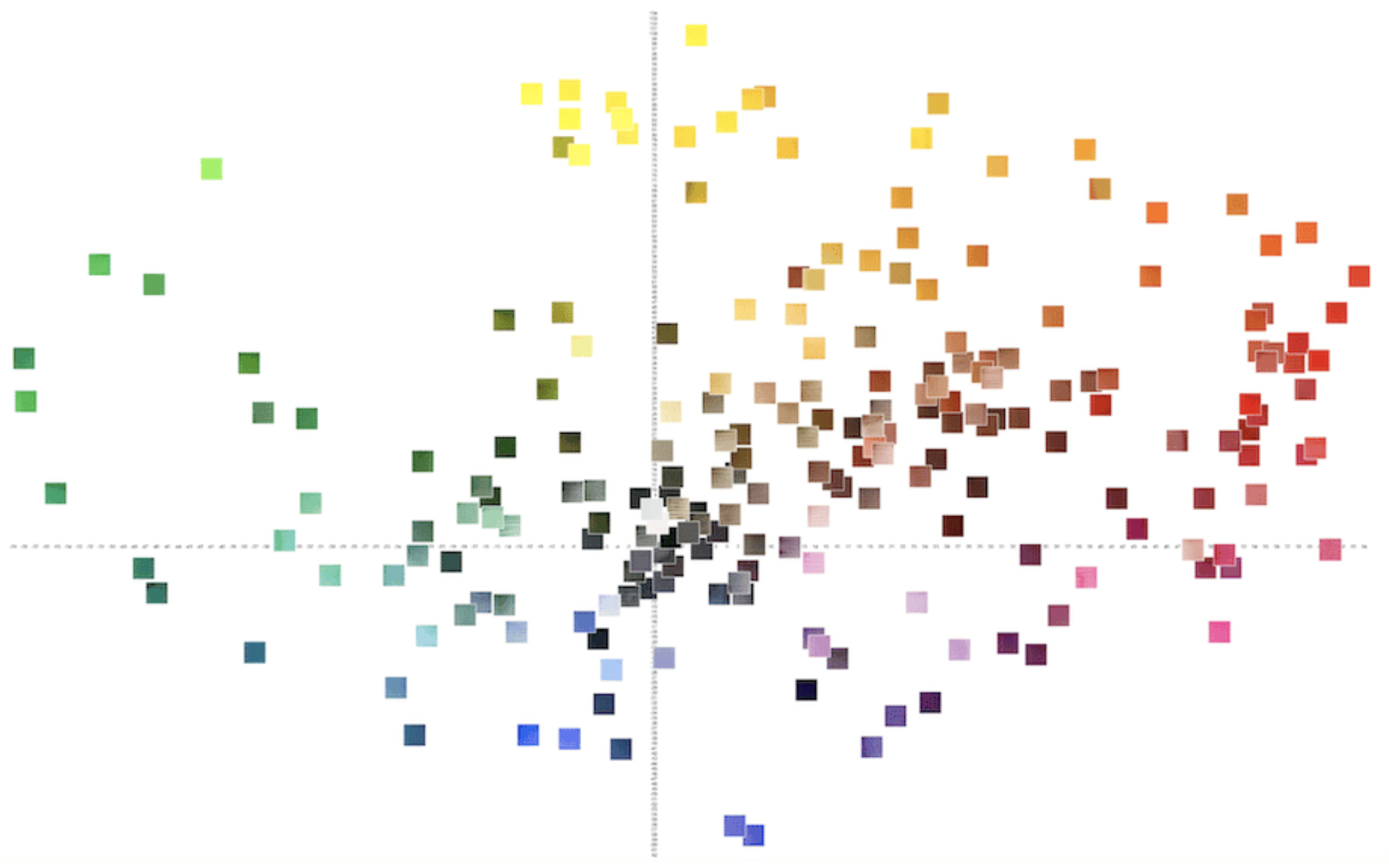
When flowers are in bloom and produce markets are bountiful – that’s the time to bring out your brilliant yellows, fiery oranges and bright reds to paint the colors of summer. In this Thursday Live presentation on Zoom, John shows us how to use a CIELab graph to plot and compare similar colors. The graph’s horizontal axis represents colors from red to green, and its vertical axis represents yellow to blue. Each of the DANIEL SMITH watercolors falls into one of the four quadrants on the graph.
點擊此處了解更多信息 about CIELab and how to use our interactive 顏色圖 to compare your favorite hues.