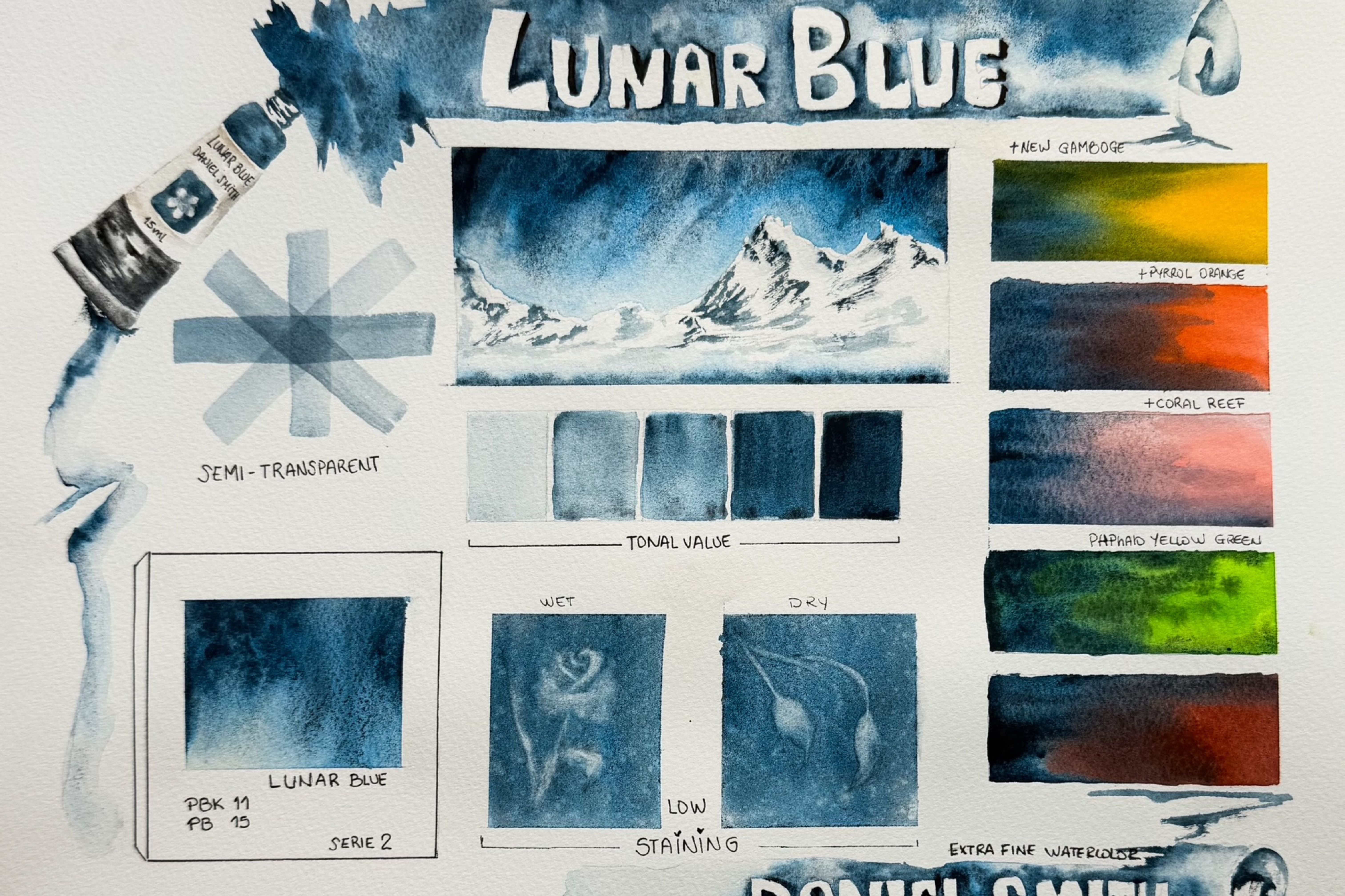
Phthalo Turquoise; One of my favorite colors from DANIEL SMITH because of how powerful it is. I love that it can create almost transparent washes, and then, with the next brushstroke, a strong, intense color that’s difficult to lift.

Yes, Phthalo Turquoise is a deep blue-green pigment with a reddish undertone, intense, vibrant, and very popular among watercolorists around the world.
Ideal for flowers, backgrounds, and skies. It has the perfect darkness of an aurora borealis.


- It’s a Phthalo pigment, which means it’s very intense and highly transparent.
- It has a bright, fresh blue-green hue.
- It’s highly pigmented, so it’s recommended to use it sparingly.
- It’s a lightfast pigment, meaning it won’t fade over time.
(Lightfastness I = Excellent.) - High staining: I did a test with the wet pigment and it does not lift completely.
It does not granulate, which is why I decided to try a salt effect with it—look at the beauty you can achieve.

- It’s similar to Phthalo Blue Turquoise, but with a greener tone.
- It’s more intense and vibrant than Viridian green.
- It’s more transparent than Chromium Green Oxide.
Favorite combinations


- With Jaune Brilliant No 1: creates a beautiful, fresh, natural green.

- With Alizarin Crimson: creates an interesting, vibrant contrast.
- With earth tones: adds depth and warmth to your mixes.

- With Titanium White: creates a misty or atmospheric effect.


- Use a soft, damp brush to apply the pigment.


- Adjust the water ratio to control color intensity.
- Experiment with different techniques, such as washes or layering, to achieve interesting effects.
I hope you find this information useful. Enjoy experimenting with Phthalo Turquoise.

About Martha ‘Marty’ Gomez-Silva

Martha Gómez-Silva (also known as Marty) is a professional hotel administrator from Peru. She started taking online painting workshops in 2020 during the pandemic lockdown. Since then, she has built a significant following of like-minded emergent artists on social media.