In watercolor, undertone is defined as how a color looks with diluted with water – as compared to mass tone, which is the color at full strength. Undertone can also refer to a color that is underneath or seen through another color.
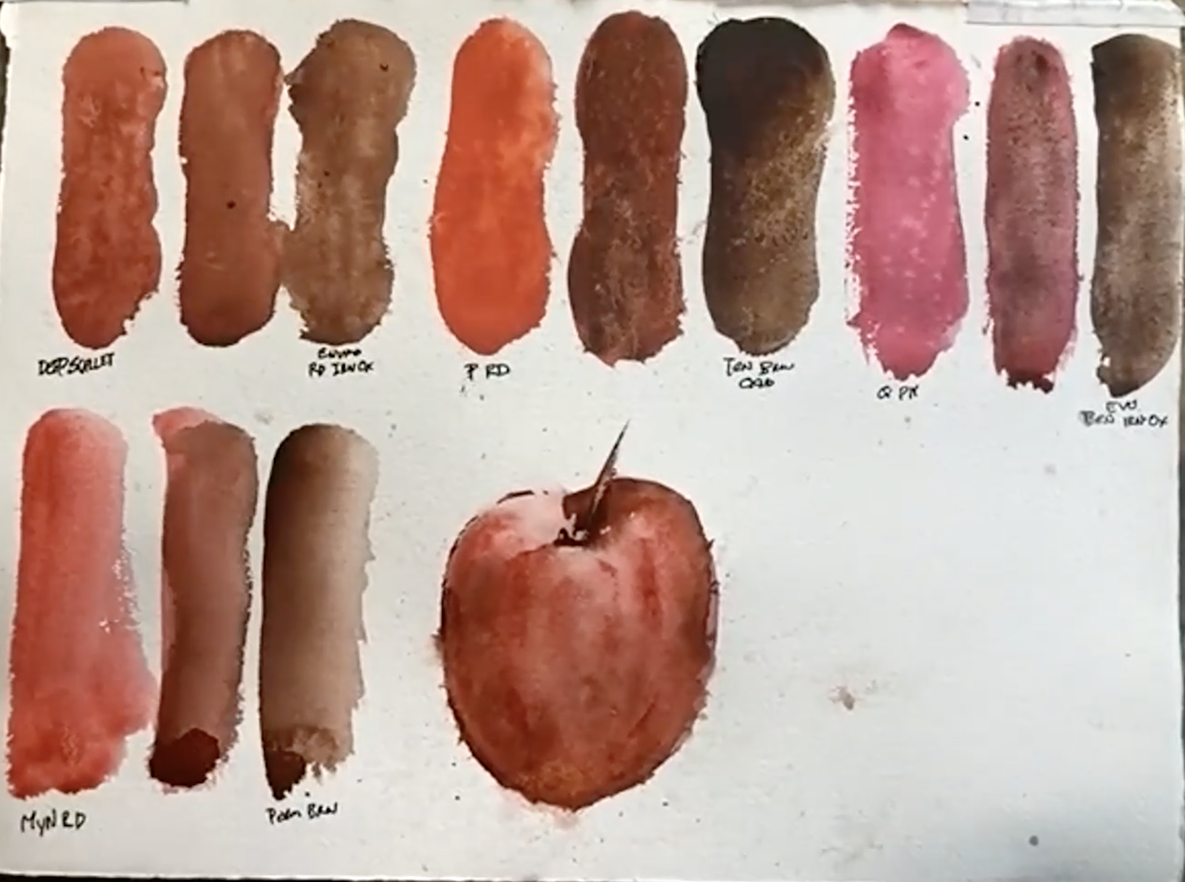
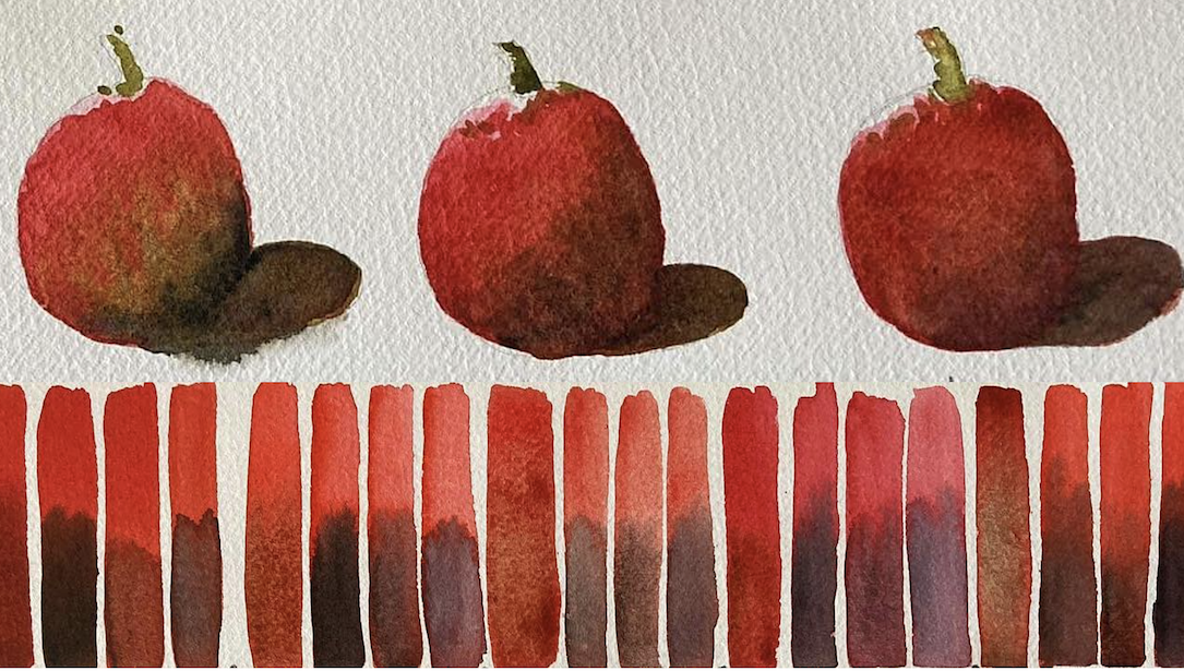
In a recent Thursday Live zoom session, Brand Ambassador Giovanni Balzarani shared his experimentation with comparing blends for a selection of his favorite red watercolors, using complementary browns plus three different blacks – to create natural looking undertones and shadows. He also referred back to an earlier session where he used the same group of reds to blend with complementary greens.
When asked how he chose a complementary brown for each of his reds, Gio said, “First I read about the colors’ characteristics and note where their pigments fall on the color wheel. Then I choose specific complementary colors that reflect my personal perception.”
These are the color groups that Giovanni worked with – the first two groups are shown in the top video excerpt:
- Cadmium Red Scarlet Hue, Burnt Sienna, Phthalo Yellow Green
- Organic Vermilion, Italian Burnt Sienna, Green Gold
- Mayan Orange, Terre Ercolano, Olive Green
- Quinacridone Coral, Pompeii Red, Spring Green
- Pyrrol Scarlet, German Greenish Raw Umber, Permanent Green Light
- Perylene Scarlet, Raw Umber, Sap Green
- Anthraquinoid Scarlet, Raw Umber Violet, Permanent Green
- Cadmium Red Medium, Burnt Umber, Cobalt Green
- Pyrrol Red, Sepia (no green)
- Perylene Red, Van Dyck Brown, Viridian
His three blacks used for each group are Lamp Black, Ivory Black and Neutral Tint.
In the bottom video, watch him paint a simple tomato with the colors in group 3, then he shows how each different black looks in the shadows.

We encourage artists to paint along with us during out Thursday Lives! Gabriel Stockton experimented with these four color groups:

Caroline Deeble shared her experience with reds: “I don’t use much pure red in my work, but I do use it to blend. Quinacridone Coral is my absolute go-to favorite. I also like working with Perylene Scarlet because it’s deep and rich – plus it can be brightened with Quinacridone Gold or dulled with Neutral Tint. There are so many beautiful reds that look similar at first, but then you realize how different each one is when you start mixing. It’s a great exercise to play and discover all the variations.”

••••••••••••••••••••••••
Watch the full hour of demos here – enjoy!


