Share:
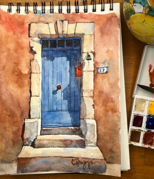
Discover how to capture light, shapes and shadows with transitional flowing colors and captivating values. In photos and video you can see how Cindy takes this Doorway in Provence, France and creates her own version in her traveling Watercolor Sketchbook using the DANIEL SMITH Ultimate Mixing Hand Poured Watercolor Half Pan Set of 15 colors.

Cindy Briggs’ set up for painting her Provence Doorway Sketchbook painting
Why this subject? I’m drawn to the windows and doors, colorful textured walls and stonework of places like this in Provence and Tuscany. They are so inviting to paint. It’s fun when I’m painting someone’s doorway and the owners come out to say hello. Often the painting stays with the owner and I find another doorway to paint. When DANIEL SMITH sent me this new set of watercolors, I really enjoyed working with some of my (included) traditional colors, and adding new ones like Indian Red, Goethite (Brown Ochre), Pyrrol Scarlet and Jane’s Grey – colors I may continue to use in my Master set. This demonstration was filmed in my studio in Utah after being inspired from my recent Make Every Day A Painting workshop in Provence, France. I actually had photographed the doorway in the village of Goult, during one of my many excursions when I lived in Provence.

1. Choose your subject.
I was drawn to this doorway as a great subject to show you how I use the select set of colors in the DANIEL SMITH Ultimate Mixing Hand Poured Watercolor Half Pan Set. You may notice in my drawing how I eliminate unnecessary details and only focus on the main subject matter.

Doorway drawing.
2. Draw with flowing lines.
In my 140lb watercolor sketchbook I took my reference photo and folded it in half to get my reference points for sizing, I demonstrate how I do that in my video further below. Then freehand I drew with a continuous contour line for more organic free flowing lines and shapes. I use a mechanical pencil and keep my lines light. I made sure I drew in the shadow shapes and noted which steps were darker. I used masking fluid on the doorknob, house number tile, and bell string.

Mingled Colors Wet on Dry.
3. First Wash of Mixed and Mingled Colors on Dry Paper.
I started with mixed and mingled colors wet-on-dry paper for the wall colors, often using the side of my brush for larger brush strokes and letting the mix and mingle on the page. I place a variety of mostly warm colors and a few cool colors randomly next to each other and let them mingle – don’t get too concerned about the way the paint settles, you can add more texture or minimize later. Tip: Be sure to paint quickly so your colors mingle & blend – if you take too long the paint dries and you end up with hard edge lines instead of blended color.
The wall colors used here are:
- Warm Colors: Burnt Sienna, Indian Red, Goethite (Brown Ochre), Pyrrol Scarlet.
- Cool Colors: Cerulean Blue, Chromium, Ultramarine Blue.
- Mailbox: Mix Hansa Yellow Medium with Pyrrol Scarlet to make an orange.

Adding blue
4. Paint the Blue Door.
I can paint the blue door next because it does not touch the wet walls. I used Cerulean Blue, Chromium and Ultramarine Blue on the door and let the two colors mingle on the page. The key is to remember you are painting the sunlit value of the door.

Painting in stones and shadows
5. Stones & Shadows.
Stones around the doorway: The perfect color for the stonework is the Buff Titanium. Sometimes I’ll add a little Hansa Yellow Medium to warm it up. While painting around the doorway I also drop in a touch of Ultramarine Blue and Burnt Sienna to vary the subtle colors. I also added shadows on the stones around the door.
Shadow on the Door. Photographs make shadows much blacker than they are. The shadow is usually related to the subject it is on. In this case I used a darker mix of my Ultramarine Blue and Cerulean Blue, Chromium and a touch of Jane’s Grey, then added a touch of the orange I mixed for reflective light from the mailbox. I also added the shadow from the doorknob.
Shadow on the Steps: This is where I had fun with warm and mostly cool colors in the shadow shapes, sticking with my color scheme. I added Jane’s Grey to the mix.

Adding details.
6. Beauty in the details.
You’ll also notice that I’ve blended some of the colors around the doorway. I blend with a wet brush and soften some of the hard edges. I’ve made the base of the wall darker and added color to the steps.
Around the edges of the stonework I add calligraphic lines with the fine point of my quill brush using the blues and browns. Then I added the linework on the doors – notice how the base of the door is darker. Also, the glass windows are dark with Blues and Burnt Sienna. My mailbox has light, shapes and shadows on it to make it look more three-dimensional.

Finesse & finish.
7. Finesse & Finish.
After removing the masking fluid on the doorknob, number tile, and bell string I painted those in and then added more depth to some of my shadows and line work. This was really fun to paint with my small Ultimate Mixing Set in the handy Travel Case.

“Provence Doorway” – Village of the Luberon, Watercolor Sketchbook by Cindy Briggs.
To see how I approached this painting from Start to Finish – please watch the video below:
Why I choose DANIEL SMITH Extra Fine Watercolors:
I admit I’ve tried other watercolors brands over the years and have eliminated all of them from my palette which for years has been 100% DANIEL SMITH Extra Fine Watercolors. I appreciate the quality and consistency of colors, the incredible and evolving unique range of color choices, especially in the natural earth hues.
I always recommend DANIEL SMITH Extra Fine Watercolors to my students, it’s worth it to have the best!
DANIEL SMITH Ultimate Mixing Hand Poured Watercolor Half Pan Set of 15 colors.

The DANIEL SMITH Ultimate Mixing Hand Poured Watercolor Half Pan Set of 15 colors gives me a great range of colors for my travels. I’ve discovered that the less you carry the more you paint, so I’m excited about this new set and the small packaging.


