




수채화로, 저음 물에 희석했을 때 색이 어떻게 보이는지를 나타내는 것으로 정의됩니다. 대중적인 음색, 이는 색상이 가장 진하게 나타난 상태를 말합니다. 언더톤은 또한 다른 색상 아래에 있거나 다른 색상을 통해 보이는 색상을 의미하기도 합니다.
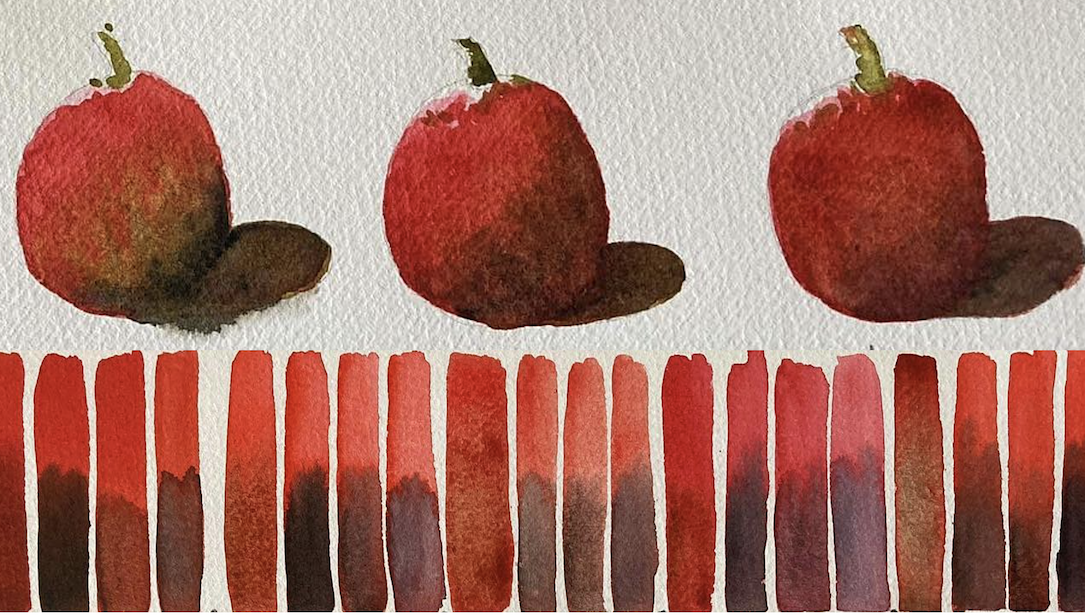
최근 목요일 라이브 줌 세션, 브랜드 앰배서더 조반니 발자라니 그는 자신이 가장 좋아하는 붉은색 수채 물감들을 조합해 보는 실험을 공유했는데, 자연스러운 언더톤과 그림자를 만들기 위해 보색 관계의 갈색과 세 가지 다른 검정색을 사용했다고 설명했습니다. 또한 그는 이전에 언급했던 내용들을 다시 언급했습니다. 이전 세션 그는 같은 붉은색 계열을 사용하여 보색 관계인 녹색과 조화를 이루도록 했습니다.
지오는 자신의 붉은색 계열 색상 각각에 어울리는 갈색 계열 색상을 어떻게 선택했느냐는 질문에 이렇게 답했다., “"먼저 각 색상의 특징을 살펴보고 색상환에서 해당 안료가 어디에 위치하는지 확인합니다. 그런 다음 제 개인적인 감각을 반영하는 특정 보색을 선택합니다."’
다음은 지오반니가 작업했던 색상 그룹입니다. 첫 번째와 두 번째 그룹은 위쪽 영상 발췌 부분에 나와 있습니다.
- 카드뮴 레드 스칼렛 색조, 번트 시에나, 프탈로 옐로우 그린
- 유기농 주홍색, 이탈리안 번트 시에나, 녹색 금
- 마야 오렌지, 테레 에르콜라노, 올리브 그린
- 퀴나크리돈 산호, 폼페이 레드, 봄 녹색
- 피롤 스칼렛, 독일산 녹색빛이 도는 생엄버, 상시 녹색 신호등
- 페릴렌 스칼렛, 로우 엄버, 수액 녹색
- 안트라퀴노이드 스칼렛, 생엄버 바이올렛, 영구적인 녹색
- 카드뮴 레드 미디엄, 번트 엄버, 코발트 그린
- 피롤 레드, 세피아 (녹색 없음)
- 페릴렌 레드, 반 다이크 브라운, 비리디안
그가 각 그룹에 사용한 세 명의 흑인은 다음과 같습니다. 램프 블랙, 아이보리 블랙 그리고 중성 색조.
아래 영상에서 그는 3번 그룹의 색상으로 간단한 토마토를 칠한 다음, 각기 다른 검은색이 그림자에서 어떻게 보이는지 보여줍니다.

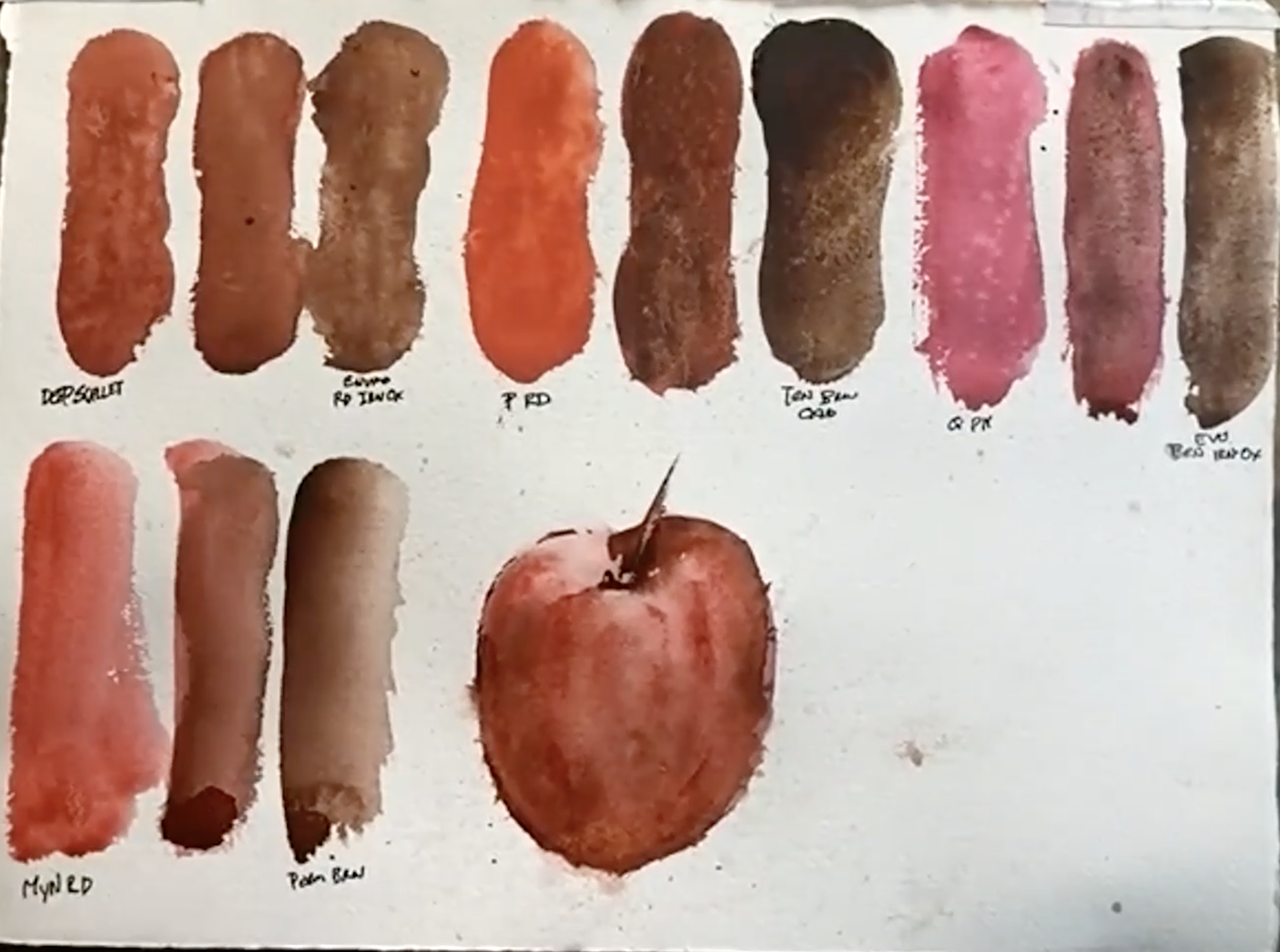
저희는 매주 목요일 라이브 방송 중에 아티스트분들이 함께 그림을 그리시도록 권장합니다! 가브리엘 스톡턴 다음 네 가지 색상 그룹을 사용하여 실험했습니다.
- 딥 스칼렛 그리고 엔비로 레드 산화철
- 피롤 스칼렛 그리고 투명 갈색 산화물
- 퀴나크리돈 핑크 그리고 엔비로 브라운 산화철
- 마야 레드 그리고 영구 갈색
캐롤라인 디블 그녀는 빨간색에 대한 자신의 경험을 공유했습니다. “"저는 제 작품에 순수한 붉은색을 많이 사용하지는 않지만, 색을 섞을 때 사용합니다.". 퀴나크리돈 산호 제가 가장 좋아하는 제품입니다. 함께 일하는 것도 좋아합니다. 페릴렌 스칼렛 깊고 풍부한 맛을 가지고 있기 때문이며, 또한 밝게 만들 수도 있습니다. 퀴나크리돈 골드 또는 ~로 인해 무뎌짐 중성 색조. 처음엔 비슷해 보이는 아름다운 붉은색들이 정말 많지만, 섞어보면 각각 얼마나 다른지 알게 돼요. 다양한 색조를 만들어내고 발견하는 건 정말 즐거운 경험이죠.”

••••••••••••••••••••••••
한 시간 분량의 데모 영상을 여기에서 모두 시청하세요 – 즐거운 시간 보내세요!