These three colors come from our recent release of Six new colors for 2025! Today, we’ll focus on this trio of delightful candy-licious colors and delve into them a little deeper!

Each of these special DANIEL SMITH Extra Fine Watercolors has the addition of a white pigment, making them semi-transparent and extra creamy. You can learn more about opacity and transparency HERE.

Jaune Brilliant No. 1, Jaune Brilliant No. 2, and Coral Reef are the stars of the show today! We will compare and showcase them side-by-side, as they look absolutely delicious together! (But please, do NOT eat the paint!)


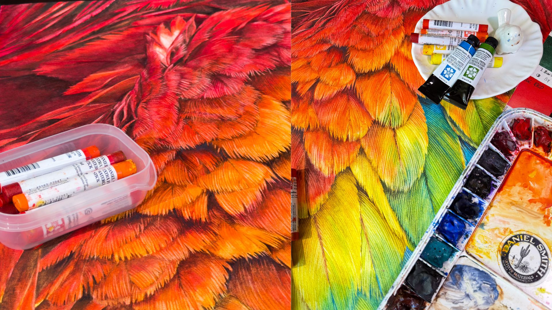
For this demonstration, each paint color was squeezed from the tube into a full pan and added to a dish with a brush. The pans were allowed to dry for several days prior to use. The re-wettability of these colors is fantastic! They transform from dry paint to a wet and creamy consistency in just a matter of seconds, with just a swirl from a wet brush!

Jaune Brilliant No. 1 and Jaune Brilliant No. 2 pair up perfectly, so bright and sunny!


Jaune Brilliant No. 1 contains a yellow pigment (PY 65) and Jaune Brilliant No. 2 showcases an orange pigment, (PO 62) both with PW 6 white pigment added.

Coral Reef also has an orange pigment (PO 73) and the same white addition. These pastel hues add a warm and happy POP to any watercolor painting! All three have excellent lightfastness and are non-staining and non-granulating.


Brand Ambassador Giovanni Balzarani chimes in with his experience using these semi-transparent colors:
“The semi-transparency allows for the application of both light and opaque glazes, making it ideal when I need to cover with just a small amount of paint. The addition of Titanium White (PW6) helps with creating light luminous effects (bright spots).
With Jaune Brilliant No.1 and No. 2, you can do a lot of combinations with complementary colors like violets and browns. Jaune Brilliant No. 2 goes into the range of a sunny skin tone, as a base for sunny tan skin, and it can be used instead of Naples Yellow.
Coral Reef is a perfect base for skin tones and flowers.”

The colors can be used full strength as finishing touches or watered down for a glowing underpainting. The possibilities are endless! Artist and Ambassador Sabine Dreher says:
“I use Jaune Brilliant No. 1 to put something in the background. As it is a very friendly sunny color, it is also very good to bring light into darkness. For example, with flowers, if I have 5 blossoms but want to emphasize 3, I can cover the remaining 2 with Jaune Brilliant No. 1. As a result, the other 3 automatically come forward.”


The application is so rich and pigmented, and the colors play so well together, whether on paper or palette!


As these new colors start to reach retailers and make their way into the hands of artists and hobbyists alike, we eagerly anticipate the creative and unique ways they will be utilized! How will you apply them to your distinct style?

Happy Valentine’s Day from all of us at Daniel Smith!