Flowers are one of my favorite subjects to paint – along with horses, portraits and abstracts. When I am watering the garden and see a flower that inspires me, I grab my phone and take many photos of it. I love spring time, when you can see from one day to the next how flowers appear and change over time. I keep tons of photos to choose from when it comes time to single one out to paint.

Pink Peonies
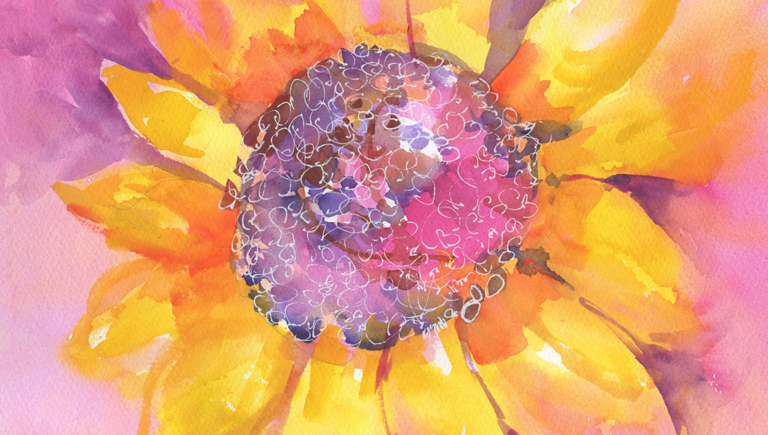
Choosing a subject is the first step in producing a painting. What is important is to be conscious of why you are choosing it – it’s the story that you want to tell. From there, you choose the path you are going to follow – what is the focal point, what do I want to focus on. For example, in this painting of peonies, I was attracted by the delicacy of the flower and the contrasts and texture of it, so I focused on expressing that.
I only draw the areas where color and values change, and then apply DANIEL SMITH Masking Fluid to keep my whites pristine. While the masking is drying, I choose my colors. In my mind, I have the tonal value sketch. Sometimes I draw it to see if it works. Sometimes I switch my reference photo from color to black and white. Does it have enough contrast, movement, balance, etc.?
Next it’s very important to choose the right colors! I love color, so I cannot be on the 12-color palette team, I like to play and test all colors out there. You can go with single pigments or you can mix your own colors. I try to use both, but most important is always having both warm and cool colors ready. If I am choosing a pink or red, I always include a warm pink and cool pink, a warm red and cool red. In this example, I have warm and cool versions of blues, greens and yellows. This helps you with depth to get a 3D effect in the painting.

The colors I chose for painting a calla lily were Mayan Yellow, Quinacridone Gold, Quinacridone Burnt Orange, French Ultramarine, Phthalo Blue (GS), Mayan Dark Blue, Cobalt Violet and Payne’s Blue Gray, and a little bit of Permanent Alizarin Crimson.
Remember in this case, texture was important for me, so I chose French Ultramarine because it’s a granulating color. All my colors are transparent except Payne’s Blue Gray which is semi-transparent. I used table salt to add texture in the yellows.


Detail showing the addition of salt on the wet areas, which leaves texture behind after it dries.
I’m painting on a canvas with a foundation of DANIEL SMITH Watercolor Ground in Titanium White. As the ground surface can be delicate, strong rubbing or scrubbing is not encouraged. I suggest you complete your initial drawing on paper, then transfer it to the canvas once you’re satisfied. I like to use water-soluble graphite pencils, as they disappear under the watercolor paint.


I start by wetting the areas I will work in, working wet on wet, adding more water with the spray bottle. I add the light colors in the first layer, first the yellows and letting them dry completely, and then I apply a glaze of light blues. If you don’t let the yellows dry, you’ll just end up with green, instead of seeing the yellow glowing through the blue. Then I let it dry completely again and I rub off the masking fluid. I continue with two or three more layers, every time letting the paper dry completely and then re-wetting it. For the final details, I work dry on wet.
It is important to lay bright colors under the darks, in this case yellows and bright greens, to make the darks glow. At the end, paint the shadows and the darkest darks. Then judge the values and stand back to see the whole painting, and ask yourself, does it need any adjustments?

Calla Lily
Here’s why I love DANIEL SMITH Watercolors. While looking for original and different colors, I encountered the DANIEL SMITH Extra Fine Watercolor series. With more than 250 colors to choose from, it was difficult at first to limit my selection and bring together a basic palette. The colors featured on my Dot Card allow me to create landscapes, portraits, flowers, abstract compositions and more. I can accomplish transparent and luminous artworks. The special intensity of the Mayan series revives the colors used by the Mayan culture to embellish murals and sculptures. Most of the colors included in my selection are transparent and very permanent; some granulate too.