In my watercolor painting, I always work in many layers. I use all approaches, from wet on wet to dry on dry, depending on the desired effects. The colors I have used in this tutorial are:
- New Gamboge A very fine transparent yellow, somehow staining, excellent for my underpainting and for giving warmth and light
- Mayan Yellow Transparent, excellent for sunlit areas
- Quinacridone Gold One of my favorites – granulating, rich, diffuses beautifully
- Raw Sienna and Burnt Sienna Standard colors in most artists’ palettes
- Piemontite Genuine An excellent granulating color used mainly for darker values and shadows, giving interest, warmth and depth
- Burnt Tigers Eye Genuine Rich granulating color, giving beautiful results when used wet on wet
- Hematite Genuine The granulating effects of this color are unique
- Imperial Purple Gives warmth and interest in shadows with very classy results
- Moonglow A fantastic transparent granulating color which I use in shadows and it gives a beautiful variety of colors when diffused
- Shadow Violet Excellent for use in shadows and beautiful in granulating effects
- Mayan Dark Blue Rich, warm dark color for deeper shadows and darker passages

Step 1
I prefer to start using some warm, yellowish underpainting. I used a combination of New Gamboge, Mayan Yellow, Raw Sienna AND Quinacridone Gold. I splashed water to create some texture.
I started building some mid-values by using Burnt Sienna, Burnt Tigers Eye and Imperial Purple. They are all excellent to give rich, warm and interesting mid values.
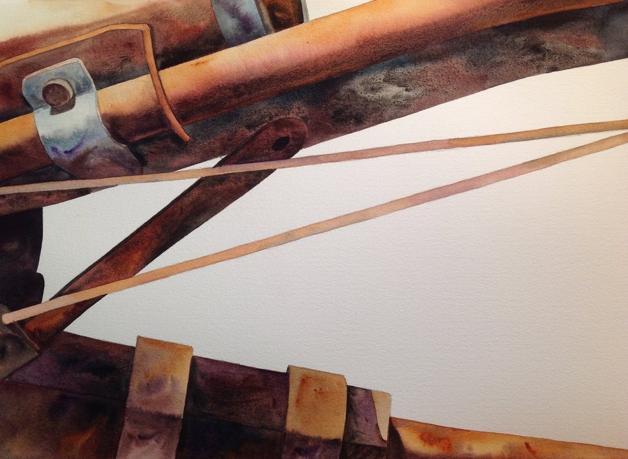
Then I continued to work some of the darks, using mostly Piemontite Genuine, Mayan Dark Blue and Hematite Genuine. In the lower part of the photo, you can see the underpainting and first layers. In the upper part, you can see the next layers, building from middle to darker values.

Step 2
Next I started working across all the areas. I build the darker areas and shadows gradually. I used Moonglow, Shadow Violet and Mayan Dark Blue, along with some Burnt Sienna, Piemontite Genuine, Imperial Purple and Burnt Tigers Eye to give some warmth in certain parts of the shadows.

Step 3
I work from one area to another, trying to build up the interest, but keeping a balanced composition at the same time. This involves several layers.

Step 4
I decided to give more depth to the painting by inventing some more shapes, in order to have a more interesting and balanced composition. This was a decision that was taken while re-evaluating the procedure, although my initial sketch was more or less what I had painted in the first two images.
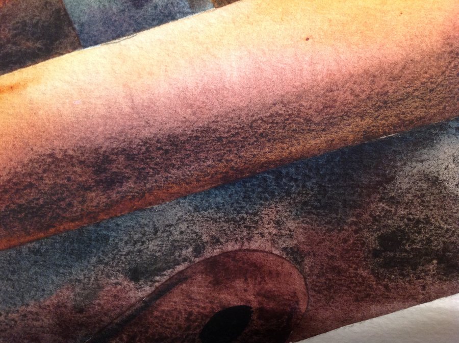
So I painted the blue/gray metal surface, the cables and the darker shapes at the back. I took advantage of the granulation of Primatek Colors to have more texture. I spattered and created various lines to show the mark of time on the metal surfaces.

‘More or Less…’ by George Politis
Step 5
I finished the painting by gradually building more on the contrasts and adding some random calligraphic lines and shapes that help in the overall balance of the painting.


