


If I had to pick my favorite colors out of the DANIEL SMITH line, you can see that most of them aren’t very bright. For the most part, they are earth tones and a few cool secondaries. The use of color in my work is subtle – I am not big on chroma.
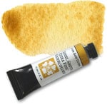
Verona Gold Ochre
Basically this is a Raw Sienna, but much more beautiful in its pigmentation. What I like best is the fact that you can easily mix it into anything and it has just the right strength to do well in that regard. I hate nothing more than picking up pigment on the fly and getting too much of a certain color into my wash. Super strong pigments can be detrimental for plein air painting or even in the studio. I do not want to be overly careful picking up pigments from my palette.
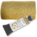
German Greenish Raw Umber
Students are always stumped when they see that one on my workshop supply list! Until they watch me start mixing it into Cobalt Blue to paint a distant mountain and then they see the magic happening! As a very subtle pigment, it’s beauty is harder to discover. It takes a bit more finesse, but is well worth it.
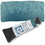
Cobalt Turquoise
This one is especially tricky since every manufacturer seems to have a different idea of what turquoise is. Some look almost blue, others green. You can go out and buy 5 different Cobalt Turquoises and get 5 different hues.
I like DANIEL SMITH’s because it mixes very well with other pigments. I am big on secondary mixes and of all the Cobalt Turquoise out there, this one is the best in my opinion.
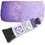
Ultramarine Violet
This one is also subtle and more importantly, not too far on the red side. I need it to be closer to blue, if you picture the color wheel. Sometimes these subtleties can make all the difference.
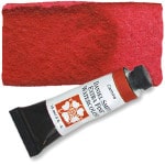
Carmine & Cadmium hues
For stronger, bolder colors mostly used in detail work, I prefer the DANIEL SMITH Cads – Yellow Light, Yellow Medium, Orange and Red. But my go-to red is definitely Carmine, which is excellent for mixes. It must be pointed out that these ‘cadmiums’ are actually hues. Being environmentally-friendly myself, I love that DANIEL SMITH managed to create pigments that act and look like cads without using the toxins!
Of course, all I’ve said here applies to my own painting style and the way I personally use pigments. Someone else might tell you something completely different! That’s how it is with art. There are no formulas – at least there shouldn’t be. It takes years of painting and switching pigments to find the ones that work for you. While it is good to see what is used by painters whose work you like, ultimately you want to find what works for you. So go out and experiment. Never get settled and too comfortable. Change and evolve… your art will show for it.


