Discover how you can jazz up your color palette with an unexpected mix of warm and cool. In this post, I’ll show you how I created my own version of this window scene in La Baux, France. I’m drawn to the windows, doors, flowers and stonework of places like Provence and Tuscany. The effort that someone puts into making their home or business look inviting, invites me to paint it. Over time, stonework and flowers have become favorite subjects of mine – how to suggest without overdoing it is always a fun challenge.

1. Planning
I decided to add overflowing flowers to the pot on the window sill in this reference photo above, for use as my focal point so I could have fun with Wisteria, Lavender and Quinacridone Lilac watercolors

2. Contour drawing
In my 9×12″ sketchbook (140lb cold-press watercolor paper), I draw with a continuous contour line for a more organic, free flowing shape. I use a mechanical pencil and keep my lines light. When suggesting overflowing flowers in the pot, I only draw the outer shape of the flowers.

3. First wash
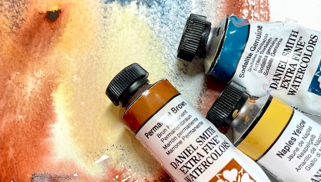
I like to start with mixing colors – wet on dry paper – for an underwash, often using the side of my brush for larger brush strokes. I placed a variety of mostly warm colors and a few cool colors randomly next to each other and let them mingle. I intentionally left an unfinished painterly edge and saved the white where the flowers will be for pure color and sparkle. The colors used here are:
Warm colors:
Cool colors:

4. Colorful flowers
Once my first layer of color wash is completely dry, I randomly paint my flower shapes with Rose Madder Permanent, Wisteria and Quinacridone Lilac. The three colors together are a beautiful combination. Paint your shapes so they interconnect and vary in shape and size, but avoid creating polka dots. Leave room for white sparkle and your greens.

5. A pot with pizzazz
After designing your colorful flower shapes, paint in organic leaf shapes with Rich Green Gold and Phthalo Yellow Green first, leaving some of the whites for sparkle. Then go in and paint a few of the darker greens with Green Apatite Genuine – a wonderful earthy green. I also added a few dabs of Lavender for pizzazz. Once the flowers are dry, go ahead and paint the pot with Burnt Sienna Light with a touch of Lavender, and the shadow shape on the doors and inside the window in Lavender (Cool) and Burnt Sienna Light (warm). Notice how I use both warm and cool colors throughout the painting to jazz up the tone.

6. Window
This is where I start layering on color to define shapes – first the window panes in Permanent Brown (warm) and Lavender. Then I defined the shadow above and around the door with Permanent Brown, Burnt Sienna Light and Lavender, always using both warm and cool colors in each shape.

7. Stonework
Around the edges of the stonework, I glaze mingled colors used on the first layer and add values between the rocks and the wall to make things pop. I add calligraphy with the fine point of my quill brush and vary the color as I draw around the window, letting the brush skip and dance around the painting.

8. Fine tune
My favorite part of the painting is when I’m just adding the final details – a brushstroke here, a dab of paint there, and some splatter to let go of the idea of perfection. You’ll see in the photo where I softened some edges and pushed back the left door/window panes so the the flowers could pop out even more.
Featured DANIEL SMITH Extra Fine Watercolors: