Several of our Brand Ambassadors are sharing their insights about using yellow in their work. See which pigments they prefer and be inspired to add more yellows to your own palette.

Yellow is an indispensable color when it comes to capturing the essence of light in art. In my approach, I use a light yellow during the first wash to highlight the areas that are hit by the sun’s rays. To maintain the brightness, I leave the lightest highlight areas white. My go-to yellow is Cadmium Yellow Medium Hue, which has a warm and inviting tone, making it a good choice for painting sunsets and yellow flowers. The use of yellow also elevates the vibrancy of the painting. Its light shade doesn’t drastically alter the color or brightness of the paper, allowing it to blend seamlessly into the background. Additionally, incorporating yellow into other elements of the painting creates a harmonious and cohesive look. Just be careful not to overdo it – if you use too much thick yellow, it can make the painting look too bright and stand out too much due to its high saturation. The best use of yellow is as a tool to enhance the colors added later in the painting process. Lemon Yellow is also included in my palette. Its unique hue is perfect for capturing the bright and sunny essence of lemons and other similar subjects that I want to stand out.

My palette is more towards the cold colors, so I’m not actually that fond of yellow. But you have to have some yellow in your palette to be able to capture a larger range of colors. My choices are Hansa Yellow Medium and Permanent Yellow Deep – a cold and a warm yellow. Hansa Yellow is very transparent and good for mixing colors.
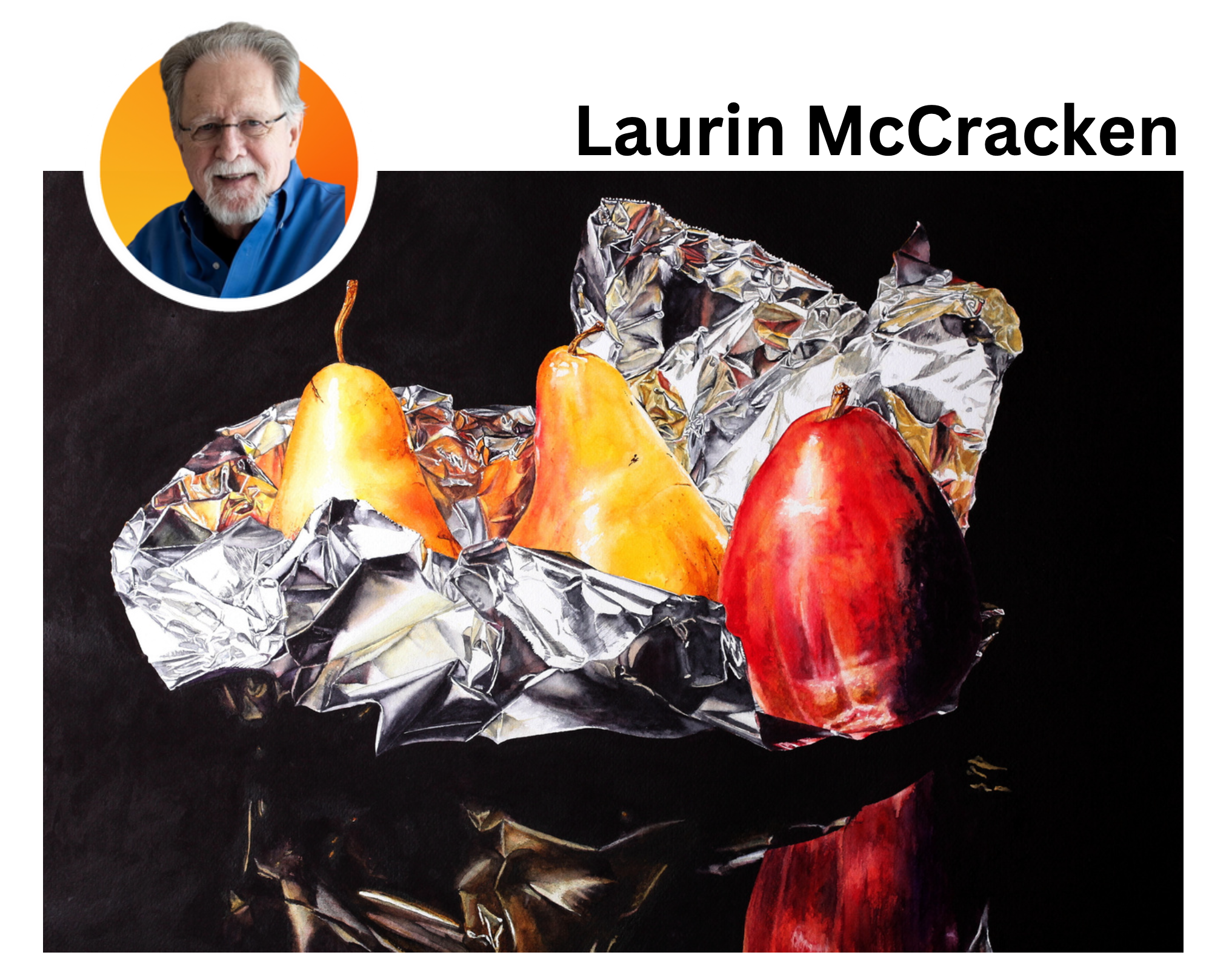
I keep three DANIEL SMITH yellows on my palette at all times – Cadmium Yellow Light Hue, Cadmium Yellow Medium Hue and Cadmium Yellow Deep Hue. When I use a yellow, I want it to be clean and bright. I often use them on the fruit in my still life paintings. When I need a darker shade, I grab a tube of Mars Yellow. I often use the Cad Yellow Medium right out of the tube, but more often I mix two or more yellows to get exactly the color that I need. I mix most of my own greens – these three yellows combined with varying amounts of Phthalo Blue Red Shade and Prussian Blue provide me a very wide range of options. I can always count on DANIEL SMITH color to be pure, bright and consistent – tube after tube and year after year.

I often use Hansa Yellow Medium and Permanent Yellow Deep in my under-painting. You can see the yellow glow on the tip of the white petals in the large flower in the above painting. Permanent Yellow Deep was the main color for the flower centers. In my negative paintings (the technique of painting the negative space around a subject to define it in the composition), I use one or two of these yellows plus a blue for my under-paintings. Both yellows are single pigment colors, which is important to me. Why? They are less problematic when it comes to mixing fresh secondary colors.

I don’t use a lot of yellows in my work, but Indian Yellow is vital to my palette, whether it’s used on its own, to enhance another colour, or to neutralize
a complimentary. I paint a lot of rusty objects and I find the Indian Yellow has the strength of colour, even when used thinly, to provide a strong base for lots of layers and tints. I can also shift my Quinacridone Burnt Orange by mixing it with the Indian Yellow to provide a fantastically strong, vibrant orange – perfect for rust. I also find that working with blues (especially Manganese Blue Hue) and Indian Yellow provides a lovely transparent version of green. A lot of mixing in my work is produced on the surface of the painting with a range of layers, rather than on the palette. I also occasionally use Burgundy Yellow Ochre, which is a much earthier yellow. It’s not as strongly pigmented and therefore has less influence on other colours when mixing, but it’s great for a warm yellowish wash.

Watercolor is all about light that shines through the transparent washes of color. In my paintings, the closet pigment to pure light is yellow. It speaks of the poetry and luminosity of light. In a fluid medium, yellow is an especially useful color on it’s own or to add brilliance to another hue. And when used with complements, it produces the most nuanced and compelling neutrals. In everyday painting, I use several different DANIEL SMITH yellows. Cadmium Yellow Deep Hue was my choice for my Master Artist Set. I find it an immensely useful and versatile pigment. It’s lightfast, surprisingly transparent, and most importantly, it’s a very neutral yellow. It does not skew too warm or cool, nor is it too orange or yellow. It works extremely well either alone or as a modifier for blues, violets, reds, and greens.

I often work in triads, so yellow must be in my palette. My yellows span from bright to earthy or muted. The brightest yellow in my palette is Aureolin, my medium is Nickel Azo Yellow, and my favourite for landscapes is Monte Amiata Natural Sienna. Depending on pigment hue, I may use yellow for an underpainting, for mixing greens, or for a final glazing. Very seldom do I apply any pure yellow dab on paper. I like Aureolin because of its transparency, clarity and brightness. I consider it to be the best choice for a true primary yellow. Together with Quinacridone Rose and Cobalt Blue, it forms my personal primary triad with which I can achieve my brightest spring hues in my landscapes. Also by adding Aureolin to mixes obtained from muted colors, I’m able to give an acidic glow to the whole painting.

I like to use yellow as the base color of my work, which gives it a warm feeling after completion. I also like to mix yellow with other cool colors such as blue and gray to produce unique shades. I often use different types of yellow in the later stages to express a light source with dots or lines. In my art, yellow represents light, warmth and happiness – letting the audience feel my enthusiasm for this wonderful world! I often use DANIEL SMITH’s most traditional and original Lemon Yellow, because it’s not easy to get dirty when mixed with other colors and it is easy to blend out. Another I like is Cadmium Yellow Deep Hue because it can make the yellow effect even more outstanding, especially between buildings or within a pattern.

I use Aureolin for its inner feature of Cobalt. Like the Cobalt Blue, they are the kinds of colors that mix without high gaps. Its transparency, like Mayan Yellow and Lemon Yellow allows for a very gradual and precise glaze. Aureolin is the first yellow in the range that starts the line towards the orange, with yellow deep following. It doesn’t granulate, so I can obtain a compact and fine glazing. I have used Aureolin together with Quinacridone Gold in my series of still life paintings featuring an Amaretto di Saronno glass bottle.

Cadmium Yellow Medium Hue is a very important color on my palette, especially when I want to emphasize the sense of light, in which yellow is used to a great extent. I like to use its high heat to enhance the contrast between warm and cold colors. I also think it can be mixed with many colors, even other shades of yellow. If you mix it with secondary colors like purple, you can make greens warmer. Mix it with tertiary colors to get rich layered tan shades. It is worth mentioning that when Cadmium Yellow Medium Hue is at different saturation levels, the lightness and transparency of the color presented is also very attractive.

I have four yellows on my palette – all have different uses and that is why I love them. The queen of colours in my opinion is Quinacridone Gold, or as I like to call it, liquid sunshine! I use it as an underpainting or a first wash to achieve that golden glow in sunsets and sunrises, as well as layering and lifting back to that pure gold. I use Lemon Yellow to create the new growth freshness in foliage and sunstruck leaves. It projects a vibe of clear, clean colour that I love so much. Both Quinacridone Gold and Lemon Yellow are transparent colours, so i can use them for glazing or layering with no worries of ever creating mud. I use Cadmium Yellow Deep Hue when I need mixing with ‘oomph’ or that strength of pure yellow that is rich and buttery. Its semi-transparent strength of pigment covers well, even over some darker shades. A little bit goes a long way and it’s great for mixing oranges and greens in my florals. Naples Yellow is the exact colour of the sand near my home in Australia so i had to have it on my palette! I love to use it for atmospheric glow in sunsets where there is a lot of moisture in the air. It’s great for establishing that misty mood in the distance as well.

I think having the right yellow can lend so much to your creative expression. I started with four yellows on my palette – Hansa Yellow Light, New Gamboge, Quinacridone Deep Gold and Burgundy Yellow Ochre. Over time, my list of favourites grew to include Azo Yellow and Nickel Azo Yellow. I always try to keep a warm and a cool version of each of the primaries on my palette – Hansa Yellow Light is cooler and New Gamboge is warmer.