
Xuất thân từ lĩnh vực thiết kế, Alison Pinto bị thu hút bởi những kết cấu và chi tiết trong cả những yếu tố phi thường lẫn đời thường của thiên nhiên. Tuy nhiên, tác phẩm của cô vượt xa những gì có thể nhìn thấy ngay từ cái nhìn đầu tiên, nó bắt nguồn từ sự kết nối cảm xúc mà cô cảm nhận được với các chủ thể của mình. Alison tin rằng nghệ thuật là một trải nghiệm mang tính cá nhân sâu sắc, và cô để cho những bức tranh của mình nói lên thay lời cô.

Vẽ màu da là một trong những khía cạnh bổ ích và thường đầy thách thức nhất của công việc vẽ chân dung. Từ những thay đổi tinh tế về nhiệt độ đến sự đa dạng phong phú của các sắc thái da trên mỗi khuôn mặt, để đạt được kết quả tự nhiên, điều đầu tiên cần làm là hiểu về màu sắc. Trong bài viết này, Đại sứ thương hiệu DANIEL SMITH, Alison Pinto, chia sẻ những hiểu biết thực tế về pha trộn màu sắc cùng với bảng tham khảo nhanh về màu da hữu ích để giúp việc tạo ra những màu da đẹp, sống động như thật trở nên dễ dàng và thuận tiện hơn.
Màu da rất đa dạng và tinh tế, không có một cách pha màu nào là “đúng” tuyệt đối. Qua thời gian, đây là một số công thức pha màu da mà tôi thường xuyên sử dụng nhất trong các bức chân dung của mình. Hãy coi chúng như một điểm khởi đầu; điều chỉnh độ ấm, độ lạnh, độ trong suốt và tỷ lệ sao cho phù hợp với đối tượng của bạn, và quan trọng nhất là đừng ngại thử nghiệm.
Mỗi khuôn mặt đều mang những biến đổi tinh tế về nhiệt độ và sắc độ, đó là một phần lý do khiến tranh chân dung trở nên hấp dẫn. Tôi hy vọng những sự pha trộn này sẽ là điểm khởi đầu hữu ích khi bạn khám phá các sắc độ da trong tác phẩm của mình.
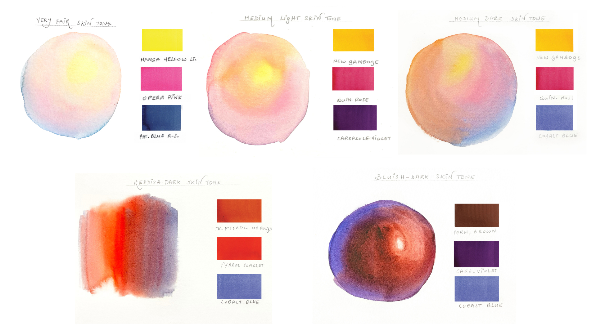
Làn da rất trắng


Hỗn hợp này dành cho những người có tông da rất trắng. Như bạn có thể thấy trong nghiên cứu này, làn da có xu hướng trở nên trong suốt hơn đáng kể, thường để lộ những dấu hiệu tinh tế của máu (màu hồng) và mạch máu (tông màu xanh lạnh) bên dưới bề mặt.
Những vùng tối trên làn da này thường nghiêng về tông màu xanh xám nhạt hoặc hồng lạnh, và đó là điều tôi cố gắng giữ nguyên.


Tông da sáng vừa phải


Sự kết hợp này đã được giới thiệu trong một trong những nghiên cứu về tông màu da trong chuyên mục "Friday Fun" của chúng tôi, sử dụng một bên tai đeo khuyên tai vàng làm đối tượng minh họa.
Trong trường hợp này, tôi đã chọn màu vàng ấm hơn và màu hồng đậm hơn để thể hiện tông da trung bình ấm áp, được làm dịu bớt bằng màu tím Carbazole. Bộ ba màu này là một trong những màu tôi yêu thích nhất và thường là những màu cần được bổ sung nhanh nhất trên bảng màu của tôi. Nó xuất hiện trên bảng chấm màu của tôi và trong nhiều tác phẩm của tôi, dành cho những tông da cần sự ấm áp và mềm mại.
Tông da tối vừa phải


Để tạo ra tông màu da đậm hơn so với hỗn hợp trước, tôi đã không còn sử dụng màu tím Carbazole Violet tinh tế mà thay vào đó là màu xanh coban Cobalt Blue. Cùng với các phiên bản màu vàng và hồng đậm hơn, bão hòa hơn, nó giúp tạo chiều sâu trong khi vẫn duy trì sự hài hòa trong hỗn hợp.
Màu xanh coban đặc biệt phù hợp ở đây vì đặc tính mềm mại hơn, hơi mờ đục hơn, giúp làm dịu bớt độ ấm của màu vàng và hồng.


Màu da hơi đỏ sẫm


Hỗn hợp này dành cho những làn da hồng hào, tươi tắn tuyệt đẹp mà chúng ta thấy ở nhiều dân tộc trên khắp thế giới. Hình ảnh thoáng qua của người đàn ông Ấn Độ lớn tuổi trong... nghiên cứu này Đây là một ví dụ về sự ấm áp tuyệt vời của làn da.
Tôi nhận thấy bí quyết nằm ở việc để các sắc thái khác nhau của màu cam đảm nhiệm phần lớn công việc tạo nền.
Những gam màu da này có thể khó vẽ một cách đáng ngạc nhiên; việc tìm ra sự cân bằng giữa độ ấm và tính tự nhiên mà không để màu sắc trông quá đậm hoặc cường điệu là rất quan trọng. Sự kết hợp này đã mang lại hiệu quả tốt cho tôi khi vẽ những gam màu da ấm áp và đậm hơn này.

Làn da sẫm màu hơi xanh


Những sắc da này thuộc hàng đẹp nhất để vẽ, mặc dù việc đạt được chúng mà không làm cho màu sắc bị lem luốc có thể khá khó khăn. Tuy nhiên, nếu được thực hiện cẩn thận, chúng có thể mang lại độ sáng tuyệt vời.
Theo tôi, điểm mấu chốt nằm ở việc cân bằng các tông màu lạnh mà không làm mất đi sự ấm áp của làn da, như bạn có thể thấy trong hình ảnh này. bức tranh của tôi.

Thêm nhiều mẹo và thủ thuật vẽ màu nước từ Alison Pinto
Hướng dẫn cơ bản về màu da trong hội họa chân dung
Tôi thường bắt đầu bằng cách tự hỏi mình hai điều:
- Nhiệt độ da là bao nhiêu?Và
- Ánh sáng tổng thể tạo nên bầu không khí như thế nào?
Trước khi nghĩ đến việc da "sáng" hay "tối màu", tôi thường xem xét xem da có tông ấm, lạnh, hồng hào, trầm hay đôi khi là vàng óng hơn. Ngay cả trên cùng một khuôn mặt, thường cũng có những sự thay đổi tinh tế, chẳng hạn như má ấm hơn, đường viền hàm lạnh hơn, sự chuyển tiếp mềm mại hơn hoặc bóng mờ quanh mắt.
Cùng một làn da có thể trông như thế nào hoàn toàn khác biệt Điều này phụ thuộc vào nguồn sáng vì da có tính phản chiếu, trong suốt và hấp thụ màu sắc xung quanh. Vì vậy, thay vì chỉ tập trung vào “Người này có màu da gì?”, Việc hỏi như sau thường hữu ích: “Ánh sáng đang tác động như thế nào đến màu da này?”
Trên thực tế, tôi thích bắt đầu bằng cách pha thử một lượng nhỏ màu trên giấy vụn trước khi áp dụng ngay lên bức tranh. Tôi điều chỉnh tỷ lệ màu từ đó, thường kiểm tra các thông số sau: Liệu điều này có tạo cảm giác chân thực với ánh sáng và không khí của bức chân dung không? Điều đó thường định hướng tôi nhiều hơn là cố gắng "phù hợp" chính xác với màu da.
Nhận biết những thay đổi tinh tế: Sự ấm áp, sự mát mẻ và những sắc thái ẩn chứa bên trong.
Tôi nghĩ một trong những cách tốt nhất để rèn luyện khả năng quan sát là dành nhiều thời gian hơn để quan sát trước khi pha chế.
Một bài tập mà tôi thường khuyên dùng là so sánh các vùng khác nhau trên khuôn mặt. Thay vì hỏi, “Màu da này là màu gì?”" hỏi, "“Khu vực này ấm hơn hay lạnh hơn khu vực bên cạnh?” hoặc "“"Cái bóng này nghiêng về màu xanh lam, tím, nâu hay hồng?"” Vùng trán có thể cảm thấy ấm hơn, vùng hàm mát hơn, má hơi ửng hồng.
Việc ghi chú nhanh hoặc tạo mẫu màu để so sánh trước khi bắt đầu rất hữu ích. So sánh màu sắc thường chính xác hơn nhiều so với việc cố gắng gọi tên màu sắc một cách trực tiếp. Những thay đổi tinh tế này thường là điều làm cho làn da trông tự nhiên. Theo thời gian, càng quan sát và so sánh nhiều, bạn càng dễ dàng nhận ra các sắc thái màu một cách trực quan.
Tìm ra tông màu da đặc trưng của bạn
Tôi vẫn thích thử nghiệm và pha trộn các màu sắc mới cho tông da, và qua nhiều năm, tôi chắc chắn đã bổ sung thêm nhiều lựa chọn. Màu Burnt Sienna đôi khi có thể là điểm khởi đầu dễ dàng tuyệt vời, trong khi một số màu Phthalo Green trong suốt hơn có thể tạo thêm điểm nhấn bất ngờ cho phần vẽ bóng.
Dĩ nhiên, không phải thí nghiệm nào cũng thành công… một số thì thành công rực rỡ, số khác thì thất bại thảm hại. Nhưng tôi nghĩ nếu bạn học được điều gì đó trong quá trình thực hiện và tận hưởng nó, thì điều đó luôn có ý nghĩa.
Xây dựng sự tự tin khi vẽ chân dung thông qua các bài tập đơn giản
Tôi khuyên bạn nên giảm bớt áp lực và không nên bắt đầu bằng một bức chân dung hoàn chỉnh. Hãy bắt đầu từ những bức nhỏ – chỉ vẽ một cái tai, một con mắt, một cái mũi hoặc một bàn tay. Điều này giúp bạn tập trung vào việc quan sát màu da và hình dạng mà không bị áp lực phải vẽ toàn bộ khuôn mặt "đúng".
Một bài tập hữu ích khác là vẽ cùng một chi tiết hai hoặc ba lần bằng các hỗn hợp màu da hơi khác nhau. Bạn sẽ nhanh chóng nhận ra những thay đổi nhỏ về độ ấm, độ lạnh hoặc lựa chọn sắc tố có thể làm thay đổi cảm giác của bức tranh như thế nào.
Quan trọng nhất là, đừng cố gắng hướng đến sự hoàn hảo. Vẽ chân dung sẽ trở nên bớt đáng sợ hơn nhiều khi bạn bắt đầu coi nó như việc quan sát và luyện tập.
Giới thiệu về Alison Pinto
Alison Pinto Alison là một họa sĩ vẽ màu nước và nhiếp ảnh gia tài năng đến từ Ấn Độ, nổi tiếng với những bức tranh màu nước vẽ từ thiên nhiên. Bà là Trưởng ban bang Maharashtra và Giám đốc điều hành của Hiệp hội Màu nước Quốc tế, chi nhánh Ấn Độ. Alison đã triển lãm tác phẩm của mình tại 13 quốc gia trên thế giới và đã giành được nhiều giải thưởng trong các triển lãm địa phương.