這是根據照片參考繪製的「瓦爾德莫薩之光」工作室版本的創作過程分階段展示。.
大多數時候,當我在工作室裡根據參考照片進行繪畫時,我會參考一些現場速寫,或者依靠記憶來記住這個地方的感覺。.

瓦爾德莫薩的戶外寫生作品。.
由於我當時已經在現場完成了一幅幾乎完整的畫作,而且很容易回憶起那個地方的感覺。.

瓦爾德莫薩的參考照片。.
照片參考可以提供所有必要的訊息,但我認為我們五官的體驗——例如嗅覺、聽覺等等——也很重要。這些我們回憶起來的事物會對繪畫產生影響。.

第一階段:瓦爾德莫薩的鉛筆素描。.
第一階段—鉛筆素描。.
我勾勒出了場景的主要形狀。通常我的鉛筆畫比較隨意,更像是一種粗略的近似。.
我沒那麼有耐心,所以與其花很多時間做鉛筆稿,我更喜歡專注於繪畫中的整體空間劃分、整體動態和形狀的相互交錯。.

第二階段:為「瓦爾德莫薩之光」確定顏色。.

第三階段:從基礎洗滌開始。.

第四階段:新增背景。.

第五階段:建設區域。.
第五階段——建設區域。.
在這個階段,樹木、前景建築物和背景山脈的陰影區域會緩慢而有條不紊地逐漸形成。.
雖然暖色調和冷色調的過渡很重要,但色調變化在這裡也很重要……最重要的是準確地保留亮部區域的負形(或正形)。.
這幅畫的大部分已經準確地描繪出來了,接下來只需要添加一些細節。.
")
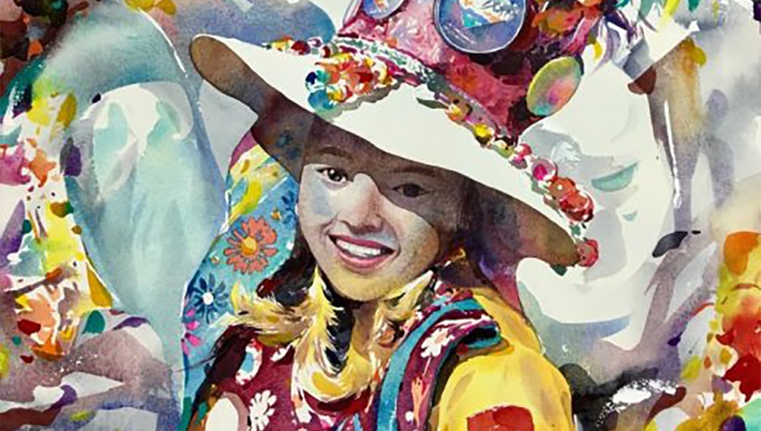
“《瓦爾德莫薩之光》,米林德·穆利克