Share:
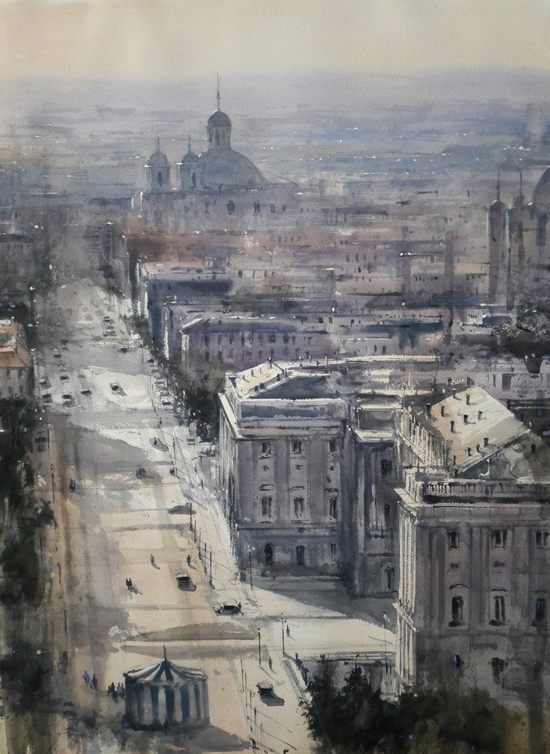
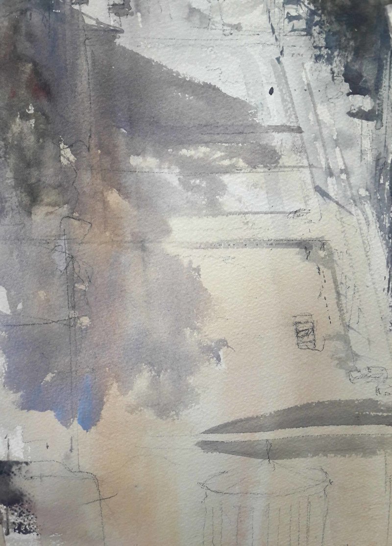
Step 1. Welcome to the beautiful city of Madrid. This is one of our most important monuments in the Capital of Spain – the Royal Palace – seen from an aerial view. In every watercolor I do, I start with a good and complete drawing to have enough information of vanishing lines and proportions of the elements of the landscape. I draw with a 2B pencil.
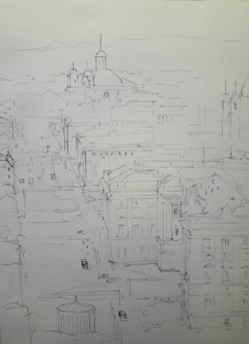
Royal Palace of Madrid sketched out in pencil
Colors used for this painting:
Aussie Red Gold
Quinacridone Lilac
Rose Madder Permanent
Lavender
Wisteria
Burnt Sienna Light
Raw Sienna Light
Payne’s Blue Gray
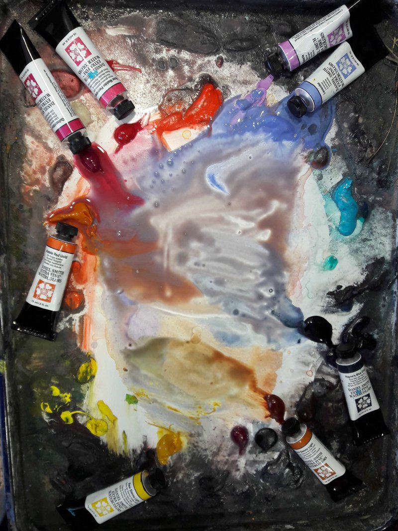
Step 2. I start the work with a “mother color” that covers the full white paper. In this case, because the landscape is a sunny day in Madrid, early in the morning, the base color is a warm wash made with Aussie Red Gold, Quinacridone Lilac and Rose Madder Permanent with different concentrations to get vibrations of the color.
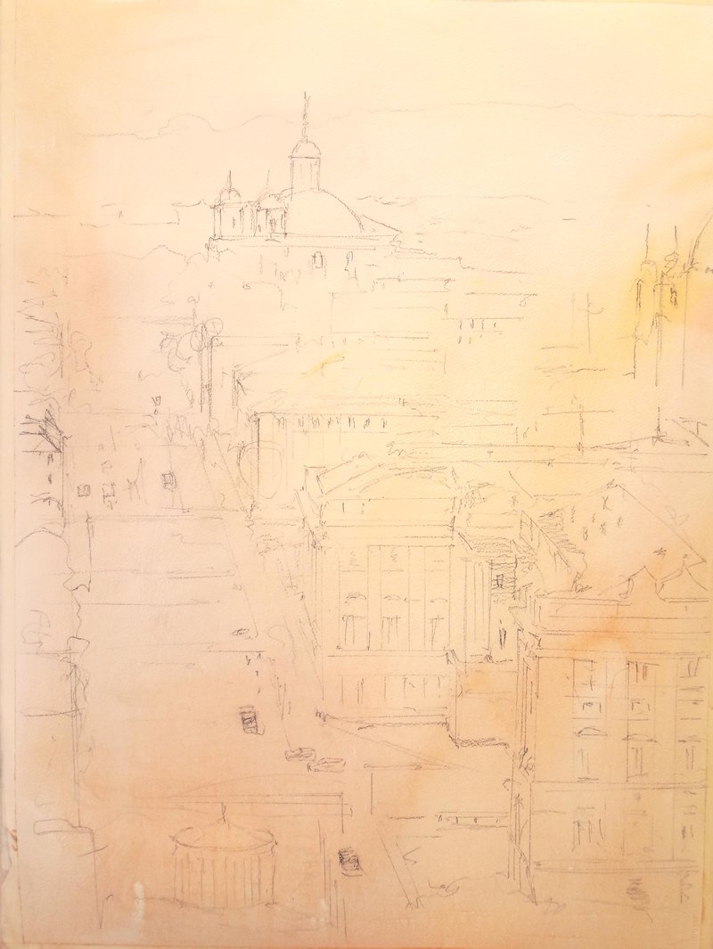
Step 3. After the first wash has dried, I start with the second one, time to put background and shadows. I mix Lavender and Wisteria to get a soft violet for the more distant part and as soon as I am approaching the lower part, I add a bit of Aussie Red Gold and Quinacridone Lilac to gray the color.
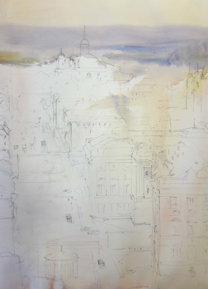
Step 4. In the same mix, as I am going down to the foreground, I continue varying the cold color made with Lavender and Wisteria, adding a bit of Burnt Sienna Light and Raw Sienna Light, this provides me warm beautiful grays.
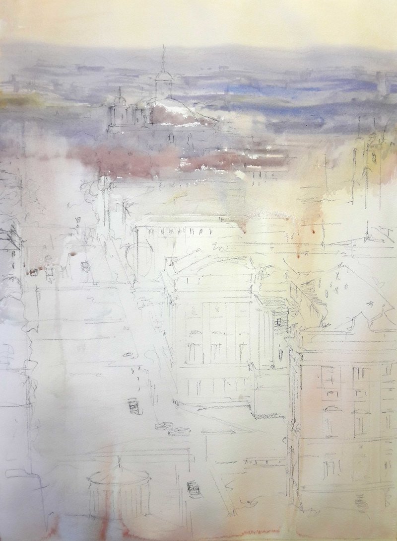
Step 5. At this point, some parts of the background have dried, so it is time to add more definition and to separate the big dome of the distant church of San Francisco. I make this dark color adding a bit of Payne’s Blue Gray to the previous mix with enough water to make it transparent.
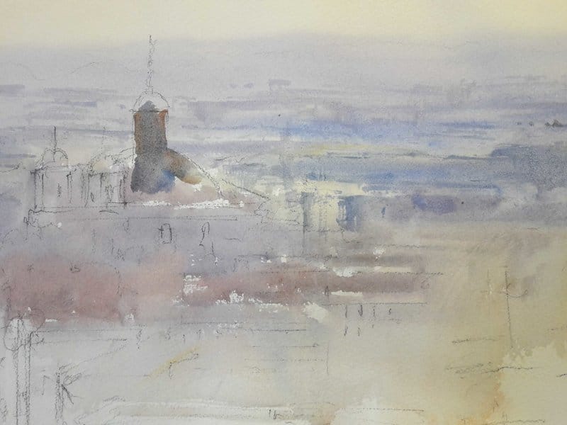
Step 6. While this layer is wet, it’s a good time to paint the windows of the church and the buildings. I need a thicker mix of Paynes Blue Gray and Burnt Sienna Light to get soft and controlled edges.
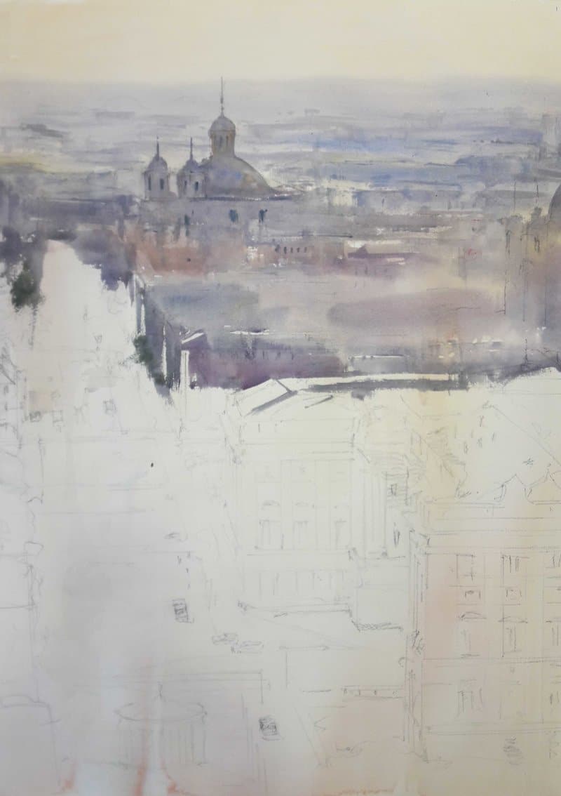
Step 7. Closer buildings means darker values, so I add more Payne’s Blue Gray, Lavender and Quinacridone Lilac and keep painting the shadows of the buildings. These three colors, mixed with the correct amount of water, produce lovely cold grays very suitable for urbanscapes.
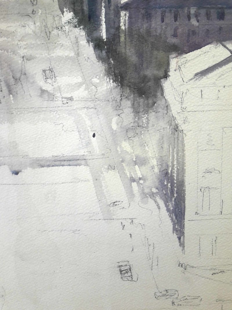
Step 8. Reaching the bottom of the work, I need more intense colors in the foreground, so I increase the lightest parts. I paint a warmer wash of Aussie Red Gold and Wisteria in the closer part of Bailen Street.
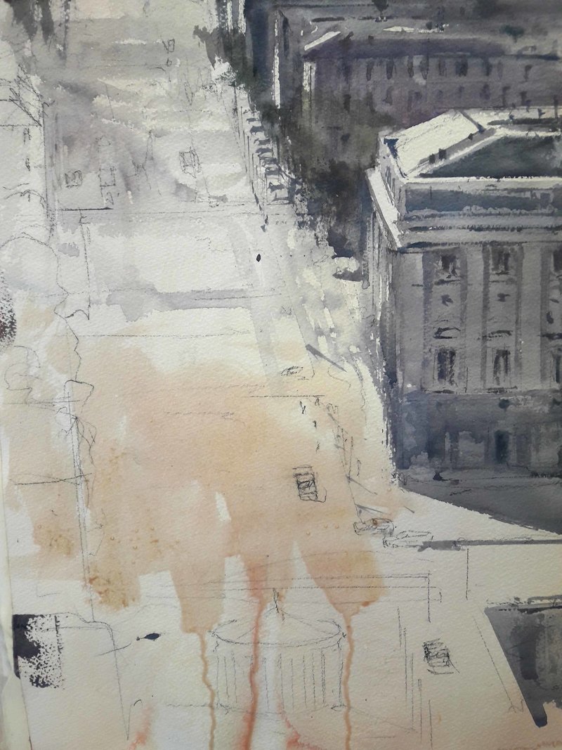
Step 9. Although this view is into the light, we have some greens in our landscape. We need colors that make a wonderful combination to have the greens we need in this sort of light. By mixing Paynes Blue Gray and Aussie Red Gold, we get a real and not too bright green, perfect to keep the harmony of our work.
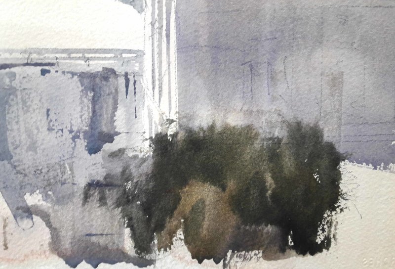
Step 10. Now to finish the shadows in the foreground with vibrations of grays – this time I use Lavender, Wisteria, Payne’s Blue Gray and Burnt Sienna Light, but in different amounts to avoid repeating colors. Every time I mixed in about fifty percent with water to paint it transparent.
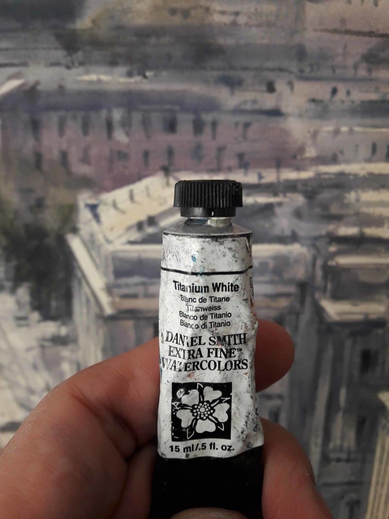
Step 11. The work is almost finished, I only need to add little details (windows, street lights, chimneys, people, cars…) and the highlights lost during the process. To complete highlights, I use Titanium White directly from the tube, completely opaque. I prefer this method rather than using masking fluid.
Royal Palace of Madrid
