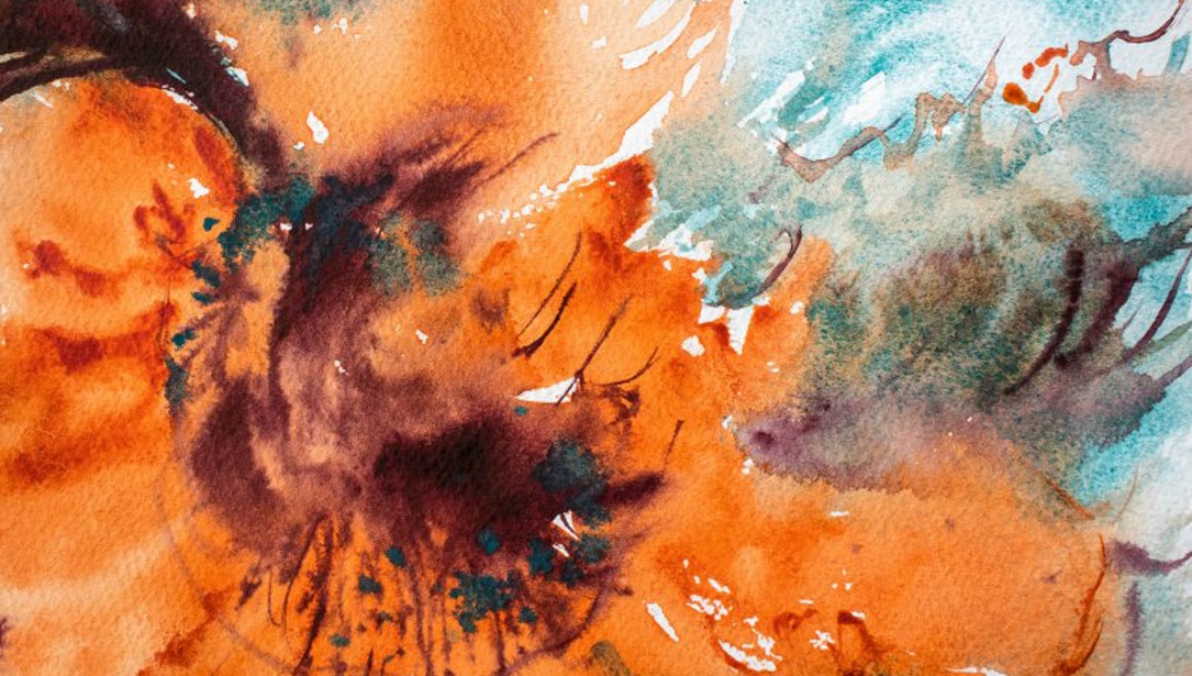
Can you have 100+ colors and a limited palette? It can be done – here’s how I indulge my addiction for DANIEL SMITH Watercolors, while avoiding color overload in my paintings.
I love thinking about the role of value and color in a painting as two hands clasped. Value is the right hand, the structure created as light and dark contrast and guide the eye through the painting. Many artists will insist that if your values are good, the colors you choose do not matter. But just as we use both hands thrown out to balance on a narrow path, the left hand of color serves an important purpose that is remarkably impactful – the role of creating mood in the painting.

When experimenting with limited palette color in landscape studies, remember that one reference photo can have thousands of iterations, when the smallest color change turns the scene from morning to evening and sunny to stormy.
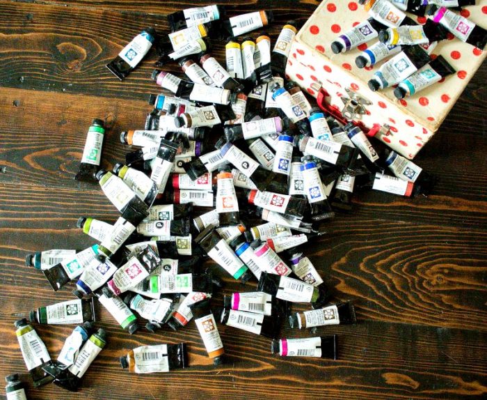
With my 100+ assortment, one would assume that I would never consider myself as working with a limited palette, but I do! Instead of working with a dozen or fewer traditional colors, I have thousands of limited palette options to choose from as I mix and match from my stash of pigments. I use a variety of strategies to help me choose the right colors for my paintings.
Strategy 1 – Triads from a Key Color
I love building a painting around a single color and then creating a triad or a near-triad to give me a wide range of mixing options. In the abstract floral painting above, I’ve chosen Quinacridone Sienna, an orange-brown. Pairing it with a cool turquoise Cobalt Teal Blue and rich Perylene Violet, I get an “almost primary triad” with a sort-of red, a kind-of blue, and an if-you-really-squint yellow that creates a beautiful earthy palette with a pop of energy.


Strategy 2 – Analogous Energy
As much as I like mixing colors, I often feel like pure colors are too vibrant when used all together in a painting. A combination of magenta, lemon yellow and blue, while balancing nicely on the color wheel, often feels too jarring and bright to me, so when I’m working with these types of vibrant colors, I like to choose an analogous color scheme. A vivid warm yellow (Quinacridone Gold) harmonizes beautifully beside Phthalo Turquoise; with the weight of color on the cool side of the color wheel, I still get lots of energy, but it feels a little less “candy store.”

Strategy 3 – Complementary Power
Pairing two complementary colors, or near-complements, gives a painting simple drama. I can work with the colors unmixed for strong impact as they play off each other, like in my painting, Storm Over Canola, a two-color landscape featuring Indigo and the warm golden tones of Nickel Azo Yellow. While a true complement to Indigo might be more of an orange, this yellow not only complements as a near-opposite on the color wheel, but as a contrasting light value against Indigo’s near-black.

Strategy 4 – Duets of Amazingness
So many of my favorite tubes of DANIEL SMITH Watercolor are the granulating, multi-pigment mixes like Moonglow, Rose of Ultramarine (shown above with Cadmium Yellow Medium Hue) and Undersea Green, or the sedimentary textural beauties of the Primatek colors, like Hematite Burnt Scarlet Genuine, Zoisite Genuine and Sodalite Genuine. These colors are so beautiful on their own that they need very little accompaniment. For paintings built around these incredible colors, I might choose only one to support my prima donna color, or use value to create a monochromatic scene that reveals the delicious color and texture of the paint.
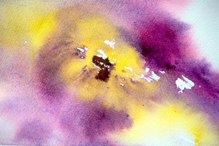
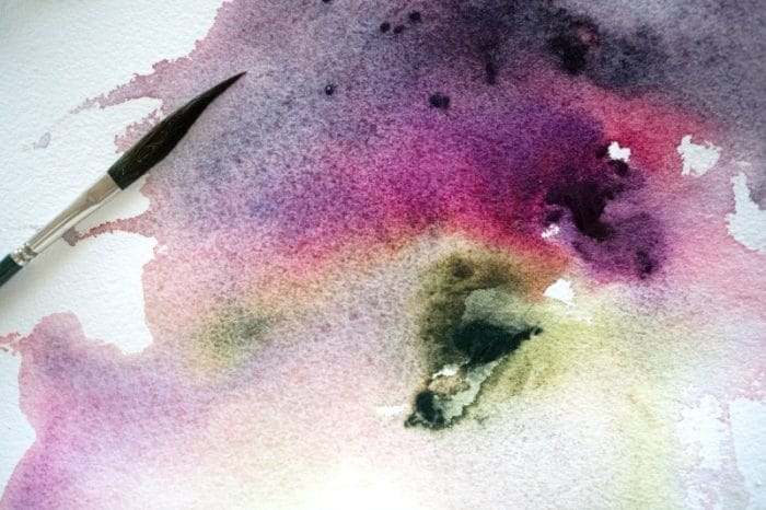
Swatches of Undersea Green, Rose of Ultramarine and Moonglow
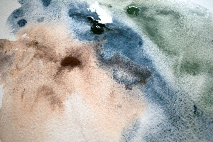
Swatches of Hematite Burnt Scarlet Genuine, Sodalite Genuine and Zoisite Genuine

Sodalite Genuine is beautiful in a monochromatic value study.

Second version of the scene above, now with Moonglow and Prussian Green

Third version of the same scene above, now with Moonglow and Lunar Earth
I try not to get too crazy at the art supply store when adding a new paint to my collection. I have learned that I am most likely to use a color when I take the time to get to know it, so adding a bunch of new colors at once is not going to be the best way for me to create dynamic new palettes from my collection. I like to give myself time to get to know one or two new colors at a time, using them obsessively in the first few weeks as I learn how they play and interact with my existing palette of old favorites. From there, I can bring in new colors and be excited all over again with the wealth of possibilities that is created every time.

