Share:
The afternoon shadows play upon the face of the white and salmon pink rocks that Georgia O’Keeffe first brought to the world’s attention over 50 years ago. The meander and rhythm of the light fascinates me as I do a quick value/composition sketch.

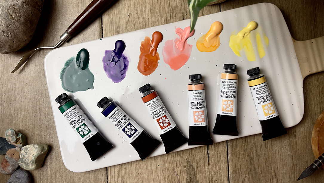
Where to start? My students know my motto: “Lightest, Brightest or Scariest, first!” While I do an all-over underwash of Aureolin Yellow for the pervasive New Mexico sunlight — we decide to start with the rock. I explain that I’ll use mostly granular pigments to help describe the sandstone layers. I mix many of the paints on the paper so I can have the joy of watching them dance together. Most of my painting will be done on 140 lb. cold pressed paper taped to a board.
Do you ever start with the sky? I do if the painting is about the sky. Because in this painting the rock is the focus and I want the value of the shaded white rock to be just slightly lighter than the sky, I choose to add the sky later. I know I’ll be able to better adjust the sky value to the rock rather than vice versa. I start with the whitish upper layers, treating the shaded part with mixture #1 while slowly adding more Cobalt Blue as the rock emerges into the light — for the core shadow. I just cannot resist adding a bit of Aureolin to the blue to watch them mix.
What about all the crevices and cracks? I’ll leave most of those to the end when the pigments’ natural variations can best show me where to place them. Meanwhile, I just suggest the uneven surface, wet on wet — sparingly.
On to the lower red layers… I paint in horizontal ribbons, taking care to go lightly over the sun-lighted area. I used mixes #2, #3, #4 plus passages of Rose Madder* — leaving some white horizontal slivers to accentuate the layers. I paint around the tree shapes and carry some of the lightest mixes onto the foreground — around some of the trees and through some of the others.
*Editor’s note – Rose Madder Genuine has been discontinued. We now offer Rose Madder Permanent.

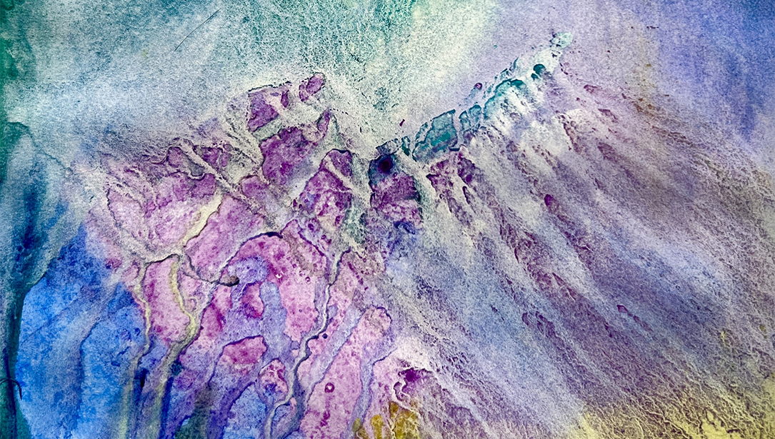
Left side, from the top:
- Amazing Mix #9 – Aureolin Yellow and Cobalt Blue
- Amazing Mix #1 – Buff Titanium and Cobalt Violet
- Quinacridone Pink accent in the crevice of Rose Madder
- Aureolin underwash
- Amazing Mix #4 – Quinacridone Pink, Quinacridone Burnt Orange and Venetian Red
- Drier Quinacridone Gold applied into damp, weak Cobalt Blue glazed area
- Amazing Mix #6 – New Gamboge with Quinacridone Burnt Orange, Burnt Sienna and Ultramarine Turquoise
- Accents of Cerulean Blue
- Cobalt Violet, Quinacridone Pink, Ultramarine Blue added into passages of Amazing Mix #10 cast shadows – Cobalt Blue and Rose Madder
Right side, from the top:
- Aureolin Yellow with Buff Titanium
- Amazing Mix #1 – Buff Titanium and Cobalt Violet with Cobalt Blue added
- Cobalt Blue glaze over Amazing Mix #2 – Buff Titanium and Rose Madder
- Amazing Mix #10 – Cobalt Blue and Rose Madder over underlying Amazing Mix #2 – Buff Titanium and Rose Madder, Amazing Mix #3 – Lunar Earth and Burnt Sienna and Amazing Mix #4 – Quinacridone Pink, Quinacridone Burnt Orange and Venetian Red
- Amazing Mix #5 – Quinacridone Burnt Orange, Burnt Sienna and Ultramarine Turquoise with Amazing Mix #7 – Cobalt Green and Nickel Azo and Amazing Mix #8 – Naphthamide Maroon and Quinacridone Magenta used throughout the trees
- Quinacridone Violet, Carbazole Violet and Ultramarine Blue mixed into shadows with dark green.
What if you think the colors are too light or not bright enough…will you add more paints now? No. I know that at the end I’ll be adding the cast shadows, which will significantly darken the shaded areas of the rocks. I’d rather keep the rock passages fresh and clean than worry too much about them now. I can make adjustments later. “Delayed Gratification” — mantra of the watercolorist! It is time to put in some of the darkest dark so that I can begin to see the entire value range of the painting. I need to get into the foreground trees and vegetation.
What greens do you use? I like to mix all my greens. My favorite mixes for the dark pine trees and piñons is #5 and #6, which can be cooled with the Ultramarine Turquoise or warmed with the Quinacridone Burnt Orange for the shady vs. sunny sides of the tree. I begin each tree on the sunny side with oranges or yellows and add the bluer tones as I move into shade. As I continue with the vegetation, I take opportunities to add #6 and #7 greens, always mixing on the paper and allowing the pigments to mix on their own as much as possible. While I paint the greens, I remember to put in some Burnt Sienna (#8) for life. Now on to the sky so that the entire paper is covered…
What blue will you use for the sky? Well, I will have to think about that. To keep the painting predominantly warm, I may need to do something else — like use more yellow in the sky, especially at the horizon to contrast with the foreground. I’ll use #9. Turning the paper upside down and slanting it toward me, I apply Aureolin to the entire area above the foreground. Then I brush in Cobalt Blue for the upper sky, watching as it dries. Turning the painting back around, I decide to apply pale Cobalt Blue brush strokes to the lower horizon for the distant hills. I add in a bit of Quinacridone Gold with a drier brush for fun and variety.
What’s next? We’ve come to what I call “Adolescence” — a point when most paintings are given up on or thrown away. But really, it is a time to stand back and see what’s working, what’s not working and decide what to do about it.
After the “Adolescent Critique,” I know I need contrast and to get into the cast shadows! I mix up a puddle of #10 for the predominant shadow color. The transparent lavender to blue glaze will allow the beautiful under-passages of sedimentary paints to show through. I begin at the top right and slowly and carefully move the paint horizontally back and forth down the page taking care to create an interesting edge to the shadow as well as the lighted trees below. As long as #10 wash remains wet, I can tuck in or accentuate with some darker, drier paint. I go on to create interesting patterns and passages of #10 horizontally across the path, using it to delineate vegetation edges and suggest land flow. Into these shadow shapes I dash other colors — Cobalt Violet, Quinacridone Pink, Cobalt Blue, Aureolin, Ultramarine Blue — even Buff Titanium — all the paints I’ve used before in this painting — for continuity and fun!
Do you ever use a smaller brush for detail? I like to try to use only my 1″ flat brush because it keeps me loose and practicing what I call “Dancing Strokes” — flipping gestural strokes of dark into the light with the edge of the brush, taking care to create variety. Sometimes, though, I do use a small round for particular details and more control.
How do you decide what details to put in? I squint and let the painting make suggestions. A too-flat area suggests the creation of a slightly darker passage — which can be accomplished with a crack. I’ll do one and then decide if I need more. I know that a crack from top to bottom will help tie the painting together and further suggest shadow transparency.
Taking care to choose an area that already suggested a fracture, I create a vertical “line” that extends from the top to disappear behind a tree. The “line” shape varies with the rock layers and colors. It gets wider, narrower, changes color, skips, and crosses from the light into the shadowed rock area. I add a few other suggestions of irregularities on the rock surface and just cannot resist lifting a sliver of light from the tip of the “light dagger” to the tree. Connection.
I go on to soften some edges here and there, add vitality to the darks — and for dessert … a few well-placed color notes to add a bit of zing! A few dabs of Cobalt Turquoise in the front left tree; a hint of Perinone Orange or Organic Vermilion in a rock crevice; a touch of Cerulean in the foliage shadows.