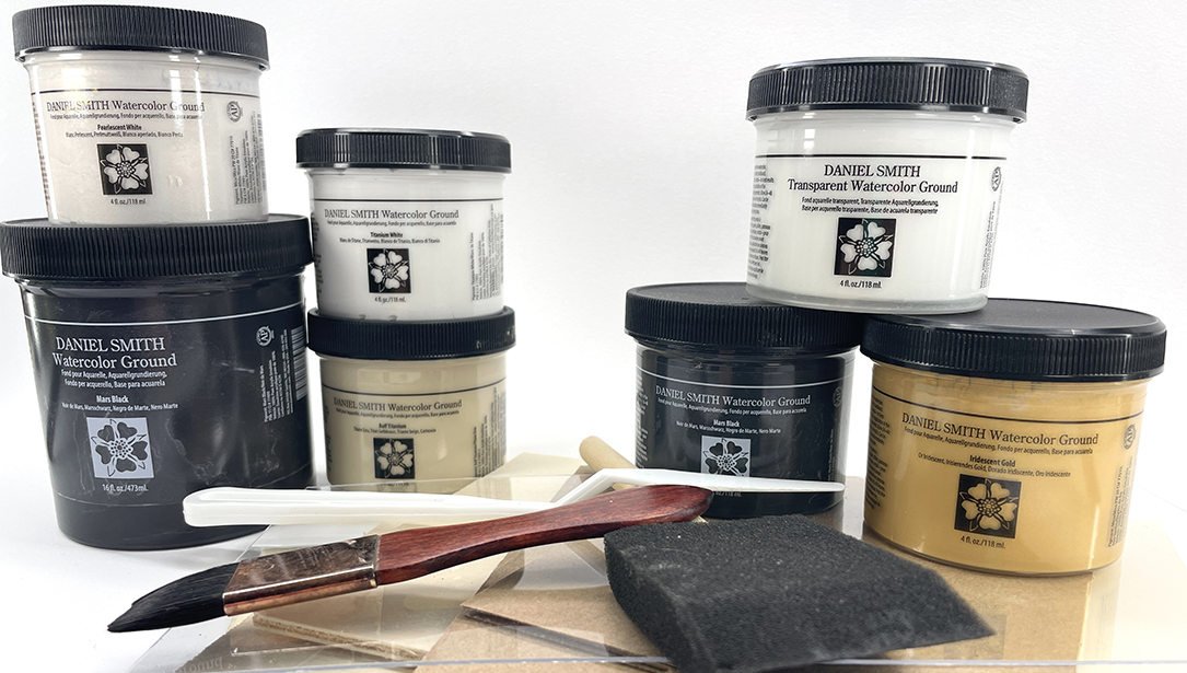
One way I keep myself growing as an artist is to force myself to learn something new, like painting on DANIEL SMITH’s Iridescent Gold Watercolor Ground. I had only finished one painting on the ground and was uncertain about the process at best, but true to my leap-before-I-look approach to art, my demo — “GOLD MAGIC: Portraits on DS Gold Watercolor Ground” — came to be. I did two additional portraits on the gold ground before presenting the demo, summarized here.
First, I thinned the ground with a little bit of water and applied one coat over the entire surface of my paper. After letting it dry overnight, I then applied a second coat using perpendicular strokes. Iridescent Gold Watercolor Ground is made from Mica PW 20 and Iron Oxides, suspended in an acrylic emulsion. Once it’s dry, it’s permanent, so I would suggest using separate brushes for the ground to avoid ruining a favored brush. On one of my paintings, I used a foam edger for painting interior trim; you can also use inexpensive foam brushes. The ground is water-soluble until dry, therefore cleanup is fairly easy. Just try to get as much of the pigment off the brush as possible before cleaning thoroughly with gentle soap and lukewarm water.

This painting of my son was my first attempt on the gold ground. I was tentative at first, but gradually learned how the pigments, paint consistency and brush strokes interacted with the gold background. I was happily surprised with the outcome.
I stretched 140# cold press paper on ½” gator board for the first paintinig – I usually stretch my paintings because I really don’t like buckles! For the second painting, I applied the ground to 140# rough block paper. For the third, I used 140# cold press block paper. All my surfaces worked fine, although the block papers buckled quite a bit while the ground was wet, which impeded smooth application. However once dry, all the papers laid perfectly flat. The ground adds weight to your paper, making it feel a bit like heavy fabric. I love the feel of it.
I had worked my drawings out ahead of time then transferred them to coated paper using graphite wax-free transfer paper, but you can also draw directly on the ground as it erases just fine.
Painting on the ground is a bit of a challenge at first. Your brush strokes apply the paint differently and the water-to-pigment ratio is important. If the paint is too thin, it doesn’t take well, but when you get close to the consistency of cream, it paints very well.

For my second painting, I wanted to see how the paper’s rough texture affected the ground – it made it somewhat smoother. Note the light, opaque highlights I applied right from the start.
The pigments I use for skin tones are light and pretty opaque when not diluted with much water. You can create the colors you want for your portraits on gold ground by mixing them with Titanium White. As opposed to painting with thin, transparent pigments, this more opaque style is especially suitable for the ground. Also, you can actually paint the ground on your work with a brush, if you want to add gold finishing touches.

I like to see personality show up in my paintings as soon as possible, so I usually paint faces first. At this stage, I wanted to get an idea of how the lights and darks on the face played with each other.

Here I started laying in the darker values in the hair. I had already put in most of the facial features and was beginning to get an idea of where the Iridescent Gold would peek through the gaps in the overlaying pigments.

This is the final painting. I reinforced the highlights where I wanted them, added strokes of blue grey to the face and hair for extra punch, and even brushed in additional gold ground for highlights in the hair.
Remember that with a gold background, you are starting out with a value already darker than plain white paper, so you need to adjust your values and technique accordingly.
The fascinating aspect of the gold ground is what happens when you turn your painting at different angles to the light. At one angle, light reflects off the unpainted gold areas creating bright, iridescent highlights, but at another angle the light seems completely absorbed. I find this play of light fascinating! Under glass, the effect is diminished somewhat, which makes me want to learn something else new… how to mount my paintings on board and eliminate glass altogether!

This is the painting I did at the demo. The paper had already been stretched, the ground applied, and the drawing transferred before I started. The painting was 75% finished in about an hour, and I finished it later at home. Such fun!
At my demo one of the attendees said he loved the effect of gold ground because it brought a “Renaissance” look and feel to the work. I understand his comment — the light reflecting off the Iridescent Gold adds great warmth, dimension and a new, exciting look to your work. Try it… you’ll like it!