Step 1.
Step 1: For my portraits, I almost always begin with a detailed drawing in my sketchbook. This way I can work through all of the problems, get my values how I want them, and play with my composition without messing around on my painting surface. If I don’t have the kinks worked out in the drawing stage, I’ll be pulling my hair out for the rest of the painting, because there’s only so much you can take back with watercolor. 😉

Step 2.
Step 2: Once I’m happy with my drawing, I transfer it onto my panel and begin painting my under-layers. I begin very wet and very loose. Just blocking in the various territories and getting some nice blues in for the foundation of his flesh tone. I’m primarily using Phthalo Blue (GS), Ultramarine Blue and Quinacridone Burnt Orange to begin. The blues are always frighteningly prominent at first, but once the subsequent layers go on, they provide a lovely cool tone where the sunlight hits his skin.
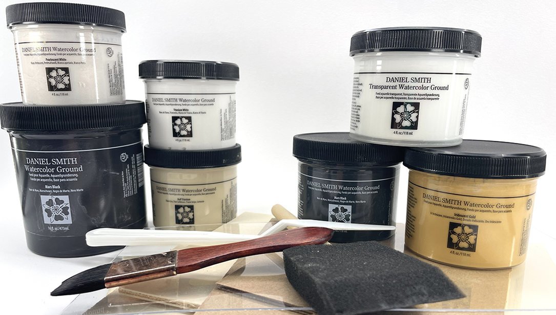
Note: this cradled wood panel has been coated with a single generous coat of DANIEL SMITH Titanium White Watercolor Ground and then sanded down to even out the ridges caused by my gesso brush. (You’ll see evidence of this underlying texture throughout the painting, which I absolutely love.) Painting on the ground is a different feel from paper, but it is a lovely surface to work on and is generally more forgiving and durable than paper.

Step 2. Detail.
Notice the loose treatment of the areas of color at this stage as they follow my pencil guidelines for areas of value. Blooms, color bleeding and crazy edges are all kept. I also never avoid the “scary” parts, like the eyes. I prefer to get them in as soon as possible, because my philosophy is, if I’m going to ruin it, I’d rather do it before I’ve invested too much time into it!

Step 3.
Step 3: I continue to build, mostly focusing on establishing a good sense of my middle values and hands, and continuing to use my same core set of colors. I don’t worry about watermarks and blooms and sharp edges. They add so much character to the painting, and as there are many, many more layers to go, they will not draw the eye like they do when they first go down. A helpful tip for discerning values is to squint your eyes, and the problem areas will often pop out at you. It also helps you “step back” and not get caught up in details that detract from the whole.

Step 4.
Step 4: More building! Now laying in some darks, getting a little more selective with whether I allow blooms and sharp edges as I hone in on points I want to emphasize and de-emphasize. At this stage, I also begin to be much more selective with my warm and cool colors, consciously layering warms and cools in very thin layers on top of each other to create a really juicy sense of complex temperature throughout. I used a lot of Quinacridone Burnt Orange, Aureolin (Cobalt Yellow) / Cadmium Red Medium Hue mixture for my warms and answered with Phthalo Blue (GS) / Ultramarine Blue mixture for my cools.

Portrait in process with palette and workspace.
When you paint in this many layers, it can be a challenge to keep your colors pure enough to play nice with each other. This is where transparent vibrant colors are so wonderful, and where the DANIEL SMITH line really shines. I love all of their Quinacridones for this reason, but I fell in love with their Quniacridone Burnt Orange particularly because it has all the intensity of a strong Burnt Sienna, but it’s transparent! So you can layer vibrantly. Having said that, I always have a couple colors with a good soft body to balance my transparents. In this piece, those were their velvety Payne’s Gray and their granulating Ultramarine Blue.

Step 5. “Smokescreen”, watercolor portrait by Sarah Graham
Step 5: Now, the final touches. In this stage, I spend far more time looking at my piece than I do placing brush to panel. I double check all of my values to make sure every form in the painting turns the way it should. I check my highlights, darks, hard edges, and pops of intense color to make sure that they not only describe the form accurately, but that those natural points of emphasis fall in places that benefit the overall composition. Any area that draws too much or too little attention gets altered. The painting will never feel perfect in every way, but when it feels “settled,” like the heart of it can be read without the viewer’s attention being distracted by parts of the painting that have unfinished business, then I can call it done.
DANIEL SMITH Color Palette for this piece:
Quinacridone Burnt Orange
Aureolin (Cobalt Yellow)
Cadmium Red Medium Hue
Phthalo Blue (GS)
Ultramarine Blue
Payne’s Gray