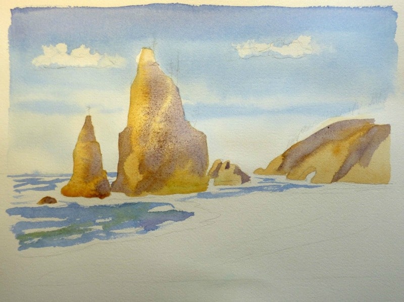
Rialto Beach on the Olympic Peninsula is one of the most dramatic landscapes on the Washington state coast, and because it’s easily reached—no major hiking involved—it is a favorite of visitors to Olympic National Park. The Park encompasses glaciers and meadows of the Olympic mountain range, as well as coastal beaches, offshore islands and rocks. Because Rialto is so iconic, its forms so powerful, and its colors so lively, I included a watercolor of it in my book, Colors of the West: An Artist’s Guide to Nature’s Palette.

I painted many of the watercolors in the book on location, en plein air. I enjoy using watercolor sketchbooks, so that I have a chronicle of my outdoor adventures and I often re-visit them in my studio, using the sketches and my photos to create larger paintings. I took a lot of photos the day I visited Rialto Beach, because I didn’t have time to set up my outdoor painting kit. For this watercolor, I used those photos when I was back in my studio. I’m painting on 140 lb. cold press watercolor paper, with round sable watercolor brushes, #4 and #7, plus a flat ¾” sable brush, very useful for skies and larger areas of the paintings. I also use ½” synthetic flat brushes, great for softening edges.

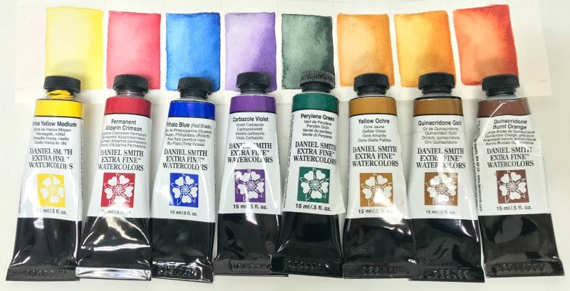
My palette of DANIEL SMITH Watercolors includes: Hansa Yellow Medium, Permanent Alizarin Crimson, Phthalo Blue (Red Shade), Carbazole Violet, Yellow Ochre, Quinacridone Gold and Quinacridone Burnt Orange. As a finishing touch, I added Perylene Green to selected areas in the trees, both individual young trees on the sea stacks and in the forest area on the distant headland. Just these eight colors allowed me to express the full range of hues of the sea and sky, sand, headland, trees and sea stacks. DANIEL SMITH Watercolors help me to achieve the most natural looking colors—I rely on them for an accurate representation of the colors I see in the wild places of the west. The degree of saturation makes them last a long time—it doesn’t take much pigment to get a rich hue, and the colors here mix beautifully, both in mixing wells on my palette, or if I decide to drop colors in and mix them directly on the paper.
Here’s what I used for each landscape element:
Sky: Phthalo Blue (RS). For the highest part of the sky (the zenith), add a little Carbazole Violet to the blue mixture for a deeper blue.
Sand: I used my basic gray mixture of Phthalo Blue (RS), Carbazole Violet, Quinacridone Burnt Orange. This is very diluted, and then I added a little bit of Permanent Alizarin Crimson.
Sea stacks and headland: Yellow Ochre plus gray mixture above. For an even brighter gold, I added a little bit of Quinacridone Gold to the mix.
Ocean: Phthalo Blue (RS) plus a green made from Phthalo Blue (RS) and Hansa Yellow Medium, with a touch of Quinacridone Burnt Orange.
Trees: A green mix of Phthalo Blue (RS), Hansa Yellow Medium plus Quinacridone Burnt Orange. For more depth, add strokes of Perylene Green.

Step 1
Tape your paper to a board using four rolled pieces of artist tape under the corners. In this demonstration, the background is painted first. Begin after all of your paints have been mixed and are ready to use. As you begin adding color, remember to place the colors you have chosen in more than one area and alternate the colors, laying them next to each other on the painting.
Step 2
After drawing the clouds, sea stacks, headland, beach and surf – wet the entire sky and paint Phthalo Blue (Red Shade) with a flat brush. Use paper towel to blot out clouds. While the wash is still wet, add a stroke at the zenith mixed from Phthalo Blue (RS) and a little bit of Carbazole Violet. Paint the ocean, leaving a lot of white for surf, and add a little green while the blue is still wet. You can make the green more neutral by adding a bit of Quinacridone Burnt Orange, and also make the blue deeper by adding a little Carbazole Violet.

Step 3
After the sky and ocean have dried, mix some Yellow Ochre with a little bit of Quinacridone Burnt Orange to paint in the sea stacks and headland. Paint loosely, and if you wish, add more saturated color as it dries a little.

Step 4
Here I have re-wet the headlands and introduced more saturated golds, beginning to model the forms with deeper saturations and darker tones. I added more pigment to the mixture, and increased the amount of Quinacridone Burnt Orange and Carbazole Violet.

Step 5
Once the headland and sea stack washes are dry, you can paint the beach with a mixture of Phthalo Blue (RS), Carbazole Violet, Quinacridone Burnt Orange and a small amount of Permanent Alizarin Crimson. Use a wet into wet technique to get the full range of colors. Once dry, you can drag a brush across the foreground to get a little bit of sand texture. Use the same mixture to model the forms, developing the clefts and blocks on the sea stacks and headland. As you paint those darker areas, use a flat brush to soften the edges of the shadowed areas, so lines are not too harshly defined (marine light is soft). The light is coming from the left side, so most of the darks are on the right side of the stacks.

Step 6
At this point, it is time to get harder edges and more powerfully sculpt the forms of the sea stacks and headland. Wherever cast shadows are strongest, I allow hard edges. Once in a while it is good to soften an edge, by dragging a flat brush across the wash while it is still wet, or occasionally re-wetting an edge and scrubbing out the hard edge, but in most cases here, I left edges alone and allowed them to form.

Step 7
Add the trees, both on the stacks and on the headland, using a mixture of Hansa Yellow Medium, Phthalo Blue (RS) and Quinacridone Burnt Orange. You can add some Perylene Green (which is a great color for conifers) for especially dark areas in the trees and headland forest. Finishing touches include darkening the shadows and clefts and adding more drybrush texture to the foreground sand. Notice the inset of the headland trees. Rather than painting a bunch of individual trees, I treated the small forest of young Sitka spruce trees as a single mass. Occasionally I will add a darker stroke of green, into the overall green.


