

In a recent Friday LIVE demo with John Cogley, artist and new Brand Ambassador Loel Kathmann shared her heartfelt, intuitive approach to watercolor painting using DANIEL SMITH Walnut Ink and an expressive rainbow of powerful pigments. Known for her abstract floral compositions, Loel’s work goes far beyond representation—each flower she paints becomes a vessel for feeling, memory, and connection.

The Layering Powerhouse – Loel’s Go-To Colors
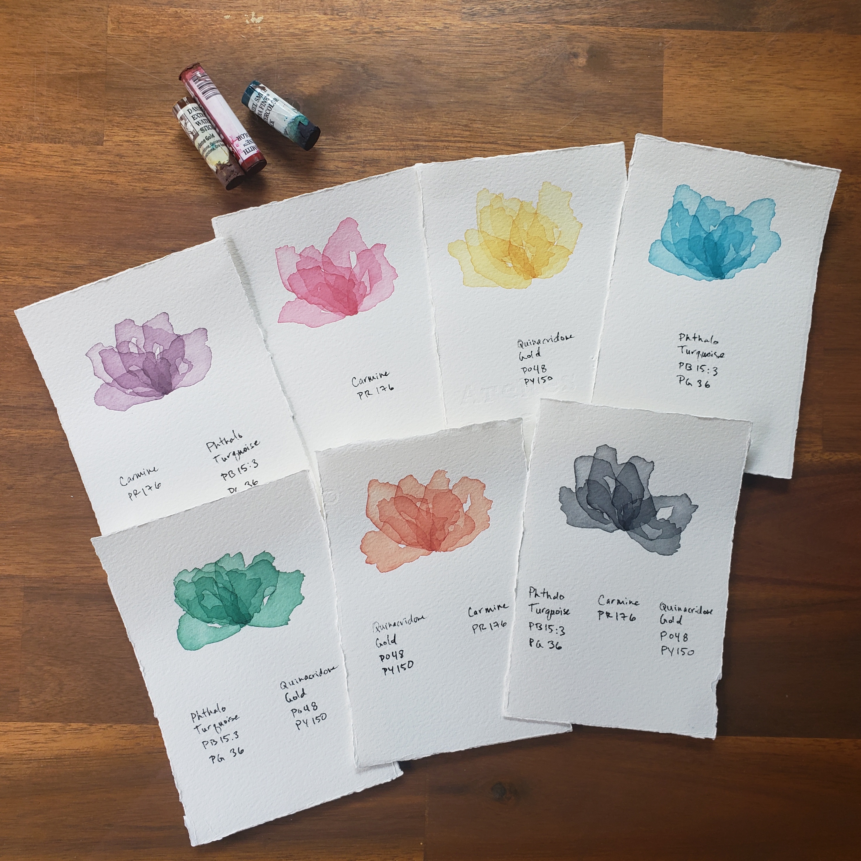
Terrific Trio
Loel refers to them as her “layering powerhouse” colors—and for good reason. She frequently uses the DANIEL SMITH Watercolor Sticks, which deliver the same rich pigment load and luminosity as traditional tubes, with the added flexibility of direct application for expressive, intuitive painting. Loel advice when it comes to choosing palette colors?
“Choose your palette based on pigment, not color.”


These “Layering” colors are essential to her process, offering transparency, vibrancy, and depth:

(PO 48 + PY 150) – A radiant, glowing hue that adds warmth and complexity, particularly effective in layered florals.

(PO 48) – A rich, earthy orange that brings warmth and grounded intensity to layered compositions.

(PB 15:3 + PG 36) – A deep, transparent blue-green that offers striking contrast and clarity, whether layered or used wet-in-wet.

(PB 15:3) – A bold, cool blue with exceptional transparency, ideal for deepening shadows and creating vibrant contrast.

(PR 176) – A lush, warm red that glazes beautifully and maintains its brilliance through multiple layers.

Used alongside DANIEL SMITH Walnut Ink, these colors create a dynamic balance of emotion, movement, and structure—hallmarks of Loel’s heartfelt floral work.
A Signature Technique Rooted in Nature
Loel’s process begins with a poetic nod to the natural world: she scatters smooth river rocks across her blank paper, then spritzes water over the surface. The rocks preserve small dry spaces while the rest of the paper becomes a soft, wet-in-wet canvas. When the rocks are removed, the untouched paper creates visual pauses—spaces waiting to receive meaning.

Into the wet areas, Loel drops vibrant color, allowing pigment to bloom and flow with a sense of emotion and spontaneity. Her signature “layering powerhouse colors” form a radiant spectrum she uses to build luminous depth through transparent washes. She frequently works with DANIEL SMITH Watercolor Sticks, taking full advantage of their rich pigment and expressive handling.
Once she is satisfied with the way the color has settled into the water, Loel adds a surprising final step to the foundation: she loosely stretches thin painter’s plastic—commonly used by house painters and contractors—over the still-wet surface. As the painting dries beneath the plastic, the shifting folds and air pockets and wrinkles imprint subtle texture, creating a dynamic base layer that adds complexity and movement to her abstract florals.

Her palette for this piece:
- Green Apatite Genuine
- Walnut Ink + Bloodstone Genuine
- Carmine
- Phthalo Blue (Green Shade)
- Iridescent Gold
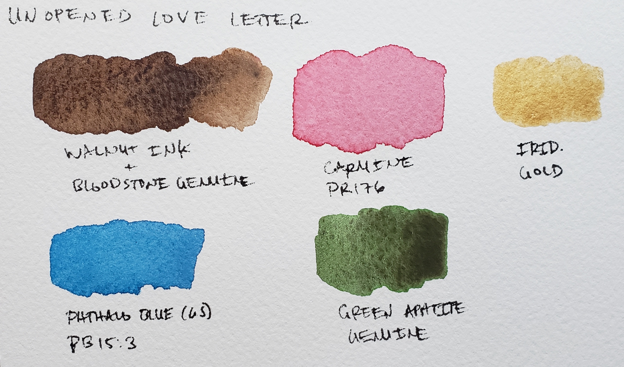
These vivid hues mix beautifully with DANIEL SMITH Walnut Ink, whose warm, transparent brown adds softness, shadow, and organic contrast.


Walnut Ink: The Grounding Thread
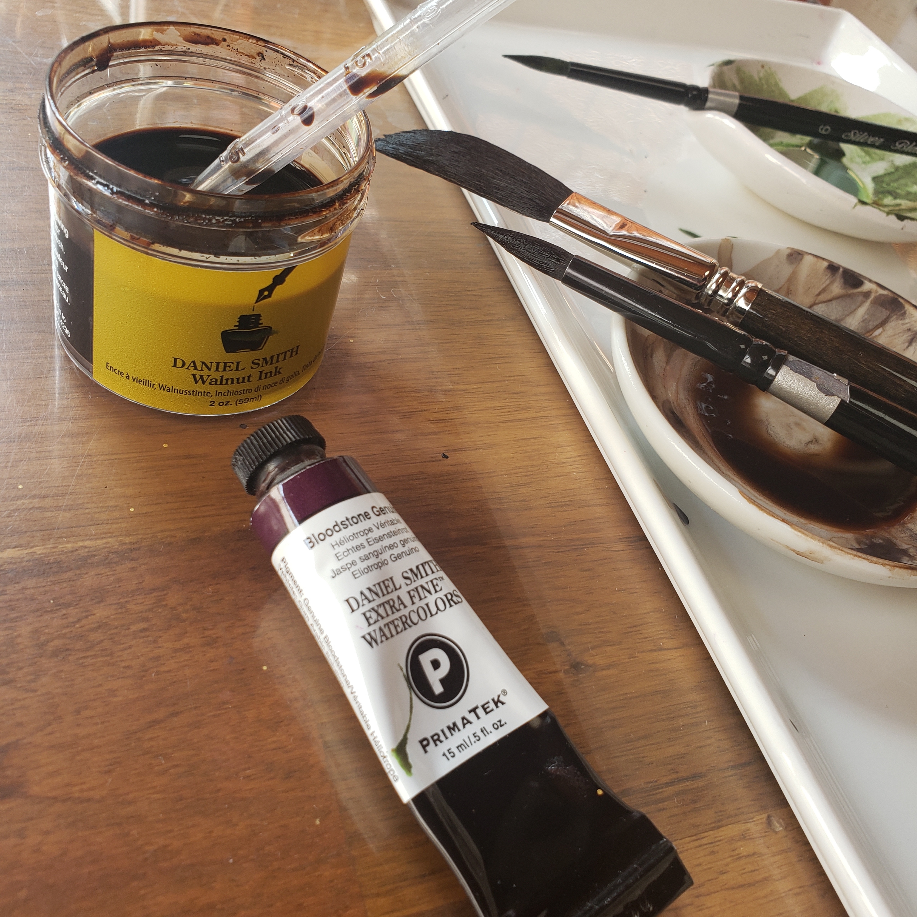
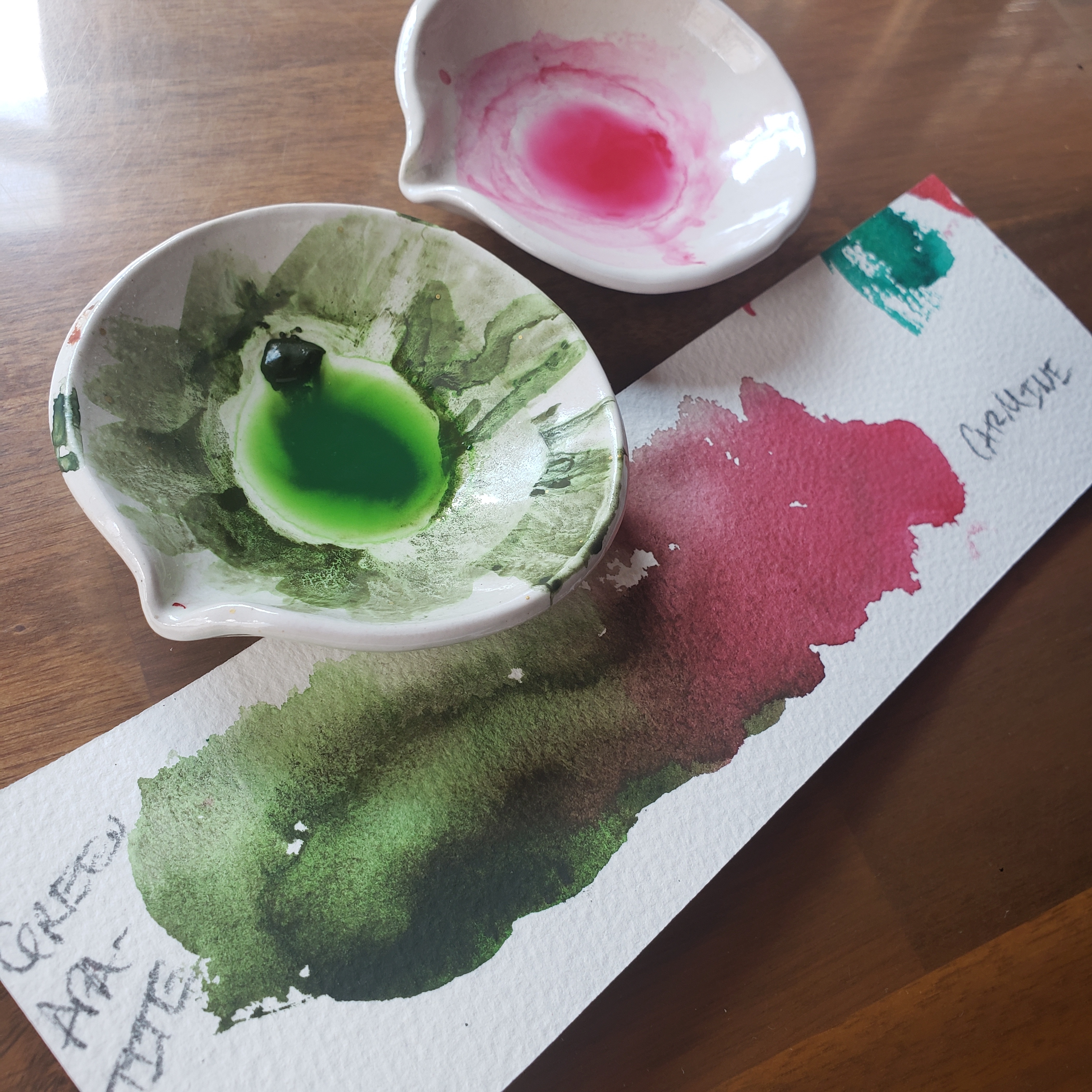
Walnut ink and Bloodstone Genuine Watercolor
For Loel, DANIEL SMITH Walnut Ink serves as a grounding thread throughout her work. Its warm, transparent brown adds depth and softness to vibrant watercolor layers, offering a natural counterbalance to high-chroma pigments.
She discovered Walnut Ink while browsing the shelves of her local art supply store. The name instantly brought back memories of her grandmother, who always kept a giant bowl of walnuts ready to be shelled. As a child, shelling walnuts wasn’t her favorite task—but the memory has stayed with her. Those quiet moments at the table now feel meaningful, tied to the steady rhythm of time spent together and her grandmother’s gentle presence.
Whether used to create delicate lines or to tone and unify bold color, Walnut Ink helps Loel weave memory and emotion into the fabric of her heartfelt abstract florals.
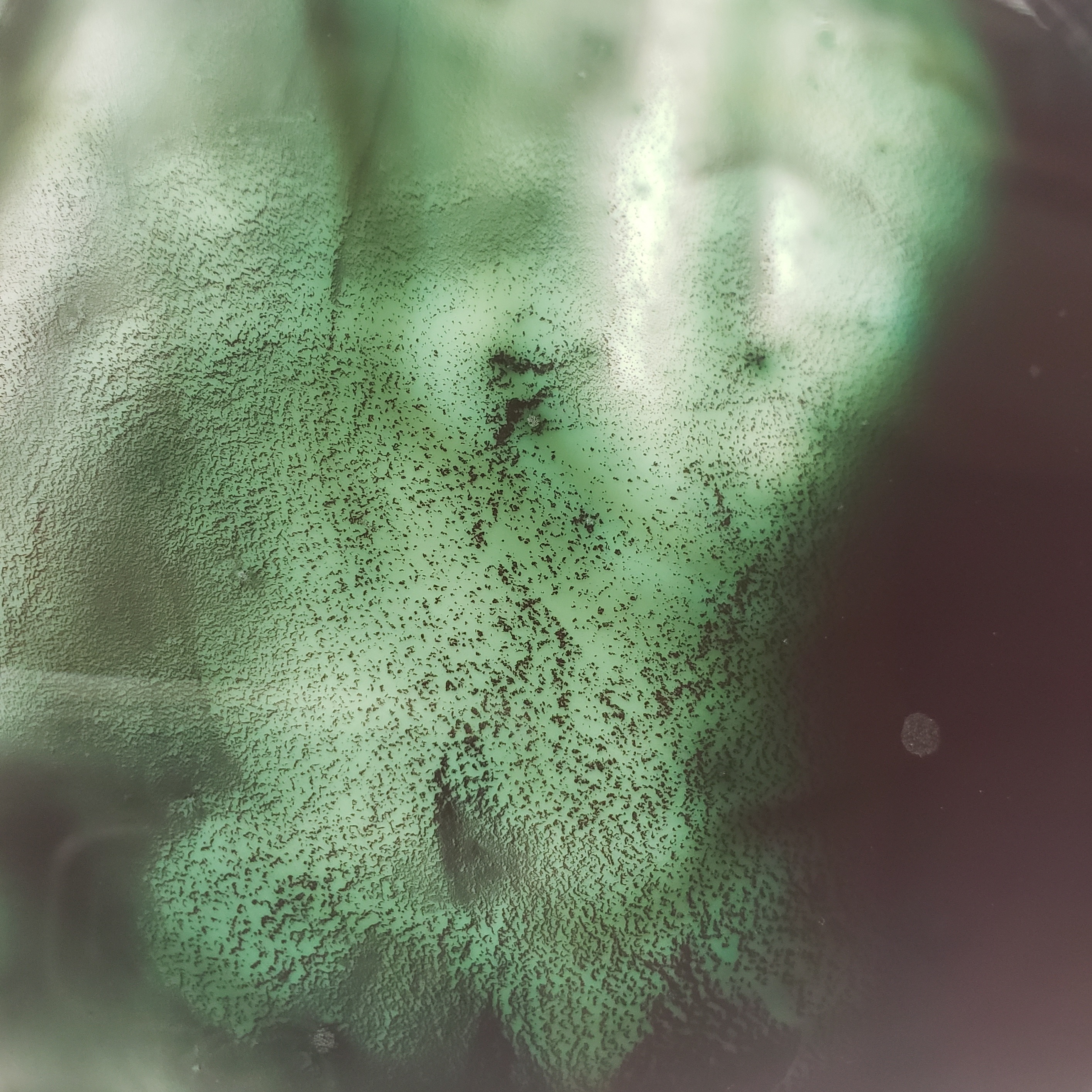
Close-up of Walnut Ink mixed with Bloodstone Genuine and Phthalo Blue (Green Shade)
Florals That Speak Emotion
Loel doesn’t paint flowers to replicate nature—she paints them to express what words often can’t. Each piece captures a feeling: joy, vulnerability, resilience, grief, or hope. Her flowers bloom with intention, guided by the flow of water and the movement of the moment rather than by rigid structure.
In her Friday LIVE session, Loel walked viewers through this heartfelt process, inviting them to explore their own emotional voice through color, water, and mark-making. She reminded us that art doesn’t have to be perfect—it has to be honest.
“There is no wasted paint.
There is no wasted paper.
There is only learning.”

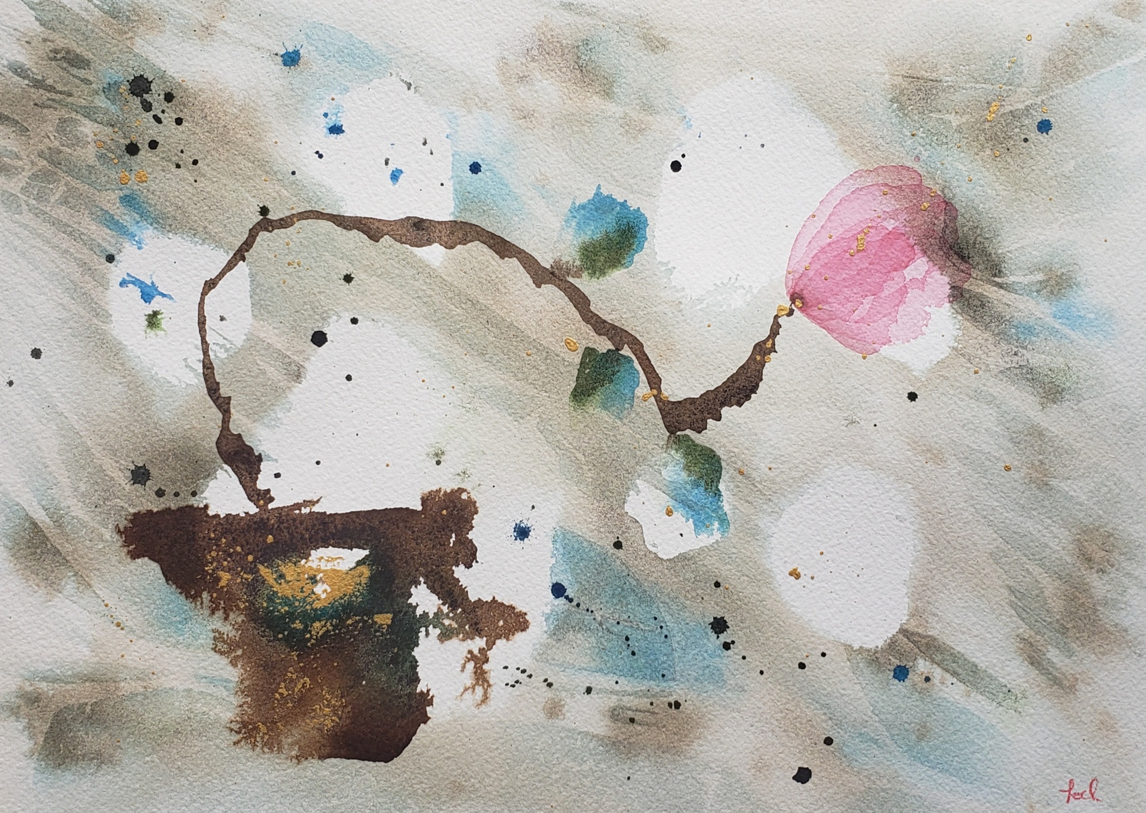
“Unopened Love Letter”
Try It for Yourself
Loel’s demo is available on the Daniel Smith YouTube and Facebook page, offering both inspiration and guidance. To explore her techniques, gather the following materials:
- DANIEL SMITH Walnut Ink
- Green Apatite Genuine, Bloodstone Genuine, Carmine, Phthalo Blue (Green Shade), Phthalo Turquoise, Quinacridone Gold, Quinacridone Burnt Orange, Iridescent Gold
- Cotton watercolor paper, soft brushes in various shapes and sizes, river rocks, painter’s plastic or plastic wrap, spray bottle
Whether you’re a longtime watercolorist or a curious beginner, Loel’s approach invites you to loosen up, layer deep, and paint what you feel.
About Loel Kathmann
 Loel Kathmann is an artist by passion and scientist by training. She has a deep appreciation for pigment chemistry and is fascinated by the connections between pigment chemistry, pigment personality, pigment appearance, and human emotion. Her technical background infuses her work with an experimental bent and detail-oriented nature. Loel lives in Washington State. She paints to meditate, takes joy in connecting with the art community, and feels grateful to share the materials and processes important to her work.

