Share:
Pomegranates are a reoccurring theme in my artwork. Every characteristic of the fruit has come to symbolize something to me in its shape, color, seeds and juice. Throughout history, the pomegranate has been a symbol of humanity’s fundamental beliefs and desires – including life and death, fertility and marriage, abundance and prosperity.
Color palette:
- Hansa Yellow Light
- Quinacridone Gold
- Cobalt Teal Blue
- Cobalt Blue
- Phthalo Blue (GS)
- Italian Burnt Sienna
- Permanent Alizarin Crimson
- Lunar Black
For this tutorial, I am using a hardbound watercolor sketchbook because they are portable and open completely flat. Before I use a sketchbook for the first time, I open it and bend the covers way back a few times. This won’t hurt the book and it helps relax the spine. No more trying to paint in the valley of a two-page spread! An additional advantage is that it fits perfectly on a standard home scanner.
My preferred way to paint is from life. If I wish to truly understand light, shadows and form, nothing compares to observing with my own eyes. There is no greater teacher than observations. This applies whether my subject matter is flora, architecture, landscape or people. The image was drawn from life and the photo serves as a gentle reminder that a camera has one eye and no brain. It is my job as an artist to put life into my work and I’m a firm believer in rearranging elements to develop a stronger image. A good rule of thought is, don’t record what you see – instead tell me what you want me to see.

I draw my image directly on the paper with a waterproof pen – no preliminary pencil sketch. I am fond of drawing with pen in my sketchbooks and rarely use pencil. I’ve found that I have a tendency to be less observant when I use a pencil, for the simple fact that I know I can erase it. Just knowing that pen can’t be erased forces me to observe longer before I put the pen to paper. If I don’t paint it, the pen sketch has a more finished quality compared to a pencil drawing. Here I have used continual line contour drawing. It’s the fastest and most accurate way to draw and I love the look. I will periodically lift my pen off the paper, but for the most part I don’t. I like drawn borders on my sketches. A white border has a nice presentation and a finished look.
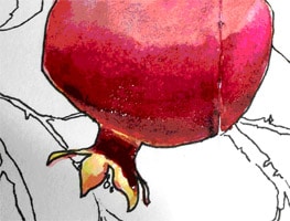
I start by painting the pomegranate in the foreground. I believe in mixing colors on the paper as much as possible. I start by creating two large puddles – one of Permanent Alizarin Crimson and another of Quinacridone Gold. I paint the entire sphere shape of the pomegranate with the crimson, but before it has a chance to dry, I had a touch of gold towards the top. Once dry, I add more crimson towards the bottom and a touch of Lunar Black. I love the effects I get with Lunar Black because it doesn’t dull the colors like most blacks. It simply adds a wonderful textural quality. It’s perfect for the look I want! The paper is heavyweight and I am able to work wet into wet without the paper warping. Now I paint the crown portion with Quinacridone Gold. When it dries, I paint the cast shadow with Permanent Alizarin Crimson and a touch of Lunar Black.
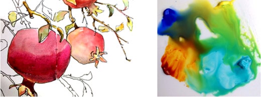
I paint the two other pomegranates using the same technique and the same three colors. I add a little Italian Burnt Sienna to the upper pomegranate for variety in color. Next I paint the leaves. Greens can be troublesome – I’ve found the most believable greens are mixed and not directly out of a tube. When I use a tube green, I always introduce another color into it. To make greens, I create puddles in the center of my palette with Cobalt Blue, Hansa Yellow Light, Cobalt Teal Blue, and Quinacridone Gold (clockwise from the top left). I let the edges of each paint puddle touch and mingle. Now I have a puddle with a large variation of greens. With each brush load, I have a varied green. Every once in a while I put a touch of Permanent Alizarin Crimson in the leaves before they dry, which gives the illusion of reflective color from the pomegranate and warms up the greens.
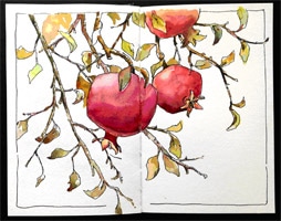
I finish painting the leaves and small branches. I darken the middle pomegranate with Permanent Alizarin Crimson and Lunar Black. Once the paint is completely dry, I lift a couple highlights on the pomegranates. My paper is internally and externally sized, which makes the surface very forgiving. With a soft brush and clean water, I gently stroke the surface to loosen the paint. I then use a dry towel to blot it off. The paper is heavyweight and handles lifting easily without damaging the surface.

I begin to paint the area behind the pomegranates with a light wash of Cobalt Blue on the upper section. I carefully paint around the pomegranates, but I allow the wash to go over many of the leaves. I don’t want the leaves to look cut out and the wash helps to unify the area, push some of the leaves back and bring others forward. By using transparent colors and building up the darks with glazes, I am able to achieve lively, rich darks. I enjoy the process of painting with multiple glazes of color. It’s important to let each glaze dry thoroughly before proceeding.
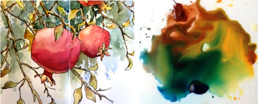
Next I apply another layer of greens. I want this glaze to be deeper and richer in color and value. I am using Italian Burnt Sienna, Quinacridone Gold and Phthalo Blue (GS) (clockwise from the top). I pull the three colors into the center of my palette and allow the edges to touch and mingle slightly. I focus on the area directly behind the pomegranates. I am careful to let some of the prior glazes show through. I begin to suggest additional leaf shapes with negative painting.
Now is the fun part when I can add the darks! I am still using Italian Burnt Sienna and Phthalo Blue (GS) for my greens, but the puddle is darker this time. As I am suggesting more leaves with negative painting, I am also dropping in pure color into wet areas. Near the upper left corner, you can see the addition of Permanent Alizarin Crimson added while the area was still damp. It adds a bit of sparkle and warmth to a dark passage of greens. The final touch is a little splatter to break up the white paper.
In closing, most watercolor paintings start out looking the same; it’s the final marks that say who we are. What are my identifying marks? I would say my work is identifiable by how I draw, how I handle transparent glazes and my negative painting.


