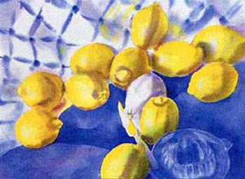
Choosing complementary colors can really enhance your painting and make the colors pop. In this small study, I juxtaposed yellow with its complement (blue) to make the lemons appear especially brilliant against the background.
I used the following colors:
• Hansa Yellow Light
• Ultramarine Blue
• Hansa Yellow
• Cobalt Blue
• French Ultramarine
• Quinacridone Rose
After carefully arranging my lemons and cloths by a north-facing window, I made a credit card-sized value sketch. Squinting helps me see the different values. I drew my still life composition to scale on sketch paper, which I subsequently transferred to my watercolor paper using a light table.
Next, I put some paint in three separate palette dishes – blues, yellows and grays. I mixed my grays from Cobalt Blue, Quinacridone Rose and Hansa Yellow Light. I put about a teaspoonful of water in each palette. I placed an absorbent cotton towel that was a little larger than my sheet of paper on a flat surface nearby.
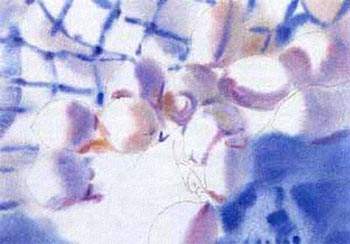
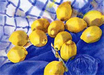
I thoroughly wet my paper on the front and back and placed it on a slick plexiglas board. I rewet the edges. You need to work rapidly before the shine leaves the paper’s surface. I dropped in the shadows and blue stripes on the top left-hand part of the cloth, then I laid in the blue underpainting for the glass lemon squeezer on the solid blue cloth. Making sure the paper still had a shine, I added in the lemons’ shadows and cast shadows using my gray mix. Once finished with that, I quickly transferred the wet paper to the flat towel to avoid back-runs around the edges.
If the shine had left the surface before I completed the shadows, I would have had to thoroughly dry the paper to set the paint and then rewet it to prevent watermarks from forming. I could also use this procedure to restate values. It is important to have the values correct at this preliminary stage, so the next stage is a cinch.
Once the paper is completely dry, I drew several dots of masking fluid with a bamboo pen on the blue paint of the lemon squeezer to preserve the white highlights. Then I placed my paper with the cotton towel back on to my plexiglas board. Before painting the yellow of each lemon, I placed a drop of clear water for the highlight. I rewet the solid blue cloth in sections and dropped on the first wash of blue paint. Occasionally, I lifted out paint with a damp sable brush. I left the lemon by the knife unpainted in the illustration to show the sequence.
Studying my set-up carefully, I worked each small area one at a time. If I wanted a soft edge, I made sure the paint was surrounded by clear water that it could merge into. If I wanted a hard edge, I painted on dry paper. Sometimes I turned my painting upside down to gauge the underlying shapes. Finally, I added the dark accents and details.

