As Van Gogh once wrote in reference to the Dutch masters he most admired – Rembrandt, Vermeer and Hals, “Profound study of the first thing to come to hand…was enough to really create something.” Of his own goal, Van Gogh added, “My ambition is truly limited to a few clods of earth, some sprouting wheat. An olive grove. A cypress…”
Van Gogh’s sketchbooks are full of studies of these simple things, and they would later become elements of his great paintings. Artistic ideas take shape in sketchbooks and journals — they are ideal for recording experiences and practicing one’s craft.
Nature studies
Over the years my journal keeping has evolved. I began with nature studies. Since childhood, animals and rocks have held a special fascination for me. When weather forced me indoors, my father’s gift of the Golden Nature Guides by Herbert S. Zim gave me many happy hours poring over their child-friendly illustrations.
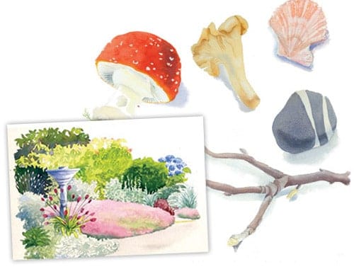
Constant study subjects for me are beach rocks and shells, forest-floor detritus like mushrooms and fir cones, and butterflies and flowers in my garden. I also added birds to my list of favorite subjects after completing several studies of specimens borrowed from the Burke Museum of Natural History and Culture at the University of Washington. These studies benefit my larger paintings as I practice shapes, volumes, highlights and cast shadows, value contrasts and color mixing. A rock or shell is a marvelous teaching tool, giving so much more pleasure to the student than studio aids like spheres and cones!
Traveling with journals: celebrating places
In the summer, I travel in the Western states to teach and vacation – Cascade Head on the Oregon coast, the North Cascades National Park in Washington, and Yellowstone National Park. No matter how many times I visit these places, I find them newly wonderful. An especially heavy winter snowpack lingering on summer peaks or a rainy sojourn on a coastal meadow will create infinite variations on a theme. A portable watercolor kit allows me to work on location, capturing light and color on the spot. I often take photographs too, so that if I don’t finish on location, I can work with the photos once I’m back in my studio.
Lettering enhances page design
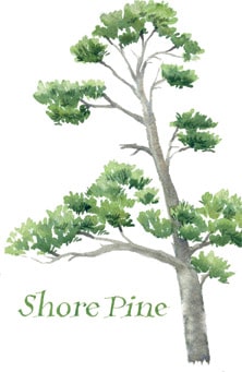
Because my sketchbook is also a journal, I make notes and record poetry or thought provoking quotes that I encounter. Good letterforms and colorful titles make for more striking and readable pages.
A favorite letterform is a relaxed Roman style that I learned from a calligrapher. It’s constructed with a broad-nibbed pen loaded with gouache in the same manner as a versal capital: two strokes which meet in the center and are filled in on the next stroke. As the pen loses its full load of gouache, it’s easier to lightly stroke in the hairline serifs. It’s rather time-consuming, so I use it only for titles. I also like to make these letters with a round brush held at an angle; downward pressure is applied to the thick part of the letter and light upward strokes make the thin part of the letter.
Visiting friends’ gardens
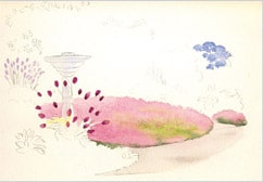
Visiting the unique gardens that my friends create is like going to an art museum or gallery and discovering a new artist whose work I love. Each site is different, and each individual chooses distinctive colors and textures. This is Claire’s garden on a record-breaking hot day in the Pacific Northwest.
Step 1: Drawing and the purest hues
I started by drawing very general outlines of the plants and pathway with an H pencil. Then I painted the purest flower hues that I could see — the Cobalt Blue hydrangeas in the background. Next I painted the flowering bed of creeping red thyme, a large expanse of mauve with a bit of green foliage visible. I used Permanent Alizarin Crimson with just a bit of Quinacridone Violet to achieve the blue-based pink. I began by quickly painting that color everywhere and then just a small bit of yellow green, using Hansa Yellow Medium with Phthalo Blue Red Shade and a small amount of the Permanent Alizarin Crimson to neutralize it.
The most important thing to remember in wet-in-wet painting is not to overload the brush with the second wash color; it tends to gush out and create back runs. I usually mix the color, then blot the brush on a paper towel, then pick up a little of the mixture with only the tip of the brush, thus avoiding the overloaded brush problem. I added a bit of slightly more saturated mixtures to create a sense of texture in the pink, and also the shadowed side of the border foliage. I used a #3 round daVinci Maestro brush to paint the small flowers.
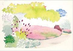
Step 2: Foliage
Next I painted the birdbath and the pathway, both in a mixed gray: Phthalo Blue (Red Shade) plus Quinacridone Burnt Orange plus Carbazole Violet. I made sure to leave some dry white paper on the birdbath edge to indicate the bright sunlight’s glare. I dropped a little of the crimson/magenta mix into the wet gray of the pathway. After allowing that to dry, I painted the allium blooms with a saturated Quinacridone Magenta.
The next task was to indicate the general hues of the foliage, the rhododendrons in the background with their spent blooms. The leaves were mixed with Hansa Yellow Medium and Phthalo Blue (Red Shade) and for the spent blooms I added a little Permanent Alizarin Crimson and Quinacridone Burnt Orange. I used the same mixture for the dragon’s blood sedum (visible in the lower right foreground.) The lamb’s ears and the fescue were a silvery blue gray. I mix Phthalo Blue (Red Shade) plus Quinacridone Burnt Orange for those glaucous-leaved plants.
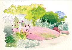
Step 3: Middle values and texture
I began to develop the texture of some of the plants by mixing up darker values of the initial washes. To darken them even more than simply a more saturated mixture could do, I add more Phthalo Blue (RS) and Quinacridone Burnt Orange. I did some negative painting around the rhododendrons in the background to help define their very recognizable leaf clusters. Other textures are easy to create with quick dabbing brush strokes.
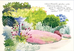
Step 4: Darkest values & negative painting
Finally, I painted the darkest values of the deep forest-green belt behind Claire’s garden. I darkened values everywhere and strengthened the shadows on the birdbath with a wash of Cobalt Blue, also adding it to the left side of the sketch in order to suggest shadows and to unify the sketch. I added more texture to the thyme and areas of foliage. I felt the allium blooms were too violet, so I dabbed a little Permanent Alizarin Crimson on them to brighten them.
Fine details and careful writing can be difficult to execute on location, so I wait on them until I’m in my studio and have some good arm and elbow support. Once there, I painted in the allium stems with a script brush. I used a drawing nib dipped in white acrylic ink for the lavender stems on the left side of the birdbath. To finish, I recorded a few thoughts with a fine-point ink pen.
Extended Watercolor Palette:


