As an urban sketcher, I have come to love on-location sketching. This unique and immersive sketching experience has made me more aware of how I see the world. My sketches tell the story of my surroundings, the places I live and where I travel. The sights, sounds and smells we encounter on-location all provide important sensory inputs for the story we want to tell. These invisible sensory information can add another dimension to our expressive lines, colors and textures in our sketches. Of course sketching on-location has its unique challenges. The changing weather can often be problematic and not forgetting the wary security guards that we have to deal with. Do not be surprised if you notice someone sketching you during your train ride home.
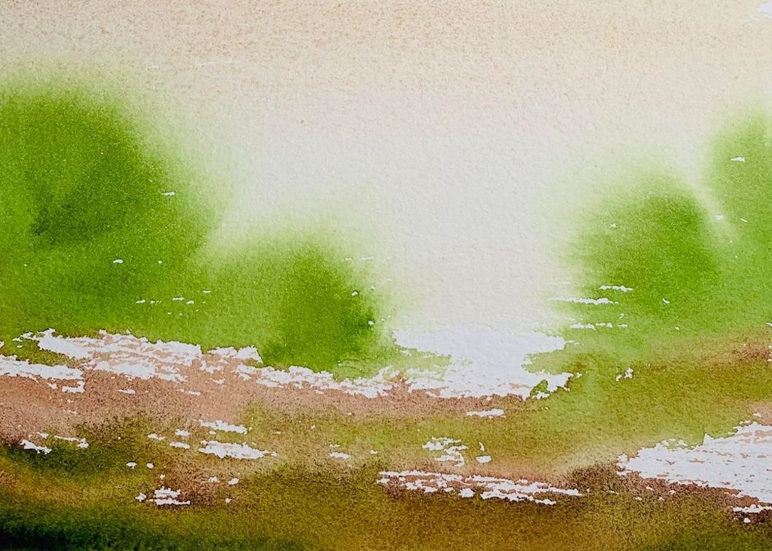
I like to use quick spontaneous sketches with bold colored shapes to capture old and new architecture in and around Singapore. For me, watercolor is the perfect medium for fast expressive sketching when I am on-location. I also carry a small bag full of useful tools to manipulate the paints. Playing with my paints has helped me discover some very unique characteristic and effects of watercolor. Through these experiments, I have discovered that balancing the timing of when and how to apply water and knowing the nature of the paper will determine if the paint will sing or get drown out.
Featured DANIEL SMITH Watercolors
-
- Hansa Yellow Deep
- Transparent Pyrrol Orange
- Transparent Brown Oxide
- Van Dyck Brown
- Permanent Alizarin Crimson
- French Ultramarine
- Cobalt Teal Blue
- Cerulean Blue Chromium
- Cobalt Blue Violet
- Blue Apatite Genuine
- Indigo
- Jadeite Genuine
- Perylene Green

I use quick expressive techniques like splashing, blotting and scrapping to move watercolor paints on paper. The fluidity and unpredictability of watercolor works perfectly for my playful approach and I especially like how well Daniel Smith’s watercolor can flow, sink and float. Their multi-pigment and highly granulating colors are very useful for gritty brick walls and colored roof tiles of old Singapore shophouses too.
For this sketch of Thian Hock Kian temple here in Singapore, I was captivated by how the temple walls and roofs were juxtaposed against each other. Bold colored shapes and interesting textures are always good elements for a sketch story. I started from the ‘heart’ of the sketch and spiraled slowly outwards to create dynamic relationships using colored shapes. My sketch is just like how our heart pumps blood to all parts of our body using major and minor arteries and veins. All parts interconnected and supportive of each other. My approach is to put down the center of interest first and not leave it to the last.

1
1) DESIGN – I started the process by throwing some colors on to overcome the fear of clean white paper and to put down my initial marks at the heart of the sketch. As I splashed and scrapped my way around, I always try to relate back to the focal point. This will help the different portions stay cohesive as one single sketch story. It is important to have fun and go very wet and wild with paint and water.

2
2) DENSITY – Here I started to experiment with where to increase and reduce the transparency of the washes to create greater sense of space and depth. I tend to move back and forth between drawing and painting to catch all the inspirations that are flowing rapidly out from my head. Not drawing everything allows me to make small shifts and gives me greater freedom to modify shape relationships. Making all my tools and colors visible and within reach also helps to make sure I can quickly find what I need to sustain the creative process.

3
3) DIRECTION – I slowly shifted the horizontal movement of the sketch to a more vertical one and eventually spiraled back towards the heart of the sketch. Details were added with more controlled splashes and scraps to suggest the fine wooden carvings of the temple structures.