Sagaku có nghĩa là cân bằng trong tiếng Nhật. Tôi nghĩ rằng tiêu đề hoàn hảo cho tác phẩm này mà tôi lấy cảm hứng để vẽ trong khi xếp các bát cơm lên tủ. Tôi thích cách chúng nghiêng và dịch chuyển khi thêm mỗi bát. Tôi dựng một bức tĩnh vật gần cửa sổ bếp khi ánh nắng buổi chiều tràn vào.
Ánh sáng ấn tượng là thứ tôi thích đưa vào mỗi bức tranh. Tôi thích độ tương phản cao. Tôi chụp ảnh tĩnh vật của mình, chụp nhiều bức ảnh từ mọi góc độ khác nhau. Sau đó, tôi tải chúng xuống máy tính. Khi nhìn thấy chúng trên màn hình máy tính, tôi xác định bức ảnh tham khảo nào có bố cục mạnh nhất. Sau đó, tôi vẽ bố cục của mình ra và chuyển bản vẽ bằng giấy chuyển tự làm để hạn chế số lượng đường kẻ chì trong bức tranh của mình.

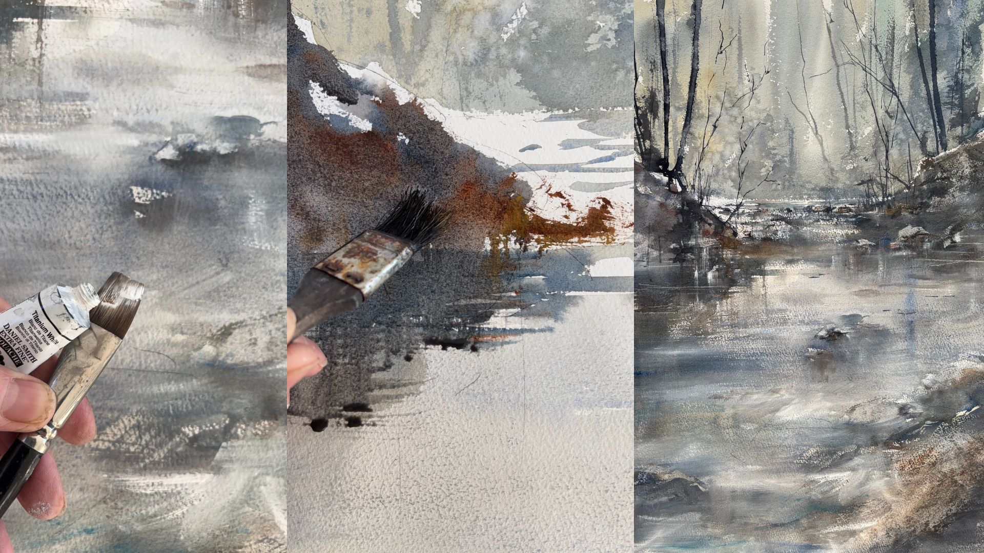
Đối với bức tranh này, tôi chỉ sử dụng bảng màu nước DANIEL SMITH khá hạn chế: Xanh lam đậm, Chàm, hỗn hợp Chàm/Nâu đỏ cho các màu tối nhất, Xám Payne, Nâu đỏ và Vàng Quinacridone.

Sau khi chuyển bản vẽ của mình lên giấy màu nước, tôi chặn nhiều vùng tối nhất bằng than chì, chúng sẽ được phủ bằng sơn và chúng giúp tôi có một "lộ trình" cho bức tranh của mình. Tôi vẽ theo phương pháp ghép hình bắt đầu từ một vùng và hoàn thành trước khi chuyển sang vùng khác. Đối với bức tranh này, tôi bắt đầu từ trên cùng và sẽ hoàn thành từng phần một trước khi chuyển sang phần tiếp theo.

Tôi đã gần hoàn thành chiếc bát trên cùng trong hình ảnh này. Tôi bắt đầu đặt các vùng tối ở phần nền để đảm bảo tôi có các giá trị ở đúng vị trí mình muốn. Sau khi đặt phần nền tối vào, tôi nhận ra rằng mép trên của bát cần được định hình lại. Tôi đã sử dụng cọ tổng hợp để giúp "xóa" một số phần nền tối bằng cách sử dụng nước sạch và thấm bằng khăn giấy, tôi kéo một chút mép trên lên để làm thẳng lại. Với rất nhiều hình elip trong một bức tranh, điều quan trọng là phải dừng lại và nhìn bức tranh từ xa để đảm bảo các bát có hình dạng chính xác.

Tiếp tục với chồng bát của tôi, tôi hoàn thành từng cái một trước khi chuyển sang cái tiếp theo. Tôi đã sử dụng Ultramarine Blue trong mỗi bát cho đến nay để đảm bảo tính liên tục của tác phẩm. Ngay cả những khu vực nằm trong bóng tối cũng có một chút Ultramarine ở đó. Tôi đã sử dụng Sepia ở các cạnh của bát và một chút Quinacridone Gold để làm ấm vành bát.

Tôi đang bắt đầu tô chiếc bát thứ sáu trong hình ảnh này. Điều quan trọng là phải giữ cho những vùng có nhiều ánh sáng chiếu vào chúng có màu trắng. Để tạo cho những chiếc bát có cảm giác tròn trịa, tôi đã phủ một lớp mỏng màu Xanh lam đậm khi chiếc bát lùi dần vào vùng tối. Khi những chiếc bát lùi dần, chúng dần trở nên tối hơn bằng cách thêm một chút Indigo vào lớp phủ ở phía bên phải của bát. Việc xử lý các cạnh của bát thực sự quan trọng. Mặc dù chiếc bát nằm trong vùng tối ở phía bên phải nhưng vẫn có một chút màu trắng hoặc Xanh lam đậm ở các cạnh.
Tôi đang bắt đầu tô chiếc bát thứ bảy trong hình ảnh này. Chiếc bát thứ sáu chủ yếu là màu chàm vì họa tiết đơn giản nên tôi đã thêm các lớp màu xanh lam nhạt Ultramarine Blue vào những chỗ có thể để giúp duy trì tính liên tục của toàn bộ bức tranh.
Vì nền rất tối, tôi quyết định sơn một vùng màu Xanh lam Ultramarine ở góc dưới bên trái. Sau đó, tôi nhẹ nhàng ký tên mình bằng bút chì lên lớp sơn Xanh lam Ultramarine đã khô. Lúc này, tôi che tên mình bằng dung dịch che phủ. Khi hoàn thành bức tranh, tôi sẽ dùng que cao su để loại bỏ dung dịch che phủ và tên tôi sẽ xuất hiện trong màu Xanh lam Ultramarine.

Tôi đang bắt đầu tô chiếc bát thứ bảy trong hình ảnh này. Chiếc bát thứ sáu chủ yếu là màu chàm vì họa tiết đơn giản nên tôi đã thêm một ít màu xanh Ultramarine Blue vào những chỗ có thể để giúp cho bức tranh toàn cảnh được liền mạch. Vì nền rất tối nên tôi quyết định tô một vùng màu xanh Ultramarine Blue ở góc dưới bên trái. Sau đó, tôi nhẹ nhàng ký tên bằng bút chì lên lớp sơn xanh Ultramarine Blue đã khô. Lúc này, tôi dùng dung dịch che tên để che. Khi bức tranh hoàn thành, tôi sẽ dùng que gắp xi măng cao su để loại bỏ dung dịch che và tên tôi sẽ xuất hiện trong màu xanh Ultramarine Blue.
Có một số hình dạng thú vị trong các bát do ánh sáng phản chiếu. Thật là một thách thức khi làm cho chúng trông giống như chúng được cho là ở đó chứ không phải là một hình dạng kỳ lạ. Đây là lúc tôi phải nhắc nhở bản thân mình vẽ những gì tôi thấy chứ không phải những gì tôi nghĩ mình thấy. Một số bát dưới cùng này có lớp phủ Payne's Gray để làm tối các giá trị ở phía bóng tối.
Đây là bức tranh đã hoàn thành. Phần bát dưới cùng rất thú vị khi vẽ. Khu vực ở giữa có một vùng sáng bóng lớn. Để đạt được điều này, tôi đã tô nhẹ các hình dạng bằng màu Payne's Gray và Ultramarine Blue, sau đó tôi phủ lên khu vực đó bằng nước thường và dùng khăn giấy để nâng màu lên. Toàn bộ bức tranh là sự kết hợp rất thú vị giữa sáng và tối trong một bảng màu gần như đơn sắc.