我非常榮幸有機會透過這篇循序漸進的文章,詳細講解我的水彩技法,以及我為研究光線而調配的丹尼爾·史密斯(DANIEL SMITH)顏料。.
我非常喜歡玻璃瓶上的倒影,研究這類主題已經很久了。當時我在布達佩斯的硬石餐廳用餐,正值國際水彩郵件藝術展期間。當我走過吧台前時,冷冽的光線從每個倒影中清晰地反射出來,刺得我睜不開眼。我立刻想到要拍幾張照片,以便將來創作水彩畫。.
這個主題的複雜性不僅在於反射,還在於各種表面的三維性。.

喬瓦尼·巴爾扎拉尼 (Giovanni Balzarani) 繪製了他的“B'EST BAR”水彩畫。.
我的繪畫過程
我為這幅畫選擇的紙張是軟壓超白水彩紙,640gsm(300磅)-整張,76x56公分。.

使用法國群青色、紫藤色和薰衣草色水彩顏料繪製天花板燈的輪廓。.

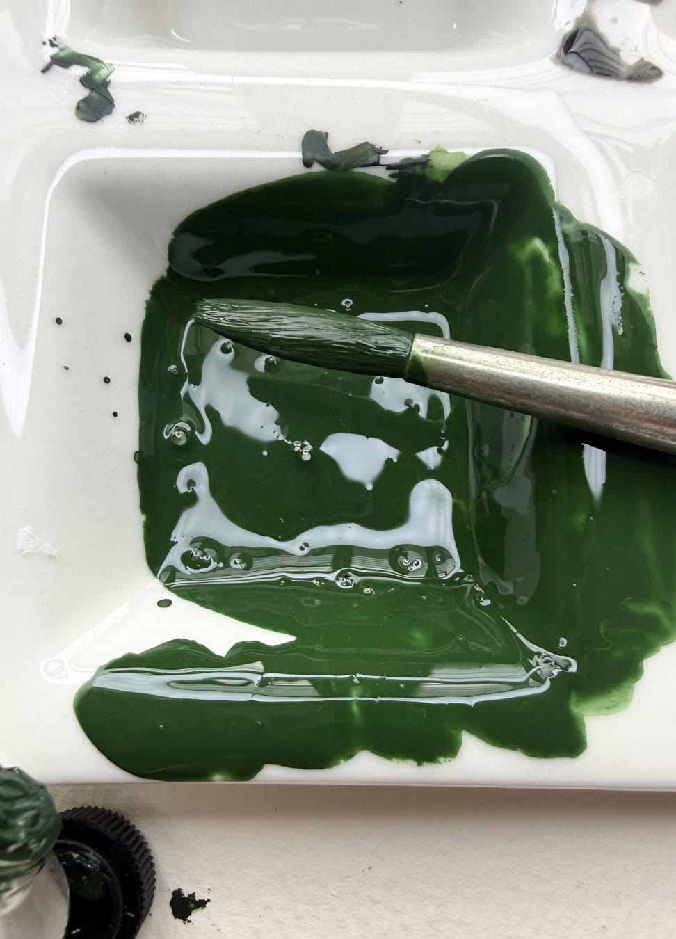
加入漢莎黃深和生赭淺作為底色。.

漢莎黃深、法國群青、錳藍和鈷藍水彩顏料混合而成。最後用凡戴克棕上光。.

我把餐廳的牆壁背景處理成了虛化狀態。.
在繼續繪製瓶子之前,在各種方案(圖層)中,我繪製了餐廳的牆壁背景,全部都失焦了,以此來表現相機的眼睛。.

對於深色調,我最常用的混合顏料是凡戴克棕+中性灰+法國群青+瑪雅藍+瑪雅深藍水彩顏料。.

這部分畫作全部都是從左到右繪製的。.
接下來是畫瓶子,一個接一個地畫,一點一點地完成,一個瓶子一個瓶子地畫。這部分我從左到右畫。這個過程最複雜,因為我必須在還沒畫出輪廓的情況下就畫出物體的最終光澤。.

為了調出暖色調,我用漢莎黃深 + 生赭淺 製作了黃色釉料,還混合了喹吖啶酮金 + 喹吖啶酮赭和吡咯橙。.

當時最常用的配色方案是那不勒斯黃+鈦白+1%群青,以及少量的淺黃鈦。.

“B'EST BAR”專案基本完成”
對於這類構圖而言,最精妙之處並非在於細節的數量,而是在於如何運用陰影來表現所有色調,這些陰影大多出現在白色背景上,因為它們的色調比例幾乎可以忽略不計。而正是這些陰影的營造,賦予了每個物體三維立體感和體積感。.

“喬瓦尼·巴爾扎拉尼 (Giovanni Balzarani) 的”B'EST BAR”