For this portrait painting titled Fae, I started with a photo of my friend Amy, a dancer and professional fairy, who did an impromptu photo shoot with me at a festival. I liked her wistful expression and fanciful costuming as the main inspiration for the painting. This piece is an example of my typical portrait painting process in watercolor.

I like to work with a reference photo as the jumping off point because a photo can capture fleeting expressions and movements, as well as the memories of a particular time and place. Although I also enjoy painting the model from life (and this practice informs all of my other drawing and painting), a live model is more limited in what can be sustained for several hours. Sometimes I hire specific models I want to shoot photos of (or I press friends and family members into service), other times I’ll bring my camera to events to capture more organic moments. I particularly love working with dancers, actors and all kinds of performers, since they’re very at ease in front of a camera. I might have a particular concept in mind when I start shooting for reference, or I might just file the photos away and see what they inspire for me later on.
I look for expressions, gestures, and light that inspire me in photos, but I don’t worry about keeping the original composition of the photo, or painting everything exactly as shown in the photograph.
In this case, I first crop from a larger full body photograph, and then move the portrait 2/3 to the right of a horizontal composition so that we can follow the subject’s gaze through the composition. I plan to eliminate the extraneous background information, and handle the environment in an expressive way. I also plan to paint the overall colors a bit warmer than what my camera captured, since the photo has a slight cool cast to it.

I like to work on 300lb cold press (rough) paper. I don’t stretch my paper, but I might clip it to a board to make manipulating the piece easier as I work. I’ll start with a fairly well-defined preliminary drawing, which allows me to be looser and more relaxed with the painting process – I know that I already have my likeness nailed down. To avoid overworking the paper before I begin painting, I will transfer the basic lines for the image from either a separate preliminary drawing or a draft copy of my photograph, and then I will refine and develop the drawing using an HB #2 mechanical pencil. I try to avoid excessive erasing.

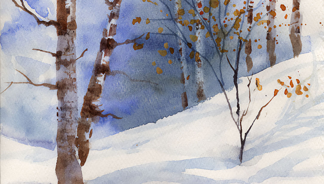
Step 1: Expressive background
Since I want a loose, expressive background for this piece, I begin there. I work mostly wet on wet, painting a soft interpretation of the natural environment in the photo, leaving out extraneous elements. I also add a big swath of pink radiating out from the flower, to create sort of a magical feeling. I allow some of the background to merge into the shadow side of the figure. I also sprinkle some salt in areas of the background while it’s semi-wet to create small salt blooms as an additional atmospheric element. When I’m working a large area like a background, I try to use the largest brush I can, only switching to smaller brushes for more control when I need to.

Step 2: Cool underpainting
My basic process for painting a portrait in watercolor starts with a cool-colored underpainting. This is a personal quirk I developed through trial and error when I painted lots and lots of portrait commissions right out of art school. Painting believable flesh requires using not just warm colors, but including some cools. I found that painting some of the cools first helped to set them under the surface of the skin, and it also helped me get a good sense of the overall value structure of the painting right from the get-go.
It’s vital to note that this is NOT a full-value underpainting like one might do an umber grisaille in oil painting. Since everything put down on the page in a watercolor will remain visible through subsequent transparent layers, going overboard with this initial cool layer would be completely overwhelming. I just focus on the cool shadows I see. Large sections of the portrait remain unpainted at this stage.
Cerulean Blue Chromium is the color I use most often for this stage. It has a slight warmth to it, and even at full strength, is not too deep in value. However I will sometimes integrate greens, other blues and purples at this stage, depending on the complexion of the subject or the lighting of the scene. On a subject with dark skin, the cool underpainting might shift to using more ultramarine blue and purples.
During this stage, I also make sure to put the white of the eyes and any visible teeth mostly in subtle cool shadow. Aside from any bright highlights on these areas, they are never fully the white of the paper. I also usually carry the cool shadows into other areas like clothing for consistency.
Overall, I tend to think in shapes of value and color, leaving fairly hard edges to my shapes. I might soften the edge of a transition within a face with just a little bit of clear water or with a dry brush texture, but smoothness is not something I concern myself with. I don’t think of it as a fundamental characteristic of watercolor. The major relationships are more fundamental in creating the illusion of realism. And any blooms or organic textures that arise in the course of painting are embraced and appreciated.

Watercolor bloom detail.

Step 3: Lightest warm flesh tones
Once the previous layer is fully dry (I use a hair dryer if I’m impatient), I look at my photograph and identify both the pure white highlights on the flesh, and the lightest light warm flesh tones. I put down a large wash on all of the flesh areas, except for the white highlights, in this light flesh color. It goes right over the cool underpainting. Indian Yellow, Pyrrol Scarlet, Permanent Alizarin Crimson, and Quinacridone Rose are the colors I usually choose from when mixing this color. There is no one exact formula – it depends on what I observe. In this case, the lightest light areas in the subjects face seem to shift more yellowish, so I used mostly Indian Yellow and Pyrrol Scarlet, well-diluted. While this wash was wet, I drop in a little bit of Pyrrol Scarlet under the subject’s chin where there is a particularly warm sunny glow.

Step 4: Mid-tone warm flesh colors
Once again, I allow the previous layer to dry fully. Now I am layering my mid-tone warm flesh color on top of the lightest lights, leaving some of those previous light areas unpainted. I usually use the same colors as above, although for darker skin, I may also introduce Burnt Sienna at this stage. The mid-tones on this subject look more pinkish to me, so I use cooler reds in the mix. There will also be variety from one area to the next in this layer. It’s important not to be too hesitant when painting the warm mid-tones. At this stage of the painting they will be the darkest thing on the face, which can lead to a tendency to want to paint them too light. Better to be a little more aggressive now, rather than realizing at the end of the painting that all of the mid-tones are too washed out.

Step 5: Blocking
Before I move on to adding more detail to the face, I make sure that all other areas of the painting are blocked in with an appropriate light color. I try to work a painting as a whole so that I can understand the overall relationships, rather than totally finishing one area while another is still totally unpainted.
At this stage I may switch to using mostly smaller brushes, as the areas I’m handling are getting smaller. I build up details and darker areas as needed to complete the painting. Colors here could be anything. As I darken some shadows on the flesh, I may return to using some cool colors. Small shadows that define the features can be warm darks or cool darks. I mix neutrals and darks using a variety of complementary color pairs.

Eye detail
It’s important that the lights and darks in the finished painting feel well-balanced and create a pleasing movement around the page. Sometimes there is a tendency for beginners to make the nostrils and the pupils of the eyes the only dark areas on a face, which looks odd. And when it comes to details like the texture of hair, eyebrows and eyelashes, it’s important to observe carefully and not default to a cartoon idea of what these things look like. Think about bigger shapes first, with individual hairs being just an enhancement in certain places.

Tips for painting portraits in watercolor:
- Use the largest brush comfortable for an area, then switch to a small one for more control or detail only when you really need to. Don’t get caught up in trying to cover a lot of area with a tiny brush.
- Think of breaking down the major value changes in the face like creating a stencil. Big shapes and accurate values are more important than smoothly blending one value into the next. A preoccupation with blending and smoothness can lead to an overworked painting, or a face that lacks structure.
- Embrace the fundamental character of watercolor. Allow it to be alive and do what it wants to do, to some degree. Accept blooms, tide lines, and other organic textures that arise naturally during the painting process as a beautiful, natural part of the process rather than fighting them or trying to correct them. An organic accident is more beautiful than overworking an area trying to force it to behave in certain way.
- Don’t isolate features – don’t think of a nose or lips as objects that need to be worked separately from the rest of the face. Work in big connected shapes.
- If realistic, full-color flesh tones are the goal (as opposed to an intentionally limited palette- which can also be great) it’s important to have both a warm and a cool red. All flesh contains cool tones as well as warm tones.
- For small pieces and traveling, I use a plastic palette with individual wells for color and large divisions for mixing. For large paintings, I use a variety of enamel butcher trays and individual ceramic dishes.
I love how pigment-rich DANIEL SMITH Watercolors are, enabling me to achieve intense color saturation easily. They readily they re-wet back to full strength even when left to dry on a palette – just like new with no scrubbing or rubbing! The wide selection of colors, including those with unique properties not available elsewhere, means each artist can choose precisely the palette that works best for them, and find exactly what is called for in any circumstance.