
I am very honored to have the chance to explain here in my step by step article, my watercolor techniques, and my DANIEL SMITH color mixes for my study of the light.
I really like the reflections on glass bottles, it is a long time that I study this kind of subject. In this case I was dining at the Hard Rock Café in Budapest, during the International Watercolor Mail Art Exhibition, and while I was walking in front of the bar, the cold light hit me hard as it bounded cleanly from every reflection. I immediately thought to shoot some photographs in order to develop a watercolor in the future.
The complexity of this subject is not only about the reflection but the three-dimensionality of the various surfaces.

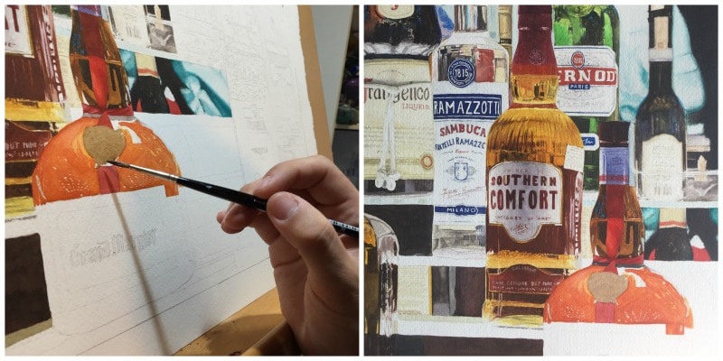
Giovanni Balzarani painting his “B’EST BAR” watercolor.
My Painting Process
The paper I have chosen for this painting is a soft press, extra white watercolor paper, 640gsm (300lb) – full sheet, 76x56cm.

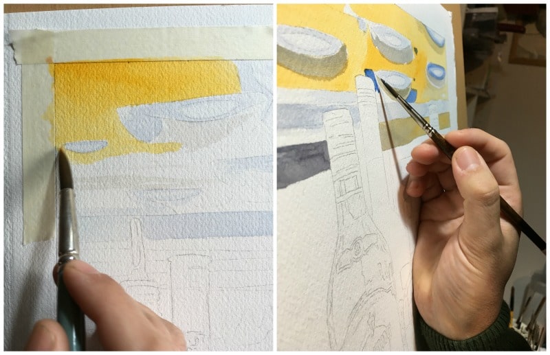
Working on the ceiling lights contour, with French Ultramarine + Wisteria + Lavender watercolors.

Adding a base of Hansa Yellow Deep + Raw Sienna Light.
I have painted a base of Hansa Yellow Deep + 로 시에나 라이트 to paint the coffered ceiling background, in order to give the final effect of the light reflection on the wood.

Color mix of Hansa Yellow Deep + French Ultramarine + Manganese Blue Hue + Cerulean Blue watercolors. Final glaze with Van Dyck Brown.
To paint the coffer, after the yellow base, I mixed again Hansa Yellow Deep + 프랑스 울트라마린 + 망간 블루 색조 + 하늘색, giving a greenish reflection. As a final glaze I added 반 다이크 브라운 so to highlight all the lamps.

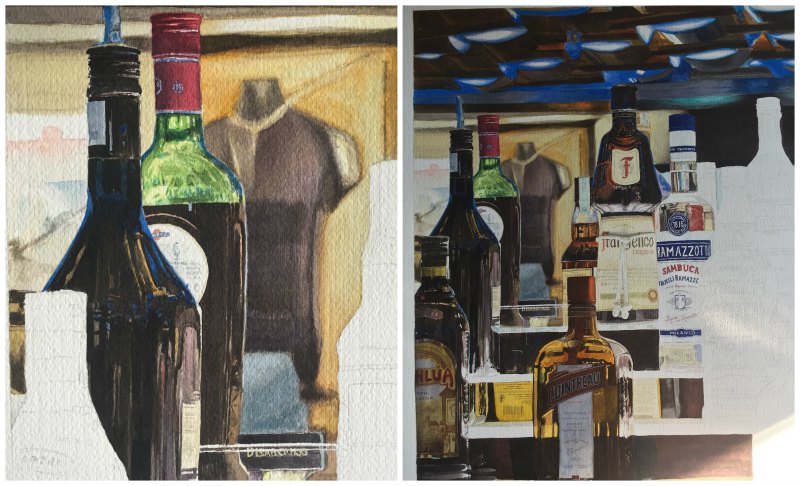
I have done the restaurant’s wall background out of focus.
Before going on with the bottles, in the various plans (layers), I have done the restaurant’s wall background, all out of focus, representing in this way the eye of the camera.

For dark tones, my most used mix is Van Dyck Brown + Neutral Tint + French Ultramarine + Mayan Blue Genuine + Mayan Dark Blue watercolors.
For dark tones I have tested various mix of colours, often avoiding the use of the ready black; most used mix is 반 다이크 브라운 + Neutral Tint + 프랑스 울트라마린 + Mayan Blue Genuine + Mayan Dark Blue.

From left to right for all of this part of the painting.
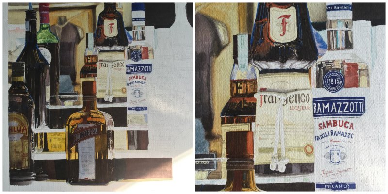
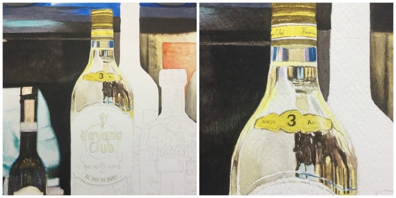
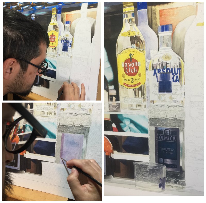
Next steps are the bottles, painted one by one, ending piece by piece, bottle by bottle. I start from left to right for all of this part of the painting. This process is the most complex because I must already paint the final light of the object without making the contour done.

For warm tones, I have made yellow glazes with Hansa Yellow Deep + Raw Sienna Light, also a mix of Quinacridone Gold + Quinacridone Sienna and Pyrrol Orange.
For warm tones, I have made yellow glazes for the base with Hansa Yellow Deep + 로 시에나 라이트, and then a mix of 퀴나크리돈 골드 + 퀴나크리돈 시에나 그리고 피롤 오렌지 for the first glaze of red tone.
퀴나크리돈 골드 is a wonderful base for the next glazes of reds, because of its reflective glow.
Dark color on light colors: I have always used 반 다이크 브라운, at a minimum percentage, and 퀴나크리돈 골드, as you should be able to see on the Southern Comfort and Grand Marnier bottles at their first glaze.

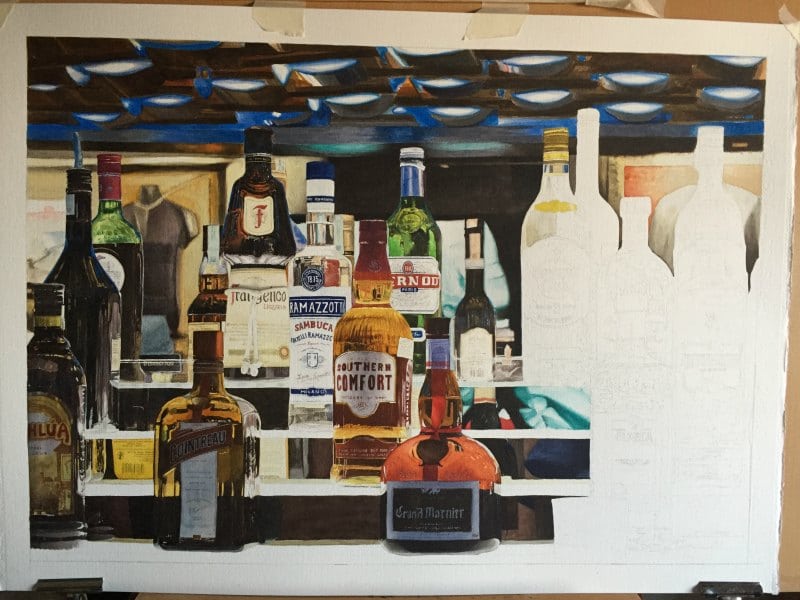
The prevalent mix was Naples Yellow + Titanium White + 1% Ultramarine Blue, and a little Buff Titanium.
For the light and transparent bottles that characterize all the right side of the painting, the prevalent mix was Naples Yellow + 티타늄 화이트 + 1% 울트라마린 블루, and creating that light greyness, is a little Buff Titanium.
The use of extra white paper has helped the work very much on light tones giving them a lot of light.

Nearly finished working on “B’EST BAR”
The most intricate (complex) work for such a composition is not about the enormous quantity of details, but about the shadows creating of all the colour tones that are there, mostly on white, because their tone percentage is almost nonexistent. Creation of such shadows creates, in turn, three-dimensionality and volume to each object.

“B’EST BAR” by Giovanni Balzarani