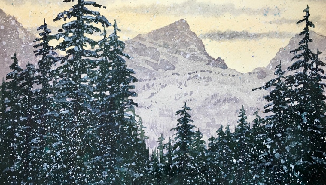
Moving a mountain is just what I did in this painting – I embellished on great content from a not so great photo. The photo I used as a springboard for the painting, but my intent was to make it my own. I took the photograph in December at about 8:00 in the morning in a valley near my home outside of Seattle, Washington. The first step in creating a painting is choosing your subject. Decide what is the element or elements in the image that attracted your attention. Choose the size and format, paper, and palette of colors, and area of dominance (focal point). Then take one more step. Ask yourself, what do I need to change? What story am I going to tell? What aspects of the scene do I keep and where should they be placed for a harmonious balance and interesting design? Do I add or subtract content or just give it better placement?

I began with a thorough analysis of this photograph and decided on my palette of colors. My revised palette offers some new options and I have enjoyed experimenting with some new color choices and made happy discoveries that add a boost in my thinking about color and a lively fresh look to my paintings. Also, I looked critically at the uninteresting mountain right in the center and the dark trees out of balance, too far toward the left edge of the picture plane and the group of trees on the right side felt too close to center. Always check your resource work for solid design principals. Make changes where necessary. What inspired me were the long violet shadows in the foreground contrasting the vibrant yellow green meadow. The textures of foliage and the various planes provided an interesting opportunity to create depth and tell a story of color and light. I tire of blue skies and fluffy white clouds used too often as a fallback position for a lot of landscape paintings. However, this is the sky presented to me (happily) on this day. I chose to make a different statement in my painting by playing with color and reflected light, echoing the glazes of color in the sky washes into the foreground road. I enjoy working with primary triads of color and underpainting them in separately to establish mood and atmosphere. This transforms the painting right from the start!

The Process
I began the painting process choosing 140# cold press paper and supported with ½ inch board slightly larger than the paper. I made a simple line drawing of the major elements, placed where I wanted them. Water was generously applied with a 2″ brush to both sides of the paper. While the paper was absorbing the moisture, I mixed Raw Sienna, Quinacridone Coral, and Cobalt Blue, each in a light to mid value range. Just before applying the first wash with a 1 ½” brush, I quickly rewet the surface so it would be shiny wet and allow the paint to slide over the surface and make a soft edge transition.

The Painting Plan
The washes were applied to both the sky area and the ground, Raw Sienna first, immediately followed by Quinacridone Coral. Let the shine on the surface start to dissipate, and then with a diagonal stroke from a wide wash brush, place two or three quick diagonal strokes of the Cobalt Blue mixture from left to right in the sky area and another couple of diagonal strokes across the foreground road. I then stapled the wet paper to the board. Allow this layer of washes to settle in and lose the shine, but not dry completely. The next layer of paint creates the mountain planes. Combine French Ultramarine Blue and Quinacridone Burnt Scarlet, a blue violet mid tone. Keep it somewhat neutral so it will sit way back in the painting. Using a #14 round brush, draw a clean upper edge of the shape, then drag the belly of the brush creating a rather ragged lower edge on your mountain shapes. You are actually painting the top of the next shape as you paint the bottom of the mountains. Start at the sides of your image where the paper is a bit dryer, and generate several different shapes that suggest distant hills and forested areas.
I chose a blue green using French Ultramarine and Sap Green. I also think if you want it darker, substitute Phthalo Blue. If the green seems a bit garish, touch in a complement such as a bit of Quinacridone Burnt Scarlet to neutralize the color intensity. I used a variety of earthy colors for the deciduous trees in the middle ground. Try Raw Sienna, Burnt Sienna, Quinacridone Burnt Orange, Sap Green and Green Gold, using different amounts of water for light and dark variations, and allow the colors to mingle on the paper. Your paper should still be slightly damp. Again, using the approach of painting from light to dark, back to front and large to small, keep working the shapes and create interest by variations in values, colors, temperatures and shapes. The entire middle ground is ready for the larger deciduous trees that tower into the sky. These trees have very little foliage in the photo; you can make yours as full or sparse as you please. I like to keep foliage looking natural by starting with the leaves and then the trunks and branches. Less is more when executing trees. Using a small piece torn from a sea wool sponge, I wet and then squeeze out the sponge and dip it into three different foliage colors. On a separate piece of paper stamp the loaded sponge quickly. When satisfied with the imprint, start applying a few foliage shapes to your painting. It is less nerve-racking this way!
Your rigger #6 brush is now the weapon of choice to say trunks and branches. Again test the load and strokes to get a feel for the sizes, shapes and values you want, then proceed to “connect the dots” from the stamped areas of foliage. If the effect of foliage seems a little contrived, take a small round brush dipped in water and soften transitions between the dots of foliage to create more of a sense of mass. Leave the edges of the masses lacy.

The dark evergreen trees I moved closer to the center and using a round brush, tapped the tree shapes in on top of the middle ground masses of trees. Now let’s move on to the foreground.
With your #14 round, apply a light to mid value wash of green gold to the meadow on the left and right sides of the road. While it is wet, add Raw Sienna and Nickel Azo Yellow to the middle of the wash to add variety, then stroke in some Sap Green and Quinacridone Burnt Orange on the edge where the meadows meet the road. When the shine leaves the surface, spatter darker colors to create variations in the surface of the wash adjusting as needed. When you are satisfied with the foreground, let it dry completely.
The final phase of this painting is what gives it so much punch! Mix a large volume of French Ultramarine and Quinacridone Burnt Scarlet for a neutral blue violet in a mid to mid dark value. It is better to make too much than run out in the middle of a stroke. Using a large flat brush or large round brush, confidently stroke on the shadow shapes. The shadows are cast from trees out of the picture plane. Note, as shadows get farther from the object casting them, the shadows become lighter and softer edged. You may mist the edges of your shadows strokes as they stretch into the meadow on the left. Let this area dry completely. The last step is to paint the fence posts. I used a similar dark to the mixture used for the tree trunks, French Ultramarine and Quinacridone Burnt Orange. A quick light rigger stroke makes a nice indication of fence wire. Step back and admire the painting. Adjust where necessary but don’t try for perfection. If you are not content, change your palette or rearrange some of the elements and do another painting. Try for a different time of day or time of year using the same concept. Add animals or people to tell a more complete story.
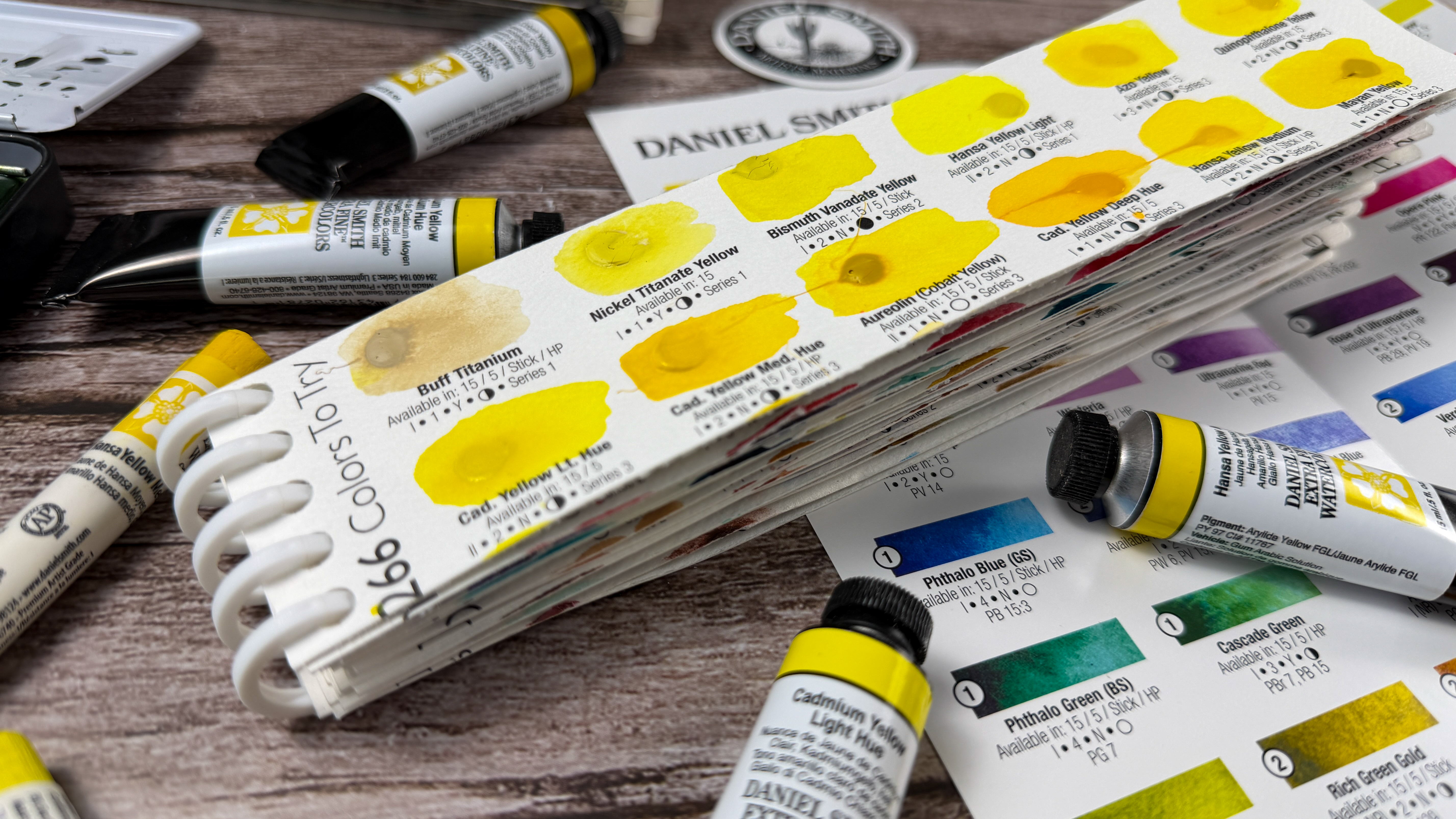
Every artist chooses a palette based on personal preferences, subject matter and need for a broad range of color mixing possibilities. Like a well-planned spice rack, every palette should include versatile staples. Although I have 32 wells for color on my palette, there are staple colors that I use most often (I seldom use more than 6 or 8 colors in a single painting). I choose colors not only for hue, but also for the characteristics the paints offer. When choosing colors, remember that you can duplicate almost any hue, but not necessarily with the particular color characteristics you’re seeking. Sometimes I want opaque and earthy qualities in paint, other times I want to contrast highly transparent color with colors that granulate and add interesting textural qualities to a painting.
Learning to be a better painter is not just about technique, it is solid design principals, invention, innovation, style, vantage point, and sometimes just good story telling! Be open to change, growth and exploration in the wonderful world of watercolor!