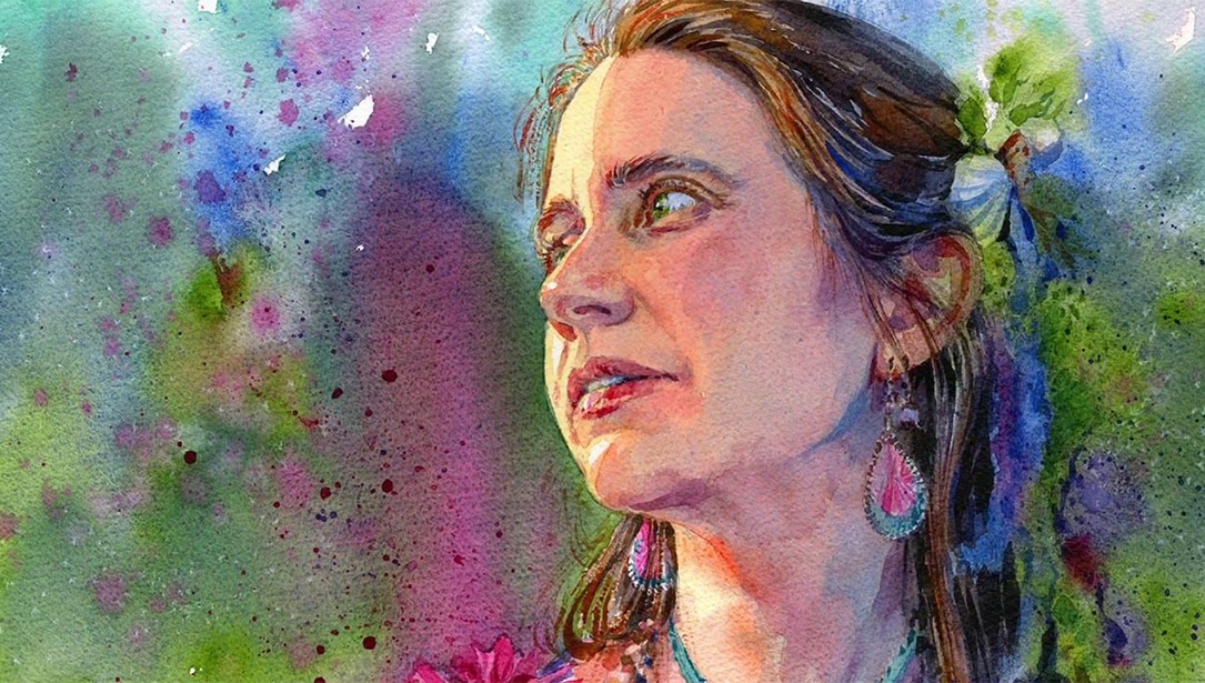
Why a cat? I love painting animals in general. Basically all of nature inspires me a lot. But I feel something really special about cats. I live in an area with a lot of feral cats and one of them now lives in my house. I have an opportunity to look at them and take pictures of them in all kinds of situations, which I often use for my paintings. When we paint any subject, we have to feel a closeness to it. When I paint cats from those captured moments, I don’t paint just a cat, I paint the “moment” that I saw in the situation. I paint the feelings and the strong connection between me and that moment.
In this painting, the moment is a sunny morning and one of the brutes in a stray cat tribe is walking around to find a place for good morning nap. On the lower right, there is a small beetle going the other direction and it stops for a moment to wait till this brute has passed.
I think that in some way, watercolor (the media I love so much) is the “cat” among other art materials. Cats are never predictable and a cat always does whatever he wants. It’s the same with watercolor, even when we think “that’s it! I know everything,” it still surprises! And to tell you the truth – I love that! I do wish to get surprises on my paper, I do wish to be friends with watercolor, and I appreciate its nature.

Reference photo, value sketch and pencil sketch on watercolor paper
Step 1
This is not really a quality printed photo, but I don’t care – everything about colors and light I have in my mind. The photo is just a memento to remember the feeling and to catch the pose in right proportions. I use my sketchbook and make a small value and composition study with pencil. Then I make the rudimentary pencil drawing on cold-press 140lb. watercolor paper.

First watercolor washes
Step 2
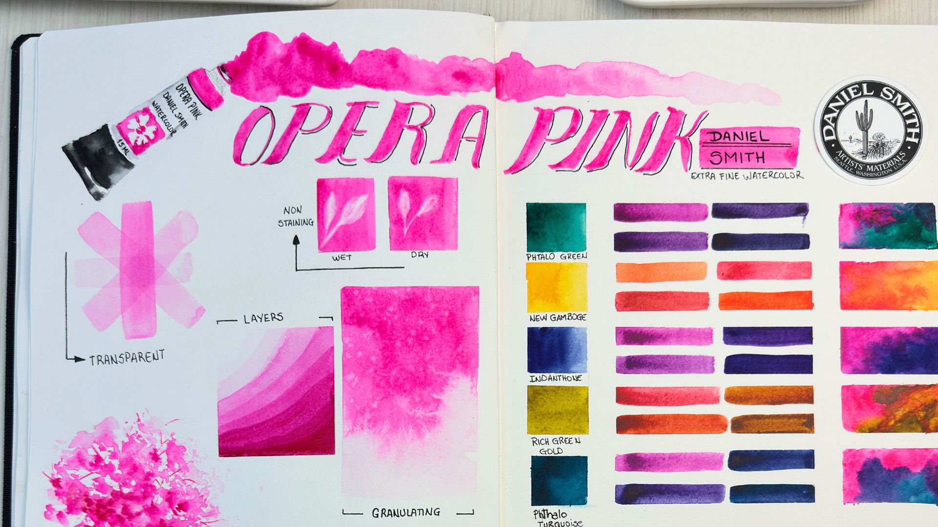
My first wash defines the warm and cool spaces, as well as the main drop-shadow, which is part of my composition. Here I use a warm mix from the palette – usually these are mixes of Quinacridone Burnt Orange, Nickel Azo Yellow, Monte Amiata Natural Sienna, and in some places I add Lunar Earth to get the granulation. My cool mix is usually Cerulean Blue, Phthalo Turquoise, French Ultramarine and Sepia in different proportions. Here I add granulating Lunar Blue to the background. For the cat’s shadow, I use Moonglow, Verditer Blue and Quinacridone Burnt Orange.


Adding values to the cat’s figure to build the form
Step 3
Continuing with the washes, I start to add values to the cat’s figure. I use the same colors as in the background, just adding a bit of Quinacridone Coral to the ears. I wet the paper with clear water, using a hake brush, before applying the colors and spraying more water if I see any hard edges that I don’t want. If I need to put a more defined mark with the brush, I blot water from the brush and take up more pigment with it. This way even when the surface is wet, we have more control of making marks. For the tail, I use watercolor’s wonderful nature when working wet onto wet paper, to get this spreading mark.

Adding darker values to the shadows
Step 4
Here I continue to add value to the shadows on the cat and the shadow beneath it, as well as adding more details to the cat. I don’t wait for the paper to dry completely, I just continue with the process – some places dry, some are still wet and I get various brush marks naturally with little effort. This is important to have soft edges and strong edges, one near another, throughout the whole painting. I also am always thinking about cool versus warm colors. Cool colors near the warm colors make the painting more natural and connected to reality, even when you are not a realist artist. For the darkest places, I love to use the mix of Sepia, Phthalo Turquoise and Verditer Blue with Deep Scarlet.


Creating textures in the background
Step 5
The most fun step is creating the textures for the background. I use all the same colors I already have on the palette, especially Lunar Blue and Lunar Earth, because I need their granulating ability for textural effects. Here there are no rules – I use a dry flat brush, splatter colors, spray water, lift marks with a paper towel – everything I could think of. Just try to stop in time before you make the painting look overworked or too dark in value.

Checking the background values
Step 6
Next I check the value of the background and make a decision to add a bit more darker value in the lower right corner. Usually I take a break for a cup of coffee and then come back to the painting to look at it with fresh eyes. This time, I saw that some more value was needed and used a mix of Deep Scarlet and Verditer Blue. I love this kind of silver gray tone that I get in this mix.

Adding the final details
Step 7
The final details – I add some graphic lines with liner brush using the same dark mix I already have, and then add a very important character in the story – the beetle! Sometimes those graphic lines add a lot to the painting, but we should be careful not to make too much of them. And don’t forget to sign the painting!

Other Way by Sophie Rodionov (15 x 20″)